5.1: Drawables, Styles, and Themes
Table of Contents:
In this chapter you learn how to use drawables, which are compiled images that you can use in your app. Android provides classes and resources to help you include rich images in your application with a minimal impact to your app's performance.
You also learn how to use styles and themes to provide a consistent appearance to all the elements in your app while reducing the amount of code.
Drawables
A drawable is a graphic that can be drawn to the screen. You retrieve drawables using APIs such as getDrawable(int) , and you apply a drawable to an XML resource using attributes such as android:drawable and android:icon.
Android includes several types of drawables, most of which are covered in this chapter.
Covered in this chapter:
|
Not covered in this chapter:
|
Using drawables
To display a drawable, use the ImageView class to create a View. In the <ImageView> element in your XML file, define how the drawable is displayed and where the drawable file is located. For example, this ImageView displays an image called "birthdaycake.png":
<ImageView
      android:id="@+id/tiles"
      android:layout_width="wrap_content"
      android:layout_height="wrap_content"
      android:src="@drawable/birthdaycake" />
About the <ImageView> attributes:
- The
android:idattribute sets a shortcut name that you use to call the image later. - The
android:layout_widthandandroid:layout_heightattributes specify the size of the View. In this example the height and width are set towrap_content, which means the View is only big enough to enclose the image within it, plus padding. - The
android:srcattribute gives the location where this image is stored. If you have versions of the image that are appropriate for different screen resolutions, store them in folders named res/drawable-[density]/. For example, store a version of birthdaycake.png appropriate for hdpi screens in res/drawable-hdpi/birthdaycake.png. For more information, see the multiple-screens guide. <ImageView>also has attributes that you can use to crop your image if it is too large or has a different aspect ratio than the layout or the View. For complete details, see theImageViewclass documentation.
To represent a drawable in your app, use the Drawable class or one of its subclasses. For example, this code retrieves the birthdaycake.png image as a Drawable:
Resources res = getResources();
Drawable drawable = res.getDrawable(R.drawable.birthdaycake);
Image files
An image file is a generic bitmap file. Android supports image files in several formats: WebP (preferred), PNG (preferred), and JPG (acceptable). GIF and BMP formats are supported, but discouraged.
The WebP format is fully supported from Android 4.2. WebP compresses better than other formats for lossless and lossy compression, potentially resulting in images more than 25% smaller than JPEG formats. You can convert existing PNG and JPEG images into WebP format before upload. For more about WebP, see the WebP documentation.
Store image files in the res/drawable folder. Use them with the android:src attribute for an ImageView and its descendants, or to create a BitmapDrawable class in Java code.
Be aware that images look different on screens with different pixel densities and aspect ratios. For information on supporting different screen sizes, see Speeding up your app, below, and the screen sizes guide.
Nine-patch files
A 9-patch is a PNG image in which you define stretchable regions. Use a 9-patch as the background image for a View to make sure the View looks correct for different screen sizes and orientations.
For example, in a View that has layout_width set to "wrap_content", the View stays big enough to enclose its content (plus padding). If you use a normal PNG image as the background image for the View, the image might be too small for the for the View on some devices, because the View stretches to accommodate the content inside it. If you use a 9-patch image instead, the 9-patch stretches as the View stretches.
Android's standard Button widget is an example of a View that uses a 9-patch as its background image. The 9-patch stretches to accommodate the text or image inside the button.
Save 9-patch files with a .9.png extension and store them in the res/drawable folder. Use them with the android:src attribute for an ImageView and its descendants, or to create a NinePatchDrawable class in Java code.
To create a 9-patch, use the Draw 9-Patch tool in Android Studio. The tool lets you start with a regular PNG and define a 1-pixel border around the image in places where it's okay for the Android system to stretch the image if needed. To use the tool:
- Put a PNG file into the res/drawable folder. (To do this, copy the image file into the app/src/main/res/drawable folder of your project.)
- In Android Studio, right-click the file and choose Create 9-Patch file. Android Studio saves the file with a .9.png extension.
- In Android Studio, double-click the .9.png file to open the editor.
- Specify which regions of the image are okay to stretch.
#
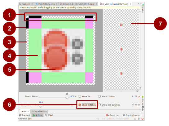
Border to indicate which regions are okay to stretch for width (horizontally).
For example, in a View that is wider than the image, the green stripes on the left- and right-hand sides of this 9-patch can be stretched to fill the View. Places that can stretch are marked with black. Click to turn pixels black.
- Border to indicate regions that are okay to stretch for height (vertically). For example, in a View that is taller then the image, the green stripes on the top and bottom of this 9-patch can be stretched to fill the View.
- Turn off pixels by shift-clicking (ctrl-click on Mac).
- Stretchable area.
- Not stretchable.
- Check Show patches to preview the stretchable patches in the drawing area.
- Previews of stretched image.Tip: Make sure that stretchable regions are at least 2x2 pixels in size. Otherwise, they may disappear when the image is scaled down.
For a more detailed discussion about how to create a 9-patch file with stretchable regions, see the 9-patch guide.
Layer list drawables
In Android you can build up an image by layering other images together, just as you can in Gimp and other image-manipulation programs. Each layer is represented by an individual drawable. The drawables that make up a single image are organized and managed in a <layer-list> element in XML. Within the <layer-list>, each drawable is represented by an <item> element.
Layers are drawn on top of each other in the order defined in the XML file, which means that the last drawable in the list is drawn on top. For example, this layer list drawable is made up of three drawables superimposed on each other:

In the following XML, which defines this layer list, the android_blue image is defined last, so it's drawn last and shown on top:
<?xml version="1.0" encoding="utf-8"?>
<layer-list xmlns:android="http://schemas.android.com/apk/res/android">
    <item>
      <bitmap android:src="@drawable/android_red"
        android:gravity="center" />
    </item>
    <item android:top="10dp" android:left="10dp">
      <bitmap android:src="@drawable/android_green"
        android:gravity="center" />
    </item>
    <item android:top="20dp" android:left="20dp">
      <bitmap android:src="@drawable/android_blue"
        android:gravity="center" />
    </item>
</layer-list>
A LayerDrawable is a drawable object that manages an array of other drawables. For more information about how to use a layer list drawable, see the layer list guide.
Shape drawables
A shape drawable is a rectangle, oval, line, or ring that you define in XML. You specify the size and style of the shape using XML attributes.
For example, this XML file creates a rectangle with rounded corners and a color gradient. The rectangle's fill color shifts from white (#000000) in the lower left corner to blue (#0000dd) in the upper right corner. The angle attribute determines how the gradient is tilted:
<?xml version="1.0" encoding="utf-8"?>
<shape xmlns:android="http://schemas.android.com/apk/res/android"
    android:shape="rectangle">
    <corners android:radius="8dp" />
    <gradient
        android:startColor="#000000"
        android:endColor="#0000dd"
        android:angle="45"/>
    <padding android:left="7dp"
        android:top="7dp"
        android:right="7dp"
        android:bottom="7dp" />
</shape>
Assuming that the shape drawable XML file is saved at res/drawable/gradient_box.xml, the following layout XML applies the shape drawable as the background to a View:
<TextView
    android:background="@drawable/gradient_box"
    android:layout_height="wrap_content"
    android:layout_width="wrap_content" />
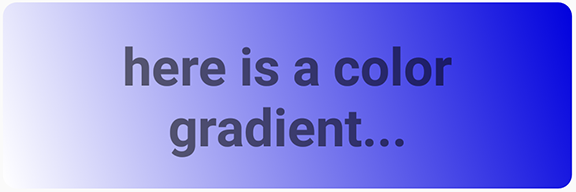
The following code shows how to programmatically get the shape drawable and use it as the background for a View, as an alternative to defining the background attribute in XML:
Resources res = getResources();
Drawable shape = res. getDrawable(R.drawable.gradient_box);

TextView tv = (TextView)findViewByID(R.id.textview);
tv.setBackground(shape);
You can set other attributes for a shape drawable. The complete syntax is as follows:
<?xml version="1.0" encoding="utf-8"?>
<shape
    xmlns:android="http://schemas.android.com/apk/res/android"
    android:shape=["rectangle" | "oval" | "line" | "ring"] >
    <!-- If it's a line, the stroke element is required. -->
    <corners
        android:radius="integer"
        android:topLeftRadius="integer"
        android:topRightRadius="integer"
        android:bottomLeftRadius="integer"
        android:bottomRightRadius="integer" />
    <gradient
        android:angle="integer"
        <!-- The angle must be 0 or a multiple of 45 -->
        android:centerX="float"
        android:centerY="float"
        android:centerColor="integer"
        android:endColor="color"
        android:gradientRadius="integer"
        android:startColor="color"
        android:type=["linear" | "radial" | "sweep"]
        android:useLevel=["true" | "false"] />
    <padding
        android:left="integer"
        android:top="integer"
        android:right="integer"
        android:bottom="integer" />
    <size
        android:width="integer"
        android:height="integer" />
    <solid
        android:color="color" />
    <stroke
        android:width="integer"
        android:color="color"
        android:dashWidth="integer"
        android:dashGap="integer" />
</shape>
For details about these attributes, see the shape drawable reference.
State list drawables
A StateListDrawable is a drawable object that uses a different image to represent the same object, depending on what state the object is in. For example, a Button widget can exist in one of several states (pressed, focused on, hovered over, or none of these). Using a state list drawable, you can provide a different background image for each state.
You describe the state list in an XML file. Each graphic is represented by an <item> element inside a single <selector> element. Each <item> uses a state_ attribute to indicate the situation in which the graphic is used.
During each state change, Android traverses the state list from top to bottom. The first item that matches the current state is used, which means that the selection is not based on the "best match," but is simply the first item that meets the minimum criteria of the state.
The state list in the following example defines which image is shown for a button when the button is in different states. When the button is pressed—that is, when state_pressed="true"—the app shows an image named button_pressed. When the button is in focus (state_focused="true"), or when the button is being hovered over (state_hovered="true"), the app shows different buttons.
<?xml version="1.0" encoding="utf-8"?>
<selector xmlns:android="http://schemas.android.com/apk/res/android">
    <item android:state_pressed="true"
          android:drawable="@drawable/button_pressed" /> <!-- pressed -->
    <item android:state_focused="true"
          android:drawable="@drawable/button_focused" /> <!-- focused -->
    <item android:state_hovered="true"
          android:drawable="@drawable/button_focused" /> <!-- hovered -->
    <item android:drawable="@drawable/button_normal" /> <!-- default -->
</selector>
Other available states include android:state_selected, android:state_checkable, android:state_checked, and others. For details about all the options, see the state list guide.
Level list drawables
A level list drawable defines alternate drawables, each assigned a maximum numerical value. To select which drawable to use, call the setLevel() method, passing in an integer that is matched against the maximum level integer defined in XML. The resource with the lowest maximum level greater than or equal to the integer passed into setLevel() is selected.
For example, the following XML defines a level list that includes two alternate drawables, status_off and status_on:
<?xml version="1.0" encoding="utf-8"?>
<level-list xmlns:android="http://schemas.android.com/apk/res/android" >
    <item
        android:drawable="@drawable/status_off"
        android:maxLevel="0" />
    <item
        android:drawable="@drawable/status_on"
        android:maxLevel="1" />
</level-list>
To select the status_off drawable, call setLevel(0). To select the status_on drawable, call setLevel(1).
An example use of a LevelListDrawable is a battery level indicator icon that uses different images to indicate different current battery levels.
Transition drawables
A TransitionDrawable is a drawable that cross-fades between two other drawables. To define a transition drawable in XML, use the <transition> element. Each drawable is represented by an <item> element inside the <transition> element. No more than two <item> elements are supported.
For example, this drawable cross-fades between an "on" state and an "off" state drawable:
<transition xmlns:android="http://schemas.android.com/apk/res/android">
    <item android:drawable="@drawable/on" />
    <item android:drawable="@drawable/off" />
</transition>
To transition forward, meaning to shift from the first drawable to the second, call startTransition(). To transition in the other direction, call reverseTransition(). Each of these methods takes an argument of type int, representing the number of milliseconds for the transition.
Vector drawables
In Android 5.0 (API Level 21) and above, you can define vector drawables, which are images that are defined by a path. Vector drawables scale without losing definition. Most vector drawables use SVG files, which are plain text files or compressed binary files that include two-dimensional coordinates for how the image is drawn on the screen.
Because SVG files are text, they are more space efficient than most other image files. Also, you only need one file for a vector image instead of a file for each screen density, as is the case for bitmap images.
To bring an existing vector image or a Material Design icon into your Android Studio project as a vector drawable:
- Right-click on the res/drawable folder.
- Select New > Vector Asset. The Vector Asset Studio opens and guides you through the process.
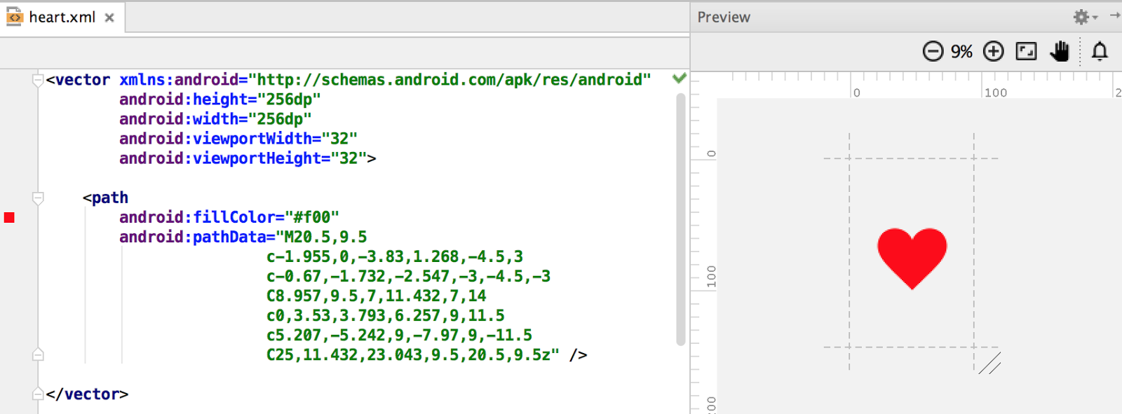
To create a vector image, define the details of the shape inside a <vector> XML element. For example, the following code defines the shape of a heart and fills it with a red color (#f00):
<vector xmlns:android="http://schemas.android.com/apk/res/android"
    <!-- intrinsic size of the drawable -->
    android:height="256dp"
    android:width="256dp"
    <!-- size of the virtual canvas -->
    android:viewportWidth="32"
    android:viewportHeight="32">

  <!-- draw a path -->
  <path android:fillColor="#f00"
      android:pathData="M20.5,9.5
                        c-1.955,0,-3.83,1.268,-4.5,3
                        c-0.67,-1.732,-2.547,-3,-4.5,-3
                        C8.957,9.5,7,11.432,7,14
                        c0,3.53,3.793,6.257,9,11.5
                        c5.207,-5.242,9,-7.97,9,-11.5
                        C25,11.432,23.043,9.5,20.5,9.5z" />
</vector>
Android Studio shows a preview of vector drawables, for example, here's the result of creating the XML file described above:
If you already have an image in SVG format, there are several ways to get the image's pathData information:
- In Android Studio, right-click on the drawable folder and select New > Vector Asset to open the Vector Asset Studio tool. Use the tool to import a local SVG file.
- Use a file-conversion tool such as svg2android.
- Open the image in a text editor, or if you're viewing the image in a browser, view the page source. Look for the
d=information, which is equivalent to thepathDatain your XML.
Vector images are represented in Android as VectorDrawable objects. For details about the pathData syntax, see the SVG Path reference. To learn how to animate the properties of vector drawables, see Animate Vector Drawables.
Images
Images, from launcher icons to banner images, are used in many ways in Android. Each use case has different requirements for image resolution, scalability and simplicity. In this section you learn about the different ways to generate images and include them in your app.
Creating icons
Every app requires at least a launcher icon, and apps often include icons for action bar actions, notifications, and other use cases.
There are two approaches to creating icons:
- Create a set of image files of the same icon in different resolutions and sizes so that the icon looks the same across devices with different screen densities. You can use Image Asset Studio to do this.
- Use vector drawables, which scale automatically without the image becoming pixelated or blurry. You can use Vector Asset Studio to do this.
Image Asset Studio
Android Studio includes a tool called Image Asset Studio that helps you generate your own app icons from Material Design icons, custom images, and text strings. It generates a set of icons at the appropriate resolution for each generalized screen density that your app supports. Image Asset Studio places the newly generated icons in density-specific folders under the res/ folder in your project. At runtime, Android uses the appropriate resource based on the screen density of the device your app is running on.
Image Asset Studio helps you generate the following icon types:
- Launcher icons
- Action bar and tab icons
- Notification icons
To use Image Asset Studio, right-click on the res/ folder in Android Studio and select New > Image Asset. The Configure Asset Studio wizard opens and guides you through the process.
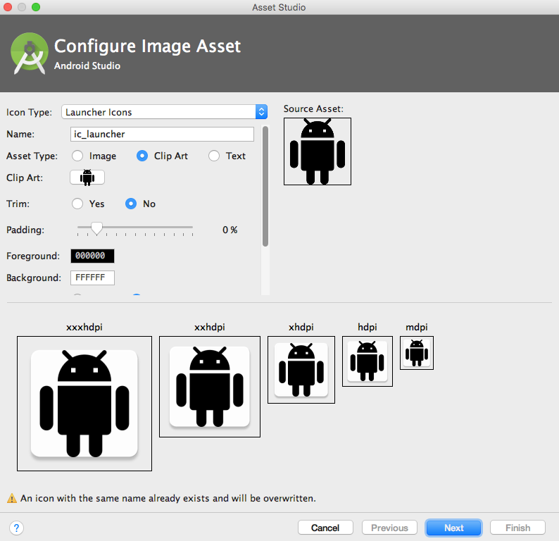
For more about Image Asset Studio, see the Image Asset Studio guide.
Vector Asset Studio
Starting with API 21, you can use vector drawables instead of image files for your icons.
Advantages of using vector drawables as icons:
- Vector drawables can reduce your APK file size dramatically, because you don't have to include multiple versions of each icon image. You can use one vector image to scale seamlessly to any resolution.
- Users might be more likely to download an app that has smaller files and a smaller package size.
Disadvantages of using vector drawables as icons:
- A vector drawable can include only a limited amount of detail. Vector drawables are mostly used for less detailed icons such as the Material Design icons. Icons with more detail usually need image files.
- Vector drawables are not supported on devices running API level 20 or below.
To use vector drawables on devices running API level 20 or below, you have to decide between two methods of backward-compatibility:
- By default, at build time the system creates bitmap versions of your vector drawables in different resolutions. This allows the icons to run on devices that aren't able to draw vector drawables.
- The
VectorDrawableCompatclass in the Android Support Library allows you to support vector drawables in Android 2.1 (API level 7) and higher.
Vector Asset Studio is a tool that helps you add Material Design icons and vector drawables to your Android project. To use it, right-click on the res/ folder in Android Studio and select New > Vector Asset. The Configure Asset Studio wizard opens and guides you through the process.
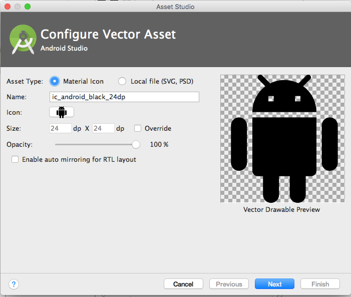
For more information on using the Vector Asset Studio and supporting backward compatibility, refer to the Vector Asset Studio guide.
Creating other images
Banner images, user profile pictures, and other images come in all shapes and sizes. In many cases they are larger than they need to be for a typical application user interface (UI). For example, the system Gallery app displays photos taken using an Android device's camera, and these photos are typically much higher resolution than the screen density of the device. Android devices have finite memory, so ideally, you want to load only a lower resolution version of a photo in memory. The lower resolution version should match the size of the UI component that displays it. An image with a higher resolution doesn't provide any visible benefit, but still takes up precious memory and adds additional performance overhead due to additional on-the-fly scaling.
You can load resized images manually, but several third party libraries have been created to help with loading, scaling and caching images.
Using image-loading libraries
Image-loading libraries like Glide and Picasso can handle image sizing, caching, and display. These third-party libraries are optimized for mobile, and they are well-documented.
Glide supports fetching, decoding, and displaying video stills, images, and animated GIFs. You can use Glide to load images from Web APIs, as well as ones located in your resource files. Glide includes features such as loading placeholder images (for loading more detailed images), cross-fade animations, and automatic caching.
To use Glide:
- Download the library.
- Include the dependency in your app-level build.gradle file, replacing
<em>n.n.n</em>with the latest version of Glide:compile 'com.github.bumptech.glide:glide:<em>n.n.n</em>'
You can use Glide to load any image into a UI element. The following example loads an image from a URL into an ImageView:
ImageView imageView = (ImageView) findViewById(R.id.my_image_view);
Glide.with(this).load("URL").into(imageView);
In the code snippet, this refers to the context of the application. Replace "URL" with the URL of the image's location. By default, the image is stored in a local cache and accessed from there the next time it's called.
- For more examples, see the Glide wiki.
- For more about Glide, see the Glide documentation and the [glide] tag on stack overflow.
- For more about Picasso, see the Picasso documentation and the [picasso] tag on stack overflow.
- To compare the features of different libraries, search on stack overflow, for example Glide vs. Picasso.
Testing image rendering
Images render differently on different devices. To avoid surprises, use the Android Virtual Device (AVD) manager to create virtual devices that simulate screens of different sizes and densities. Use these AVDs to test all your images.
Speeding up your app
Fetching and caching images
When your app fetches an image, it can use a lot of data. To conserve data, make sure your request starts out as small as possible. Define and store pre-sized images on the server side, then request images that are already sized to the View.
Cache your images so that each image only needs to travel over the network once. When an image is requested, check your cache first. Only request the image over the network if the image is not in the cache. Use an image-loading library like Glide or Picasso to handle caching. These libraries also manage the size of the cache, getting rid of old or unused images. For more about libraries, see the libraries section of this chapter.
To maximize performance in different contexts, set conditional rules for how your app handles images, depending on connection type and stability. Use ConnectivityManager to determine the connection type and status, then set conditional rules accordingly. For example, when a user is on a data connection (not WiFi), downgrade the requested image resolution to less than screen resolution. Upgrade the requested screen resolution again when the user is on WiFi.
When your app is fetching images over a network, a slow connection might leave your user waiting. Here are ways to keep your app feeling fast, even if images load slowly:
- Prioritize more important images so that they load first. Libraries like Glide and Picasso let you order requests by image priority.
- Prioritize requests for text before requests for images. If your app is usable without images, for example if it's a news feed app, letting a user scroll past your image can make the app functional and might even render the image request obsolete.
- Display placeholder colors while fetching images.
If you display placeholder colors, you want the look of your app to stay consistent while the app loads images. Use the Palette library to select a placeholder color based on the requested image's color balance. First, include the Palette library in your build.gradle file:
dependencies: {
    compile 'com.android.support:palette-v7:24.2.1'
}
Pull the dominant color for the image you want and set it as the background color in your ImageView. If you fetch the image using a library, put the following code after you've defined the URL to load into the ImageView:
Palette palette = Palette.from(tiles).generate(new PaletteAsyncListener(){
   Public void onGenerated(Pallet pallette) {
      Palette.Swatch background = palette.getDominantSwatch();
         if (background != null) {
            ImageView.setBackgroundColor(background.getRgb());
          }
     }
}
Serving images over a network
To save bandwidth and keep your app moving fast, use WebP formats to serve and send images.
Another way to save bandwidth is to serve and cache custom-sized images. To do this, allow clients to specify the resolution and size required for their device and View, then generate and cache the needed image on the server side before you send it.
For example, a news feed landing page might request only a thumbnail image. Instead of sending a full-sized image, send only the thumbnail specified by that ImageView. You can further reduce the size of the thumbnail by producing images at different resolutions.
Activity.isLowRamDevice() method to find out whether a device defines itself as "low RAM." If the method returns true, send low-resolution images so that your app uses less on-device memory.
Styles
In Android, a style is a collection of attributes that define the look and format of a View. You can apply the same style to any number of Views in your app; for example, several TextViews might have the same text size and layout. Using styles allows you to keep these common attributes in one location and apply them to each TextView using a single line of code in XML.
You can define styles yourself or use one of the platform styles that Android provides.
Defining and applying styles
To create a style, add a <style> element inside a <resources> element in any XML file located in the res/values/ folder. When you create a project in Android Studio, a res/values/styles.xml file is created for you.
A <style> element includes the following:
- A
nameattribute. Use the style's name when you apply the style to a View. - An optional
parentattribute. You learn about usingparentattributes in the Inheritance section below. - Any number of
<item>elements as child elements of<style>. Each<item>element includes one style attribute.
This example creates a style that formats text to use a light gray monospace typeface so it looks like code:
<resources>
    <style name="CodeFont">
        <item name="android:typeface">monospace</item>
        <item name="android:textColor">#D7D6D7</item>
    </style>
</resources>
The following XML applies the new CodeFont style to a View:
<TextView
    style="@style/CodeFont"
    android:text="@string/code_string" />
Inheritance
A new style can inherit the properties of an existing style. When you create a style that inherits properties, you define only the properties that you want to change or add. You can inherit properties from platform styles and from styles that you create yourself.
To inherit a platform style, use the parent attribute to specify the resource ID of the style you want to inherit. For example, here's how to inherit the Android platform's default text appearance (the TextAppearance style) and change its color:
<style name="GreenText" parent="@android:style/TextAppearance">
    <item name="android:textColor">#00FF00</item>
</style>
To apply this style, use @style/GreenText.
To inherit a style that you created yourself, use the name of the style you want to inherit as the first part of the new style's name, and separate the parts with a period:
name="StyleToInherit.Qualifier"
For example, to create a style that inherits the CodeFont style defined above, use CodeFont as the first part of the new style's name:
<style name="CodeFont.RedLarge">
    <item name="android:textColor">#FF0000</item>
    <item name="android:textSize">34sp</item>
</style>
This example includes the typeface attribute from the original CodeFont style, overrides the original textColor attribute with red, and adds a new attribute, textSize. To apply this style, use @style/CodeFont.RedLarge.
Themes
You create a theme the same way you create a style, which is by adding a <style> element inside a <resources> element in any XML file located in the res/values/ folder.
What's the difference between a style and a theme?
- A style applies to a View. In XML, you apply a style using the
styleattribute. - A theme applies to an entire Activity or application, rather than to an individual View. In XML, you apply a theme using the
android:themeattribute.
Any style can be used as a theme. For example, you could apply the CodeFont style as a theme for an Activity, and all the text inside the Activity would use gray monospace font.
Applying themes
To apply a theme to your app, declare it inside an <application> element inside the AndroidManifest.xml file. This example applies the AppTheme theme to the entire application:
<?xml version="1.0" encoding="utf-8"?>
<manifest xmlns:android="http://schemas.android.com/apk/res/android"
    package="com.exampledomain.myapp">
    <application
        ...
        android:theme="@style/AppTheme">
    </application>
    ...
To apply a theme to an Activity, declare it inside an <activity> element in the AndroidManifest.xml file. In this example, the android:theme attribute applies the Theme_Dialog platform theme to the Activity:
<activity android:theme="@android:style/Theme.Dialog">
Default theme
When you create a new project in Android Studio, a default theme is defined for you within the styles.xml file. For example, this code might be in your styles.xml file:
<style name="AppTheme" parent="Theme.AppCompat.Light.DarkActionBar">
   <!-- Customize your theme here. -->
   <item name="colorPrimary">@color/colorPrimary</item>
   <item name="colorPrimaryDark">@color/colorPrimaryDark</item>
   <item name="colorAccent">@color/colorAccent</item>
</style>
In this example, AppTheme inherits from Theme.AppCompat.Light.DarkActionBar, which is one of the many Android platform themes available to you. (You'll learn about the color attributes in the unit on Material Design.)
Platform styles and themes
The Android platform provides a collection of styles and themes that you can use in your app. To find a list of all of them, you need to look in two places:
- The R.style class lists most of the available platform styles and themes.
- The support.v7.appcompat.R.style class lists more of them. These styles and themes have "
AppCompat" in their names, and they are supported by the v7 appcompat library.
The style and theme names include underscores. To use them in your code, replace the underscores with periods. For example, here's how to apply the Theme_NoTitleBar theme to an activity:
<activity android:theme="@android:style/Theme.NoTitleBar"
And here's how to apply the AlertDialog_AppCompat style to a View:
<TextView
    style="@style/AlertDialog.AppCompat"
    android:text="@string/code_string" />
The documentation doesn't describe all the styles and themes in detail, but you can infer things about them from their names. For example, in Theme.AppCompat.Light.DarkActionBar
- "Theme" indicates that this style is meant to be used as a theme.
- "AppCompat" indicates that this theme is supported by the v7 appcompat library.
- "Light" indicates that the theme consists of light background, white by default. All the text colors in this theme are dark, to contrast with the light background. (If you wanted a dark background and light text, your theme could inherit from a theme such as
Theme.AppCompatwithout "Light" in the name.) - "DarkActionBar" indicates that a dark color is used for the action bar, so any text or icons in the action bar are a light color.
Another useful theme is Theme.AppCompat.DayNight, which enables the user to browse in a low-contrast "night mode" at night. It automatically changes the theme from Theme.AppCompat.Light to Theme.AppCompat, based on the time of day. To learn more about the DayNight theme, read Chris Banes's blog post.
To learn more about using platform styles and themes, visit the styles and themes guide.
Related practical
The related exercises and practical documentation is in Android Developer Fundamentals: Practicals.
