5.2: Material Design
Table of Contents:
- Introduction
- Principles of Material Design
- Colors
- Typography
- Layout
- Components and patterns
- Motion
- Animations
- Related practical
- Learn more
Material Design is a visual design philosophy that Google created in 2014. The aim of Material Design is a unified user experience across platforms and device sizes. Material Design includes a set of guidelines for style, layout, motion, and other aspects of app design. The complete guidelines are available in the Material Design Spec.
Material Design is for desktop web applications as well as for mobile apps. This chapter focuses only on Material Design for mobile apps on Android.
Principles of Material Design
The "material" metaphor
In Material Design, elements in your Android app behave like real world materials: they cast shadows, occupy space, and interact with each other.
Bold, graphic, intentional
Material Design involves deliberate color choices, edge-to-edge imagery, large-scale typography, and intentional white space that create a bold and graphic interface.
Emphasize user actions in your app so that the user knows right away what to do, and how to do it. For example, highlight things that users can interact with, such as buttons, EditText fields, and switches.
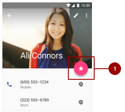
- In this layout, the floating action button is highlighted with a pink accent color.
Meaningful motion
Make animations and other motions in your app meaningful, so they don't happen at random. Use motions to reinforce the idea that the user is the app's primary mover. For example, design your app so that most motions are initiated by the user's actions, not by events outside the user's control. You can also use motion to focus the user's attention, give the user subtle feedback, or highlight an element of your app.
When your app presents an object to the user, make sure the motion doesn't break the continuity of the user's experience. For example, the user shouldn't have to wait for an animation or transition to complete.
The Motion section in this chapter goes into more detail about how to use motion in your app.
Colors
Material Design color palette
Material Design principles include the use of bold color. The Material Design color palette contains colors to choose from, each with a primary color and shades labeled from 50 to 900:
- Choose a color labeled "500" as the primary color for your brand. Use that color and shades of that color in your app.
- Choose a contrasting color as your accent color and use it to create highlights in your app. Select any color that starts with "A."
When you create an Android project in Android Studio, a sample Material Design color scheme is selected for you and applied to your theme. In values/colors.xml, three <color> elements are defined, colorPrimary, colorPrimaryDark, and colorAccent:
<?xml version="1.0" encoding="utf-8"?>
<resources>
    <color name="colorPrimary">#3F51B5</color>
    <!-- Indigo. -->
    <color name="colorPrimaryDark">#303F9F</color>
    <!-- A darker shade of indigo. -->
    <color name="colorAccent">#FF4081</color>
    <!-- A shade of pink. -->
</resources>
In values/styles.xml, the three defined colors are applied to the default theme, which applies the colors to some app elements by default:
colorPrimaryis used by several Views by default. For example, in theAppThemetheme,colorPrimaryis used as the background color for the action bar. Change this value to the "500" color that you select as your brand's primary color.colorPrimaryDarkis used in areas that need to slightly contrast with your primary color, for example the status bar. Set this value to a slightly darker version of your primary color.colorAccentis used as the highlight color for several Views. It's also used for switches in the "on" position, floating action buttons, and more.
In the screenshot below, the background of the action bar uses colorPrimary (indigo), the status bar uses colorPrimaryDark (a darker shade of indigo), and the switch in the "on" position uses colorAccent (a shade of pink).
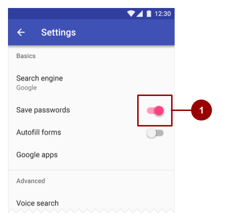
- In this layout, the switch in the "on" position is highlighted with a pink accent color.
In summary, here's how to use the Material Design color palette in your Android app:
- Pick a primary color for your app from Material Design color palette and copy its hex value into the
colorPrimaryitem in colors.xml. - Pick a darker shade of this color and copy its hex value into the
colorPrimaryDarkitem. - Pick an accent color from the shades starting with an "A" and copy its hex value into the colorAccent item.
If you need more colors, create additional
<color>elements in the colors.xml file. For example, you could pick a lighter version of indigo and create an additional<color>element namedcolorPrimaryLight. (The name is up to you.)<color name="colorPrimaryLight">#9FA8DA</color> <!-- A lighter shade of indigo. -->To use this color, reference it as
@color/colorPrimaryLight.
Changing the values in colors.xml automatically changes the colors of the Views in your app, because the colors are applied to the theme in styles.xml.
Contrast
Make sure all the text in your app's UI contrasts with its background. Where you have a dark background, make the text on top of it a light color, and vice versa. This kind of contrast is important for readability and accessibility, because not all people see colors the same way.
If you use a platform theme such as Theme.AppCompat, contrast between text and its background is handled for you. For example:
- If your theme inherits from
Theme.AppCompat, the system assumes you are using a dark background. Therefore all of the text is near white by default. - If your theme inherits from
Theme.AppCompat.Light, the text is near black, because the theme has a light background. - If you use the
Theme.AppCompat.Light.DarkActionBartheme, the text in the action bar is near white, to contrast with the action bar's dark background. The rest of the text in the app is near black, to contrast with the light background.
Use color contrast to create visual separation among the elements in your app. Use your colorAccent color to to call attention to key UI elements such as floating action buttons and switches in the "on" position.
Opacity
Your app can display text with different degrees of opacity to convey the relative importance of information. For example, text that's less important might be nearly transparent (low opacity).
Set the android:textColor attribute using any of these formats: "#rgb", "#rrggbb", "#argb", or "#aarrggbb". To set the opacity of text, use the "#argb" or "#aarrggbb" format and include a value for the alpha channel. The alpha channel is the a or the aa at the start of the textColor value.
The maximum opacity value, FF in hex, makes the color completely opaque. The minimum value, 00 in hex, makes the color complete transparent.
To determine what hex number to use in the alpha channel:
- Decide what level of opacity you want to use, as a percentage. The level of opacity used for text depends on whether your background is dark or light. To find out what level of opacity to use in different situations, see the Text color portion of the Material Design guide.
- Multiply that percentage, as a decimal value, by 255. For example, if you need primary text that's 87% opaque, multiply 0.87 x 255. The result is 221.85.
- Round the result to the nearest whole number: 222.
- Use a hex converter to convert the result to hex:
DE. If the result is a single value, prefix it with0.
In the following XML code, the background of the text is dark, and the color of the primary text is 87% white (deffffff). The first two numbers of the color code (de) indicate the opacity.
<TextView
   android:layout_width="wrap_content"
   android:layout_height="wrap_content"
   android:text="Hello World!"
   android:textSize="45dp"
   android:background="@color/colorPrimaryDark"
   android:textColor="#deffffff"/>
Typography
Typeface
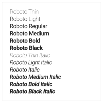
Roboto is the standard Material Design typeface on Android. Roboto has six weights: Thin, Light, Regular, Medium, Bold, and Black.
Font styles
The Android platform provides predefined font styles and sizes that you can use in your app. These styles and sizes were developed to balance content density and reading comfort under typical conditions. Type sizes are specified with sp (scaleable pixels) to enable large type modes for accessibility.
Be careful not to use too many different type sizes and styles together in your layout.
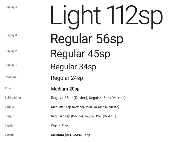
To use one of these predefined styles in a View, set the android:textAppearance attribute. This attribute defines the default appearance of the text: its color, typeface, size, and style. Use the backward-compatible TextAppearance.AppCompat style.
For example, to make a TextView appear in the Display 3 style, add the following attribute to the TextView in XML:
android:textAppearance="@style/TextAppearance.AppCompat.Display3"
For more information on styling text, view the Typography Material Design guidelines.
Layout
Metrics and keylines
Components in the Material Design templates that are meant for mobile, tablet, and desktop devices align to an 8dp square grid. A dp is a density-independent pixel, an abstract unit based on screen density. A dp is similar to an sp, but sp is also scaled by the user's font size preference. That's why sp is preferred for accessibility. For more about units of measurement, refer to the Layouts, Views, and Resources unit.
The 8dp square grid guides the placement of elements in your layout. Every square in the grid is 8dp x 8dp, so the height and width of every element in the layout is a multiple of 8dp.
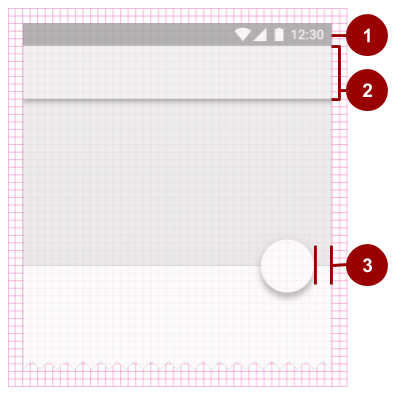
- The status bar in this layout is 24dp tall, the height of three grid squares.
- The toolbar is 56dp tall, the height of seven grid squares.
- One of the right-hand content margins is 16dp from the edge of the screen, the width of two grid squares.
Iconography in toolbars align to a 4dp square grid instead of an 8dp square grid, so the dimensions of icons in the toolbar are multiples of 4dp.
Keylines are outlines in a layout grid that determine the placement of text and icons. For example, keylines mark the edges of the margins in a layout.
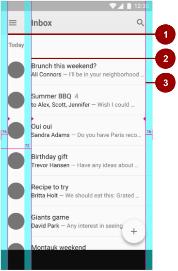
- Keyline showing the left margin for the screen edge, which in this case is 16dp.
- Keyline showing the left margin for content associated with an icon or avatar, 72dp.
- Keyline showing the right margin for the screen edge, 16dp.
Material Design typography aligns to a 4dp baseline grid, which is a grid made up only of horizontal lines.
The Material Design guide provides downloadable templates for commonly used UI screens. To learn more about metrics and keylines in Material Design, visit the metrics and keylines guide.
Components and patterns
Buttons and many other Views used in Android conform by default to Material Design principles. The Material Design guide includes components and patterns that you can build on to help your users intuit how the elements in your UI work, even if users are new to your app.
Use Material Design components to guide the specs and behavior of buttons, chips, cards, and many other UI elements. Use Material Design patterns to guide how you format dates and times, gestures, the navigation drawer, and many other aspects of your UI.
This section teaches you about the Design Support Library and some of the components and patterns that are available to you. For complete documentation about all the components and patterns that you can use, see the Material Design guide.
Design Support Library
The Design package provides APIs to support adding Material Design components and patterns to your apps. The Design Support Library adds support for various Material Design components and patterns for you to build on. To use the library, include the following dependency in your build.gradle file:
compile 'com.android.support:design:25.0.1'
To make sure you have the most recent version number for the Design Support Library, check the Support Library page.
Floating action buttons (FABs)
Use a floating action button (FAB) for actions you want to encourage users to take. A FAB is a circled icon that floats "above" the UI. On focus it changes color slightly, and it appears to lift up when selected. When tapped, it can contain related actions.
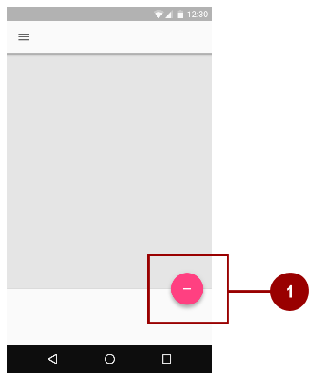
- A normal-sized FAB
To implement a FAB, use the FloatingActionButton widget and set the FAB's attributes in your layout XML. For example:
<android.support.design.widget.FloatingActionButton
    android:id="@+id/addNewItemFAB"
    android:layout_width="wrap_content"
    android:layout_height="wrap_content"
    android:src="@drawable/ic_plus_sign"
    app:fabSize="normal"
    app:elevation="10%" />
The fabSize attribute sets the FAB's size. It can be "normal" (56dp), "mini" (40dp), or "auto", which changes based on the window size.
The FAB's elevation is the distance between its surface and the depth of its shadow. You can set the elevation attribute as a reference to another resource, a string, a Boolean, or several other ways.
To learn about all the attributes you can set for a FAB including clickable, rippleColor, and backgroundTint, see FloatingActionButton. To make sure you're using FABs as intended, check the extensive FAB usage information in the Material Design guide.
Navigation drawers
A navigation drawer is a panel that slides in from the left and contains navigation destinations for your app. A navigation drawer spans the height of the screen, and everything behind it is visible, but darkened.
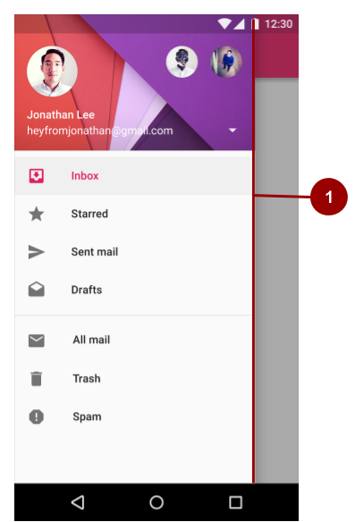
- An "open" navigation drawer
To implement a navigation drawer, use the DrawerLayout APIs available in the Support Library.
In your XML, use a DrawerLayout object as the root view of your layout. Inside it, add two views, one for your primary layout when the drawer is hidden, and one for the contents of the drawer.
For example, the following layout has two child views: a FrameLayout to contain the main content (populated by a Fragment at runtime), and a ListView for the navigation drawer.
<android.support.v4.widget.DrawerLayout
    xmlns:android="http://schemas.android.com/apk/res/android"
    android:id="@+id/drawer_layout"
    android:layout_width="match_parent"
    android:layout_height="match_parent">
    <!-- The main content view -->
    <FrameLayout
        android:id="@+id/content_frame"
        android:layout_width="match_parent"
        android:layout_height="match_parent" />
    <!-- The navigation drawer -->
    <ListView android:id="@+id/left_drawer"
        android:layout_width="240dp"
        android:layout_height="match_parent"
        android:layout_gravity="start"
        android:choiceMode="singleChoice"
        android:divider="@android:color/transparent"
        android:dividerHeight="0dp"
        android:background="#111"/>
</android.support.v4.widget.DrawerLayout>
For more information, see Creating a Navigation Drawer and the usage information in the Material Design guide.
Snackbars
A snackbar provides brief feedback about an operation through a message in a horizontal bar on the screen. It contains a single line of text directly related to the operation performed. A snackbar can contain a text action, but no icons.
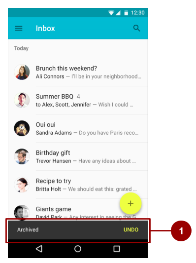
- Snackbar
Snackbars automatically disappear after a timeout or after a user interaction elsewhere on the screen. You can associate a snackbar with any kind of view (any object derived from the View class). However, if you associate the snackbar with a CoordinatorLayout, the snackbar gains additional features:
- The user can dismiss the snackbar by swiping it away.
- The layout moves some other UI elements when the snackbar appears. For example, if the layout has a FAB, the layout moves the FAB up when it shows the snackbar, instead of drawing the snackbar on top of the FAB.
To create a Snackbar object, use the Snackbar.make() method. Specify the ID of the CoordinatorLayout view to use for the snackbar, the message that the snackbar displays, and the length of time to show the message. For example, this Java statement creates the snackbar and calls show() to show the snackbar to the user:
Snackbar.make(findViewById(R.id.myCoordinatorLayout), R.string.email_sent,
                        Snackbar.LENGTH_SHORT).show;
For more information, see Building and Displaying a Pop-Up Message and the Snackbar reference. To make sure you're using snackbars as intended, see the snackbar usage information in the Material Design guide.
Tabs
Use tabs to organize content at a high level. For example, the user might use tabs to switch between Views, data sets, or functional aspects of an app. Present tabs as a single row above their associated content. Make tab labels short and informative.
You can you use tabs with swipe views in which users navigate between tabs with a horizontal finger gesture (horizontal paging). If your tabs use swipe views, don't pair the tabs with content that also supports swiping.
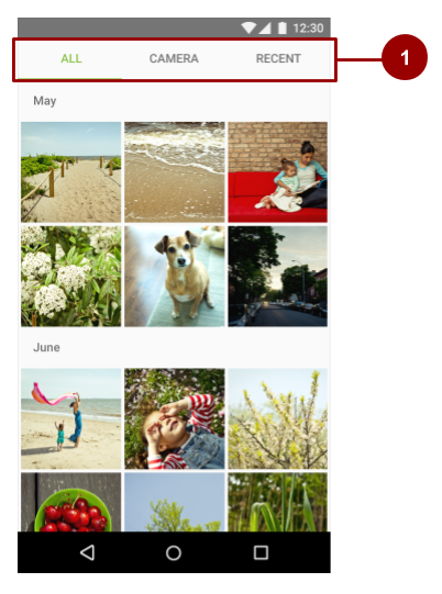
- Three tabs, with the ALL tab selected
For information on implementing tabs, see Creating Swipe Views with Tabs. To make sure you're using tabs as intended, see the extensive tab usage information in the Material Design guide.
Cards
A card is a sheet of material that serves as an entry point to more detailed information. Each card covers only one subject. A card may contain a photo, text, and a link. It can display content containing elements of varying size, such as photos with captions of variable length.
A card collection is a layout of cards on the same plane.
The CardView widget is included as part of the v7 support library. To use it, add the following dependency to your build.gradle file:
compile 'com.android.support:cardview-v7:24.2.1'
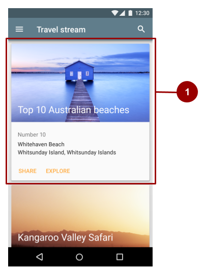
- One card in a card collection
For more information on using the CardView widget, visit the card guide.
Lists
A list is a single continuous column of rows of equal width. Each row functions as a container for a tile. Tiles hold content, and can vary in height within a list.
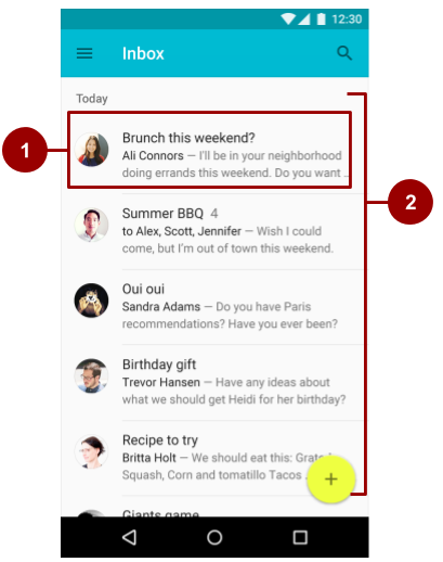
- A tile within the list
- A list with rows of equal width, each containing a tile
To create a list, use the RecyclerView widget. Include the following dependency in your build.gradle file.
compile 'com.android.support:recyclerview-v7:24.2.1'
For more information on creating lists in Android, see the creating lists guide.
Motion
Motion in the world of Material Design is used to describe spatial relationships, functionality, and intention with beauty and fluidity. Motion shows how an app is organized and what it can do.
Motion in Material Design must be:
- Responsive. It quickly responds to user input precisely where the user triggers it.
- Natural. Movement is inspired by forces in the natural world. For example, real-world forces like gravity inspire an element's movement along an arc rather than in a straight line.
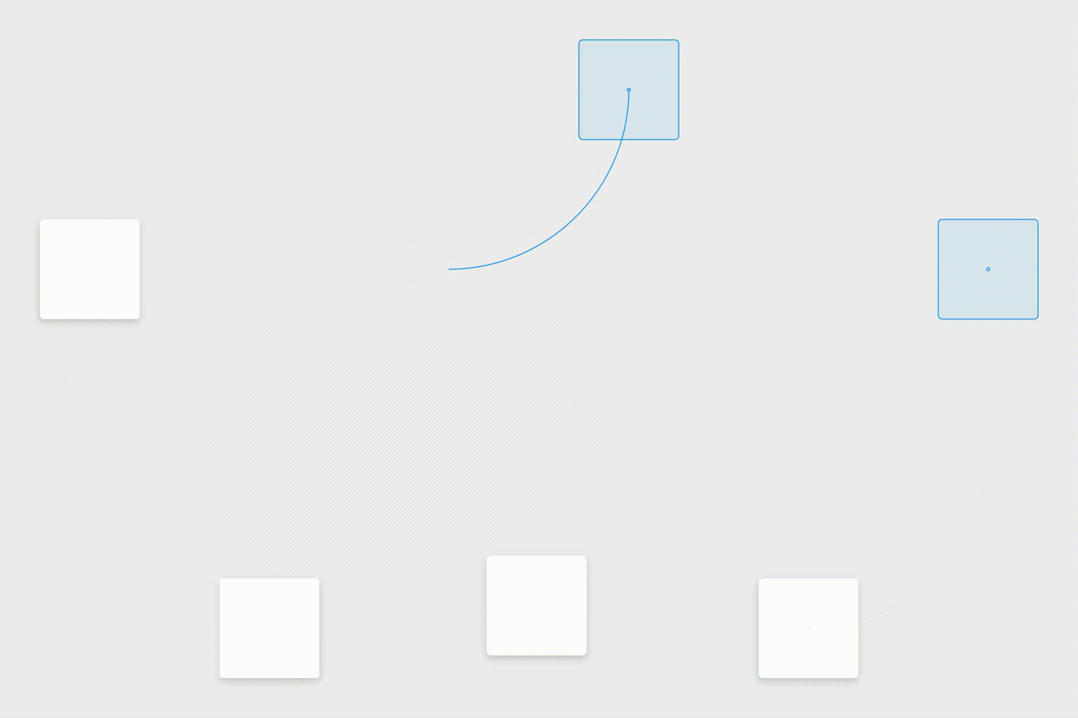
- Aware. Material is aware of its surroundings, including the user and other material around it. Objects can be attracted to other objects in the UI, and they respond appropriately to user intent. As elements transition into view, their movement is choreographed in a way that defines their relationships.
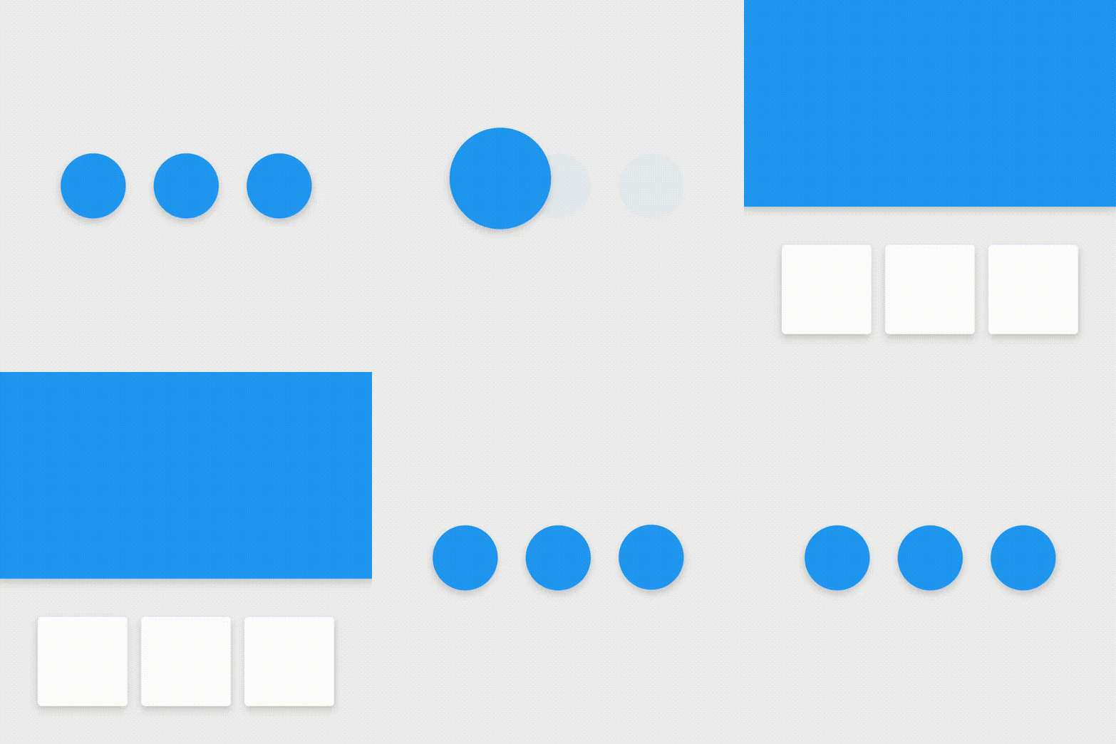
- Intentional. Movement guides the user's focus to the right place at the right time. Movement can communicate different signals, such as whether an action is unavailable.
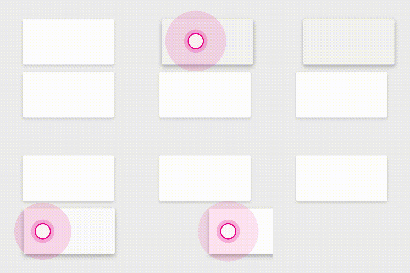
To put these principles into practice in Android, use animations and transitions.
Animations
There are three ways you can create animation in your app:
- Property animation changes an object's properties over a specified period of time.The property animation system was introduced in Android 3.0 (API level 11). Property animation is more flexible than view animation, and it offers more features.
- View animation calculates animation using start points, end points, rotation, and other aspects of animation. The Android view animation system is older than the property animation system and can only be used for Views. It's relatively easy to set up and offers enough capabilities for many use cases.
- Drawable animation lets you load a series of drawable resources one after another to create an animation. Drawable animation is useful if you want to animate things that are easier to represent with drawable resources, such as a progression of bitmap images.
For complete details about these three types for animation, see the Animation and Graphics Overview.
The Material Design theme provides some default animations for touch feedback and activity transitions. The animation APIs let you create custom animations for touch feedback in UI controls, changes in view state, and activity transitions.
Touch feedback
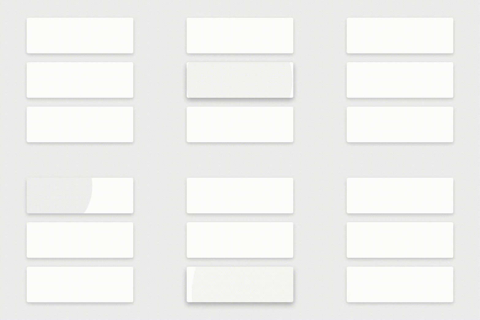
Touch feedback provides instant visual confirmation at the point of contact when a user interacts with a UI element. The default touch feedback animations for buttons use the RippleDrawable class, which transitions between different states with a ripple effect.
In this example, ripples of ink expand outward from the point of touch to confirm user input. The card "lifts" and casts a shadow to indicate an active state:
In most cases, you apply ripple functionality in your view XML by specifying the view background as follows:
?android:attr/selectableItemBackgroundfor a bounded ripple.?android:attr/selectableItemBackgroundBorderlessfor a ripple that extends beyond the view. It is drawn upon, and bounded by, the nearest parent of the view with a non-null background.Note: TheselectableItemBackgroundBorderlessattribute was introduced in API level 21.
Alternatively, you can define a RippleDrawable as an XML resource using the <ripple> element.
You can assign a color to RippleDrawable objects. To change the default touch feedback color, use the theme's android:colorControlHighlight attribute.
For more information, see the API reference for the RippleDrawable class.
Circular reveal
A reveal animation shows or hides a group of UI elements by animating a view's clipping boundaries. In circular reveal, you reveal or hide a view by animating a clipping circle. (A clipping circle is a circle that crops or hides the part of an image that's outside the circle.)
To animate a clipping circle, use the ViewAnimationUtils.createCircularReveal() method. For example, here's how to reveal a previously invisible view using circular reveal:
// previously invisible view
View myView = findViewById(R.id.my_view);

// get the center for the clipping circle
int cx = myView.getWidth() / 2;
int cy = myView.getHeight() / 2;

// get the final radius for the clipping circle
float finalRadius = (float) Math.hypot(cx, cy);

// create the animator for this view (the start radius is zero)
Animator anim =
    ViewAnimationUtils.createCircularReveal(myView, cx, cy, 0, finalRadius);

// make the view visible and start the animation
myView.setVisibility(View.VISIBLE);
anim.start();
Here's how to hide a previously visible view using circular reveal:
// previously visible view
final View myView = findViewById(R.id.my_view);

// get the center for the clipping circle
int cx = myView.getWidth() / 2;
int cy = myView.getHeight() / 2;

// get the initial radius for the clipping circle
float initialRadius = (float) Math.hypot(cx, cy);

// create the animation (the final radius is zero)
Animator anim =
    ViewAnimationUtils.createCircularReveal(myView, cx, cy, initialRadius, 0);

// make the view invisible when the animation is done
anim.addListener(new AnimatorListenerAdapter() {
    @Override
    public void onAnimationEnd(Animator animation) {
        super.onAnimationEnd(animation);
        myView.setVisibility(View.INVISIBLE);
    }
});

// start the animation
anim.start();
Activity transitions
Activity transitions are animations that provide visual connections between different states in your UI. You can specify custom animations for enter and exit transitions, and for transitions of shared elements between activities.
- An enter transition determines how views in an activity enter the scene. For example in an explode enter transition, views enter the scene from the outside and fly towards the center of the screen.
- An exit transition determines how views in an activity exit the scene. For example in an explode exit transition, views exit the scene by moving away from the center.
- A shared elements transition determines how views that are shared between two activities transition between these activities. For example, if two activities have the same image in different positions and sizes, the
changeImageTransformshared element transition translates and scales the image smoothly between these activities.
To use these transitions, set transition attributes in a <style> element in your XML. The following example creates a theme named BaseAppTheme that inherits one of the Material Design themes. The BaseAppTheme theme uses all three types of activity transitions:
<style name="BaseAppTheme" parent="android:Theme.Material">
  <!-- enable window content transitions -->
  <item name="android:windowActivityTransitions">true</item>

  <!-- specify enter and exit transitions -->
  <item name="android:windowEnterTransition">@transition/explode</item>
  <item name="android:windowExitTransition">@transition/explode</item>

  <!-- specify shared element transitions -->
  <item name="android:windowSharedElementEnterTransition">
    @transition/change_image_transform</item>
  <item name="android:windowSharedElementExitTransition">
    @transition/change_image_transform</item>
</style>
The change_image_transform transition in this example is defined as follows:
<!-- res/transition/change_image_transform.xml -->
<!-- (see also Shared Transitions below) -->
<transitionSet xmlns:android="http://schemas.android.com/apk/res/android">
  <changeImageTransform/>
</transitionSet>
The changeImageTransform element corresponds to the ChangeImageTransform class. For more information, see the API reference for Transition.
To enable window content transitions in your Java code instead, call the Window.requestFeature() method:
// inside your activity (if you did not enable transitions in your theme)
getWindow().requestFeature(Window.FEATURE_CONTENT_TRANSITIONS);

// set an exit transition
getWindow().setExitTransition(new Explode());
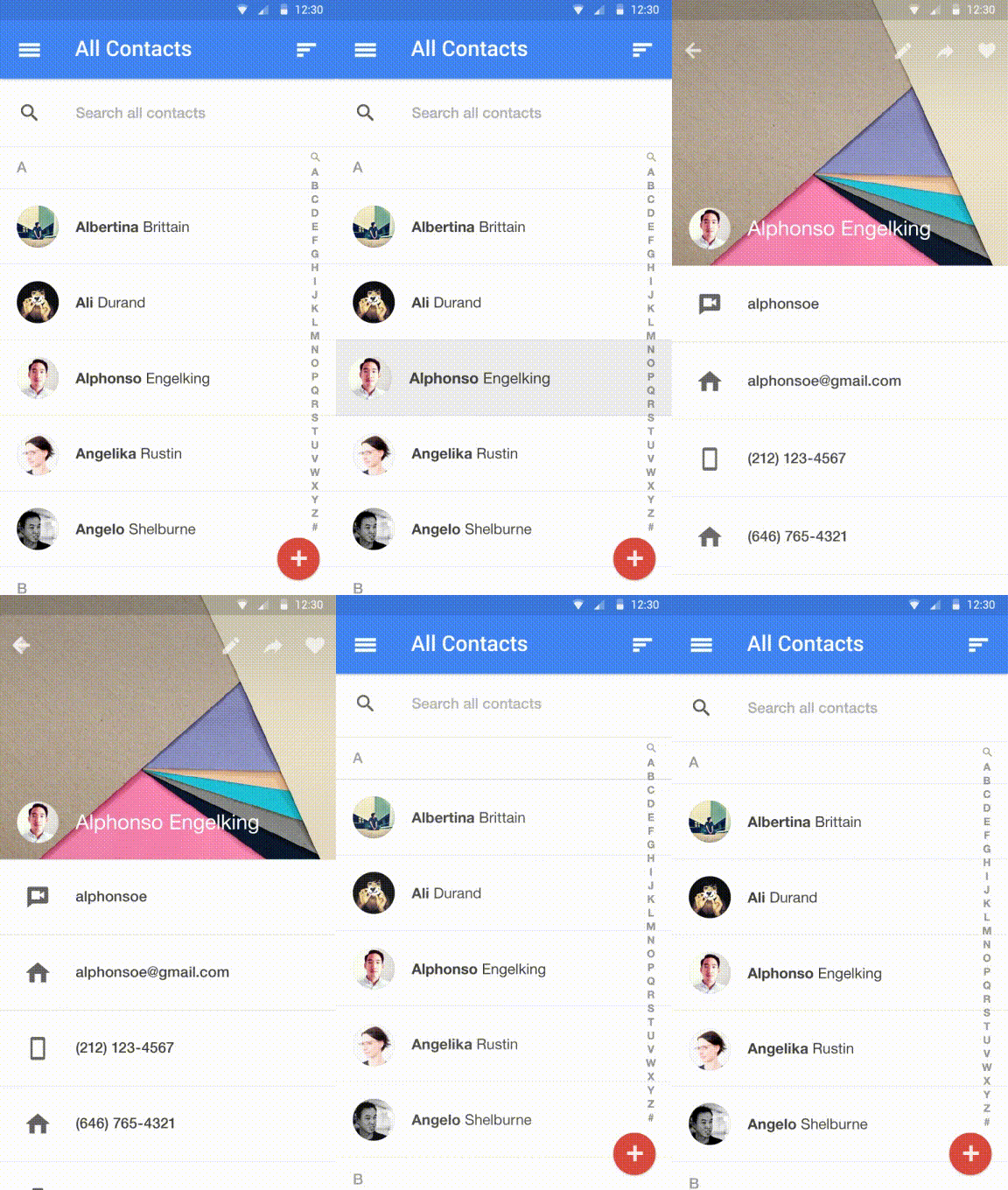
To specify transitions in your code, call the following methods with a Transition object:
Window.setEnterTransition()Window.setExitTransition()Window.setSharedElementEnterTransition()Window.setSharedElementExitTransition()
For details about these methods, see the Window reference documentation.
To start an activity that uses transitions, use the ActivityOptions.makeSceneTransitionAnimation() method.
For more about implementing transitions in your app, see the activity transitions guide.
Curved motion
In Android 5.0 (API level 21) and above, you can define custom timing curves and curved motion patterns for animations. To do this, use the PathInterpolator class, which interpolates an object's path based on a Bézier curve or a Path object. The interpolator specifies a motion curve in a 1x1 square, with anchor points at (0,0) and (1,1) and control points that you specify using the constructor arguments. You can also define a path interpolator as an XML resource:
<pathInterpolator xmlns:android="http://schemas.android.com/apk/res/android"
    android:controlX1="0.4"
    android:controlY1="0"
    android:controlX2="1"
    android:controlY2="1"/>
The system provides XML resources for the three basic curves in the material design specification:
@interpolator/fast_out_linear_in.xml@interpolator/fast_out_slow_in.xml@interpolator/linear_out_slow_in.xml
To use a PathInterpolator object, pass it to the Animator.setInterpolator() method.
The ObjectAnimator class has constructors you can use to animate coordinates along a path using two or more properties at once. For example, the following Java code uses a Path object to animate the X and Y properties of a view:
ObjectAnimator mAnimator;
mAnimator = ObjectAnimator.ofFloat(view, View.X, View.Y, path);
...
mAnimator.start();
Other custom animations
Other custom animations are possible, including animated state changes (using the StateListAnimator class) and animated vector drawables (using the AnimatedVectorDrawable class). For complete details, see Defining Custom Animations.
Related practical
The related exercises and practical documentation is in Android Developer Fundamentals: Practicals.
