4.3: Screen Navigation
Contents:
- Providing users with a path through your app
- Back-button navigation
- Hierarchical navigation patterns
- Ancestral navigation (the Up button)
- Descendant navigation
- Lateral navigation with tabs and swipes
- Related practical
- Learn more
Providing users with a path through your app
In the early stages of developing an app, you should determine the paths users should take through your app in order to do something, such as placing an order or browsing through content. Each path enables users to navigate across, into, and back out from the different tasks and pieces of content within the app.
In many cases you will need several different paths through your app that offer the following types of navigation:
- Back navigation: Users can navigate back to the previous screen using the Back button.
- Hierarchical navigation: Users can navigate through a hierarchy of screens organized with a parent screen for every set of child screens.
Back-button navigation
Back-button navigation—navigation back through the history of screens—is deeply rooted in the Android system. Android users expect the Back button in the bottom left corner of every screen to take them to the previous screen. The set of historical screens always starts with the user's Launcher (the device's Home screen), as shown in the figure below. Pressing Back enough times should return the user back to the Launcher.
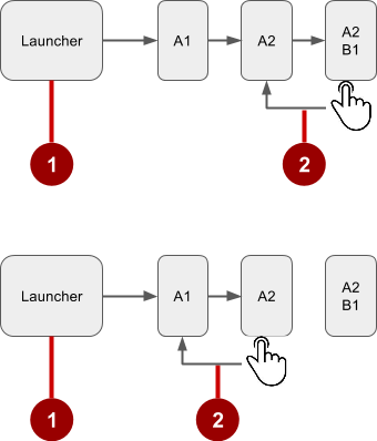
In the above figure:
- Starting from Launcher.
- Clicking the Back button to navigate to the previous screen.
You don't have to manage the Back button in your app. The system handles tasks and the back stack—the list of previous screens—automatically. The Back button by default simply traverses this list of screens, removing the current screen from the list as the user presses it.
There are, however, cases where you may want to override the behavior for the Back button. For example, if your screen contains an embedded web browser in which users can interact with page elements to navigate between web pages, you may wish to trigger the embedded browser's default back behavior when users press the device's Back button.
The onBackPressed() method of the Activity class is called whenever the activity detects the user's press of the Back key. The default implementation simply finishes the current activity, but you can override this to do something else:
@Override
public void onBackPressed() {
    // Add the Back key handler here.
    return;
}
If your code triggers an embedded browser with its own behavior for the Back key, you should return the Back key behavior to the system's default behavior if the user uses the Back key to go beyond the beginning of the browser's internal history.
Hierarchical navigation patterns
To give the user a path through the full range of an app's screens, the best practice is to use some form of hierarchical navigation. An app's screens are typically organized in a parent-child hierarchy, as shown in the figure below:
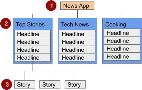
In the figure above:
- Parent screen. A parent screen (such as a news app's home screen) enables navigation down to child screens.
- The main activity of an app is usually the parent screen.
- Implement a parent screen as an Activity with descendant navigation to one or more child screens.
- First-level child screen siblings. Siblings are screens in the same position in the hierarchy that share the same parent screen (like brothers and sisters).
- In the first level of siblings, the child screens may be collection screens that collect the headlines of stories, as shown above.
- Implement each child screen as an Activity or Fragment.
- Implement lateral navigation to navigate from one sibling to another on the same level.
- If there is a second level of screens, the first level child screen is the parent to the second level child screen siblings. Implement descendant navigation to the second-level child screens.
- Second-level child screen siblings. In news apps and others that offer multiple levels of information, the second level of child screen siblings might offer content, such as stories.
You can enable the user to navigate up to and down from a parent, and sideways among siblings:
- Descendant navigation: Navigating down from a parent screen to a child screen.
- Ancestral navigation: Navigating up from a child screen to a parent screen.
- Lateral navigation: Navigating from one sibling to another sibling (at the same level).
You can use a main activity (as a parent screen) and then other activities or fragments to implement a hierarchy of screens within an app.
Main activity with other activities
If the first-level child screen siblings have another level of child screens under them, you should implement the first-level screens as activities, so that their lifecycles are managed properly before calling any second-level child screens.
For example, in the figure above, the parent screen is most likely the main activity. An app's main activity (usually MainActivity.java) is typically the parent screen for all other screens in your app, and you implement a navigation pattern in the main activity to enable the user to go to other activities or fragments. For example, you can implement navigation using an Intent that starts an activity.
Tip: Using an Intent in the current activity to start another activity adds the current activity to the call stack, so that the Back button in the other activity (described in the previous section) returns the user to the current activity.
As you learned previously, the Android system initiates code in an Activity instance with callback methods that manage the activity's lifecycle for you. (A previous lesson covers the activity lifecycle; for more information, see "Managing the Activity Lifecycle" in the Training section of the Android Developer Develop guide.)
The hierarchy of parent and child activities is defined in the AndroidManifest.xml file. For example, the following defines OrderActivity as a child of the parent MainActivity:
<activity android:name=".OrderActivity"
   android:label="@string/title_activity_order"
   android:parentActivityName=
                        "com.example.android.droidcafe.MainActivity">
   <meta-data
      android:name="android.support.PARENT_ACTIVITY"
      android:value=".MainActivity"/>
</activity>
Main activity with fragments
If the child screen siblings do not have another level of child screens under them, you can implement them as fragments. A Fragment represents a behavior or portion of a user interface within in an activity. Think of a fragment as a modular section of an activity which has its own lifecycle, receives its own input events, and which you can add or remove while the activity is running.
You can combine multiple fragments in a single activity. For example, in a section sibling screen showing a news story and implemented as an activity, you might have a child screen for a video clip implemented as a fragment. You would implement a way for the user to navigate to the video clip fragment, and then back to the activity showing the story.
Ancestral navigation (the Up button)
With ancestral navigation in a multitier hierarchy, you enable the user to go up from a section sibling to the collection sibling, and then up to the parent screen.
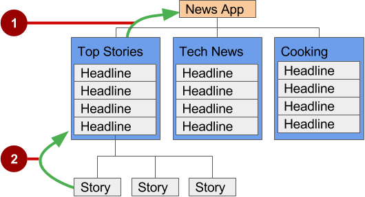
In the above figure:
- Up button for ancestral navigation from the first-level siblings to the parent.
- Up button for ancestral navigation from second-level siblings to the first-level child screen acting as a parent screen.
The Up button is used to navigate within an app based on the hierarchical relationships between screens. For example (referring to the figure above):
- If a first-level child screen offers headlines to navigate to second-level child screens, the second-level child screen siblings should offer Up buttons that return to the first-level child screen, which is their shared parent.
- If the parent screen offers navigation to first-level child siblings, then the first-level child siblings should offer an Up button that returns to the parent screen.
- If the parent screen is the topmost screen in an app (that is, the app's home screen), it should not offer an Up button.
Tip: The Back button below the screen differs from the Up button. The Back button provides navigation to whatever screen you viewed previously. If you have several children screens that the user can navigate through using a lateral navigation pattern (as described later in this chapter), the Back button would send the user back to the previous child screen, not to the parent screen. Use an Up button if you want to provide ancestral navigation from a child screen back to the parent screen. For more information about Up navigation, see Providing Up Navigation.
See the "Menus" concept chapter for details on how to implement the app bar. To provide the Up button for a child screen activity, declare the activity's parent to be MainActivity in the AndroidManifest.xml file. You can also set the android:label to a title for the activity screen, such as "Order Activity" (extracted into the string resource title_activity_order in the code below). Follow these steps to declare the parent in AndroidManifest.xml:
- Open AndroidManifest.xml.
- Change the activity element for the child screen activity (in this example,
OrderActivity) to the following:<activity android:name=".OrderActivity" android:label="@string/title_activity_order" android:parentActivityName= "com.example.android.optionsmenuorderactivity.MainActivity"> <meta-data android:name="android.support.PARENT_ACTIVITY" android:value=".MainActivity"/> </activity>
The child ("Order Activity") screen now includes the Up button in the app bar (highlighted in the figure below), which the user can tap to navigate back to the parent screen.

Descendant navigation
With descendant navigation, you enable the user to go from the parent screen to a first-level child screen, and from a first-level child screen down to a second-level child screen.
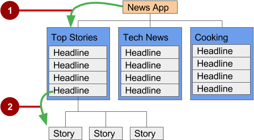
In the above figure:
- Descendant navigation from parent to first-level child screen.
- Descendant navigation from headline in a first-level child screen to a second-level child screen.
Buttons or targets
The best practice for descendant navigation from the parent screen to collection siblings is to use buttons or simple targets such as an arrangement of images or iconic buttons (also known as a dashboard). When the user touches a button, the collection sibling screen opens, replacing the current context (screen) entirely.
Tip: Buttons and simple targets are rarely used for navigating to section siblings within a collection. See lists, carousels, and cards in the next section.
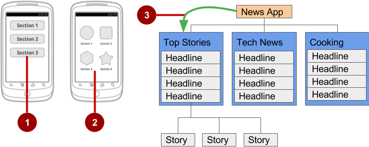
In the figure above:
- Buttons on a parent screen.
- Targets (Image buttons or icons) on a parent screen.
- Descendant navigation pattern from parent screen to first-level child siblings.
A dashboard usually has either two or three rows and columns, with large touch targets to make it easy to use. Dashboards are best when each collection sibling is equally important. You can use a LinearLayout, RelativeLayout, or GridLayout. See Layouts for an overview of how layouts work.
Navigation drawer
A navigation drawer is a panel that usually displays navigation options on the left edge of the screen, as shown on the right side of the figure below. It is hidden most of the time, but is revealed when the user swipes a finger from the left edge of the screen or touches the navigation icon in the app bar, as shown on the left side of the figure below.
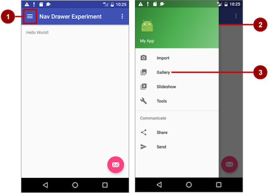
In the above figure:
- Navigation icon in the app bar
- Navigation drawer
- Navigation drawer menu item
A good example of a navigation drawer is in the Gmail app, which provides access to the Inbox, labelled email folders, and settings. The best practice for employing a navigation drawer is to provide descendant navigation from the parent activity to all of the other activities or fragments in an app. It can display many navigation targets at once—for example, it could contain buttons (like a dashboard), tabs, or a list of items (like the Gmail drawer).
To make a navigation drawer in your app, you need to do the following:
- Create the following layouts:
- A navigation drawer as the activity layout's root view.
- A navigation view for the drawer itself.
- An app bar layout that will include a navigation icon button.
- A content layout for the activity that displays the navigation drawer.
- A layout for the navigation drawer header.
- Populate the navigation drawer menu with item titles and icons.
- Set up the navigation drawer and item listeners in the activity code.
- Handle the navigation menu item selections.
Creating the navigation drawer layout
To create a navigation drawer layout, use the DrawerLayout APIs available in the Support Library. For design specifications, follow the design principles for navigation drawers in the Navigation Drawer design guide.
To add a navigation drawer, use a DrawerLayout as the root view of your activity's layout. Inside the DrawerLayout, add one view that contains the main content for the screen (your primary layout when the drawer is hidden) and another view, typically a NavigationView, that contains the contents of the navigation drawer.
Tip: To make your layouts simpler to understand, use the include tag to include an XML layout within another XML layout.
For example, the following layout uses:
- A
DrawerLayoutas the root of the activity's layout in activity_main.xml. - The main content of screen defined in the app_bar_main.xml layout file.
- A NavigationView that represents a standard navigation menu that can be populated by a menu resource XML file.
Refer to the figure below that corresponds to this layout:
activity_main.xml:
<?xml version="1.0" encoding="utf-8"?>
<android.support.v4.widget.DrawerLayout xmlns:android="http://schemas.android.com/apk/res/android"
    xmlns:app="http://schemas.android.com/apk/res-auto"
    xmlns:tools="http://schemas.android.com/tools"
    android:id="@+id/drawer_layout"
    android:layout_width="match_parent"
    android:layout_height="match_parent"
    android:fitsSystemWindows="true"
    tools:openDrawer="start">

    <include
        layout="@layout/app_bar_main"
        android:layout_width="match_parent"
        android:layout_height="match_parent" />

    <android.support.design.widget.NavigationView
        android:id="@+id/nav_view"
        android:layout_width="wrap_content"
        android:layout_height="match_parent"
        android:layout_gravity="start"
        android:fitsSystemWindows="true"
        app:headerLayout="@layout/nav_header_main"
        app:menu="@menu/activity_main_drawer" />

</android.support.v4.widget.DrawerLayout>
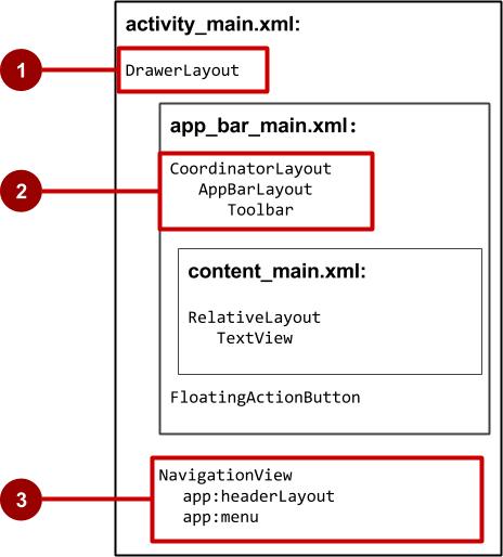
In the above figure:
- DrawerLayout is the root view of the activity's layout.
- The included
app_bar_main(app_bar_main.xml) uses a CoordinatorLayout as its root, and defines the app bar layout with a Toolbar which will include the navigation icon to open the drawer. - The NavigationView defines the navigation drawer layout and its header, and adds menu items to it.
Note the following in the activity_main.xml layout:
- The
android:idfor the DrawerLayout view isdrawer_layout. You will use this id to instantiate adrawerobject in your code. - The
android:idfor theNavigationViewisnav_view. You will use this id to instantiate anavigationViewobject in your code. - The
NavigationViewmust specify its horizontal gravity with theandroid:layout_gravityattribute. Use the"start"value for this attribute (rather than"left"), so that if the app is used with right-to-left (RTF) languages, the drawer appears on the right rather than the left side.android:layout_gravity="start" - Use the
android:fitsSystemWindows="true"attribute to set the padding of theDrawerLayoutand theNavigationViewto ensure the contents don't overlay the system windows.DrawerLayoutusesfitsSystemWindowsas a sign that it needs to inset its children (such as the main content view), but still draw the top status bar background in that space. As a result, the navigation drawer appears to be overlapping, but not obscuring, the translucent top status bar. The insets you get fromfitsSystemWindowswill be correct on all platform versions to ensure your content does not overlap with system-provided UI components.
The navigation drawer header
The NavigationView specifies the layout for the header of the navigation drawer with the attribute app:headerLayout="@layout/nav_header_main". The nav_header_main.xml file defines the layout of this header to include an ImageView and a TextView, which is typical for a navigation drawer, but you could also include other Views.
Tip: The header's height should be 160dp, which you should extract into a dimension resource (nav_header_height).
nav_header_main.xml:
<LinearLayout xmlns:android="http://schemas.android.com/apk/res/android"
    android:layout_width="match_parent"
    android:layout_height="@dimen/nav_header_height"
    android:background="@drawable/side_nav_bar"
    android:gravity="bottom"
    android:orientation="vertical"
    android:paddingBottom="@dimen/activity_vertical_margin"
    android:paddingLeft="@dimen/activity_horizontal_margin"
    android:paddingRight="@dimen/activity_horizontal_margin"
    android:paddingTop="@dimen/activity_vertical_margin"
    android:theme="@style/ThemeOverlay.AppCompat.Dark">

    <ImageView
        android:id="@+id/imageView"
        android:layout_width="wrap_content"
        android:layout_height="wrap_content"
        android:paddingTop="@dimen/nav_header_vertical_spacing"
        android:src="@android:drawable/sym_def_app_icon" />

    <TextView
        android:layout_width="match_parent"
        android:layout_height="wrap_content"
        android:paddingTop="@dimen/nav_header_vertical_spacing"
        android:text="@string/my_app_title"
        android:textAppearance="@style/TextAppearance.AppCompat.Body1" />

</LinearLayout>
The app bar layout
The include tag in the activity_main layout includes the app_bar_main layout, which uses a CoordinatorLayout as its root. The app_bar_main.xml layout file defines the app bar layout with the Toolbar class as shown previously in the chapter about menus. It also defines a floating action button, and uses an include tag to include the content_main (content_main.xml) layout:
app_bar_main.xml:
<?xml version="1.0" encoding="utf-8"?>
<android.support.design.widget.CoordinatorLayout xmlns:android="http://schemas.android.com/apk/res/android"
    xmlns:app="http://schemas.android.com/apk/res-auto"
    xmlns:tools="http://schemas.android.com/tools"
    android:layout_width="match_parent"
    android:layout_height="match_parent"
    android:fitsSystemWindows="true"
    tools:context="com.example.android.navigationexperiments.MainActivity">

    <android.support.design.widget.AppBarLayout
        android:layout_width="match_parent"
        android:layout_height="wrap_content"
        android:theme="@style/AppTheme.AppBarOverlay">

        <android.support.v7.widget.Toolbar
            android:id="@+id/toolbar"
            android:layout_width="match_parent"
            android:layout_height="?attr/actionBarSize"
            android:background="?attr/colorPrimary"
            app:popupTheme="@style/AppTheme.PopupOverlay" />

    </android.support.design.widget.AppBarLayout>

    <include layout="@layout/content_main" />

    <android.support.design.widget.FloatingActionButton
        android:id="@+id/fab"
        android:layout_width="wrap_content"
        android:layout_height="wrap_content"
        android:layout_gravity="bottom|end"
        android:layout_margin="@dimen/fab_margin"
        android:src="@android:drawable/ic_dialog_email" />

</android.support.design.widget.CoordinatorLayout>
Note the following:
- The
app_bar_mainlayout uses a CoordinatorLayout as its root, and includes thecontent_mainlayout. - The
app_bar_mainlayout uses theandroid:fitsSystemWindows="true"attribute to set the padding of the app bar to ensure that it doesn't overlay the system windows such as the status bar.
The content layout for the main activity screen
The above layout uses an include tag to include the content_main layout, which defines the layout of the main activity screen (content_main.xml). In the example layout below, the main activity screen shows a TextView that displays the string "Hello World!":
content_main.xml:
<?xml version="1.0" encoding="utf-8"?>
<RelativeLayout xmlns:android="http://schemas.android.com/apk/res/android"
    xmlns:app="http://schemas.android.com/apk/res-auto"
    xmlns:tools="http://schemas.android.com/tools"
    android:layout_width="match_parent"
    android:layout_height="match_parent"
    android:paddingBottom="@dimen/activity_vertical_margin"
    android:paddingLeft="@dimen/activity_horizontal_margin"
    android:paddingRight="@dimen/activity_horizontal_margin"
    android:paddingTop="@dimen/activity_vertical_margin"
    app:layout_behavior="@string/appbar_scrolling_view_behavior"
    tools:context="com.example.android.navigationexperiments.MainActivity"
    tools:showIn="@layout/app_bar_main">

    <TextView
        android:layout_width="wrap_content"
        android:layout_height="wrap_content"
        android:text="@string/hello_world" />
</RelativeLayout>
Note the following:
- The
content_mainlayout must be the first child in theDrawerLayoutbecause the drawer must be on top of the content. In our layout above, thecontent_mainlayout is included in theapp_bar_mainlayout, which is the first child. - The
content_mainlayout uses aRelativeLayoutview group set to match the parent view's width and height, because it represents the entire UI when the navigation drawer is hidden. - The layout behavior for the
RelativeLayoutis set to the string resource@string/appbar_scrolling_view_behavior, which controls the scrolling behavior of the screen in relation to the app bar at the top. This behavior is defined by the AppBarLayout.ScrollingViewBehavior class. This behavior should be used by Views which can scroll vertically—it supports nested scrolling to automatically scroll any AppBarLayout siblings.
Populating the navigation drawer menu
The NavigationView in the activity_main layout specifies the menu items for the navigation drawer using the following statement:
app:menu="@menu/activity_main_drawer"
The menu items are defined in the activity_main_drawer.xml file, which is located under app > res > menu. The <group></group> tag defines a menu group—a collection of items that share traits, such as whether they are visible, enabled, or checkable. A group must contains one or more <item></> elements and be a child of a <menu> element, as shown below. In addition to defining each menu item's title with the android:title attribute, the file also defines each menu item's icon with the android:icon attribute.
The group is defined with the android:checkableBehavior attribute. This attribute lets you put interactive elements within the navigation drawer, such as toggle switches that can be turned on or off, and checkboxes and radio buttons that can be selected. The choices for this attribute are:
single: Only one item from the group can be checked. Use for radio buttons.all: All items can be checked. Use for checkboxes.none: No items are checkable.<?xml version="1.0" encoding="utf-8"?> <menu xmlns:android="http://schemas.android.com/apk/res/android"> <group android:checkableBehavior="none"> <item android:id="@+id/nav_camera" android:icon="@drawable/ic_menu_camera" android:title="@string/import_camera" /> <item android:id="@+id/nav_gallery" android:icon="@drawable/ic_menu_gallery" android:title="@string/gallery" /> <item android:id="@+id/nav_slideshow" android:icon="@drawable/ic_menu_slideshow" android:title="@string/slideshow" /> <item android:id="@+id/nav_manage" android:icon="@drawable/ic_menu_manage" android:title="@string/tools" /> </group> <item android:title="@string/communicate"> <menu> <item android:id="@+id/nav_share" android:icon="@drawable/ic_menu_share" android:title="@string/share" /> <item android:id="@+id/nav_send" android:icon="@drawable/ic_menu_send" android:title="@string/send" /> </menu> </item> </menu>
Setting up the navigation drawer and item listeners
To use a listener for the navigation drawer's menu items, the activity hosting the navigation drawer must implement the OnNavigationItemSelectedListener interface:
Implement
NavigationView.OnNavigationItemSelectedListenerin the class definition:public class MainActivity extends AppCompatActivity implements NavigationView.OnNavigationItemSelectedListener { ... }This interface offers the onNavigationItemSelected() method, which is called when an item in the navigation drawer menu item is tapped. As you enter
OnNavigationItemSelectedListener, the red warning bulb appears on the left margin.Click the red warning bulb, choose Implement methods, and choose the onNavigationItemSelected(item:MenuItem):boolean method.
Android Studio adds a stub for the method:
@Override
    public boolean onNavigationItemSelected(MenuItem item) {
        return false;
    }
}
You learn how to use this stub in the next section.
Before setting up the navigation item listener, add code to the activity's
onCreate()method to instantiate the DrawerLayout and NavigationView objects (drawerandnavigationViewin the code below):@Override protected void onCreate(Bundle savedInstanceState) { . . . DrawerLayout drawer = (DrawerLayout) findViewById(R.id.drawer_layout); ActionBarDrawerToggle toggle = new ActionBarDrawerToggle(this, drawer, toolbar, R.string.navigation_drawer_open, R.string.navigation_drawer_close); if (drawer != null) { drawer.addDrawerListener(toggle); } toggle.syncState(); NavigationView navigationView = (NavigationView) findViewById(R.id.nav_view); if (navigationView != null) { navigationView.setNavigationItemSelectedListener(this); } }The above code instantiates an ActionBarDrawerToggle, which substitutes a special drawable for the activity's Up button in the app bar, and links the activity to the DrawerLayout. The special drawable appears as a "hamburger" navigation icon when the drawer is closed, and animates into an arrow as the drawer opens.
Note: Be sure to use the ActionBarDrawerToggle in support-library-v7.appcompact, not the version in support-library-v4.Tip: You can customize the animated toggle by defining the drawerArrowStyle in your ActionBar theme (for more detailed information about the ActionBar theme, see Adding the App Bar in the Android Developer documentation.
The above code implements addDrawerListener() to listen for drawer open and close events, so that when the user taps custom drawable button, the navigation drawer slides out.
You must also use the syncState() method of ActionBarDrawerToggle to synchronize the state of the drawer indicator. The synchronization must occur after the DrawerLayout's instance state has been restored, and any other time when the state may have diverged in such a way that the ActionBarDrawerToggle was not notified.
The above code ends by setting a listener,
setNavigationItemSelectedListener(), to the navigation drawer to listen for item clicks.- The ActionBarDrawerToggle also lets you specify the strings to use to describe the open/close drawer actions for accessibility services. Define the following strings in your strings.xml file:
<string name="navigation_drawer_open">Open navigation drawer</string>
<string name="navigation_drawer_close">Close navigation drawer</string>
Handling navigation menu item selections
Write code in the onNavigationItemSelected() method stub to handle menu item selections. This method is called when an item in the navigation drawer menu is tapped.
It uses if statements to take the appropriate action based on the menu item's id, which you can retrieve using the getItemId() method:
@Override
public boolean onNavigationItemSelected(MenuItem item) {
   DrawerLayout drawer = (DrawerLayout) findViewById(R.id.drawer_layout);
   // Handle navigation view item clicks here.
   switch (item.getItemId()) {
      case R.id.nav_camera:
         // Handle the camera import action (for now display a toast).
         drawer.closeDrawer(GravityCompat.START);
         displayToast(getString(R.string.chose_camera));
         return true;
      case R.id.nav_gallery:
         // Handle the gallery action (for now display a toast).
         drawer.closeDrawer(GravityCompat.START);
         displayToast(getString(R.string.chose_gallery));
         return true;
      case R.id.nav_slideshow:
         // Handle the slideshow action (for now display a toast).
         drawer.closeDrawer(GravityCompat.START);
         displayToast(getString(R.string.chose_slideshow));
         return true;
      case R.id.nav_manage:
         // Handle the tools action (for now display a toast).
         drawer.closeDrawer(GravityCompat.START);
         displayToast(getString(R.string.chose_tools));
         return true;
      case R.id.nav_share:
         // Handle the share action (for now display a toast).
         drawer.closeDrawer(GravityCompat.START);
         displayToast(getString(R.string.chose_share));
         return true;
      case R.id.nav_send:
         // Handle the send action (for now display a toast).
         drawer.closeDrawer(GravityCompat.START);
         displayToast(getString(R.string.chose_send));
         return true;
      default:
         return false;
   }
}
After the user taps a navigation drawer selection or taps outside the drawer, the DrawerLayout closeDrawer() method closes the drawer.
Lists and carousels
Use a scrolling list, such as a RecyclerView, to provide navigation targets for descendant navigation. Vertically scrolling lists are often used for a screen that lists stories, with each list item acting as a button to each story. For more visual or media-rich content items such as photos or videos, you may want to use a horizontally-scrolling list (also known as a carousel). These UI elements are good for presenting items in a collection (for example, a list of news stories).
You learn all about RecyclerView in the next chapter.
Master/detail navigation flow
In a master/detail navigation flow, a master screen contains a list of items, and a detail screen shows detailed information about a specific item. Descendant navigation is usually implemented by one of the following:
- Using an Intent that starts an activity representing the detail screen. For more information about Intents, see Intents and Intent Filters in the Android Developer Guide.
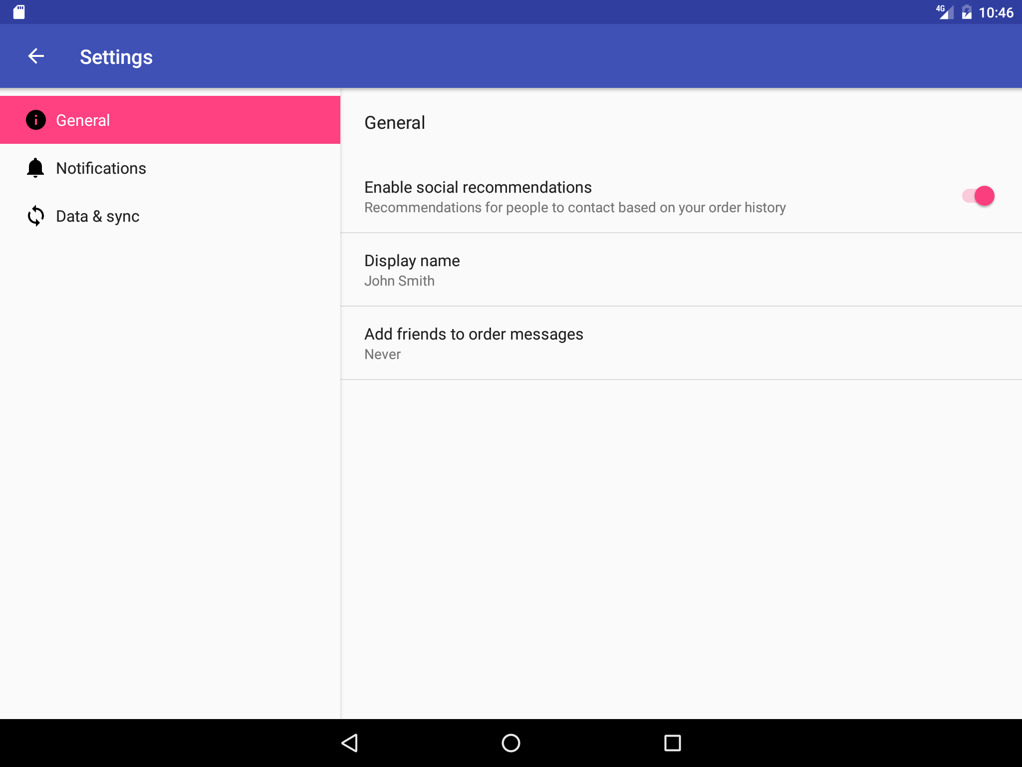
- When adding a Settings Activity, you can extend PreferenceActivity to create a two-pane master/detail layout to support large screens, and include fragments within the activity to replace the activity's content with a settings fragment. This is a useful pattern if you have multiple groups of settings and need to support tablet-sized screens as well as smartphones. You learn about the Settings Activity and PreferenceActivity in a subsequent chapter. For more information about using fragments, see Fragments in the Android Developer Guide.
Smartphones are best suited for displaying one screen at a time—such as a master screen (on the left side of the figure below) and a detail screen (on the right side of the figure below).
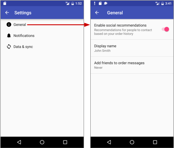
On the other hand, tablet displays, especially when viewed in the landscape orientation, are best suited for showing multiple content panes at a time: the master on the left, and the detail to the right, as shown below.
Options menu in the app bar
The app bar typically contains the options menu, which is most often used for navigation patterns for descendant navigation. It may also contain an Up icon for ancestral navigation, a nav icon for opening a navigation drawer, and a filter icon to filter page views. You learned how to set up the options menu and the app bar in a previous chapter.
Lateral navigation with tabs and swipes
With lateral navigation, you enable the user to go from one sibling to another (at the same level in a multitier hierarchy). For example, if your app provides several categories of stories (such as Top Stories, Tech News, and Cooking, as shown in the figure below), you would want to provide your users the ability to navigate from one category to the next, or from one top story to the next, without having to navigate back up to the parent screen.
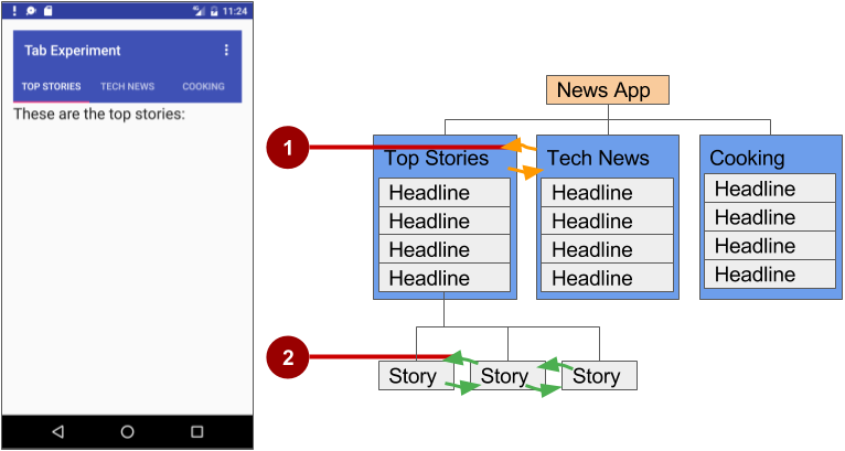
In the above figure:
- Lateral navigation from one category screen to another
- Lateral navigation from one story screen to another
Another example of lateral navigation is the ability to swipe left or right in a Gmail conversation to view a newer or older email in the same Inbox.
You can implement lateral navigation with tabs that represent each screen. Tabs appear across the top of a screen, as shown on the left side of the above figure, providing navigation to other screens. Tab navigation is a common solution for lateral navigation from one child screen to another child screen that is a sibling—in the same position in the hierarchy and sharing the same parent screen.
Tabs are most appropriate for small sets (four or fewer) of sibling screens. You can combine tabs with swipe views, so that the user can swipe across from one screen to another as well as tap a tab.
Tabs offer two benefits:
- Since there is a single, initially-selected tab, users already have access to that tab's content from the parent screen without any further navigation.
- Users can navigate quickly between related screens, without needing to first revisit the parent.
Keep in mind the following best practices when using tabs:
- Tabs are usually laid out horizontally.
- Tabs should always run along the top of the screen, and should not be aligned to the bottom of the screen.
- Tabs should be persistent across related screens. Only the designated content region should change when tapping a tab, and tab indicators should remain available at all times.
- Switching to another tab should not be treated as history. For example, if a user switches from tab A to tab B, pressing the Up button in the app bar should not reselect tab A but should instead return the user to the parent screen.
The key steps for implementing tabs are:
- Defining the tab layout. The main class used for displaying tabs is TabLayout. It provides a horizontal layout to display tabs. You can show the tabs below the app bar.
- Implementing a Fragment for each tab content screen. A fragment is a behavior or a portion of user interface within an activity. It's like a mini-activity within the main activity, with its own own lifecycle. One benefit of using fragments for the tab content is that you can isolate the code for managing the tab content in the fragment. To learn about fragments, see Fragments in the API Guide.
- Adding a pager adapter. Use the PagerAdapter class to populate "pages" (screens) inside of a ViewPager, which is a layout manager that lets the user flip left and right through screens of data. You supply an implementation of a PagerAdapter to generate the screens that the view shows. ViewPager is most often used in conjunction with Fragment, which is a convenient way to supply and manage the lifecycle of each screen.
- Creating an instance of the tab layout, and set the text for each tab.
- Using
PagerAdapterto manage screen ("page") views. Each screen is represented by its own fragment. - Setting a listener to determine which tab is tapped.
There are standard adapters for using fragments with the ViewPager:
- FragmentPagerAdapter: Designed for navigating between sibling screens (pages) representing a fixed, small number of screens.
- FragmentStatePagerAdapter: Designed for paging across a collection of screens (pages) for which the number of screens is undetermined. It destroys fragments as the user navigates to other screens, minimizing memory usage. The app for this practical challenge uses FragmentStatePagerAdapter.
Defining tab layout
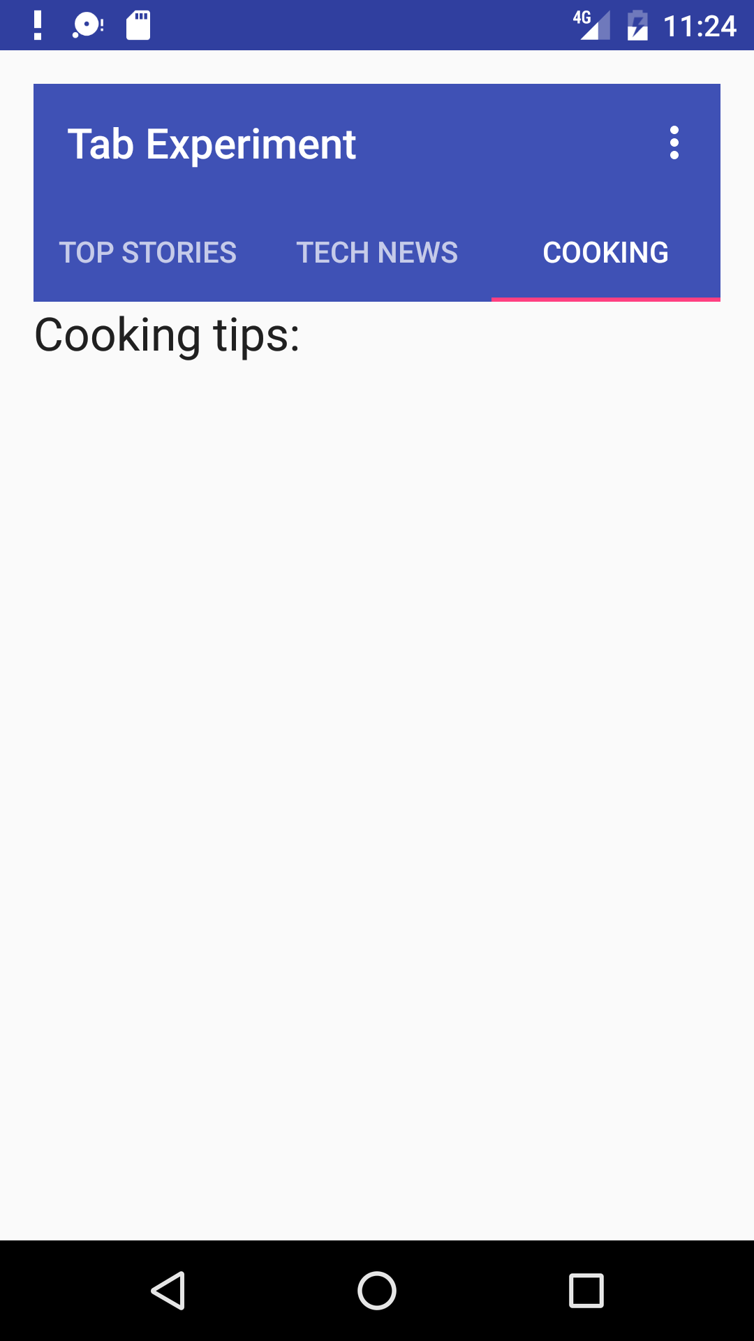
To use a TabLayout, you can design the main activity's layout to use a Toolbar for the app bar, a TabLayout for the tabs below the app bar, and a ViewPager within the root layout to switch child views. The layout should look similar to the following, assuming each child view fills the screen:
<android.support.v7.widget.Toolbar
        android:id="@+id/toolbar"
        android:layout_width="match_parent"
        android:layout_height="wrap_content"
        android:layout_alignParentTop="true"
        android:background="?attr/colorPrimary"
        android:minHeight="?attr/actionBarSize"
        android:theme="@style/ThemeOverlay.AppCompat.Dark.ActionBar"
        app:popupTheme="@style/ThemeOverlay.AppCompat.Light"/>

    <android.support.design.widget.TabLayout
        android:id="@+id/tab_layout"
        android:layout_width="match_parent"
        android:layout_height="wrap_content"
        android:layout_below="@id/toolbar"
        android:background="?attr/colorPrimary"
        android:minHeight="?attr/actionBarSize"
        android:theme="@style/ThemeOverlay.AppCompat.Dark.ActionBar"/>

    <android.support.v4.view.ViewPager
        android:id="@+id/pager"
        android:layout_width="match_parent"
        android:layout_height="fill_parent"
        android:layout_below="@id/tab_layout"/>
For each child view, create a layout file such as tab_fragment1.xml, tab_fragment2.xml, tab_fragment3.xml, and so on.
Implementing each fragment
A fragment is a behavior or a portion of user interface within an activity. It's like a mini-activity within the main activity, with its own own lifecycle. To learn about fragments, see Fragments in the API Guide.
Add a class for each fragment (such as TabFragment1.java, TabFragment2.java, and TabFragment3.java) representing a screen the user can visit by clicking a tab. Each class should extend Fragment and inflate the layout associated with the screen (tab_fragment1, tab_fragment2, and tab_fragment3). For example, TabFragment1.java looks like this:
public class TabFragment1 extends Fragment {

   @Override
   public View onCreateView(LayoutInflater inflater,
                   ViewGroup container, Bundle savedInstanceState) {
      return inflater.inflate(R.layout.tab_fragment1, container, false);
   }
}
Adding a pager adapter
Add a PagerAdapter that extends FragmentStatePagerAdapter and:
- Defines the number of tabs.
- Uses the getItem() method of the Adapter class to determine which tab is clicked.
- Uses a
switch caseblock to return the screen (page) to show based on which tab is clicked.
public class PagerAdapter extends FragmentStatePagerAdapter {
    int mNumOfTabs;

    public PagerAdapter(FragmentManager fm, int NumOfTabs) {
        super(fm);
        this.mNumOfTabs = NumOfTabs;
    }

    @Override
    public Fragment getItem(int position) {

        switch (position) {
            case 0:
                return new TabFragment1();
            case 1:
                return new TabFragment2();
            case 2:
                return new TabFragment3();
            default:
                return null;
        }
    }

    @Override
    public int getCount() {
        return mNumOfTabs;
    }
}
Creating an instance of the tab layout
In the onCreate() method of the main activity, create an instance of the tab layout from the tab_layout element in the layout, and set the text for each tab using addTab():
@Override
protected void onCreate(Bundle savedInstanceState) {
   ...
   // Create an instance of the tab layout from the view.
   TabLayout tabLayout = (TabLayout) findViewById(R.id.tab_layout);
   // Set the text for each tab.
   tabLayout.addTab(tabLayout.newTab().setText("Top Stories"));
   tabLayout.addTab(tabLayout.newTab().setText("Tech News"));
   tabLayout.addTab(tabLayout.newTab().setText("Cooking"));
   // Set the tabs to fill the entire layout.
   tabLayout.setTabGravity(TabLayout.GRAVITY_FILL);
   // Use PagerAdapter to manage page views in fragments.
   ...
}
Extract string resources for the tab text set by setText():
"Top Stories"totab_label1"Tech News"totab_label2"Cooking"totab_label3
Managing screen views in fragments and set a listener
Use PagerAdapter in the main activity's onCreate() method to manage screen ("page") views in the fragments. Each screen is represented by its own fragment. You also need to set a listener to determine which tab is tapped. The following code should appear after the code from the previous section in the onCreate() method:
@Override
protected void onCreate(Bundle savedInstanceState) {
   ...
   // Use PagerAdapter to manage page views in fragments.
   // Each page is represented by its own fragment.
   // This is another example of the adapter pattern.
   final ViewPager viewPager = (ViewPager) findViewById(R.id.pager);
   final PagerAdapter adapter = new PagerAdapter
                (getSupportFragmentManager(), tabLayout.getTabCount());
   viewPager.setAdapter(adapter);
   // Setting a listener for clicks.
   viewPager.addOnPageChangeListener(new
                TabLayout.TabLayoutOnPageChangeListener(tabLayout));
   tabLayout.addOnTabSelectedListener(new TabLayout.OnTabSelectedListener() {
      @Override
      public void onTabSelected(TabLayout.Tab tab) {
         viewPager.setCurrentItem(tab.getPosition());
      }

      @Override
         public void onTabUnselected(TabLayout.Tab tab) {

      }

      @Override
         public void onTabReselected(TabLayout.Tab tab) {
      }
   });
}
Using ViewPager for swipe views (horizontal paging)
The ViewPager is a layout manager that lets the user flip left and right through "pages" (screens) of content. ViewPager is most often used in conjunction with Fragment, which is a convenient way to supply and manage the lifecycle of each "page". ViewPager also provides the ability to swipe "pages" horizontally.
In the previous example, you used a ViewPager within the root layout to switch child screens. This provides the ability for the user to swipe from one child screen to another. Users are able to navigate to sibling screens by touching and dragging the screen horizontally in the direction of the desired adjacent screen.
Swipe views are most appropriate where there is some similarity in content type among sibling pages, and when the number of siblings is relatively small. In these cases, this pattern can be used along with tabs above the content region to indicate the current page and available pages, to aid discoverability and provide more context to the user.
Tip: It's best to avoid horizontal paging when child screens contain horizontal panning surfaces (such as maps), as these conflicting interactions may deter your screen's usability.
Related practical
The related exercises and practical documentation is in Android Developer Fundamentals: Practicals.
