4.2: Menus
Contents:
Types of menus
A menu is a set of options the user can select from to perform a function, such as searching for information, saving information, editing information, or navigating to a screen. Android offers the following types of menus, which are useful for different situations (refer to the figure below):
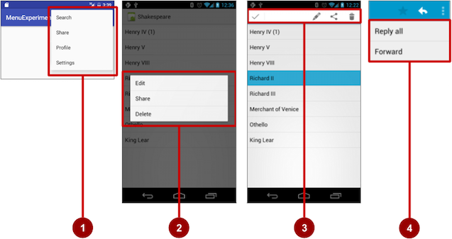
- Options menu: Appears in the app bar and provides the primary options that affect using the app itself. Examples of menu options: Search to perform a search, Bookmark to save a link to a screen, and Settings to navigate to the Settings screen.
- Context menu: Appears as a floating list of choices when the user performs a long tap on an element on the screen. Examples of menu options: Edit to edit the element, Delete to delete it, and Share to share it over social media.
- Contextual action bar: Appears at the top of the screen overlaying the app bar, with action items that affect the selected element(s). Examples of menu options: Edit, Share, and Delete for one or more selected elements.
- Popup menu: Appears anchored to a view such as an ImageButton, and provides an overflow of actions or the second part of a two-part command. Example of a popup menu: the Gmail app anchors a popup menu to the app bar for the message view with Reply, Reply All, and Forward.
The app bar and options menu
The app bar (also called the action bar) is a dedicated space at the top of each activity screen. When you create an activity from a template (such as Empty Template), an app bar is automatically included for the activity in a CoordinatorLayout root view group at the top of the view hierarchy.
The app bar by default shows the app title, or the name defined in AndroidManifest.xml by the android:label attribute for the activity. It may also include the Up button for navigating up to the parent activity, which is described in the next chapter.
The options menu in the app bar provides navigation to other activities in the app, or the primary options that affect using the app itself — but not ones that perform an action on an element on the screen. For example, your options menu might provide the user choices for navigating to other activities, such as placing an order, or for actions that have a global impact on the app, such as changing settings or profile information.
The options menu appears in the right corner of the app bar. The app bar is split into four different functional areas that apply to most apps:
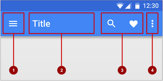
- Navigation button or Up button: Use a navigation button in this space to open a navigation drawer, or use an Up button for navigating up through your app's screen hierarchy to the parent activity. Both are described in the next chapter.
- Title: The title in the app bar is the app title, or the name defined in AndroidManifest.xml by the
android:labelattribute for the activity. - Action icons for the options menu: Each action icon appears in the app bar and represents one of the options menu's most frequently used items. Less frequently used options menu items appear in the overflow options menu.
- Overflow options menu: The overflow icon opens a popup with option menu items that are not shown as icons in the app bar.
Frequently-used options menu items should appear as icons in the app bar. The overflow options menu shows the rest of the menu:
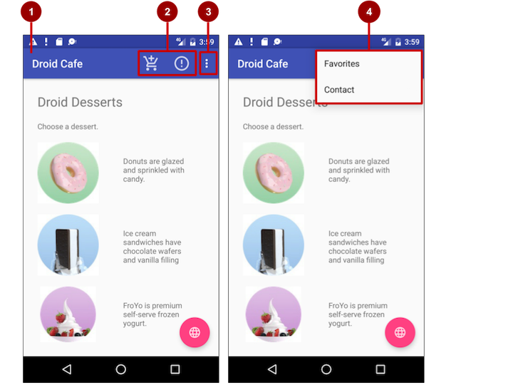
In the above figure:
- App bar. The app bar includes the app title, the options menu, and the overflow button.
- Options menu action icons. The first two options menu items appear as icons in the app bar.
- Overflow button. The overflow button (three vertical dots) opens a menu that shows more options menu items.
- Options overflow menu. After clicking the overflow button, more options menu items appear in the overflow menu.
Adding the app bar
Each activity that uses the default theme also has an ActionBar as its app bar. Some themes also set up an ActionBar as an app bar by default. When you start an app from a template such as Empty Activity, an ActionBar appears as the app bar.
However, as features were added to the native ActionBar over various Android releases, the native ActionBar behaves differently depending on the version of Android running on the device. For this reason, if you are adding an options menu, you should use the v7 appcompat support library's Toolbar as an app bar. Using the Toolbar makes it easy to set up an app bar that works on the widest range of devices, and also gives you room to customize your app bar later on as your app develops. Toolbar includes the most recent features, and works for any device that can use the support library.
In order to use Toolbar as the app bar (rather than the default ActionBar) for an activity, do one of the following:
- Start your project with the Basic Activity template, which implements the Toolbar for the activity as well as a rudimentary options menu (with one item, Settings). You can skip this section.
- Do it yourself, as shown in this section:
- Add the support libraries: appcompat and design.
- Use a NoActionBar theme and styles for the app bar and background.
- Add an AppBarLayout and a Toolbar to the layout.
- Add code to the activity to set up the app bar.
Adding the support libraries
If you start an app project using the Basic Activity template, the template adds the following support libraries for you, so you can skip this step.
If you are not using the Basic Activity template, add the appcompat support library (current version is v7) for the Toolbar class, and the design library for the NoActionBar themes, to your project:
- Choose Tools > Android > SDK Manager to check that the Android Support Repository is installed; if it is not, install it.
- Open the build.gradle file for your app, and add the support library feature project identifiers to the
dependenciessection. For example, to includesupport:appcompatandsupport:design, add:compile 'com.android.support:appcompat-v7:23.4.0' compile 'com.android.support:design:23.4.0'Note: Update the version numbers for dependencies if necessary. If the version number you specified is lower than the currently available library version number, Android Studio will warn you ("a newer version of com.android.support:design is available"). Update the version number to the one Android Studio tells you to use.
Using themes to design the app bar
If you start an app project using the Basic Activity template, the template adds the theme to replace the ActionBar with a Toolbar, so you can skip this step.
If you are not using the Basic Activity template, you can use the Toolbar class for the app bar by turning off the default ActionBar using a NoActionBar theme for the activity. Themes in Android are similar to styles, except that they are applied to an entire app or activity rather than to a specific view.
When you create a new project in Android Studio, an app theme is automatically generated for you. For example, if you start an app project with the Empty Activity or Basic Activity template, the AppTheme theme is provided in styles.xml in the res > values directory.
Tip: You learn more about themes in the chapter on drawables, styles and themes.
You can modify the theme to provide a style for the app bar and app background so that the app bar is visible and stands out against the background. Follow these steps:
Open the styles.xml file. You should already have the following in the file:
<resources> <!-- Base application theme. --> <style name="AppTheme" parent="Theme.AppCompat.Light.DarkActionBar"> <!-- Customize your theme here. --> <item name="colorPrimary">@color/colorPrimary</item> <item name="colorPrimaryDark">@color/colorPrimaryDark</item> <item name="colorAccent">@color/colorAccent</item> </style> ... </resources>AppTheme"inherits"—takes on all the styles—from a parent them calledTheme.AppCompat.Light.DarkActionBar, which is a standard theme supplied with Android. However, you can override an inherited style with another style by adding the other style to styles.xml.Add the
AppTheme.NoActionBar,AppTheme.AppBarOverlay, andAppTheme.PopupOverlaystyles under theAppThemestyle, as shown below. These styles will override the style attributes with the same names inAppTheme, affecting the appearance of the app bar and the app's background:<resources> <!-- Base application theme. --> <style name="AppTheme" parent="Theme.AppCompat.Light.DarkActionBar"> ... </style> <style name="AppTheme.NoActionBar"> <item name="windowActionBar">false</item> <item name="windowNoTitle">true</item> </style> <style name="AppTheme.AppBarOverlay" parent="ThemeOverlay.AppCompat.Dark.ActionBar" /> <style name="AppTheme.PopupOverlay" parent="ThemeOverlay.AppCompat.Light" /> ... </resources>- In the AndroidManifest.xml file, add the NoActionBar theme in appcompat to the
<application>element. Using this theme prevents the app from using the native ActionBar class to provide the app bar:<activity ... android:theme="@style/AppTheme.NoActionBar"> </activity>
Adding AppBarLayout and a Toolbar to the layout
If you start an app project using the Basic Activity template, the template adds the AppBarLayout and Toolbar for you, so you can skip this step.
If you are not using the Basic Activity template, you can include the Toolbar in an activity's layout by adding an AppBarLayout and a Toolbar element. AppBarLayout is a vertical LinearLayout which implements many of the features of the material designs app bar concept, such as scrolling gestures. Keep in mind the following:
AppBarLayoutmust be a direct child within aCoordinatorLayoutroot view group, andToolbarmust be a direct child withinAppBarLayout, as shown below:<android.support.design.widget.CoordinatorLayout ... > <android.support.design.widget.AppBarLayout ...> <android.support.v7.widget.Toolbar ... /> </android.support.design.widget.AppBarLayout> ... </android.support.design.widget.CoordinatorLayout>- Position the
Toolbarat the top of the activity's layout, since you are using it as an app bar. AppBarLayoutalso requires a separate content layout sibling for the content that scrolls underneath the app bar. You can add this sibling as a view group (such as RelativeLayout or LinearLayout) as follows:- In the same layout file for the activity (as in activity_main.xml)
- In a separate layout file, such as content_main.xml, which you can then add to the activity's layout file with an include statement:
<include layout="@layout/content_main" />
You need to set the content sibling's scrolling behavior, as shown below with the RelativeLayout group, to be an instance of
AppBarLayout.ScrollingViewBehavior:<RelativeLayout ... android:layout_width="match_parent" android:layout_height="match_parent" app:layout_behavior="@string/appbar_scrolling_view_behavior" ... > </RelativeLayout>The layout behavior for the
RelativeLayoutis set to the string resource@string/appbar_scrolling_view_behavior, which controls the scrolling behavior of the screen in relation to the app bar at the top. This string resource represents the following string, which is defined in the values.xml file that should not be edited:android.support.design.widget.AppBarLayout$ScrollingViewBehaviorThis behavior is defined by the AppBarLayout.ScrollingViewBehavior class. This behavior should be used by Views which can scroll vertically—it supports nested scrolling to automatically scroll any AppBarLayout siblings.
Adding code to set up the app bar
If you start an app project using the Basic Activity template, the template adds the code needed to set up the app bar, so you can skip this step.
If you are not using the Basic Activity template, you can follow these steps to set up the app bar in the activity:
- Make sure that any activity that you want to show an app bar extends AppCompatActivity:
public class MyActivity extends AppCompatActivity { ... } - In the activity's
onCreate()method, call the activity's setSupportActionBar() method, and pass the activity's toolbar (assuming the Toolbar element's id istoolbar). ThesetSupportActionBar()method sets the toolbar as the app bar for the activity:@Override protected void onCreate(Bundle savedInstanceState) { super.onCreate(savedInstanceState); setContentView(R.layout.activity_main); Toolbar toolbar = (Toolbar) findViewById(R.id.toolbar); setSupportActionBar(toolbar); }
The activity now shows the app bar. By default, the app bar contains just the name of the app.
Adding the options menu
Android provides a standard XML format to define options menu items. Instead of building the menu in your activity's code, you can define the menu and all its items in an XML menu resource. A menu resource defines an application menu (options menu, context menu, or popup menu) that can be inflated with MenuInflater, which loads the resource as a Menu object in your activity or fragment.
If you start an app project using the Basic Activity template, the template adds the menu resource for you and inflates the options menu with MenuInflater, so you can skip this step and go right to "Defining how menu items appear".
If you are not using the Basic Activity template, use the resource-inflate design pattern, which makes it easy to create an options menu. Follow these steps (refer to the figure below):

- XML menu resource. Create an XML menu resource file for the menu items, and assign appearance and position attributes as described in the next section.
- Inflating the menu. Override the onCreateOptionsMenu() method in your activity or fragment to inflate the menu.
- Handling menu item clicks. Menu items are views, so you can use the
android:onClickattribute for each menu item. However, the onOptionsItemSelected() method can handle all the menu item clicks in one place, and determine which menu item was clicked, which makes your code easier to understand. - Performing actions. Create a method to perform an action for each options menu item.
Creating an XML resource for the menu
Follow these steps to add the menu items to an XML menu resource:
- Click the res directory, and choose File > New > Android resource directory, choose menu in the Resource type drop-down menu, and click OK.
- Click the new menu directory, and choose File > New > Menu resource file, enter the name of the file as menu_main or something similar, and click OK. The new menu_main.xml file now resides within the menu directory.
- Open the menu_main.xml file (if not already open), and click the Text tab next to the Design tab at the bottom of the pane to show the text of the file.
Add the first options menu item using the
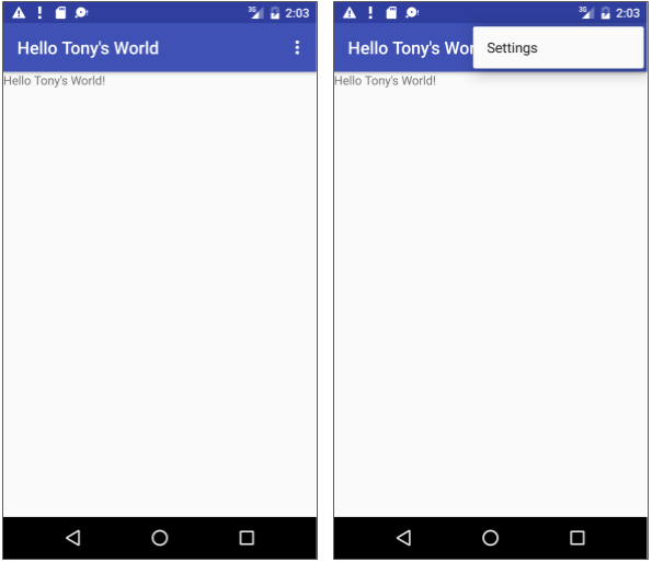
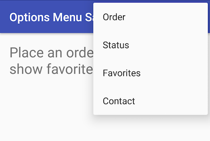
<item … />tag. In this example, the item is Settings:<menu xmlns:android="http://schemas.android.com/apk/res/android" ...> <item android:id="@+id/action_settings" android:title="@string/settings" /> </menu>After setting up and inflating the XML resource in the activity or fragment code, the overflow icon in the app bar, when clicked, would show the options menu with just one option (Settings):
Defining how menu items appear
If you start an app project using the Basic Activity template, the template adds the options menu with one option: Settings.
To add more options menu items, add more <item … /> tags in the menu_main.xml file. For example, in the following snippet, two options menu items are defined: @string/settings (Settings) and @string/action_order (Order):
<menu xmlns:android="http://schemas.android.com/apk/res/android"
   ...>
   <item
      android:id="@+id/action_settings"
      android:title="@string/settings" />
   <item
      android:id="@+id/action_order"
      android:icon="@drawable/ic_order_white"
      android:title="@string/action_order"/>
</menu>
Within each <item … /> tag you can add the attributes to define how the menu item appears, such as the order of its appearance relative to the other items, and whether the item can appear as an icon in the app bar. Any item you set to not appear in the app bar (or that can't fit in the app bar given the display orientation) is placed in order in the overflow menu).
Whenever possible, you want to show the most frequently used actions using icons in the app bar so that the user can click them without having to first click the overflow button.
Adding icons for menu items
To specify icons for actions, you need to first add the icons as image assets to the drawable folder by following these steps (see Image Asset Studio for a complete description):
- Expand res in the Project view, and right-click (or Command-click) drawable.
- Choose New > Image Asset. The Configure Image Asset dialog appears.
- Choose Action Bar and Tab Items in the drop-down menu.
- Edit the name of the icon (for example, ic_order_white for the Order menu item).
- Click the clipart image (the Android logo) to select a clipart image as the icon. A page of icons appears. Click the icon you want to use.
- (Optional) Choose HOLO_DARK from the Theme drop-down menu. This sets the icon to be white against a dark-colored (or black) background. Click Next.
- Click Finish in the Confirm Icon Path dialog.
Icon and appearance attributes
Use the following attributes to govern the menu item's appearance:
android:icon: An image to use as the menu item icon. For example, the following menu item definesic_order_whiteas its icon:<item android:id="@+id/action_order" android:icon="@drawable/ic_order_white" android:title="@string/action_order"/>android:title: A string for the title of the menu item.android:titleCondensed: A string to use as a condensed title for situations in which the normal title is too long.
Position attributes
Use the android:orderInCategory attribute to specify the order in which the menu items appear in the menu, with the lowest number appearing higher in the menu. This is usually the order of importance of the item within the menu. For example, if you want Order to be first, followed by Status, Favorites, and Contact, the following table shows the priority of these items in the menu:
Menu Item |
|
Order |
10 |
Status |
20 |
Favorites |
40 |
Contact |
100 |
Use the app:showAsAction attribute to show menu items as icons in the app bar, with the following values:
"always": Always place this item in the app bar. Use this only if it's critical that the item appear in the app bar (such as a Search icon). If you set multiple items to always appear in the app bar, they might overlap something else in the app bar, such as the app title."ifRoom": Only place this item in the app bar if there is room for it. If there is not enough room for all the items marked"ifRoom", the items with the lowestorderInCategoryvalues are displayed in the app bar, and the remaining items are displayed in the overflow menu."never": Never place this item in the app bar. Instead, list the item in the app bar's overflow menu."withText": Also include the title text (defined byandroid:title) with the item. The title text appears anyway if the item appears in the overflow menu, so this attribute is used primarily to include the title with the icon in the app bar.
For example, the following menu item's icon appears in the app bar only if there is room for it:
<item
   android:id="@+id/action_favorites"
   android:icon="@drawable/ic_favorites_white"
   android:orderInCategory="40"
   android:title="@string/action_favorites"
   app:showAsAction="ifRoom" />

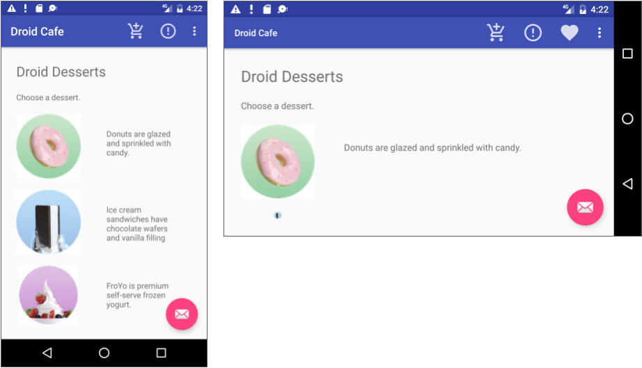
In the above figure:
- Options menu action icons. The first two options menu items appear as action icons in the app bar: Order (the shopping cart icon) and Info (the "i" icon).
- Overflow button. Clicking the overflow button shows the overflow menu.
- Options overflow menu. The overflow menu shows more of the options menu: Favorites and Contact. Favorites (the heart icon) doesn't fit into the app bar in vertical orientation, but may appear in horizontal orientation on a smartphone, or in both orientations on a tablet, as shown below.
Inflating the menu resource
If you start an app project using the Basic Activity template, the template adds the code for inflating the options menu with MenuInflater, so you can skip this step.
If you are not using the Basic Activity template, inflate the menu resource in your activity by using the onCreateOptionsMenu() method (with the Override annotation) with the getMenuInflater() method of the Activity class.
The getMenuInflater() method returns a MenuInflater, which is a class used to instantiate menu XML files into Menu objects. The MenuInflater class provides the inflate() method, which takes as a parameter the resource id for an XML layout resource to load (R.menu.menu_main in the following example), and the Menu to inflate into (menu in the following example):
@Override
public boolean onCreateOptionsMenu(Menu menu) {
   getMenuInflater().inflate(R.menu.menu_main, menu);
   return true;
}
Handling the menu item click
As with a button, the android:onClick attribute defines a method to call when this menu item is clicked. You must declare the method in the activity as public and accept a MenuItem as its only parameter, which indicates the item clicked.
For example, you could define the Favorites item in the menu resource file to use the android:onClick attribute to call the onFavoritesClick() method:
<item
        android:id="@+id/action_favorites"
        android:icon="@drawable/ic_favorites_white"
        android:orderInCategory="40"
        android:title="@string/action_favorites"
        app:showAsAction="ifRoom"
        android:onClick="onFavoritesClick" />
You would declare the onFavoritesClick() method in the activity:
public void onFavoritesClick(MenuItem item) {
    // The item parameter indicates which item was clicked.
    // Add code to handle the Favorites click.
}
However, the onOptionsItemSelected() method of the Activities class can handle all the menu item clicks in one place, and determine which menu item was clicked, which makes your code easier to understand. The Basic Activity template provides an implementation of the onOptionsItemSelected() method with a switch case block to call the appropriate method (such as showOrder) based on the menu item's id, which you can retrieve using the getItemId() method of the Adapter class:
@Override
public boolean onOptionsItemSelected(MenuItem item) {
   switch (item.getItemId()) {
      case R.id.action_order:
         showOrder();
         return true;
      case R.id.action_status:
         showStatus();
         return true;
      case R.id.action_contact:
         showContact();
         return true;
      default:
         // Do nothing
   }
   return super.onOptionsItemSelected(item);
}
Contextual menu
Use a contextual menu to allow users to take an action on a selected view. You can provide a context menu for any View, but they are most often used for items in a RecyclerView, GridView, or other view collections in which the user can perform direct actions on each item.
Android provides two kinds of contextual menus:
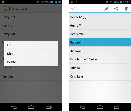
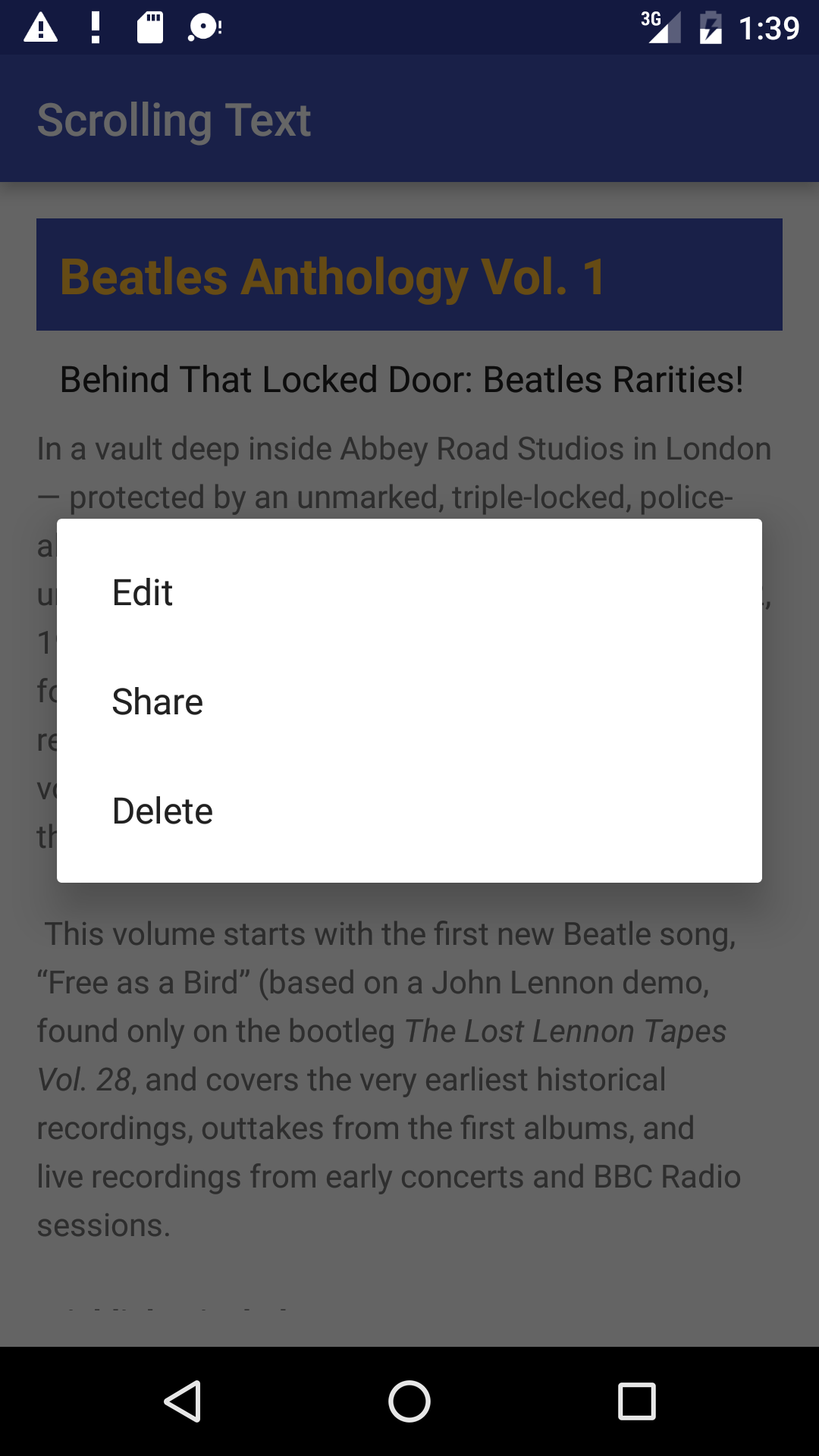
- A context menu, shown on the left side in the figure below, appears as a floating list of menu items when the user performs a long tap on a view element on the screen. It is typically used to modify the view element or use it in some fashion. For example, a context menu might include Edit to edit a view element, Delete to delete it, and Share to share it over social media. Users can perform a contextual action on one view element at a time.
- A Contextual action bar, shown on the right side of the figure below, appears at the top of the screen in place of the app bar or underneath the app bar, with action items that affect the selected view element(s). Users can perform an action on multiple view elements at once (if your app allows it).
Floating context menu
The familiar resource-inflate design pattern is used to create a floating context menu, modified to include registering (associating) the context menu with a view:
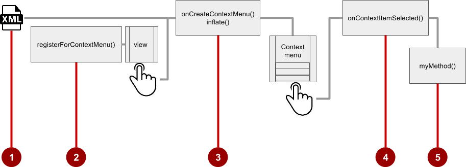
Follow these steps to create a floating context menu for one or more view elements (refer to figure above):
- Create an XML menu resource file for the menu items, and assign appearance and position attributes (as described in the previous section).
- Register a view to the context menu using the registerForContextMenu() method of the Activity class.
- Implement the onCreateContextMenu() method in your activity or fragment to inflate the menu.
- Implement the onContextItemSelected() method in your activity or fragment to handle menu item clicks.
- Create a method to perform an action for each context menu item.
Creating the XML resource file
Create the XML menu resource directory and file by following the steps in the previous section. Use a suitable name for the file, such as menu_context. Add the context menu items (in this example, the menu items are Edit, Share, and Delete):
<item
   android:id="@+id/context_edit"
   android:title="@string/edit"
   android:orderInCategory="10"/>

<item
   android:id="@+id/context_share"
   android:title="@string/share"
   android:orderInCategory="20"/>

<item
   android:id="@+id/context_delete"
   android:title="@string/delete"
   android:orderInCategory="30"/>
Registering a view to the context menu
Register a view to the context menu by calling the registerForContextMenu() method and passing it the view. Registering a context menu for a view sets the View.OnCreateContextMenuListener on the view to this activity, so that onCreateContextMenu() will be called when it is time to show the context menu. (You implement onCreateContextMenu in the next section.)
For example, in the onCreate() method for the activity, add the registerForContextMenu() statement:
...
// Registering the context menu to the text view of the article.
TextView article_text = (TextView) findViewById(R.id.article);
registerForContextMenu(article_text);
...
Multiple views can be registered to the same context menu. If you want each item in a ListView or GridView to provide the same context menu, register all items for a context menu by passing the ListView or GridView to registerForContextMenu().
Implementing the onCreateContextMenu() method
When the registered view receives a long-click event, the system calls the onCreateContextMenu() method, which you can override in your activity or fragment. This is where you define the menu items, usually by inflating a menu resource.
For example:
@Override
public void onCreateContextMenu(ContextMenu menu, View v,
                         ContextMenu.ContextMenuInfo menuInfo) {
   super.onCreateContextMenu(menu, v, menuInfo);
   MenuInflater inflater = getMenuInflater();
   inflater.inflate(R.menu.menu_context, menu);
}
In the above code:
- The
menuparameter for onCreateContextMenu() is the context menu to be built. - The
vparameter is the view registered for the context menu. - The
menuInfoparameter is extra information about the view registered for the context menu. This information varies depending on the class of v, which could be a RecyclerView or a GridView. If you are registering a RecyclerView or GridView, you would instantiate a ContextMenu.ContextMenuInfo object to provide the information about the item selected, and pass it asmenuInfo, such as the row id, position, or child view.
The MenuInflater class provides the inflate() method, which takes as a parameter the resource id for an XML layout resource to load (menu_context in the above example), and the Menu to inflate into (menu in the above example).
Implementing the onContextItemSelected() method
When the user clicks on a menu item, the system calls the onContextItemSelected() method. You override this method in your activity or fragment in order to determine which menu item was clicked, and for which view the menu is appearing. You also use it to implement the appropriate action for the menu items, such as editNote() and shareNote() below for the Edit and Share menu items. For example:
@Override
public boolean onContextItemSelected(MenuItem item) {
   switch (item.getItemId()) {
      case R.id.context_edit:
         editNote();
         return true;
      case R.id.context_share:
         shareNote();
         return true;
      default:
         return super.onContextItemSelected(item);
   }
}
The above example uses the getItemId() method to get the id for the selected menu item, and uses it in a switch case block to determine which action to take. The id is the android:id attribute assigned to the menu item in the XML menu resource file.
When the user performs a long-click on the article in the text view, the floating context menu appears and the user can click a menu item.
If you are using the menuInfo information for a RecyclerView or GridView, you would add a statement before the switch case block to gathers the specific information about the selected view (for info) by using AdapterView.AdapterContextMenuInfo:
AdapterView.AdapterContextMenuInfo info =
            (AdapterView.AdapterContextMenuInfo) item.getMenuInfo();
Contextual action bar
A contextual action bar appears at the top of the screen to present actions the user can perform on a view after long-clicking the view, as shown in the figure below.
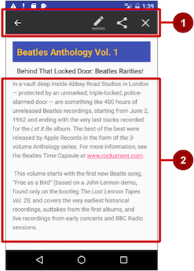
In the above figure:
- Contextual action bar. The bar offers three actions on the right side (Edit, Share, and Delete) and the Done button (left arrow icon) on the left side.
- View. View on which a long-click triggers the contextual action bar.
The contextual action bar appears only when contextual action mode, a system implementation of ActionMode, occurs as a result of the user performing a long-click on the View.
ActionMode represents a user interface (UI) mode for providing alternative interaction, replacing parts of the normal UI until finished. For example, text selection is implemented as an ActionMode, as are contextual actions that work on a selected item on the screen. Selecting a section of text or long-clicking a view triggers ActionMode.
While this mode is enabled, the user can select multiple items (if your app allows it), deselect items, and continue to navigate within the activity. The action mode is disabled and the contextual action bar disappears when the user deselects all items, presses the Back button, or taps Done (left-arrow icon) on the left side of the bar.
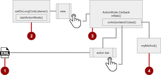
Follow these steps to create a contextual action bar (refer to the figure below):
- Create an XML menu resource file for the menu items, and assign an icon to each one (as described in a previous section).
- Set the long-click listener to the view that should trigger the contextual action bar using the setOnLongClickListener() method. Call startActionMode() within the setOnLongClickListener() method when the user performs a long tap on the view.
- Implement the ActionMode.Callback interface to handle the ActionMode lifecycle. Include in this interface the action for responding to a menu item click in the onActionItemClicked() callback method.
- Create a method to perform an action for each context menu item.
Creating the XML resource file
Create the XML menu resource directory and file by following the steps in a previous section. Use a suitable name for the file, such as menu_context. Add icons for the context menu items (in this example, the menu items are Edit, Share, and Delete). For example, the Edit menu item would have these attributes:
<item
   android:id="@+id/context_edit"
   android:orderInCategory="10"
   android:icon="@drawable/ic_action_edit_white"
   android:title="@string/edit" />
The standard contextual action bar has a dark background. Use a light or white color for the icons. If you are using clip art icons, choose HOLO_DARK for the Theme drop-down menu when creating the new image asset.
Setting the long-click listener
Use setOnLongClickListener() to set a long-click listener to the View that should trigger the contextual action bar. Add the code to set the long-click listener to the activity class (such as MainActivity) using the activity's onCreate() method. Follow these steps:
Declare the member variable
mActionModein the class definition for the activity:private ActionMode mActionMode;You will call startActionMode() to enable ActionMode, which returns the ActionMode created. By saving this in a member variable (
mActionMode), you can make changes to the contextual action bar in response to other events.- Set up the contextual action bar listener in the
onCreate()method, usingViewas the type for the view in order to use thesetOnLongClickListener:@Override protected void onCreate(Bundle savedInstanceState) { ... View articleView = findViewById(article); articleView.setOnLongClickListener(new View.OnLongClickListener() { ... // Add method here to start ActionMode after long-click. ... }); }
Implementing the ActionMode.Callback interface
Before you can add the code to onCreate() to start ActionMode, you must implement the ActionMode.Callback interface to manage the action mode lifecycle. In its callback methods, you can specify the actions for the contextual action bar, and respond to clicks on action items.
- Add the following method to the activity class (such as MainActivity) to implement the interface:
public ActionMode.Callback mActionModeCallback = new
                                     ActionMode.Callback() {
   ...
   // Add code to create action mode here.
   ...
}
Add the
onCreateActionMode()code within the brackets of the above method to create action mode (the full code is provided at the end of this section):@Override public boolean onCreateActionMode(ActionMode mode, Menu menu) { // Inflate a menu resource providing context menu items MenuInflater inflater = mode.getMenuInflater(); inflater.inflate(R.menu.menu_context, menu); return true; }The onCreateActionMode() method inflates the menu using the same pattern used for a floating context menu. But this inflation occurs only when ActionMode is created, which is when the user performs a long-click. The MenuInflater class provides the inflate() method, which takes as a parameter the resource
idfor an XML layout resource to load (menu_contextin the above example), and the Menu to inflate into (menuin the above example).Add the onActionItemClicked() method with your handlers for each menu item:
@Override
public boolean onActionItemClicked(ActionMode mode, MenuItem item) {
switch (item.getItemId()) {
  case R.id.context_edit:
     editNote();
     mode.finish();
     return true;
  case R.id.context_share:
     shareNote();
     mode.finish();
     return true;
  default:
     return false;
}
The above code above uses the getItemId() method to get the
idfor the selected menu item, and uses it in aswitch caseblock to determine which action to take. Theidin eachcasestatement is theandroid:idattribute assigned to the menu item in the XML menu resource file.The actions shown are the
editNote()andshareNote()methods, which you can create in the same activity. After the action is picked, you use themode.finish()method to close the contextual action bar.Add the onPrepareActionMode() and onDestroyActionMode() methods, which manage the ActionMode lifecycle:
@Override
public boolean onPrepareActionMode(ActionMode mode, Menu menu) {
      return false; // Return false if nothing is done.
}
The
onPrepareActionMode()method shown above is called each time ActionMode occurs, and is always called afteronCreateActionMode().@Override public void onDestroyActionMode(ActionMode mode) { mActionMode = null; }The
onDestroyActionMode()method shown above is called when the user exits ActionMode by clicking Done in the contextual action bar, or clicking on a different view.Review the full code for the ActionMode.Callback interface implementation:
public ActionMode.Callback mActionModeCallback = new
                                        ActionMode.Callback() {
   @Override
   public boolean onCreateActionMode(ActionMode mode, Menu menu) {
      // Inflate a menu resource providing context menu items
      MenuInflater inflater = mode.getMenuInflater();
      inflater.inflate(R.menu.menu_context, menu);
      return true;
   }

   // Called each time ActionMode is shown. Always called after
   // onCreateActionMode.
   @Override
   public boolean onPrepareActionMode(ActionMode mode, Menu menu) {
      return false; // Return false if nothing is done
   }

   // Called when the user selects a contextual menu item
   @Override
   public boolean onActionItemClicked(ActionMode mode, MenuItem item) {
      switch (item.getItemId()) {
         case R.id.context_edit:
            editNote();
            mode.finish();
            return true;
         case R.id.context_share:
            shareNote();
            mode.finish();
            return true;
         default:
            return false;
      }
   }

   // Called when the user exits the action mode
   @Override
   public void onDestroyActionMode(ActionMode mode) {
      mActionMode = null;
   }
};
Starting ActionMode
You use startActionMode() to start ActionMode after the user performs a long-click.
To start ActionMode, add the
onLongClick()method within the brackets of thesetOnLongClickListenermethod inonCreate():@Override protected void onCreate(Bundle savedInstanceState) { ... articleView.setOnLongClickListener(new View.OnLongClickListener() { // Called when the user long-clicks on articleView public boolean onLongClick(View view) { if (mActionMode != null) return false; // Start the contextual action bar // using the ActionMode.Callback. mActionMode = MainActivity.this.startActionMode(mActionModeCallback); view.setSelected(true); return true; } }); }The above code first ensures that the
ActionModeinstance is not recreated if it's already active by checking whethermActionModeis null before starting the action mode:if (mActionMode != null) return false;When the user performs a long-click, the call is made to
startActionMode()using the ActionMode.Callback interface, and the contextual action bar appears at the top of the display. The setSelected() method changes the state of this view to selected (set totrue).Review the code for the
onCreate()method in the activity, which now includessetOnLongClickListener()andstartActionMode():@Override protected void onCreate(Bundle savedInstanceState) { super.onCreate(savedInstanceState); setContentView(R.layout.activity_main); // set up the contextual action bar listener View articleView = findViewById(article); articleView.setOnLongClickListener(new View.OnLongClickListener() { // Called when the user long-clicks on articleView public boolean onLongClick(View view) { if (mActionMode != null) return false; // Start the contextual action bar // using the ActionMode.Callback. mActionMode = MainActivity.this.startActionMode(mActionModeCallback); view.setSelected(true); return true; } }); }
Popup menu
A PopupMenu is a vertical list of items anchored to a View. It appears below the anchor view if there is room, or above the view otherwise.
A popup menu is typically used to provide an overflow of actions (similar to the overflow action icon for the options menu) or the second part of a two-part command. Use a popup menu for extended actions that relate to regions of content in your activity. Unlike a context menu, a popup menu is anchored to a Button (View), is always available, and it's actions generally do not affect the content of the View.
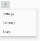
For example, the Gmail app uses a popup menu anchored to the overflow icon in the app bar when showing an email message. The popup menu items Reply, Reply All, and Forward are related to the email message, but don't affect or act on the message. Actions in a popup menu should not directly affect the corresponding content (use a contextual menu to directly affect selected content). As shown below, a popup can be anchored to the overflow action button in the action bar.

Creating a pop-up menu
Follow these steps to create a popup menu (refer to figure below):

- Create an XML menu resource file for the popup menu items, and assign appearance and position attributes (as described in a previous section).
- Add an ImageButton for the popup menu icon in the XML activity layout file.
- Assign onClickListener() to the button.
- Override the
onClick()method to inflate the popup menu and register it with PopupMenu.OnMenuItemClickListener. - Implement the onMenuItemClick() method.
- Create a method to perform an action for each popup menu item.
Creating the XML resource file
Create the XML menu resource directory and file by following the steps in a previous section. Use a suitable name for the file, such as menu_popup.
Adding an ImageButton for the icon to click
Use an ImageButton in the activity layout for the icon that triggers the popup menu. Popup menus are anchored to a view in the activity, such as an ImageButton. The user clicks it to see the menu.
<ImageButton
    android:layout_width="wrap_content"
    android:layout_height="wrap_content"
    android:id="@+id/button_popup"
    android:src="@drawable/@drawable/ic_action_popup"/>
Assigning onClickListener to the button
- Create a member variable (
mButton) in the activity's class definition:public class MainActivity extends AppCompatActivity { private ImageButton mButton; ... } - In the
onCreate()method for the same activity, assign theImageButtonin the layout to the member variable, and assign onClickListener() to the button:@Override protected void onCreate(Bundle savedInstanceState) { ... mButton = (ImageButton) findViewById(R.id.button_popup); mButton.setOnClickListener(new View.OnClickListener() { ... // define onClick here ... });
Inflating the popup menu
As part of the setOnClickListener() method within onCreate(), add the onClick() method to inflate the popup menu and register it with PopupMenu.OnMenuItemClickListener:
@Override
public void onClick(View v) {
   //Creating the instance of PopupMenu
   PopupMenu popup = new PopupMenu(MainActivity.this, mButton);
   //Inflating the Popup using xml file
   popup.getMenuInflater().inflate(R.menu.menu_popup, popup.getMenu());
   //registering popup with OnMenuItemClickListener
   popup.setOnMenuItemClickListener(new
                              PopupMenu.OnMenuItemClickListener() {
      ...
      // Add onMenuItemClick here
      ...
            // Perform action here
      ...
}
After instantiating a PopupMenu object (popup in the above example), the method uses the MenuInflater class and its inflate() method, which takes as parameters:
- The resource
idfor an XML layout resource to load (menu_popupin the example above) - The Menu to inflate into (
popup.getMenu()in the example above).
The code then registers the popup with the listener, PopupMenu.OnMenuItemClickListener.
Implementing onMenuItemClick
To perform an action when the user selects a popup menu item, implement the onMenuItemClick() callback within the above setOnClickListener() method, and finish the method with popup.show to show the popup menu:
         public boolean onMenuItemClick(MenuItem item) {
            // Perform action here
            return true;
         }
      });
      popup.show();  //show the popup menu
   }
});// close the setOnClickListener method
Putting these pieces together, the entire onCreate() method should now look like this:
private ImageButton mButton;

@Override
protected void onCreate(Bundle savedInstanceState) {
   super.onCreate(savedInstanceState);
   setContentView(R.layout.activity_main);
   ...
   // popup button setup
   mButton = (ImageButton) findViewById(R.id.button_popup);
   mButton.setOnClickListener(new View.OnClickListener() {
      @Override
      public void onClick(View v) {
         //Creating the instance of PopupMenu
         PopupMenu popup = new PopupMenu(MainActivity.this, mButton);
         //Inflating the Popup using xml file
         popup.getMenuInflater().inflate(R.menu.menu_popup, popup.getMenu());

         //registering popup with OnMenuItemClickListener
         popup.setOnMenuItemClickListener(new PopupMenu.OnMenuItemClickListener() {
            public boolean onMenuItemClick(MenuItem item) {
               // Perform action here
               return true;
            }
         });
         popup.show();//show the popup menu
      }
   });//close the setOnClickListener method
 }
Related practical
The related exercises and practical documentation is in Android Developer Fundamentals: Practicals.
Learn more
- Android API Guide, "Develop" section:
- Other:
- Android API Guide, "Design" section: Icons and other downloadable resources
- Android Studio User's Guide: Image Asset Studio
- Android Developers Blog: "Holo Everywhere"
