4.2: Using an Options Menu
Contents:
- What you should already KNOW
- What you will LEARN
- What you will DO
- App overview
- Task 1: Add items to the options menu
- Task 2: Add icons for menu items
- Coding challenge #1
- Task 3: Handle the selected menu item
- Coding challenge #2
- Summary
- Related concept
- Learn more
The app bar (also called the action bar) is a dedicated space at the top of each activity screen. When you create an activity from a template (such as Basic Activity Template), an app bar is automatically included for the activity in a CoordinatorLayout root view group at the top of the view hierarchy.
The options menu in the app bar provides navigation to other activities in the app, or the primary options that affect using the app itself—but not ones that perform an action on an element on the screen. For example, your options menu might provide the user choices for navigating to other activities, such as placing an order, or for actions that have a global impact on the app, such as changing settings or profile information.
In this practical you'll learn about setting up the app bar and options menu in your app (shown in the figure below).
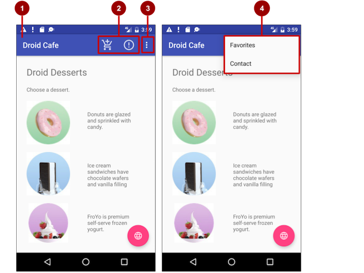
In the above figure:
- App bar. The app bar includes the app title, the options menu, and the overflow button.
- Options menu action icons. The first two options menu items appear as icons in the app bar.
- Overflow button. The overflow button (three vertical dots) opens a menu that shows more options menu items.
- Options overflow menu. After clicking the overflow button, more options menu items appear in the overflow menu.
Options menu items appear in the options overflow menu (see figure above). However, you can place some items as icons—as many as can fit—in the app bar. Using the app bar for the options menu makes your app consistent with other Android apps, allowing users to quickly understand how to operate your app and have a great experience.
Tip: To provide a familiar and consistent user experience, you should use the Menu APIs to present user actions and other options in your activities. See Menus for details.
What you should already KNOW
From the previous chapters, you should be familiar with how to do the following:
- Creating and running apps in Android Studio.
- Creating and editing UI elements using the Layout Editor, entering XML code directly, and accessing elements from your Java code.
- Adding onClick functionality to a button.
What you will LEARN
- Adding menu items to the options menu.
- Adding icons for items in the options menu.
- Setting menu items to show in the action bar.
- Adding the event handlers for menu item clicks.
What you will DO
- Continue adding features to the Droid Cafe project from the previous practical.
- Add menu items to the options menu.
- Add icons for menu items to appear in the action bar.
- Connect menu item clicks to event handlers that process the click events.
App overview
In the previous practical you created an app called Droid Cafe, shown in the figure below, using the Basic Activity template. This template also provides a skeletal options menu in the app bar at the top of the screen. You will learn how to:
- Set up the app bar.
- Modify the options menu.
- Add icons for some of the menu items.
- Show the icon for the menu item in the app bar rather than the overflow menu.
- Show the item in the overflow menu, depending on the screen size and orientation.
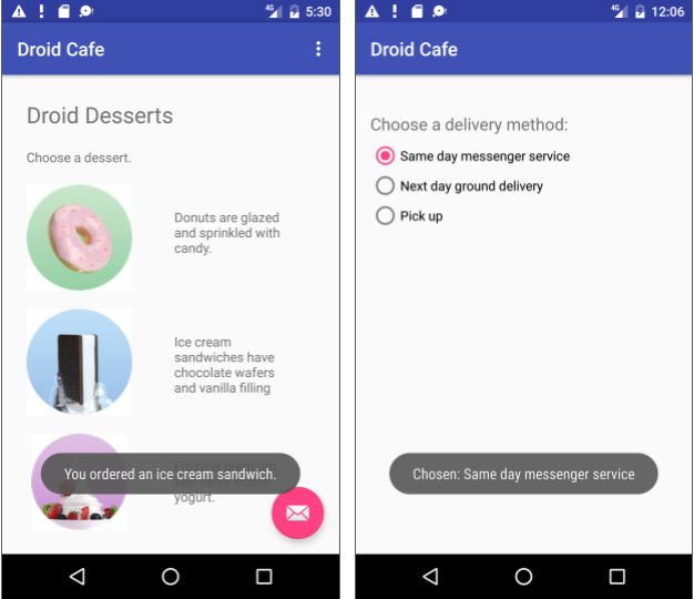
For this exercise you are using the v7 appcompat support library's Toolbar as an app bar. There are other ways to implement an app bar. For example, some themes set up an ActionBar as an app bar by default. But using the appcompat Toolbar makes it easy to set up an app bar that works on the widest range of devices, and also gives you room to customize your app bar later on as your app develops.
To read more about design considerations for using the app bar, see App Bar in the Material Design specification.
To start the project from where you left off in the previous practical, download:
Android Studio project: DroidCafe Part 1
Task 1. Add items to the options menu
You will open the Droid Cafe project from the previous practical, and add menu items to the options menu in the app bar at the top of the screen.
1.1 Examine the app bar code
Open the Droid Cafe project from the previous practical. The project includes the following layout files in the res > layout folder:
activity_main.xml: The main layout for MainActivity, the first screen the user sees.
content_main.xml: The layout for the content of the MainActivity screen, which (as you will see shortly) is included within activity_main.xml.
activity_order.xml: The layout for OrderActivity, which you added in the previous practical.
Open content_main.xml. In the previous practical, you added TextViews and ImageViews to the root view group (which you changed to RelativeLayout).
The layout behavior for the
RelativeLayoutis set to@string/appbar_scrolling_view_behavior, which controls the scrolling behavior of the screen in relation to the app bar at the top. Right-click (Control-click) this string resource and choose Go To > Declaration to see the string resource's actual value, which is defined in a file called "values.xml". This file is generated by Android Studio, not visible in the Project: Android view and should not be edited. The actual value of@string/appbar_scrolling_view_behaviorin values.xml is"android.support.design.widget.AppBarLayout$ScrollingViewBehavior".For more about scrolling behavior, see the Android Design Support Library blog entry in the Android Developers Blog. For design practices involving scrolling menus, see Scrolling Techniques in the Material Design specification.
Open activity_main.xml to see the main layout, which uses a CoordinatorLayout layout with an embedded AppBarLayout layout. The CoordinatorLayout and the AppBarLayout tags require fully qualified names that specify
android.support.design, which is the Android Design Support Library.AppBarLayout is a vertical LinearLayout which uses the Toolbar class in the support library, instead of the native ActionBar, to implement an app bar. The app bar is a section at the top of the display that can display the activity title, navigation, and other interactive items. The native ActionBar behaves differently depending on the version of Android running on the device. For this reason, if you are adding an options menu, you should use the v7 appcompat support library's Toolbar as an app bar. Using the Toolbar makes it easy to set up an app bar that works on the widest range of devices, and also gives you room to customize your app bar later on as your app develops. Toolbar includes the most recent features, and works for any device that can use the support library.
The Toolbar within this layout has the id
toolbar, and is also specified, like the AppBarLayout, with a fully qualified name (android.support.v7.widget):<android.support.design.widget.AppBarLayout android:layout_width="match_parent" android:layout_height="wrap_content" android:theme="@style/AppTheme.AppBarOverlay"> <android.support.v7.widget.Toolbar android:id="@+id/toolbar" android:layout_width="match_parent" android:layout_height="?attr/actionBarSize" android:background="?attr/colorPrimary" app:popupTheme="@style/AppTheme.PopupOverlay" /> </android.support.design.widget.AppBarLayout>For more details about the AppBarLayout class, see AppBarLayout in the Android Developer Reference. For more details about toolbars, see Toolbar in the Android Developer Reference.
Tip: The activity_main.xml layout also uses an
include layoutstatement to include the entire layout defined in content_main.xml. This separation of layout definitions makes it easier to change the layout's content apart from the layout's toolbar definition and coordinator layout. This is a best practice for separating your content (which may need to be translated) from the format of your layout.- Run the app. Notice the bar at the top of the screen showing the name of the app (Droid Cafe). It also shows the action overflow button (three vertical dots) on the right side. Tap the overflow button to see the options menu, which at this point has only one menu option, Settings.
Examine the AndroidManifest.xml file. The
.MainActivityactivity is set to use theNoActionBartheme:android:theme="@style/AppTheme.NoActionBar"The
NoActionBartheme is defined in the styles.xml file (expand app > res >values > styles.xml to see it). Styles are covered in another lesson, but you can see that theNoActionBartheme sets thewindowActionBarattribute tofalse(no window action bar), and thewindowNoTitleattribute totrue(no title).The reason these values are set is because you are defining the app bar in your layout (activity_main.xml) with AppBarLayout, rather than using an ActionBar. Using one of the NoActionBar themes prevents the app from using the native ActionBar class to provide the app bar. The native ActionBar class behaves differently depending on what version of the Android system a device is using. By contrast, the most recent features are added to the support library's version of Toolbar and available on any device that can use the support library. For this reason, you should use the support library's Toolbar class to implement your activities' app bars instead of ActionBar. Using the support library's Toolbar ensures that your app has consistent behavior across the widest range of devices.
- Look at MainActivity, which extends
AppCompatActivityand starts with theonCreate()method:@Override protected void onCreate(Bundle savedInstanceState) { super.onCreate(savedInstanceState); setContentView(R.layout.activity_main); Toolbar toolbar = (Toolbar) findViewById(R.id.toolbar); setSupportActionBar(toolbar); ...
After setting the content view to the activity_main.xml layout, the onCreate() method sets toolbar to be the Toolbar defined in the activity_main.xml layout. It then calls the activity's setSupportActionBar() method, and passes toolbar to it, setting the toolbar defined in activity_main.xml as the app bar for the activity.
For best practices about adding the app bar to your app, see Adding the App Bar in Best Practices for User Interface.
1.2 Add more menu items to the options menu
You will add the following menu items to the options menu of the Droid Cafe app:
- Order: Go to the Order Activity screen to see the food order.
- Status: Check the status of a food order.
- Favorites: Show favorite foods.
- Contact: Contacting the restaurant. Since you don't need the existing Settings item, you will change Settings to Contact.
Android provides a standard XML format to define menu items. Instead of building a menu in your activity's code, you can define a menu and all of its menu items in an XML menu resource. You can then inflate the menu resource (load it as a Menu object) in your activity or fragment:
Take a look at menu_main.xml (expand res > menu in the Project view). It defines menu items with the
<item> </item>tag within the<menu> </menu>block. The only menu item provided from the template isaction_settings(the Settings choice), which is defined as:<item android:id="@+id/action_settings" android:orderInCategory="100" android:title="@string/action_settings" app:showAsAction="never" />In Android Studio, the
android:titleattribute shows the string value"Settings"even though the string is defined as a resource. Android Studio displays the value so that you can see at-a-glance what the value is without having to open the strings.xml resource file. If you click on this string, it changes to show the string resource"@string/action_settings".- Change the following attributes of the
action_settingsitem to make it theaction_contactitem (don't change the existingandroid:orderInCategoryattribute):Attribute Value android:id "@+id/action_contact" android:title "Contact" app:showAsAction "never" - Extract the hard-coded string
"Contact"into the string resourceaction_contact. - Add a new menu item using the
<item> </item>tag within the<menu> </menu>block, and give the item the following attributes:
TheAttribute Value android:id "@+id/action_order" android:orderInCategory "10" android:title "Order" app:showAsAction "never" android:orderInCategoryattribute specifies the order in which the menu items appear in the menu, with the lowest number appearing higher in the menu. The Contact item is set to 100, which is a big number in order to specify that it shows up at the bottom rather than the top. You set the Order item to 10, which puts it above Contact, and leaves plenty of room in the menu for more items. - Extract the hard-coded string
"Order"into the string resourceaction_order. - Add two more menu items the same way with the following attributes:
Status item attribute Value android:id "@+id/action_status" android:orderInCategory "20" android:title "Status" app:showAsAction "never" Favorites item attribute Value android:id "@+id/action_favorites" android:orderInCategory "40" android:title "Favorites" app:showAsAction "never" - Extract
"Status"into the resourceaction_status, and"Favorites"into the resourceaction_favorites. - You will display a toast message with an action message depending on which menu item the user selects. Add the following string names and values in
strings.xmlfor these messages:<string name="action_order_message">You selected Order.</string> <string name="action_status_message">You selected Status.</string> <string name="action_favorites_message">You selected Favorites.</string> <string name="action_contact_message">You selected Contact.</string> - Open MainActivity, and change the
ifstatement in theonOptionsItemSelected()method replacing the idaction_settingswith the new idaction_order:if (id == R.id.action_order)
Run the app, and tap the action overflow icon, shown on the left side of the figure below, to see the options menu, shown on the right side of the figure below. You will soon add callbacks to respond to items selected from this menu.
![]()
In the above figure:
- Tap the overflow icon in the app bar to see the options menu.
- The options menu drops down from the app bar.
Notice the order of items in the options menu. You used the android:orderInCategory attribute to specify the priority of the menu items in the menu: The Order item is 10, followed by Status (20) and Favorites (40), and Contact is last (100). The following table shows the priority of items in the menu:
| Menu item | orderInCategory attribute |
| Order | 10 |
| Status | 20 |
| Favorites | 40 |
| Contact | 100 |
Task 2. Add icons for menu items
Whenever possible, you want to show the most frequently used actions using icons in the app bar so the user can click them without having to first click the overflow icon. In this task, you'll add icons for some of the menu items, and show some of menu items in the app bar at the top of the screen as icons.
In this example, let's assume the Order and Status actions are considered the most frequently used. Favorites is occasionally used, and Contact is the least frequently used. You can set icons for these actions, and specify the following:
- Order and Status should always be shown in the app bar.
- Favorites should be shown in the app bar if it will fit; if not, it should appear in the overflow menu.
- Contact should not appear in the app bar; it should only appear in the overflow menu.
2.1 Add icons for menu items
To specify icons for actions, you need to first add the icons as image assets to the drawable folder.
- Expand res in the Project view, and right-click (or Control-click) drawable.
- Choose New > Image Asset. The Configure Image Asset dialog appears.
- Choose Action Bar and Tab Items in the drop-down menu.
- Change ic_action_name to ic_order_white (for the Order action). The Configure Image Asset screen should look as follows (see Create App Icons with Image Asset Studio for a complete description.)
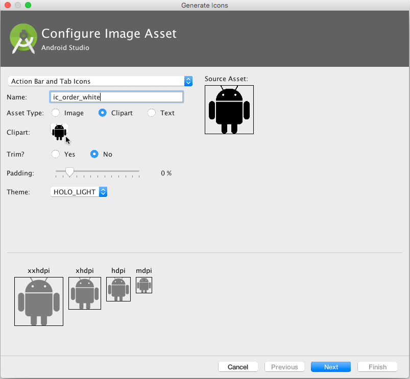
- Click the clipart image (the Android logo next to "Clipart:") to select a clipart image as the icon. A page of icons appears. Click the icon you want to use for the Order action (for example, the shopping cart icon may be appropriate).
- Choose HOLO_DARK from the Theme drop-down menu. This sets the icon to be white against a dark-colored (or black) background. Click Next.
- Click Finish in the Confirm Icon Path dialog.
- Repeat the above steps for the Status and Favorites icons, naming them ic_status_white and ic_favorites_white respectively. You may want to use the circled-i icon for Status (typically used for Info), and the heart icon for Favorites.
2.2 Show the menu items as icons in the app bar
To show menu items as icons in the app bar, use the app:showAsAction attribute in menu_main.xml. The following values for the attribute specify whether or not the action should appear in the app bar as an icon:
"always": Always appears in the app bar. (If there isn't enough room it may overlap with other menu icons.)"ifRoom": Appears in the app bar if there is room."never": Never appears in the app bar; it's text appears in the overflow menu.
Follow these steps to show some of the menu items as icons:
- Open menu_main.xml again, and add the following attributes to the Order, Status, and Favorites items so that the first two (Order and Status) always appear, and the Favorites item appears only if there is room for it:
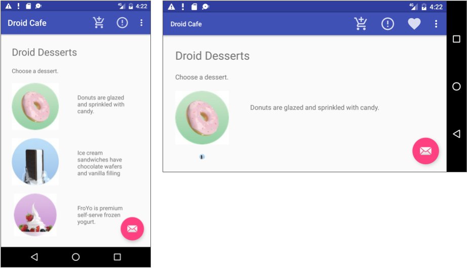
Order item attribute Old value New value android:icon "@drawable/ic_order_white" app:showAsAction "never" "always" Status item attribute Old value New value android:icon "@drawable/ic_status_white" app:showAsAction "never" "always" Favorites item attribute Old value New value android:icon "@drawable/ic_favorites_white" app:showAsAction "never" "ifRoom" - Run the app. You should now see at least two icons in the app bar: the icon for Order and the icon for Status as shown in the figure below If your device or the emulator is displaying in vertical orientation, the Favorites and Contact options appear in the overflow menu.
- Rotate your device to the horizontal orientation, or if you're running in the emulator, click the Rotate Left or Rotate Right icons to rotate the display into the horizontal orientation. You should then see all three icons in the app bar for Order, Status, and Favorites.
Tip: How many action buttons will fit in the app bar? It depends on the orientation and the size of the device screen. Fewer buttons appear in a vertical orientation, as shown on the left side of the figure below, compared to a horizontal orientation as shown on the right side of the figure below. Action buttons may not occupy more than half of the main app bar's width.
Coding challenge #1
Challenge 1: When you click the floating action button with the email icon that appears at the bottom of the screen, the code in MainActivity displays a drawer that opens and closes, called a snackbar. A snackbar provides feedback about an operation—it shows a brief message at the bottom of the screen on a smartphone, or in the lower left corner on larger devices. For more information, see Snackbar.
Look at how other apps implement the floating action button. For example, the Gmail app provides a floating action button to create a new email message, and the Contacts app provides one to create a new contact. For more information about floating action buttons, see FloatingActionButton.
Now that you know how to add icons for menu items, use the same technique to add another icon, and assign that icon to the floating action button, replacing the email icon. For example, you might want the floating action button to start a chat session; in which case you might want to use an icon showing a human.
Hint: The floating action button is defined in activity_main.xml.
While adding the icon, also change the text that appears in the snackbar after tapping the floating action button. You will find this text in the Snackbar.make statement in the main activity. Extract the string resource for this text to be snackbar_text.
Task 3. Handle the selected menu item
In this task, you'll add a method to display a message about which menu item is tapped, and use the onOptionsItemSelected() method to determine which menu item was tapped.
3.1 Create a method to display the menu choice
- Open MainActivity.
- If you haven't already added the following method (in the previous lesson) for displaying a toast message, add it now:
public void displayToast(String message) {
   Toast.makeText(getApplicationContext(), message,
                          Toast.LENGTH_SHORT).show();
}
The displayToast() method gets the message from the appropriate string (such as action_contact_message).
3.2 Use the onOptionsItemSelected event handler
The onOptionsItemSelected() method handles selections from the options menu. You will add a switch case block to determine which menu item was selected, and what message to create for each selected item. (Rather than creating a message for each item, you could implement an event handler for each item that performs an action, such as starting another activity, as shown later in this lesson.)
- Find the
onOptionsItemSelected()method. Theifstatement in the method, provided by the template, determines if a certain menu item was clicked, using the menu item'sid(action_orderin the below example):@Override public boolean onOptionsItemSelected(MenuItem item) { int id = item.getItemId(); if (id == R.id.action_order) { return true; } return super.onOptionsItemSelected(item); } - Replace the
ifstatement and the assignment toidwith the followingswitch caseblock that sets the appropriatemessagebased on the menu item'sid:@Override public boolean onOptionsItemSelected(MenuItem item) { switch (item.getItemId()) { case R.id.action_order: displayToast(getString(R.string.action_order_message)); return true; case R.id.action_status: displayToast(getString(R.string.action_status_message)); return true; case R.id.action_favorites: displayToast(getString(R.string.action_favorites_message)); return true; case R.id.action_contact: displayToast(getString(R.string.action_contact_message)); return true; default: // Do nothing } return super.onOptionsItemSelected(item); } - Run the app. You should now see a different toast message on the screen, as shown on the right side of the figure below, based on which menu item you choose.
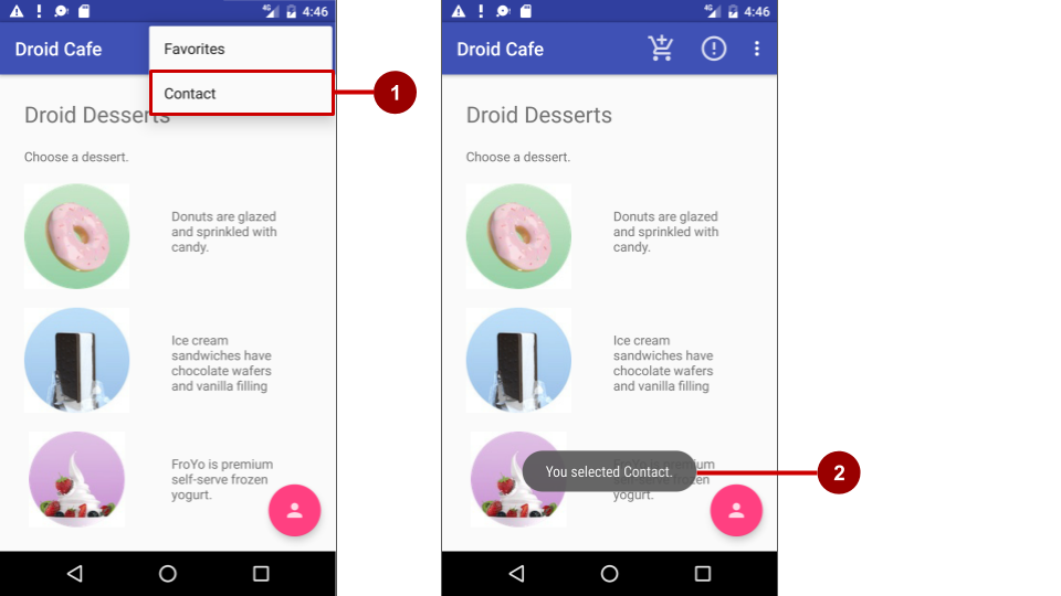
In the above figure:
- Selecting the Contact item in the options menu.
- The toast message that appears.
Solution code (includes coding challenge #1)
Android Studio project: DroidCafe Part 2
Coding challenge #2
Challenge 2: In the previous challenge, you changed the icon for the floating action button that appears at the bottom of the MainActivity screen in your app.
For this challenge:
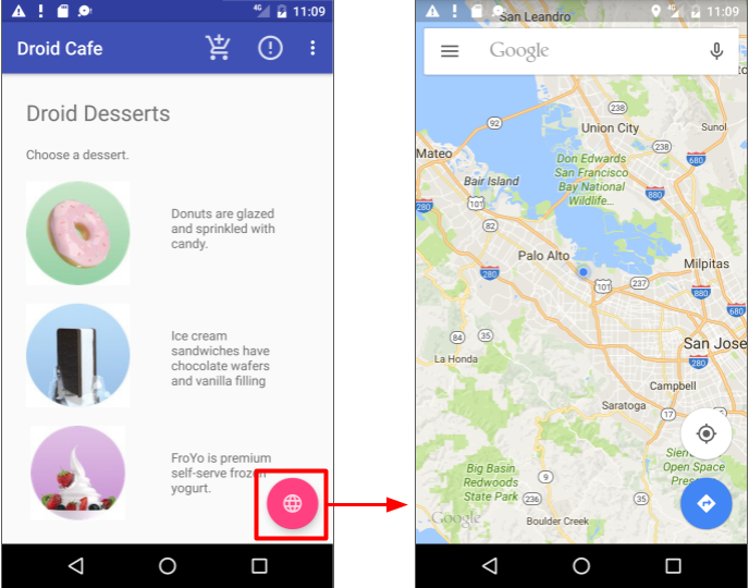
- Change the icon for the floating action button again, but this time to an appropriate icon for a map, such as the world icon.
- In
MainActivity, replace the action to display a snackbar with an implicit intent to launch the Maps app when the floating action button is tapped. - Add the following specific coordinates (for Google headquarters) and the zoom level (
12) to a string resource calledgoogle_mtv_coord_zoom12:<string name="google_mtv_coord_zoom12">geo:37.422114,-122.086744?z=12</string> - Add the following method to start the Maps app, which passes the above string as
datausing an implicit intent:public void displayMap() { Intent intent = new Intent(); intent.setAction(Intent.ACTION_VIEW); // Using the coordinates for Google headquarters. String data = getString(R.string.google_mtv_coord_zoom12); intent.setData(Uri.parse(data)); if (intent.resolveActivity(getPackageManager()) != null) { startActivity(intent); } }
For examples of implicit intents, including opening the Maps app, see Common Implicit Intents on github.
After tapping the floating action button to go to the Maps app, as shown in the figure below, the user can tap the Back button below the screen to return to your app.
Solution code (includes coding challenge #2)
Android Studio Project: DroidCafe Part 3
You will finish the DroidCafe app in the next lesson.
Summary
In this practical, you learned how to do the following:
- Set up an options menu in the app bar:
- Using the Basic Activity template to automatically set up the options menu and a floating action button.
- Using
@string/appbar_scrolling_view_behaviorto provide the standard scrolling behavior of the app bar's options menu. - Using a CoordinatorLayout view group with the AppBarLayout class to create an options menu in the app bar.
- Using an
include layoutstatement in an XML layout file to include an entire layout defined in another XML file. - Using the
NoActionBartheme to prevent the app from using the native ActionBar class attributes for the app bar, in order to set thewindowActionBarattribute tofalse(no window action bar), and thewindowNoTitleattribute totrue(no title). - Using an activity's
onCreate()method to call the activity'ssetSupportActionBar()method to set the toolbar defined in the layout as the app bar for the activity. - Defining a menu and all its items in an XML menu resource, and then inflating the menu resource in an activity or fragment to load it as a Menu object.
- Using the
android:orderInCategoryattribute to specify the order in which the menu items appear in the menu, with the lowest number appearing higher in the menu. - Using the
app:showAsActionattribute to show menu items as icons in the app bar. - Adding event handlers for options menu items, and using the
onOptionsItemSelected()method to retrieve the selection from the options menu.
- Use icons in a project:
- Adding icons to a project and using them to show menu items in the app bar.
- Challenge: Changing the icon for a floating action button, and changing the
Snackbar.makecode.
- Challenge: Making an implicit intent to launch the Maps app with specific coordinates.
Related concept
The related concept documentation is in Android Developer Fundamentals: Concepts.
Learn more
- Android Developer Reference:
- Android Developers Blog: Android Design Support Library
- Material Design Spec:
- Best Practices for User Interface: Adding the App Bar
- Github: Common Implicit Intents
- Images and icons:
