4.3: Using the App Bar and Tabs for Navigation
Contents:
- What you should already KNOW
- What you will LEARN
- What you will DO
- App overview
- Task 1: Add an Up button for ancestral navigation
- Task 2: Use tab navigation with swipe views
- Coding challenges
- Summary
- Related concept
- Learn more
In the early stages of developing an app, you should determine the paths users should take through your app in order to do something, such as placing an order or browsing through content. Each path enables users to navigate across, into, and back out from the different tasks and pieces of content within the app.
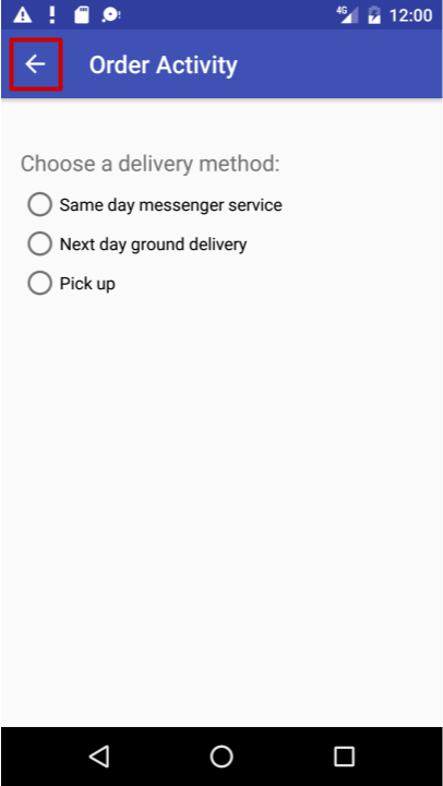
In this practical, you'll learn how to add an Up button (a left-facing arrow) to the app bar of your app, as shown below, to navigate from a child screen up to the parent screen.

The Up button is always used to navigate to the parent screen in the hierarchy. It differs from the Back button (the triangle at the bottom of the screen), which provides navigation to whatever screen the user viewed previously.
This practical also introduces tab navigation, in which tabs appear across the top of a screen, providing navigation to other screens. Tab navigation is a very popular solution for lateral navigation from one child screen to another child screen that is a sibling, as shown in the diagram below. Tabs provide navigation to and from the sibling screens Top Stories, Tech News, and Cooking without having to navigate up to the parent. Tabs can also provide navigation to and from stories, which are sibling screens under the Top Stories parent.
Tabs are most appropriate for four or fewer sibling screens. The user can tap a tab to see a different screen, or swipe left or right to see a different screen.
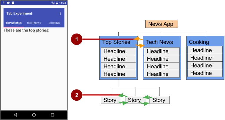
In the above figure:
- Lateral navigation from one category screen to another
- Lateral navigation from one story screen to another
What you should already KNOW
From the previous chapters, you should be able to:
- Create and run apps in Android Studio.
- Create and edit UI elements using the Layout Editor, entering XML code directly, and accessing elements from your Java code.
- Add menu items and icons to the options menu in the app bar.
What you will LEARN
In this practical, you will learn to:
- Add the Up button to the app bar.
- Set up an app with tab navigation and swipe views.
What you will DO
- Continue adding features to the Droid Cafe project from the previous practical.
- Provide the Up button in the app bar to navigate to the previous screen within an activity.
- Create a new app with tabs for navigating activity screens that can also be swiped.
App overview
In the previous practical you created an app called Droid Cafe in three parts, using the Basic Activity template. This template also provides an app bar at the top of the screen. You will learn how to add an Up button (a left-facing arrow) to the app bar for up navigation from the second activity (OrderActivity) to the main activity (MainActivity). This will complete the Droid Cafe app.
To start the project from where you left off in the previous practical, download the Android Studio project DroidCafe Part 3.
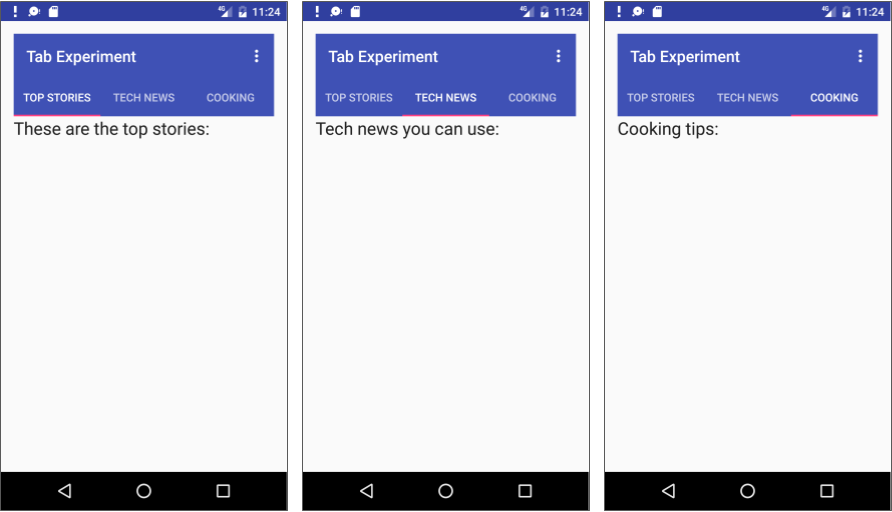
The second app you will create for tab navigation will show three tabs below the app bar to navigate to sibling screens. As the user taps a tab, the screen shows a content screen depending on which tab is tapped. The user can also swipe left and right to visit the content screens. Swiping views is handled automatically by the ViewPager class.
Task 1. Add an Up button for ancestral navigation
Your app should make it easy for users to find their way back to the app's main screen, which is the parent activity. One way to do this is to provide an Up button on the app bar for all activities that are children of the parent activity.
The Up button provides ancestral "up" navigation, enabling the user to go up from a child page to the parent page. The Up button is the left-facing arrow on the left side of the app bar, as shown on the left side of the figure below.
When the user touches the Up button, the app navigates to the parent activity. The diagram on the right side of the figure below shows how the Up button is used to navigate within an app based on the hierarchical relationships between screens.

In the above figure:
- Navigating from the first-level siblings to the parent.
- Navigating from second-level siblings to the first-level child screen acting as a parent screen
Tip: The Back button (the triangle at the bottom of the screen) differs from the Up button. The Back button provides navigation to whatever screen you viewed previously. If you have several child screens that the user can navigate through using a lateral navigation pattern (as described in the next section), the Back button would send the user back to the previous child screen, not to the parent screen. Use an Up button if you want to provide ancestral navigation from a child screen back to the parent screen. For more information about Up navigation, see Providing Up Navigation.
As you learned previously, when adding activities to an app, you can add Up-button navigation to a child activity such as OrderActivity by declaring the activity's parent to be MainActivity in the AndroidManifest.xml file. You can also set the android:label attribute for a title for the activity screen, such as "Order Activity":
- If you don't already have the Droid Cafe app open from the previous practical, download the Android Studio project DroidCafe Part 3 and rename the project to DroidCafe.
- Open the DroidCafe project.
- Open AndroidManifest.xml.
- Change the activity element for OrderActivity to the following:
<activity android:name=".OrderActivity" android:label="Order Activity" android:parentActivityName="com.example.android. droidcafe.MainActivity"> <meta-data android:name="android.support.PARENT_ACTIVITY" android:value=".MainActivity"/> </activity> - Extract the android:label value
"Order Activity"to a string resource namedtitle_activity_order. - Run the app.
The Order Activity screen now includes the Up button (highlighted in the figure below) in the app bar to navigate back to the parent activity.

Solution code:
Android Studio project: DroidCafe
Task 2. Use tab navigation with swipe views
With lateral navigation, you enable the user to go from one sibling to another (at the same level in a multitier hierarchy). For example, if your app provides several categories of stories (such as Top Stories, Tech News, and Cooking, as shown in the figure below), you would want to provide your users the ability to navigate from one category to the next, without having to navigate back up to the parent screen. Another example of lateral navigation is the ability to swipe left or right in a Gmail conversation to view a newer or older one in the same Inbox.

In the above figure:
- Lateral navigation from one category screen to another
- Lateral navigation from one story screen to another
You can implement lateral navigation with tabs that represent each screen. Tabs appear across the top of a screen, as shown on the left side of the figure above, in order to provide navigation to other screens. Tab navigation is a very popular solution for lateral navigation from one child screen to another child screen that is a sibling—in the same position in the hierarchy and sharing the same parent screen. Tab navigation is often combined with the ability to swipe child screens left-to-right and right-to-left.
The primary class used for displaying tabs is TabLayout in the Android Design Support Library. It provides a horizontal layout to display tabs. You can show the tabs below the app bar, and use the PagerAdapter class to populate screens "pages" inside of a ViewPager. ViewPager is a layout manager that lets the user flip left and right through screens. This is a common pattern for presenting different screens of content within an activity—use an adapter to fill the content screen to show in the activity, and a layout manager that changes the content screens depending on which tab is selected.
You supply an implementation of a PagerAdapter to generate the screens that the view shows. ViewPager is most often used in conjunction with Fragment. By using fragments, you have a convenient way to manage the lifecycle of each screen "page".
To use classes in the Android Support Library, add com.android.support:design:xx.xx.x(in which xx.xx.x is the newest version) to the build.gradle (Module: app) file.
The following are standard adapters for using fragments with the ViewPager:
- FragmentPagerAdapter: Designed for navigating between sibling screens (pages) representing a fixed, small number of screens.
- FragmentStatePagerAdapter: Designed for paging across a collection of screens (pages) for which the number of screens is undetermined. It destroys fragments as the user navigates to other screens, minimizing memory usage. The app for this practical challenge uses FragmentStatePagerAdapter.
2.1 Create the layout for tab navigation
- Create a new project using the Empty Activity template. Name the app Tab Experiment.
Edit the build.gradle (Module: app) file, and add the following lines (if they are not already added) to the
dependenciessection:compile 'com.android.support:design:25.0.1' compile 'com.android.support:support-v4:25.0.1'If Android Studio suggests a version with a higher number, edit the above lines to update the version. Also, if Android Studio suggests a newer version of
compileSdkVersion,buildToolsVersion, and/ortargetSdkVersion, edit them to update the version.In order to use a Toolbar rather than an action bar and app title, add the following statements to the res > values > styles.xml file to hide the action bar and the title:
<style name="AppTheme" parent="Theme.AppCompat.Light.DarkActionBar"> ... <item name="windowActionBar">false</item> <item name="windowNoTitle">true</item> </style>- Open the activity_main.xml layout file. In the Layout Editor, click the Text tab at the bottom of the screen and change the root view group to RelativeLayout, as you've done in previous exercises.
In the activity_main.xml layout, remove the TextView supplied by the template, and add a Toolbar, a TabLayout, and a ViewPager within the root layout.
As you type the
app:popupThemeattribute forToolbaras shown below,appwill be in red if you didn't add the following statement toRelativeLayout:<RelativeLayout xmlns:app="http://schemas.android.com/apk/res-auto"You can click on
appand press Option-Return, and Android Studio automatically adds the statement.
Depending on your version of Android Studio, your layout code will look something like the following:
Solution code:
<?xml version="1.0" encoding="utf-8"?>
<RelativeLayout xmlns:android="http://schemas.android.com/apk/res/android"
    xmlns:tools="http://schemas.android.com/tools"
    xmlns:app="http://schemas.android.com/apk/res-auto"
    android:id="@+id/activity_main"
    android:layout_width="match_parent"
    android:layout_height="match_parent"
    android:paddingBottom="@dimen/activity_vertical_margin"
    android:paddingLeft="@dimen/activity_horizontal_margin"
    android:paddingRight="@dimen/activity_horizontal_margin"
    android:paddingTop="@dimen/activity_vertical_margin"
    tools:context="com.example.android.tabexperiment.MainActivity">

    <android.support.v7.widget.Toolbar
        android:id="@+id/toolbar"
        android:layout_width="match_parent"
        android:layout_height="wrap_content"
        android:layout_alignParentTop="true"
        android:background="?attr/colorPrimary"
        android:minHeight="?attr/actionBarSize"
        android:theme="@style/ThemeOverlay.AppCompat.Dark.ActionBar"
        app:popupTheme="@style/ThemeOverlay.AppCompat.Light"/>

    <android.support.design.widget.TabLayout
        android:id="@+id/tab_layout"
        android:layout_width="match_parent"
        android:layout_height="wrap_content"
        android:layout_below="@id/toolbar"
        android:background="?attr/colorPrimary"
        android:minHeight="?attr/actionBarSize"
        android:theme="@style/ThemeOverlay.AppCompat.Dark.ActionBar"/>

   <android.support.v4.view.ViewPager
        android:id="@+id/pager"
        android:layout_width="match_parent"
        android:layout_height="fill_parent"
        android:layout_below="@id/tab_layout"/>

</RelativeLayout>
2.2 Create a layout and class for each fragment
Add a fragment representing each tabbed screen: TabFragment1, TabFragment2, and TabFragment3. To add each fragment:
Click com.example.android.tabexperiment in the project view.
Choose File > New > Fragment > Fragment (Blank).
Name the fragment TabFragment1.
Check the "Create layout XML?" option, and change the Fragment Layout Name for the XML file to tab_fragment1.
Uncheck the "Include fragment factory methods?" and the "include interface callbacks?" options. You don't need these methods.
Click Finish.
Repeat the above steps, using TabFragment2 and TabFragment3 for Step C, and tab_fragment2 and tab_fragment3 for Step D.
Each fragment (TabFragment1, TabFragment2, and TabFragment3) is created with its class definition set to extend
Fragment. Also, each fragment inflates the layout associated with the screen (tab_fragment1,tab_fragment2, andtab_fragment3), using the familiar resource-inflate design pattern you learned in a previous chapter with the options menu.For example, TabFragment1 looks like this:
public class TabFragment1 extends Fragment {
          @Override
          public View onCreateView(LayoutInflater inflater,
                   ViewGroup container, Bundle savedInstanceState) {
          return inflater.inflate(R.layout.tab_fragment1, container, false);
          }
}
Android Studio automatically includes the following import statements:
import android.os.Bundle;
import android.support.v4.app.Fragment;
import android.view.LayoutInflater;
import android.view.View;
import android.view.ViewGroup;
Edit each fragment layout XML file (tab_fragment1, tab_fragment2, and tab_fragment3):
Change the Root Tag to
RelativeLayout.Add a
TextViewwith text such as "These are the top stories".Set the text appearance with
android:textAppearance="?android:attr/textAppearanceLarge".Repeat the above steps for each fragment layout XML file, entering different text for the TextView in step B.
Examine each fragment layout XML file. For example, tab_fragment1 should look like this:
<?xml version="1.0" encoding="utf-8"?> <RelativeLayout xmlns:android="http://schemas.android.com/apk/res/android" android:layout_width="match_parent" android:layout_height="match_parent"> <TextView android:layout_width="wrap_content" android:layout_height="wrap_content" android:text="These are the top stories:" android:textAppearance="?android:attr/textAppearanceLarge"/> </RelativeLayout>- In the fragment layout XML file tab_fragment1, extract the string for
"These are the top stories:"into the string resourcetab_1. Do the same for the strings in tab_fragment2, and tab_fragment3.
2.3 Add a PagerAdapter
The adapter-layout manager pattern lets you provide different screens of content within an activity—use an adapter to fill the content screen to show in the activity, and a layout manager that changes the content screens depending on which tab is selected.
Add a new
PagerAdapterclass to the app that extends FragmentStatePagerAdapter and defines the number of tabs (mNumOfTabs):public class PagerAdapter extends FragmentStatePagerAdapter { int mNumOfTabs; public PagerAdapter(FragmentManager fm, int NumOfTabs) { super(fm); this.mNumOfTabs = NumOfTabs; } }While entering the above code, Android Studio automatically imports:
import android.support.v4.app.Fragment;
import android.support.v4.app.FragmentManager;
import android.support.v4.app.FragmentStatePagerAdapter;
If FragmentManager in the above code is in red, a red lightbulb icon should appear when you click on it. Click the lightbulb icon and choose Import class. Import choices appear. Select the following import choice:
FragmentManager (android.support.v4)
Choosing the above imports the following:
import android.support.v4.app.FragmentManager;Also, Android Studio underlines the class definition for PagerAdapter and, if you click on PagerAdapter, displays a red bulb icon. Click the icon and choose Implement Methods, and then click OK to implement the already selected
getItem()andgetCount()methods.- Change the newly added
getItem()method to the following, which uses aswitch caseblock to return the fragment to show based on which tab is clicked@Override public Fragment getItem(int position) { switch (position) { case 0: return new TabFragment1(); case 1: return new TabFragment2(); case 2: return new TabFragment3(); default: return null; } } - Change the newly added
getCount()method to the following to return the number of tabs:@Override public int getCount() { return mNumOfTabs; }
2.4 Inflate the Toolbar and TabLayout
Since you are using tabs that fit underneath the app bar, you have set up the app bar and Toolbar in the activity_main.xml layout in the first step of this task. Now you need to inflate the Toolbar (using the same method described in a previous chapter about the options menu), and create an instance of TabLayout to position the tabs.
Inflate the
Toolbarin theonCreate()method in MainActivity.java:@Override protected void onCreate(Bundle savedInstanceState) { ... Toolbar toolbar = (Toolbar) findViewById(R.id.toolbar); setSupportActionBar(toolbar); // Create an instance of the tab layout from the view. ... }In the above code,
Toolbaris in red, and a red lightbulb icon should appear. Click the icon and choose Import class. Import choices appear. Select Toolbar (android.support.v7.widget.Toolbar), and the following import statement appears in your code:import android.support.v7.widget.Toolbar;- Open strings.xml, and create the following string resources:
<string name="tab_label1">Top Stories</string>
<string name="tab_label2">Tech News</string>
<string name="tab_label3">Cooking</string>
At the end of the
onCreate()method, create an instance of the tab layout from thetab_layoutelement in the layout, and set the text for each tab using addTab():... // Create an instance of the tab layout from the view. TabLayout tabLayout = (TabLayout) findViewById(R.id.tab_layout); // Set the text for each tab. tabLayout.addTab(tabLayout.newTab().setText(R.string.tab_label1)); tabLayout.addTab(tabLayout.newTab().setText(R.string.tab_label2)); tabLayout.addTab(tabLayout.newTab().setText(R.string.tab_label3)); // Set the tabs to fill the entire layout. tabLayout.setTabGravity(TabLayout.GRAVITY_FILL); // Use PagerAdapter to manage page views in fragments. ...
2.5 Use PagerAdapter to manage screen views
- Below the code you added to the
onCreate()method in the previous task, add the following code to usePagerAdapterto manage screen (page) views in the fragments:... // Using PagerAdapter to manage page views in fragments. // Each page is represented by its own fragment. // This is another example of the adapter pattern. final ViewPager viewPager = (ViewPager) findViewById(R.id.pager); final PagerAdapter adapter = new PagerAdapter (getSupportFragmentManager(), tabLayout.getTabCount()); viewPager.setAdapter(adapter); // Setting a listener for clicks. ... At the end of the
onCreate()method, set a listener (TabLayoutOnPageChangeListener) to detect if a tab is clicked, and create theonTabSelected()method to set theViewPagerto the appropriate tabbed screen. The code should look as follows:... // Setting a listener for clicks. viewPager.addOnPageChangeListener(new TabLayout.TabLayoutOnPageChangeListener(tabLayout)); tabLayout.addOnTabSelectedListener(new TabLayout.OnTabSelectedListener() { @Override public void onTabSelected(TabLayout.Tab tab) { viewPager.setCurrentItem(tab.getPosition()); } @Override public void onTabUnselected(TabLayout.Tab tab) { } @Override public void onTabReselected(TabLayout.Tab tab) { } }); }- Run the app. Tap each tab to see each "page" (screen). You should also be able to swipe left and right to visit the different "pages".
Solution code
Android Studio Project: Tab Experiment (including coding challenge 1)
Android Studio Project: NavDrawer Experiment (coding challenge 2)
Coding challenges
Challenge 1: When you created the layout for tab navigation in the first step of the previous lesson, you established a Toolbar for the app bar in the activity_main.xml layout file. Add an options menu to the app bar as a challenge.
To start, you will want to create the menu_main.xml file, and add menu items for the options menu. You must add at least one menu item, such as Settings.
You can inflate the options menu in the Toolbar by adding the onCreateOptionsMenu() method, as you did in a previous lesson on using the options menu.
Finally you can detect which options menu item is checked by using the onOptionsItemSelected() method.
Challenge 2: Create a new app with a navigation drawer. When the user taps a navigation drawer choice, close the drawer and display a toast message showing which choice was selected.
A navigation drawer is a panel that usually displays navigation options on the left edge of the screen, as shown on the right side of the figure below. It is hidden most of the time, but is revealed when the user swipes a finger from the left edge of the screen or touches the navigation icon in the app bar, as shown on the left side of the figure below.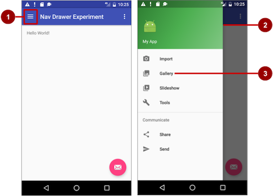
In the above figure:
- Navigation icon in the app bar
- Navigation drawer
- Navigation drawer menu item
To make a navigation drawer in your app, you need to do the following:
- Create the following layouts:
- A navigation drawer as the activity layout's root view.
- A navigation view for the drawer itself.
- An app bar layout that will include a navigation icon button.
- A content layout for the activity that displays the navigation drawer.
- A layout for the navigation drawer header.
- Populate the navigation drawer menu with item titles and icons.
- Set up the navigation drawer and item listeners in the activity code.
- Handle the navigation menu item selections.
To create a navigation drawer layout, use the DrawerLayout APIs available in the Support Library. For design specifications, follow the design principles for navigation drawers in the Navigation Drawer design guide.
To add a navigation drawer, use a DrawerLayout as the root view of your activity's layout. Inside the DrawerLayout, add one view that contains the main content for the screen (your primary layout when the drawer is hidden) and another view, typically a NavigationView, that contains the contents of the navigation drawer.
Tip: To make your layouts simpler to understand, use the include tag to include an XML layout within another XML layout. The figure below is a visual representation of the activity_main.xml layout and its included XML layouts:
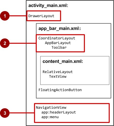
In the above figure:
- DrawerLayout is the root view of the activity's layout.
- The included
app_bar_mainuses a CoordinatorLayout as its root, and defines the app bar layout with a Toolbar which will include the navigation icon to open the drawer. - The NavigationView defines the navigation drawer layout and its header, and adds menu items to it.
Summary
- Add Up-button navigation to a child activity by declaring the activity's parent in the AndroidManifest.xml file.
- Set up tab navigation:
- Tabs are a good solution for "lateral navigation" between sibling views.
- The primary class used for tabs is TabLayout in the design support library.
- You should use the adapter pattern when populating tabs (pages) with data.
- A ViewPager is a layout manager that allows the user to flip left and right through pages of data.
- ViewPager is most often used in conjunction with fragments.
- There are two standard adapters for using ViewPager: FragmentPagerAdapter and FragmentStatePagerAdapter.
Related concept
The related concept documentation is in Android Developer Fundamentals: Concepts.
Learn more
- Android developer documentation:
- Android Developers Blog: Android Design Support Library
- Other
- AndroidHive: Android Material Design working with Tabs
- Truiton: Android Tabs Example – With Fragments and ViewPager
