4.1: Using Keyboards, Input Controls, Alerts, and Pickers
Contents:
- What you should already KNOW
- What you will LEARN
- What you will DO
- App overview
- Task 1: Experiment with text entry keyboard attributes
- Task 2: Change the keyboard type
- Task 3: Add a spinner input control for selecting a phone label
- Task 4: Use a dialog for an alert requiring a decision
- Task 5: Use a picker for user input
- Task 6: Use image views as buttons
- Task 7: Use radio buttons
- Coding challenge
- Summary
- Related concept
- Learn more
You can customize input methods to make entering data easier for users.
In this practical, you'll learn to:
- Use different on-screen keyboards and controls for user input.
- Show an alert message that users can interact with.
- Provide interface elements for selecting a time and date.
- Use images as buttons to launch an activity.
- Add radio buttons for the user to select one item from a set of items.
What you should already KNOW
For this practical you should be able to:
- Create an Android Studio project from a template and generating the main layout.
- Run apps on the emulator or a connected device.
- Make a copy of an app project, and renaming the app.
- Create and editing UI elements using the Layout Editor and XML code.
- Access UI elements from your code using
findViewById(). - Convert the text in a view to a string using
getText().toString(). - Handle a button click.
- Display a toast message.
- Start an activity with another app using an implicit intent.
- Use an adapter to connect your data to a view, such as the RecyclerView in a previous lesson.
What you will LEARN
In this practical, you will learn to:
- Change the input methods to enable spelling suggestions, auto-capitalization, and password obfuscation.
- Change the generic on-screen keyboard to a phone keypad or other specialized keyboards.
- Add a spinner input control to show a dropdown menu with values, from which the user can select one.
- Add an alert with OK and Cancel for a user decision.
- Use date and time pickers and recording the selections.
- Use images as buttons to launch an activity.
- Add radio buttons for the user to select one item from a set of items.
What you will DO
- Create new Android Studio projects to show keyboards, a spinner, an alert, and time and date pickers.
- Provide spelling suggestions when a user enters text, and automatically capitalize new sentences, by experimenting with the input method.
- Experiment with the input type attribute to change the on-screen keyboard to a special keyboard for entering email addresses, and then to a numeric keypad to force numeric entry.
- Add a spinner input control for the phone number field for selecting one value from a set of values.
- Create a new project with an alert dialog to notify the user to make a decision, such as OK or Cancel.
- Add the date picker and time picker to the new project, and use listeners to record the user's selection.
- Create a new project to use images as buttons.
- Create a second activity and add radio buttons for selecting an option.
- Set
onClickhandlers for the images used as buttons to launch a second activity.
App overview
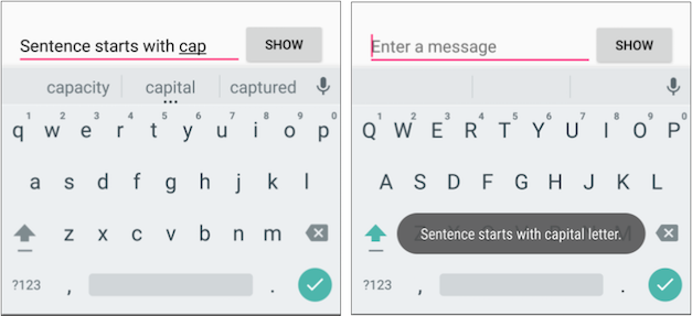
In this practical, you'll create and build a new app called Keyboard Samples for experimenting with the android:inputType attribute for the EditText UI element. You will change the keyboard so that it suggests spelling corrections and capitalizes each new sentence, as shown on the left side of the figure below. To keep the app simple, you'll display the entered text in a toast message, shown on the right side of the figure below.
You will also change the keyboard to one that offers the "@" symbol in a prominent location for entering email addresses, and to a phone keypad for entering phone numbers, as shown on the left side and in the center of the figure below. As a challenge, you will implement a listener for the action key in the keyboard in order to send an implicit intent to another app to dial the phone number.
You will then copy the app to create Phone Number Spinner that offers a spinner input control for selecting the label (Home, Work, Other, Custom) for the phone number, as shown on the right side of the figure below.
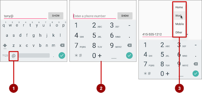
The figure above shows the following:
- The email keyboard with the "@" symbol in an easy-to-find location
- The phone keypad
- The spinner
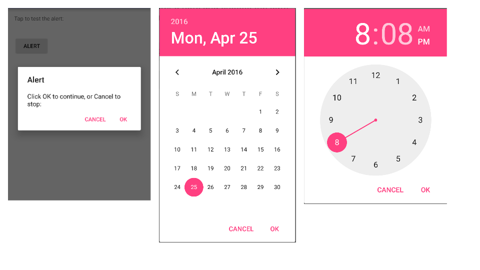
You'll also create Alert Sample to experiment with an alert dialog, shown on the left side of the figure below, and Date Time Pickers to experiment with a date picker and a time picker, shown in the center and on the right side of the figure below, and use the time and date selections in your app.
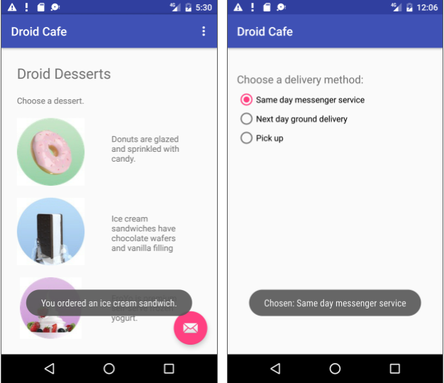
The last tasks involve creating an app from the Basic Activity template that lets a user tap image buttons to launch an activity, as shown on the left side of the figure below, and choose a single delivery option from radio-button choices for a food order, as shown on the right side of the figure below.
Task 1. Experiment with text entry keyboard attributes
Touching an EditText editable text field places the cursor in the text field and automatically displays the on-screen keyboard. You will change attributes of the text entry field so that the keyboard suggests spelling corrections while you type, and automatically starts each new sentence with capital letters. For example:
android:inputType="textCapSentences": Sets the keyboard to capital letters at the beginning of sentences.android:inputType="textAutoCorrect": Sets the keyboard to show automatic spelling corrections as you enter characters.android:inputType="textMultiLine": Enables the Return key on the keyboard to end lines and create new blank lines without closing the keyboard.android:inputType="textPassword": Sets the characters the user enters into dots to conceal the entered password.
1.1 Create the main layout and the showText method
You will add a Button, and change the TextView element to an EditText element so that the user can enter text. The app's layout will look like the following figure.
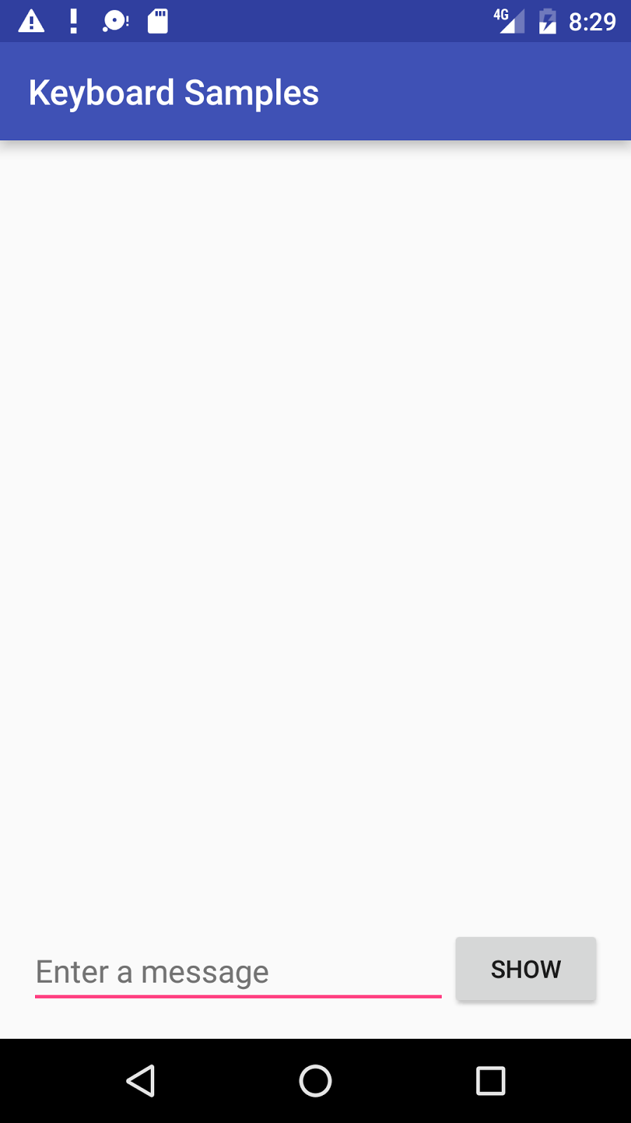
- Create a new project called Keyboard Samples, and choose the Empty Activity template.
- Open the activity_main.xml layout file. In the Layout Editor, click the Text tab at the bottom of the screen and change the root view group to RelativeLayout, as you've done in previous exercises.
- Add a Button above the existing TextView element with the following attributes:
Button attribute New value android:id "@+id/button_main" android:layout_width "wrap_content" android:layout_height "wrap_content" android:layout_alignParentBottom "true" android:layout_alignParentRight "true" android:onClick "showText" android:text "Show" Extract the string resource for the
android:textattribute value to create and entry for it in strings.xml: Place the cursor on "Show", press Alt-Enter (Option-Enter on the Mac), and select Extract string resources. Then change the Resource name for the string value to show.You extract string resources because it makes the app project more flexible for changing strings. The string resource assignments are stored in the strings.xml file (under app > res > values). You can edit this file to change the string assignments so that the app can be localized with a different language. For example, the "Show" value for the resource named
showcould be changed to "Montrer" for the French version of the app.- Change the existing TextView element as follows:
- Delete the
android:textattribute that specified "Hello World!". - If the TextView element includes any layout-constraint attributes, remove them.
- Change the TextView tag to an EditText tag, and make sure the ending tag is
/>. - Add or change the following attributes:
You learned about theEditText attribute TextView old value EditText new value android:id "@+id/editText_main" android:layout_width "wrap_content" "match_parent" android:layout_height "wrap_content" "wrap_content" android:layout_alignParentBottom "true" android:layout_toLeftOf "@id/button_main" android:hint "Enter a message" android:layout_toLeftOfandandroid:layout_alignParentBottomattributes in a previous lesson. These layout-related attributes work with the RelativeLayout view group to position child views relative to each other or to the parent. Theandroid:hintattribute sets the text to appear in the field that provides a hint for the user to provide input, such as "Enter a message"
- Delete the
Extract the string resource for the
android:hintattribute value "Enter a message" to the resource name enter. Depending on your version of Android Studio, your activity_main.xml layout file will look something like the following:<RelativeLayout xmlns:android="http://schemas.android.com/apk/res/android" xmlns:tools="http://schemas.android.com/tools" android:layout_width="match_parent" android:layout_height="match_parent" android:paddingBottom="@dimen/activity_vertical_margin" android:paddingLeft="@dimen/activity_horizontal_margin" android:paddingRight="@dimen/activity_horizontal_margin" android:paddingTop="@dimen/activity_vertical_margin" tools:context="com.example.android.keyboardsamples.MainActivity"> <Button android:id="@+id/button_main" android:layout_width="wrap_content" android:layout_height="wrap_content" android:layout_alignParentBottom="true" android:layout_alignParentRight="true" android:onClick="showText" android:text="@string/show" /> <EditText android:id="@+id/editText_main" android:layout_width="match_parent" android:layout_height="wrap_content" android:layout_alignParentBottom="true" android:layout_toLeftOf="@id/button_main" android:hint="@string/enter" /> </RelativeLayout>- Open MainActivity.java and enter the following
showTextmethod, which retrieves the information entered into the EditText element and shows it in a toast message:public void showText(View view) { EditText editText = (EditText) findViewById(R.id.editText_main); if (editText != null) { String showString = editText.getText().toString(); Toast.makeText(this, showString, Toast.LENGTH_SHORT).show(); } } - Open strings.xml (in app > res > values), and edit the
app_namevalue to "Keyboard Samples" (be sure to include a space between "Keyboard" and "Samples"). - Run the app and examine how the keyboard works.
Tapping the Show button shows the toast message of the text entry.
To close the on-screen keyboard, tap the down-pointing arrow in the bottom row of icons.
In the standard keyboard layout, a checkmark icon in a green circle, shown below, appears in the lower right corner of the keypad. This is known as the Return (or Enter) key, and it is used to enter a new line:
![]()
With the default attributes for the EditText element, tapping the Return key adds another line of text. In the next section, you will change the keyboard so that it capitalizes sentences as you type. As a result of setting the android:inputType attribute, the default attribute for the Return key changes to shift focus away from the EditText element and close the keyboard.
1.2 Set the keyboard to capitalize sentences
- Add the
android:inputTypeattribute to the EditText element using thetextCapSentencesvalue to set the keyboard to capital letters at the beginning of a sentence, so that users can automatically start a sentence with a capital letter:android:inputType="textCapSentences" - Run your app.
Capital letters will now appear on the keyboard at the beginning of sentences. When you tap the Return key on the keyboard, the keyboard closes and your text entry is finished. You can still tap the text entry field to add more text or edit the text. Tap Show to show the text in a toast message.
For details about the android:inputType attribute, see Specifying the Input Method Type.
1.3 Set the keyboard to hide a password when entering it
- Change the EditText element to use the
textPasswordvalue for theandroid:inputTypeattribute.android:inputType="textPassword" - Change the
android:hintto "Enter your password". - Run the app.
The characters the user enters turn into dots to conceal the entered password. For help, see Text Fields.
Solution code:
Android Project: KeyboardSamples
Task 2. Change the keyboard type
Every text field expects a certain type of text input, such as an email address, phone number, password, or just plain text. It's important to specify the input type for each text field in your app so that the system displays the appropriate soft input method, such as:
- The standard on-screen keyboard for plain text
- The keyboard for an email address which includes the "@" symbol in a prominent location
- The phone keypad for a phone number
2.1 Use an email keyboard
Modify the main activity's EditText element to show an email keyboard rather than a standard keyboard:
- In the EditText element in the activity_main.xml layout file, change the
android:inputTypeattribute to the following:android:inputType="textEmailAddress" - Change the
android:hintattribute to "Enter an email address". - Extract the string resource for the
android:hintvalue toenter_email. - Run the app. Tapping the field brings up the on-screen email keyboard with the "@" symbol located next to the space key.
2.2 Use a phone keypad
Modify the main activity's EditText element to show a phone keypad rather than a standard keyboard:
- In the EditText element in the activity_main.xml layout file, change the
android:inputTypeattribute to the following:android:inputType="phone" - Change the
android:hintattribute to "Enter a phone number". - Extract the string resource for the
android:hintvalue toenter_phone. - Run the app.
Tapping the field now brings up the on-screen phone keypad in place of the standard keyboard.
Task 3. Add a spinner input control for selecting a phone label
Input controls are the interactive components in your app's user interface. Android provides a wide variety of controls you can use in your UI, such as buttons, seek bars, checkboxes, zoom buttons, toggle buttons, spinners, and many more. (For more information about input controls, see Input Controls.)
A spinner provides a quick way to select one value from a set. Touching the spinner displays a drop-down list with all available values, from which the user can select one. If you are providing only two or three choices, you might want to use radio buttons for the choices if you have room in your layout for them; however, with more than three choices, a spinner works very well, scrolls as needed to display items, and takes up little room in your layout.
For more information about spinners, see Spinners.
To provide a way to select a label for a phone number (such as Home, Work, Mobile, and Other), you can add a spinner to the layout to appear right next to the phone number field.
3.1 Copy the KeyboardSamples project and modify the layout
Use the following figure as as a guide for the main activity's layout:
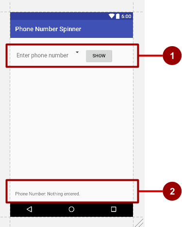
In the above figure:
- The first LinearLayout with an EditText view, a spinner icon, and the Show button.
- The second LinearLayout with two TextViews.
Follow these steps:
- Copy the KeyboardSamples project folder, rename it to PhoneNumberSpinner, and refactor it to populate the new name throughout the app project. (See the Appendix for instructions on copying a project.)
- After refactoring, change the
<string name="app_name">value in the strings.xml file (within app > res > values) to Phone Number Spinner (with spaces) as the app's name. - Open the activity_main.xml layout file.
Enclose the existing EditText and Button elements from the previous lesson within a LinearLayout with a horizontal orientation, placing the EditText element above the Button:
<LinearLayout android:layout_width="match_parent" android:layout_height="match_parent" android:layout_marginTop="@dimen/activity_vertical_margin" android:orientation="horizontal"> <EditText … <Button … </LinearLayout>- Make the following changes to the EditText and Button elements:
- Remove the following attributes from the EditText element:
android:layout_toLeftOfandroid:layout_alignParentBottom
- Remove the following attributes from the Button element:
android:layout_alignParentRightandroid:layout_alignParentBottom
- Change three other attributes of the EditText element as follows:
EditText attribute Value android:layout_width "wrap_content" android:inputType "phone" android:hint "Enter phone number"
- Remove the following attributes from the EditText element:
Add a Spinner element between the EditText element and the Button element:
<Spinner
   android:id="@+id/label_spinner"
   android:layout_width="wrap_content"
   android:layout_height="wrap_content">
</Spinner>
The Spinner element provides the drop-down list. In the next task you will add code that will fill the spinner list with values. The layout code for the EditText, Spinner, and Button elements within the LinearLayout should now look like this:
<LinearLayout
   android:layout_width="match_parent"
   android:layout_height="match_parent"
   android:layout_marginTop="@dimen/activity_vertical_margin"
   android:orientation="horizontal">

   <EditText
      android:id="@+id/editText_main"
      android:layout_width="wrap_content"
      android:layout_height="wrap_content"
      android:inputType="phone"
      android:hint="Enter phone number" />

   <Spinner
      android:id="@+id/label_spinner"
      android:layout_width="wrap_content"
      android:layout_height="wrap_content">
   </Spinner>

   <Button
      android:id="@+id/button_main"
      android:layout_width="wrap_content"
      android:layout_height="wrap_content"
      android:onClick="showText"
      android:text="Show" />

</LinearLayout>
Add another LinearLayout below the LinearLayout you just created, with a horizontal orientation to enclose two TextView elements side-by-side — a text description, and a text field to show the phone number and the phone label — and align the LinearLayout to the parent's bottom (refer to the figure above):
<LinearLayout android:layout_width="wrap_content" android:layout_height="wrap_content" android:orientation="horizontal" android:layout_alignParentBottom="true"> <TextView … <TextView … </LinearLayout>- Add the following TextView elements within the LinearLayout:
TextView attribute Value android:id "@+id/title_phonelabel" android:layout_width "wrap_content" android:layout_height "wrap_content" android:text "Phone Number: " TextView attribute Value android:id "@+id/text_phonelabel" android:layout_width "wrap_content" android:layout_height "wrap_content" android:text "Nothing entered." - Check your layout by clicking the Preview tab on the right side of the layout window.
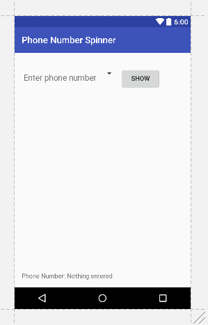 You should now have a screen (refer to the figure above) with the phone entry field at the top on the left, a skeletal spinner next to the field, and the Show button on the right. At the bottom should appear the text "Phone Number:" followed by "Nothing entered."
 - Extract your strings into string resources: Place the cursor on the hard-coded string, press Alt-Enter (Option-Enter on the Mac), and select Extract string resources. Then edit the Resource name for the string value. Extract as follows:
Element String String resource EditText "Enter phone number" "@string/hint_phonenumber" Button "Show" "@string/show_button" TextView "Phone Number: " "@string/phonenumber_label" TextView "Nothing entered." "@string/nothing_entered"
3.2 Add code to activate the spinner and its listener
The choices for this phone label spinner are well-defined static strings ("Home", "Work", etc), so you can use a text array defined in strings.xml to hold the values for it.
To activate the spinner and its listener, implement the AdapterView.OnItemSelectedListener interface, which requires also adding the onItemSelected() and onNothingSelected() callback methods.
- Open strings.xml to define the selectable values (Home, Work, Mobile, and Other) for the spinner as the string array
labels_array:<string-array name="labels_array"> <item>Home</item> <item>Work</item> <item>Mobile</item> <item>Other</item> </string-array> - To define the selection callback for the spinner, change your
MainActivityclass to implement theAdapterView.OnItemSelectedListenerinterface as shown:
As you type AdapterView. in the above statement, Android Studio automatically imports thepublic class MainActivity extends AppCompatActivity implements AdapterView.OnItemSelectedListener {AdapterViewwidget. The reason why you need theAdapterViewis because you need an adapter—specifically an ArrayAdapter—to assign the array to the spinner. An adapter connects your data—in this case, the array of spinner items—to the spinner view. You will learn more about this pattern of using an adapter to connect data in another lesson. This line should appear in your block of import statements:
After typing OnItemSelectedListener in the above statement, wait a few seconds for a red light bulb to appear in the left margin.import android.widget.AdapterView; Click the bulb and choose Implement methods. The
onItemSelected()andonNothingSelected()methods, which are required forOnItemSelectedListener, should already be highlighted, and the "Insert @Override" option should be checked. Click OK.This step automatically adds empty
onItemSelected()andonNothingSelected()callback methods to the bottom of theMainActivityclass. Both methods use the parameterAdapterView<?>. The<?>is a Java type wildcard, enabling the method to be flexible enough to accept any type ofAdapterViewas an argument.- Instantiate a spinner object in the
onCreate()method using the Spinner element in the layout (label_spinner), and set its listener (spinner.setOnItemSelectedListener) in theonCreate()method. Add the code to theonCreate()method:@Override protected void onCreate(Bundle savedInstanceState) { ... // Create the spinner. Spinner spinner = (Spinner) findViewById(R.id.label_spinner); if (spinner != null) { spinner.setOnItemSelectedListener(this); } ... - Continuing to edit the
onCreate()method, add a statement that creates the ArrayAdapter with the string array (labels_array) using the Android-supplied simple spinner layout for each item (layout.simple_spinner_item):
The... // Create ArrayAdapter using the string array and default spinner layout. ArrayAdapter<CharSequence> adapter = ArrayAdapter.createFromResource(this, R.array.labels_array, android.R.layout.simple_spinner_item); ...simple_spinner_itemlayout used in this step, and thesimple_spinner_dropdown_itemlayout used in the next step, are the default pre-defined layouts provided by Android in the R.layout class. You should use these layouts unless you want to define your own layouts for the items in the spinner and the spinner's appearance. - Specify the layout for the spinner's choices to be
simple_spinner_dropdown_item, and then apply the adapter to the spinner:... // Specify the layout to use when the list of choices appears. adapter.setDropDownViewResource (android.R.layout.simple_spinner_dropdown_item); // Apply the adapter to the spinner. if (spinner != null) { spinner.setAdapter(adapter); } ...
3.3 Add code to respond to the user's selections
When the user selects an item in the spinner, the Spinner object receives an on-item-selected event. To handle this event, you already implemented the AdapterView.OnItemSelectedListener interface in the previous step, adding empty onItemSelected() and onNothingSelected() callback methods.
In this step you will first declare mSpinnerLabel as the string to hold the selected item. You will then fill in the code for the onItemSelected() method to retrieve the selected item in the spinner, using getItemAtPosition(), and assign the item to mSpinnerLabel:
- Declare the
mSpinnerLabelstring at the beginning of theMainActivityclass definition:public class MainActivity extends AppCompatActivity implements AdapterView.OnItemSelectedListener { private String mSpinnerLabel = ""; ... } Add code to the empty
onItemSelected()callback method, as shown below, to retrieve the user's selected item usinggetItemAtPosition, and assign it tomSpinnerLabel. You can also add a call to theshowText()method you already added to the previous version of the app:public void onItemSelected(AdapterView<?> adapterView, View view, int i, long l) { mSpinnerLabel = adapterView.getItemAtPosition(i).toString(); showText(view); }Tip: By adding the
showText()method to the aboveonItemSelected()method, you have enabled the spinner selection listener to display the spinner choice along with the phone number, so that you no longer need the Show button that called theshowText()method.Add code to the empty
onNothingSelected()callback method, as shown below, to display a logcat message if nothing is selected:public void onNothingSelected(AdapterView<?> adapterView) { Log.d(TAG, "onNothingSelected: "); }The TAG in the above statement is in red because it hasn't been defined.
Extract the string resource for
"onNothingSelected: "tonothing_selected.Click TAG, click the red light bulb, and choose Create constant field 'TAG' from the pop-up menu. Android Studio adds the following under the
MainActivityclass declaration:
private static final String TAG = ;
- Add
MainActivity.class.getSimpleName()to use the simple name of the class for TAG:
private static final String TAG = MainActivity.class.getSimpleName();
- Change the
String showStringstatement in theshowTextmethod to show both the entered string and the selected spinner item (mSpinnerLabel):
String showString = (editText.getText().toString() + " - " + mSpinnerLabel);
- Run the app.
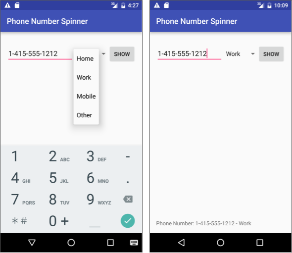
The spinner appears next to the phone entry field and shows the first choice (Home). Tapping the spinner reveals all the choices, as shown on the left side of the figure below. After entering a phone number and choosing a spinner item, a message appears at the bottom of the screen with the phone number and the selected spinner item, as shown on the right side of the figure below. (You can also tap the Show button to show both the phone number and the spinner item, but since this is redundant, you can now remove the Show button.)
Solution code:
Android Studio project: PhoneNumberSpinner
Task 4. Use a dialog for an alert requiring a decision
You can provide a dialog for an alert to require users to make a decision. A dialog is a window that appears on top of the display or fills the display, interrupting the flow of activity.
For example, an alert dialog might require the user to click Continue after reading it, or give the user a choice to agree with an action by clicking a positive button (such as OK or Accept), or to disagree by clicking a negative button (such as Cancel). In Android, you use the AlertDialog subclass of the Dialog class to show a standard dialog for an alert.
Tip: Use dialogs sparingly as they interrupt the user's work flow. Read the Dialogs design guide for best design practices, and Dialogs in the Android developer documentation for code examples.
In this practical, you will use a button to trigger a standard alert dialog. In a real world app, you might trigger an alert dialog based on some condition, or based on the user tapping something.
Android Studio project: AlertSample
4.1 Create a new project with a layout to show an alert dialog
In this exercise, you'll build an alert with OK and Cancel buttons, which will be triggered by the user clicking a button.
- Create a new project called Alert Sample based on the Empty Activity template.
- Open the activity_main.xml layout file. In the Layout Editor, click the Text tab at the bottom of the screen and change the root view group to RelativeLayout, as you've done in previous exercises.
- If the TextView element includes any layout-constraint attributes, remove them.
- Make the following changes to the TextView:
TextView attribute Value android:id "@+id/top_message" android:text "Tap to test the alert:" - Extract the
android:textstring above into the resourcetap_testto make it easier to translate. - Add a Button with the following attributes:
Button attribute Value android:id "@+button1" android:layout_width wrap_content android:layout_height wrap_content android:layout_below "@id/top_message" android:layout_marginTop "36dp" android:text "Alert" android:onClick "onClickShowAlert" - Extract the
android:textstring above into the resourcealert_buttonto make it easier to translate. - Extract the dimension value for
android:layout_marginTopthe same way: Place the cursor on"36dp", press Alt-Enter (Option-Enter on the Mac), and select Extract dimension resource. Then edit the Resource name for the value to button_top_margin.
The dimension resource assignments are stored in the dimens.xml file (under app > res > values > dimens). You can edit this file to change the assignments so that the app can be changed for different display sizes.
4.2 Add an alert dialog to the main activity
The builder design pattern makes it easy to create an object from a class that has a lot of required and optional attributes and would therefore require a lot of parameters to build. Without this pattern, you would have to create constructors for combinations of required and optional attributes; with this pattern, the code is easier to read and maintain. For more information about the builder design pattern, see Builder pattern.
The builder class is usually a static member class of the class it builds. You use AlertDialog.Builder to build a standard alert dialog, using setTitle to set its title, setMessage to set its message, and setPositiveButton and setNegativeButton to set its buttons.
To make the alert, you need to make an object of AlertDialog.Builder. You will add the onClickShowAlert() method, which makes this object as its first order of business.
onClickShowAlert() method. This occurs only if the onClickShowAlert() method is called, which is what happens when the user clicks the button. This means the app builds a new dialog only when the button is clicked, which is useful if the dialog is seen only rarely (when the user takes a certain path through the app). However, if the dialog appears often, you may want to build the dialog once in the onCreate() method, and then invoke the dialog in the onClickShowAlert() method.
Add the
onClickShowAlert()method toMainActivity.javaas follows:public void onClickShowAlert(View view) { AlertDialog.Builder myAlertBuilder = new AlertDialog.Builder(MainActivity.this);Note: If AlertDialog.Builder is not recognized as you enter it, click the red light bulb icon, and choose the support library version (android.support.v7.app.AlertDialog) for importing into your activity.Set the title and the message for the alert dialog inside
onClickShowAlert()after the code in the previous step:... // Set the dialog title. myAlertBuilder.setTitle("Alert"); // Set the dialog message. myAlertBuilder.setMessage("Click OK to continue, or Cancel to stop:"); ...- Extract the title and message into string resources. The previous lines of code should now be:
...
// Set the dialog title.
myAlertBuilder.setTitle(R.string.alert_title);
// Set the dialog message.
myAlertBuilder.setMessage(R.string.alert_message);
...
Add the OK button to the alert with
setPositiveButton()and usingonClickListener():... // Add the buttons. myAlertBuilder.setPositiveButton("OK", new DialogInterface.OnClickListener() { public void onClick(DialogInterface dialog, int which) { // User clicked OK button. Toast.makeText(getApplicationContext(), "Pressed OK", Toast.LENGTH_SHORT).show(); } }); ...You set the positive (OK) and negative (Cancel) buttons using the
setPositiveButton()andsetNegativeButton()methods. After the user taps the OK button in the alert, you can grab the user's selection and use it in your code. In this example, you display a toast message if the OK button is clicked.Extract the string resource for
"OK"and for"Pressed OK". The statement should now be:... // Add the buttons. myAlertBuilder.setPositiveButton(R.string.ok, new DialogInterface.OnClickListener() { public void onClick(DialogInterface dialog, int which) { // User clicked OK button. Toast.makeText(getApplicationContext(), R.string.pressed_ok, Toast.LENGTH_SHORT).show(); } }); ...- Add the Cancel button to the alert with
setNegativeButton()andonClickListener(), display a toast message if the button is clicked, and then cancel the dialog:... myAlertBuilder.setNegativeButton("Cancel", new DialogInterface.OnClickListener() { public void onClick(DialogInterface dialog, int which) { // User cancelled the dialog. Toast.makeText(getApplicationContext(), "Pressed Cancel", Toast.LENGTH_SHORT).show(); } }); ... - Extract the string resource for
"Cancel"and"Pressed Cancel". The statement should now be:... myAlertBuilder.setNegativeButton(R.string.cancel, new DialogInterface.OnClickListener() { public void onClick(DialogInterface dialog, int which) { // User cancelled the dialog. Toast.makeText(getApplicationContext(), R.string.pressed_cancel, Toast.LENGTH_SHORT).show(); } }); ... Add
show(), which creates and then displays the alert dialog, to the end ofonClickShowAlert():... // Create and show the AlertDialog. myAlertBuilder.show(); }Tip: To learn more about onClickListener and other listeners, see User Interface: Input Events.
Run the app.
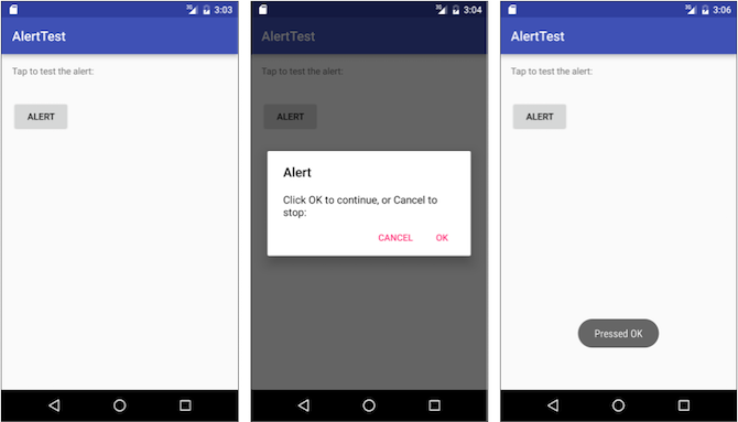
You should be able to tap the Alert button, shown on the left side of the figure below, to see the alert dialog, shown in the center of the figure below. The dialog shows OK and Cancel buttons, and a toast message appears showing which one you pressed, as shown on the right side of the figure below.
Solution code:
Android Studio project: AlertSample
Task 5. Use a picker for user input
Android provides ready-to-use dialogs, called pickers, for picking a time or a date. You can use them to ensure that your users pick a valid time or date that is formatted correctly and adjusted to the user's local time and date. Each picker provides controls for selecting each part of the time (hour, minute, AM/PM) or date (month, day, year). You can read all about setting up pickers in Pickers.
In this task you'll create a new project, and add the date picker and time picker. You will also learn how to use fragments. A fragment is a behavior or a portion of user interface within an activity. It's like a mini-activity within the main activity, with its own own lifecycle, and it's used for building a picker. All the work is done for you. To learn about fragments, see Fragments in the API Guide.
One benefit of using fragments for the pickers is that you can isolate the code sections for managing the date and the time for various locales that display date and time in different ways. The best practice to show a picker is to use an instance of DialogFragment, which is a subclass of Fragment. A DialogFragment displays a dialog window floating on top of its activity's window. In this exercise, you'll add a fragment for each picker dialog and use DialogFragment to manage the dialog lifecycle.
Tip: Another benefit of using fragments for the pickers is that you can implement different layout configurations, such as a basic dialog on handset-sized displays or an embedded part of a layout on large displays.
5.1 Create the main activity layout
To start this task, create the main activity layout to provide buttons to access the time and date pickers. Refer to the XML layout code below:
- Start a new project called Date Time Pickers using the Empty Activity template.
- Open activity_main.xml to edit the layout code.
- Change the layout to LinearLayout and add
android:orientation="vertical"to orient the layout vertically. Don't worry about the appearance of the layout yet. The goal is to use a layout that embeds a RelativeLayout within the LinearLayout: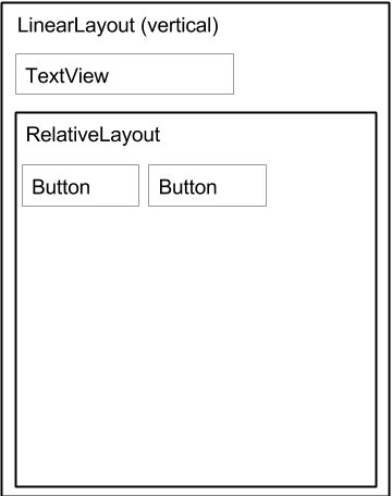
- Change the first TextView element's text to "Choose the date and time: " and extract the text to the string resource
choose_datetime.TextView attribute Old value New value android:text "Hello World" "@string/choose_datetime" - Add the
android:textSizeattribute and enter a text size of 20sp. Extract theandroid:textSizedimension totext_size.TextView attribute Old value New value android:textSize "@dimen/text_size" - Add a RelativeLayout child inside the LinearLayout to contain the Button elements, and accept the
"match parent"default width and height. - Add the first Button element within the RelativeLayout with the following attributes:
Don't worry that theFirst Button attribute Value android:layout_width "wrap_content" android:layout_height "wrap_content" android:id "@+id/button_date" android:layout_marginTop "12dp" android:text "Date" android:onClick "showDatePickerDialog" showDatePickerDialogreference is in red. The method hasn't been defined yet—you define it later. - Extract the string
"Date"into the string resourcedate_button. - Extract the dimension
"12dp"forandroid:layout_marginToptobutton_top_margin. - Add the second Button element inside the RelativeLayout child with the following attributes:
TheSecond Button attribute Value android:layout_width "wrap_content" android:layout_height "wrap_content" android:id "@+id/button_time" android:layout_marginTop "@dimen/button_top_margin" android:layout_alignBottom "@id/button_date" android:layout_toRightOf "@id/button_date" android:text "Time" android:onClick "showTimePickerDialog" showTimePickerDialogreference is in red. The method hasn't been defined yet — you define it later. - Extract the string
"Time"into the string resourcetime_button. - If you haven't already done so, click the Preview tab to show a preview of the layout. It should look like the code and figure below.
Solution code for the main layout:
Depending on your version of Android Studio, your code will look something like the following.
<?xml version="1.0" encoding="utf-8"?>
<LinearLayout xmlns:android="http://schemas.android.com/apk/res/android"
    xmlns:tools="http://schemas.android.com/tools"
    android:orientation="vertical"
    android:layout_width="match_parent"
    android:layout_height="match_parent"
    android:paddingBottom="@dimen/activity_vertical_margin"
    android:paddingLeft="@dimen/activity_horizontal_margin"
    android:paddingRight="@dimen/activity_horizontal_margin"
    android:paddingTop="@dimen/activity_vertical_margin"
    tools:context="com.example.android.DateTimePickers.MainActivity">

    <TextView
        android:layout_width="wrap_content"
        android:layout_height="wrap_content"
        android:textSize="@dimen/text_size"
        android:text="@string/choose_datetime"/>

    <RelativeLayout
        android:layout_width="match_parent"
        android:layout_height="match_parent">

        <Button
            android:layout_width="wrap_content"
            android:layout_height="wrap_content"
            android:id="@+id/button_date"
            android:layout_marginTop="@dimen/button_top_margin"
            android:text="@string/date_button"
            android:onClick="showDatePickerDialog"/>

        <Button
            android:layout_width="wrap_content"
            android:layout_height="wrap_content"
            android:id="@+id/button_time"
            android:layout_marginTop="@dimen/button_top_margin"
            android:layout_alignBottom="@id/button_date"
            android:layout_toRightOf="@id/button_date"
            android:text="@string/time_button"
            android:onClick="showTimePickerDialog"/>

    </RelativeLayout>
</LinearLayout>

5.2 Create a new fragment for the date picker
In this exercise, you'll add a fragment for the date picker. A fragment is like a mini-activity within the main activity, with its own own lifecycle.
- Expand app > java > com.example.android.DateTimePickers and select MainActivity.
- Choose File > New > Fragment > Fragment (Blank), and name the fragment DatePickerFragment. Uncheck all three checkbox options so that you do not create a layout XML, do not include fragment factory methods, and do not include interface callbacks. You don't need to create a layout for a standard picker. Click Finish to create the fragment.
- Open DatePickerFragment and edit the DatePickerFragment class definition to extend DialogFragment and implement
DatePickerDialog.OnDateSetListenerto create a standard date picker with a listener. See Picker for more information about extending DialogFragment for a date picker:
As you type DialogFragment and DatePickerDialog.OnDateSetListener, Android Studio automatically adds the following in thepublic class DatePickerFragment extends DialogFragment implements DatePickerDialog.OnDateSetListener {importblock at the top:
In addition, a red bulb icon appears in the left margin after a few seconds.import android.app.DatePickerDialog; import android.support.v4.app.DialogFragment; - Click the red bulb icon and choose Implement methods from the pop-up menu. A dialog appears with
onDateSet()already selected and the "Insert @Override" option checked. Click OK to create the emptyonDateSet()method. This method will be called when the user sets the date. After adding the emptyonDateSet()method, Android Studio automatically adds the following in theimportblock at the top:
Theimport android.widget.DatePicker;onDateSet()method's parameters should beint year,int month, andint dayOfMonth. Change thedayOfMonthparameter todayfor brevity:public void onDateSet(DatePicker view, int year, int month, int day) - Remove the empty public constructor for DatePickerFragment.
- Replace
onCreateView()withonCreateDialog()that returnsDialog, and annotateonCreateDialog()with@NonNullto indicate that the return valueDialogcan't be null—any attempt to refer to the return valueDialogmust be null-checked.@NonNull @Override public Dialog onCreateDialog(Bundle savedInstanceState) { ... } Add the following code to
onCreateDialog()to initialize theyear,month, anddayfromCalendar, and return the dialog and these values to the main activity. As you enterCalendar, specify the import to bejava.util.Calendar.@NonNull @Override public Dialog onCreateDialog(Bundle savedInstanceState) { // Use the current date as the default date in the picker. final Calendar c = Calendar.getInstance(); int year = c.get(Calendar.YEAR); int month = c.get(Calendar.MONTH); int day = c.get(Calendar.DAY_OF_MONTH); // Create a new instance of DatePickerDialog and return it. return new DatePickerDialog(getActivity(), this, year, month, day); }
Solution code for DatePickerFragment:
 public class DatePickerFragment extends DialogFragment
                 implements DatePickerDialog.OnDateSetListener {
  @NonNull
  @Override
  public Dialog onCreateDialog(Bundle savedInstanceState) {
     // Use the current date as the default date in the picker.
     final Calendar c = Calendar.getInstance();
     int year = c.get(Calendar.YEAR);
     int month = c.get(Calendar.MONTH);
     int day = c.get(Calendar.DAY_OF_MONTH);

     // Create a new instance of DatePickerDialog and return it.
     return new DatePickerDialog(getActivity(), this, year, month, day);
  }
public void onDateSet(DatePicker view, int year, int month, int day) {
// Do something with the date chosen by the user.
}
}
5.3 Create a new fragment for the time picker
Add a fragment to the DateTimePickers project for the time picker:
- Select MainActivity again.
- Choose File > New > Fragment > Fragment (Blank), and name the fragment TimePickerFragment. Uncheck all three options so you do not create a layout XML, do not include fragment factory methods, and do not include interface callbacks. Click Finish to create the fragment.
- Open TimePickerFragment and follow the same procedures as with DatePickerFragment, implementing the
onTimeSet()blank method, replacingonCreateView()withonCreateDialog(), and removing the empty public constructor for TimePickerFragment. TimePickerFragment performs the same tasks as the DatePickerFragment, but with time values:- It extends DialogFragment and implements
TimePickerDialog.OnTimeSetListenerto create a standard time picker with a listener. See Picker for more information about extending DialogFragment for a time picker. - It uses the
onCreateDialog()method to initialize thehourandminutefromCalendar, and returns the dialog and these values to the main activity using the 24-hour date format. As you enterCalendar, specify the import to bejava.util.Calendar. - It also defines the empty
onTimeSet()method for you to add code to use thehourOfDayandminutethe user selects. This method will be called when the user sets the time:public void onTimeSet(TimePicker view, int hourOfDay, int minute) { // Do something with the time chosen by the user. }
- It extends DialogFragment and implements
import android.support.v4.app.DialogFragment; import android.app.TimePickerDialog; import android.widget.TimePicker; import java.util.Calendar;
Solution code for TimePickerFragment:
public class TimePickerFragment extends DialogFragment
implements TimePickerDialog.OnTimeSetListener {
@NonNull
@Override
public Dialog onCreateDialog(Bundle savedInstanceState) {
// Use the current time as the default values for the picker.
final Calendar c = Calendar.getInstance();
int hour = c.get(Calendar.HOUR_OF_DAY);
int minute = c.get(Calendar.MINUTE);
// Create a new instance of TimePickerDialog and return it.
return new TimePickerDialog(getActivity(), this, hour, minute,
DateFormat.is24HourFormat(getActivity()));
}
public void onTimeSet(TimePicker view,
                       int hourOfDay, int minute) {
// Do something with the time chosen by the user.
}
}
5.4 Modify the main activity
While much of the code in the main activity stays the same, you need to add methods that create instances of FragmentManager to manage each fragment and show each picker.
- Create string resources in strings.xml:
<string name="date_picker">datePicker</string> <string name="time_picker">timePicker</string> - Open MainActivity.
Add the
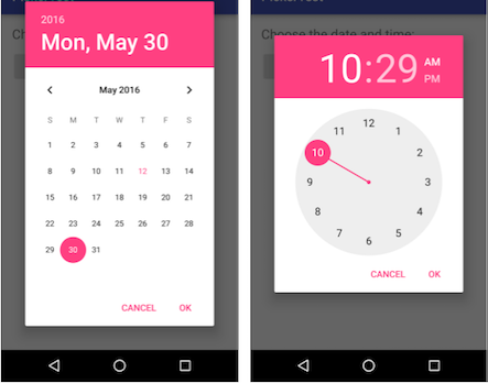
showDatePickerDialog()andshowTimePickerDialog()methods, referring to the code below. It creates an instance of FragmentManager to manage the fragment automatically, and to show the picker. For more information about fragments, see Fragments.public class MainActivity extends AppCompatActivity { @Override protected void onCreate(Bundle savedInstanceState) { super.onCreate(savedInstanceState); setContentView(R.layout.activity_main); } public void showDatePickerDialog(View v) { DialogFragment newFragment = new DatePickerFragment(); newFragment.show(getSupportFragmentManager(), getString(R.string.date_picker)); } public void showTimePickerDialog(View view) { DialogFragment newFragment = new TimePickerFragment(); newFragment.show(getSupportFragmentManager(), getString(R.string.time_picker)); } }- Run the app. You should see the date and time pickers after tapping the buttons.
5.5 Use the chosen date and time
In this exercise you'll pass the date and time back to MainActivity, and convert the date and time to strings that you can show in a toast message.
- Open MainActivity and add the
processDatePickerResult()method signature that takes theyear,month, anddayas arguments:public void processDatePickerResult(int year, int month, int day) { } - Add the following code to the
processDatePickerResult()method to convert themonth,day, andyearto separate strings:
Tip: TheString month_string = Integer.toString(month+1); String day_string = Integer.toString(day); String year_string = Integer.toString(year);monthinteger returned by the date picker starts counting at 0 for January, so you need to add 1 to it to start show months starting at 1. - Add the following after the above code to concatenate the three strings and include slash marks for the U.S. date format:
String dateMessage = (month_string + "/" + day_string + "/" + year_string); - Add the following after the above statement to display a toast message:
Toast.makeText(this, "Date: " + dateMessage, Toast.LENGTH_SHORT).show(); - Extract the hard-coded string
"Date: "into a string resource nameddate. This automatically replaces the hard-coded string withgetString(R.string.date). The code for theprocessDatePickerResult()method should now look like this:public void processDatePickerResult(int year, int month, int day) { String month_string = Integer.toString(month + 1); String day_string = Integer.toString(day); String year_string = Integer.toString(year); // Assign the concatenated strings to dateMessage. String dateMessage = (month_string + "/" + day_string + "/" + year_string); Toast.makeText(this, getString(R.string.date) + dateMessage, Toast.LENGTH_SHORT).show(); } - Open DatePickerFragment, and add the following to the
onDateSet()method to invoke theprocessDatePickerResult()method inMainActivityand pass it theyear,month, andday:
You usepublic void onDateSet(DatePicker view, int year, int month, int day) { // Set the activity to the Main Activity. MainActivity activity = (MainActivity) getActivity(); // Invoke Main Activity's processDatePickerResult() method. activity.processDatePickerResult(year, month, day); }getActivity()which, when used in a fragment, returns the activity the fragment is currently associated with. You need this because you can't call a method inMainActivitywithout the context ofMainActivity(you would have to use anintentinstead, as you learned in a previous lesson). The activity inherits the context, so you can use it as the context for calling the method (as inactivity.processDatePickerResult). - The TimePickerFragment uses the same logic. Open MainActivity and add the
processTimePickerResult()method signature that takes thehourOfDayandminuteas arguments:public void processTimePickerResult(int hourOfDay, int minute) { } - Add the following code to the
processTimePickerResult()method to convert thehourOfDayandminuteto separate strings:String hour_string = Integer.toString(hourOfDay); String minute_string = Integer.toString(minute); - Add the following after the above code to concatenate the strings and include a colon for the time format:
String timeMessage = (hour_string + ":" + minute_string); - Add the following after the above statement to display a toast message:
Toast.makeText(this, "Time: " + timeMessage, Toast.LENGTH_SHORT).show(); - Extract the hard-coded string
"Time: "into a string resource namedtime. This automatically replaces the hard-coded string withgetString(R.string.time). The code for theprocessDatePickerResult()method should now look like this:public void processTimePickerResult(int hourOfDay, int minute) { // Convert time elements into strings. String hour_string = Integer.toString(hourOfDay); String minute_string = Integer.toString(minute); // Assign the concatenated strings to timeMessage. String timeMessage = (hour_string + ":" + minute_string); Toast.makeText(this, getString(R.string.time) + timeMessage, Toast.LENGTH_SHORT).show(); } - Open TimePickerFragment and add the following to the
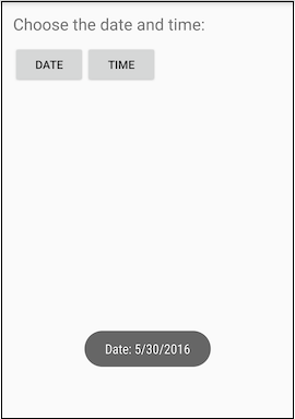
onTimeSet()method to invoke theprocessTimePickerResult()method inMainActivityand pass it thehourOfDayandminute:public void onTimeSet(TimePicker view, int hourOfDay, int minute) { // Set the activity to the Main Activity. MainActivity activity = (MainActivity) getActivity(); // Invoke Main Activity's processTimePickerResult() method. activity.processTimePickerResult(hourOfDay, minute); } - You can now run the app. After selecting the date or time, the date or time appears in a toast message at the bottom, as shown in the figure below.
Solution code:
Android Studio project: DateTimePickers
Task 6: Use image views as buttons
You can make a view clickable, as a button, by adding the android:onClick attribute in the XML layout. For example, you can make an image act like a button by adding android:onClick to the ImageView.
Tip: If you are using multiple images as clickable images, arrange them in a viewgroup so that they are grouped together.
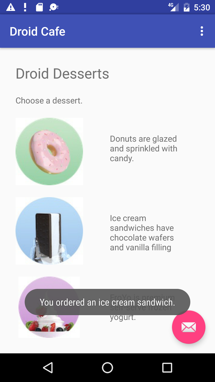
In this task you'll create a prototype of an app for ordering desserts from a café. After starting a new project based on the Basic Activity template, you'll modify the "Hello World" TextView with appropriate text, and add images to use for the "Add to order" buttons.
6.1 Start the new project
- Start a new Android Studio project with the app name Droid Cafe. Choose the Basic Activity template, accept the default settings, and click Finish. The project opens with two layouts in the res > layout folder: activity_main.xml, and content_main.xml.
- Open the content_main.xml layout file. In the Layout Editor, click the Text tab at the bottom of the screen and change the root view group to RelativeLayout, as you've done in previous exercises.
- Open content_main.xml. If the TextView element includes any layout-constraint attributes, remove them. Extract the
"Hello World"string in the TextView to use theintro_textresource name. - Open strings.xml and redefine the
intro_textresource to use more descriptive text, such as"Droid Desserts":<string id="intro_text">Droid Desserts</string> - Change the TextView in the layout to use a larger text size of
24spand padding of10dp, and add theandroid:idattribute with theidset totextintro. - Extract the dimension resource for the
android:paddingattribute to the resource namepadding_regular, and theandroid:textSizeattribute to the resource nametext_heading. You will use these resource names in subsequent steps. - Add another TextView under the
textintroTextView with the following attributes:TextView attribute Value android:layout_width "wrap_content" android:layout_height "wrap_content" android:padding "@dimen/padding_regular" android:id "@+id/choose_dessert" android:layout_below "@id/textintro" android:text "Choose a dessert." - Extract the string resource for the
android:textattribute to the resource namechoose_a_dessert.
6.2 Add the images
- The images named donut_circle.jpg, froyo_circle.jpg, and icecream_circle.jpg are provided with the starter apps in the 4_1_P_starter_images.zip file, which you can unzip on your computer. To copy the images to your project, follow these steps:
- Close your project.
- Copy the image files into your project's drawable folder. Find the drawable folder in a project by using this path: project_name > app > src > main > res > drawable
- Reopen your project.
- Open content_main.xml file again and add an ImageView for the donut image to the layout under the
choose_dessertview, using the following attributes:ImageView attribute for donut Value android:layout_width "wrap_content" android:layout_height "wrap_content" android:padding "@dimen/padding_regular" android:id "@+id/donut" android:layout_below "@id/choose_dessert" android:contentDescription "Donuts are glazed and sprinkled with candy." android:src "@drawable/donut_circle" - Extract the
android:contentDescriptionattribute value to the string resourcedonuts. You will use this string resource in the next step. - Add a TextView that will appear next to the donut image as a description, with the following attributes:
TextView attribute Value android:layout_width "wrap_content" android:layout_height "wrap_content" android:padding "35dp" android:layout_below "@+id/choose_dessert" android:layout_toRightOf "@id/donut" android:text "@string/donuts" - Extract the dimension resource for the
android:paddingattribute to the resource namepadding_wide. You will use this resource name in subsequent steps. - Add a second ImageView to the layout for the ice cream sandwich, using the following attributes:
ImageView attribute for ice_cream Value android:layout_width "wrap_content" android:layout_height "wrap_content" android:padding "@dimen/padding_regular" android:id "@+id/ice_cream" android:layout_below "@id/donut" android:contentDescription "Ice cream sandwiches have chocolate wafers and vanilla filling." android:src "@drawable/icecream_circle" - Extract the
android:contentDescriptionattribute value to the string resourceice_cream_sandwiches. - Add a TextView that will appear next to the ice cream sandwich as a description, with the following attributes:
TextView attribute Value android:layout_width "wrap_content" android:layout_height "wrap_content" android:padding "@dimen/padding_wide" android:layout_below "@+id/donut" android:layout_toRightOf "@id/ice_cream" android:text "@string/ice_cream_sandwiches" - Add a third ImageView to the layout for the froyo, using the following attributes:
ImageView attribute for ice_cream Value android:layout_width "wrap_content" android:layout_height "wrap_content" android:padding "@dimen/padding_regular" android:id "@+id/froyo" android:layout_below "@id/ice_cream" android:contentDescription "FroYo is premium self-serve frozen yogurt." android:src "@drawable/froyo_circle" - Extract the
android:contentDescriptionattribute value to the string resourcefroyo. - Add a TextView that will appear next to the froyo as a description, with the following attributes:
TextView attribute Value android:layout_width "wrap_content" android:layout_height "wrap_content" android:padding "@dimen/padding_wide" android:layout_below "@+id/ice_cream" android:layout_toRightOf "@id/froyo" android:text "@string/froyo"
6.3 Add onClick methods for the image views
You can add the android:onClick attribute to any View to make it clickable as a button. In this step you will add android:onClick to the images in the content_main.xml layout. You need to also add a method for the android:onClick attribute to call. The method, for this task, displays a toast message showing which image was tapped. (In a later task, you will modify the method to launch another activity called OrderActivity.)
- Add the following string resources to the strings.xml file for the strings to be shown in the toast message:
<string name="donut_order_message">You ordered a donut.</string> <string name="ice_cream_order_message">You ordered an ice cream sandwich.</string> <string name="froyo_order_message">You ordered a FroYo.</string> - Add the following
displayToast()method for displaying a toast message:public void displayToast(String message) { Toast.makeText(getApplicationContext(), message, Toast.LENGTH_SHORT).show(); } - Add the following
showFoodOrder()method to the end of MainActivity (before the closing bracket). For this task, use thedisplayToast()method to display a toast message:
Tip: The first four lines are a comment in the Javadoc format, which makes the code easier to understand and also helps generate documentation for your code if you use Javadoc. It is a best practice to add such a comment to every new method you create. For more information about how to write comments, see How to Write Doc Comments for the Javadoc Tool./** * Displays a toast message for the food order * and starts the OrderActivity activity. * @param message Message to display. */ public void showFoodOrder(String message) { displayToast(message); }
Although you could have added this method in any position within MainActivity, it is best practice to put your own methods below the methods already provided in MainActivity by the template.
Add the following methods to the end of MainActivity (you can add them before
showFoodOrder()):/** * Shows a message that the donut image was clicked. */ public void showDonutOrder(View view) { showFoodOrder(getString(R.string.donut_order_message)); } /** * Shows a message that the ice cream sandwich image was clicked. */ public void showIceCreamOrder(View view) { showFoodOrder(getString(R.string.ice_cream_order_message)); } /** * Shows a message that the froyo image was clicked. */ public void showFroyoOrder(View view) { showFoodOrder(getString(R.string.froyo_order_message)); }- Add the
android:onClickattribute to the three ImageViews in content_main.xml:<ImageView android:layout_width="wrap_content" android:layout_height="wrap_content" android:padding="10dp" android:id="@+id/donut" android:layout_below="@id/choose_dessert" android:contentDescription="@string/donut" android:src="@drawable/donut_circle" android:onClick="showDonutOrder"/> . . . <ImageView android:layout_width="wrap_content" android:layout_height="wrap_content" android:padding="10dp" android:id="@+id/ice_cream" android:layout_below="@id/donut" android:contentDescription="@string/ice_cream_sandwich" android:src="@drawable/icecream_circle" android:onClick="showIceCreamOrder"/> . . . <ImageView android:layout_width="wrap_content" android:layout_height="wrap_content" android:padding="10dp" android:id="@+id/froyo" android:layout_below="@id/ice_cream" android:contentDescription="@string/froyo" android:src="@drawable/froyo_circle" android:onClick="showFroyoOrder"/> Run the app.
Clicking the donut, ice cream sandwich, or froyo image displays a toast message about the order, as shown in the figure below.
Task 7: Use radio buttons
Radio buttons are input controls that are useful for selecting only one option from a set of options. You should use radio buttons if you want the user to see all available options side-by-side. If it's not necessary to show all options side-by-side, you may want to use a spinner instead.
Later in this practical you will add another activity and screen layout for setting the delivery options for a food order, and use radio buttons for the delivery choices.
For an overview and more sample code for radio buttons, see Radio Buttons.
7.1 Add another activity
As you learned in a previous lesson, an activity represents a single screen in your app in which your user can perform a single, focused task. You already have one activity, MainActivity.java. You will now add another activity for setting the delivery options for an order, and use an explicit intent to launch the second activity.
Right-click the com.example.android.droidcafe folder in the left column and choose New > Activity > Empty Activity. Edit the Activity Name to be OrderActivity, and the Layout Name to be activity_order. Leave the other options alone, and click Finish.
The OrderActivity class should now be listed under
MainActivityin the java folder, and activity_order.xml should now be listed in the layout folder. The Empty Activity template added these files.- Open the activity_order.xml layout file. In the Layout Editor, click the Text tab at the bottom of the screen and change the root view group to RelativeLayout, as you've done in previous exercises.
- Open MainActivity. Change the
showFoodOrder()method to make an explicit intent to start OrderActivity:public void showFoodOrder(String message) { displayToast(message); Intent intent = new Intent(this, OrderActivity.class); startActivity(intent); } - Run the app. Clicking an image button now launches the second activity, which is a blank screen. (The toast message appears briefly on the blank screen.)
7.2 Add the layout for radio buttons
To create each radio button option, you will create RadioButton elements in the activity_order.xml layout file, which is linked to OrderActivity. After editing the layout file, the layout for the radio buttons in OrderActivity will look something like the figure below, depending on your version of Android Studio.
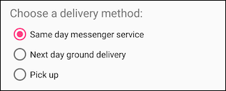
Since radio button selections are mutually exclusive, you will group them together inside a RadioGroup. By grouping them together, the Android system ensures that only one radio button can be selected at a time.
- Open activity_order.xml_ac and add a TextView element with the
idset toorder_intro_text:TextView attribute Value android:id "@+id/order_intro_text" android:layout_width "match_parent" android:layout_height "wrap_content" android:layout_marginTop "24dp" android:layout_marginBottom "6dp" android:textSize "18sp" android:text "Choose a delivery method:" - Extract the string resource for
"Choose a delivery method:"to bechoose_delivery_method. - Extract the dimension resources for the margin values:
"24dp"totext_margin_top"6dp"totext_margin_bottom"18sp"tointro_text_size- Add a RadioGroup to the layout underneath the TextView you just added:
<RadioGroup android:layout_width="match_parent" android:layout_height="wrap_content" android:orientation="vertical" android:layout_below="@id/order_intro_text"> </RadioGroup> - Add the following three RadioButton elements within the RadioGroup, using the following attributes. The
"onRadioButtonClicked"entry for theonClickattribute will be highlighted until you add that method in the next task.RadioButton #1 attribute Value android:id "@+id/sameday" android:layout_width "wrap_content" android:layout_height "wrap_content" android:text "Same day messenger service" android:onClick "onRadioButtonClicked" RadioButton #2 attribute Value android:id "@+id/nextday" android:layout_width "wrap_content" android:layout_height "wrap_content" android:text "Next day ground delivery" android:onClick "onRadioButtonClicked" RadioButton #3 attribute Value android:id "@+id/pickup" android:layout_width "wrap_content" android:layout_height "wrap_content" android:text "Pick up" android:onClick "onRadioButtonClicked" - Extract the three string resources for the
android:textattributes to the following names, so that the strings can be easily translated:same_day_messenger_servicenext_day_ground_deliverypick_up
7.3 Add the radio button click handler
The android:onClick attribute for each radio button element specifies the onRadioButtonClicked() method to handle the click event. Therefore, you need to add a new onRadioButtonClicked() method in the OrderActivity class.
Ordinarily your app would display some message regarding which type of delivery was chosen. You will accomplish this with a toast message by creating a method called displayToast() in OrderActivity.
In the onRadioButtonClicked() method you will use a switch case block to check if a radio button has been clicked. At the end of the switch case block, you will add a default statement that displays a log message if none of the radio buttons were checked.
- Open strings.xml and create the following string resources:
- A resource named
chosenfor the string"Chosen: "(include the space after the colon and the quotation marks). - A resource named nothing_clicked for the string "
onRadioButtonClicked: Nothing clicked."
- A resource named
- Open OrderActivity and add the following statement to define
TAG_ACTIVITYfor thelogmessage:private static final String TAG_ACTIVITY = OrderActivity.class.getSimpleName(); - Add the following
displayToastmethod to OrderActivity:public void displayToast(String message) { Toast.makeText(getApplicationContext(), message, Toast.LENGTH_SHORT).show(); } - Add the following
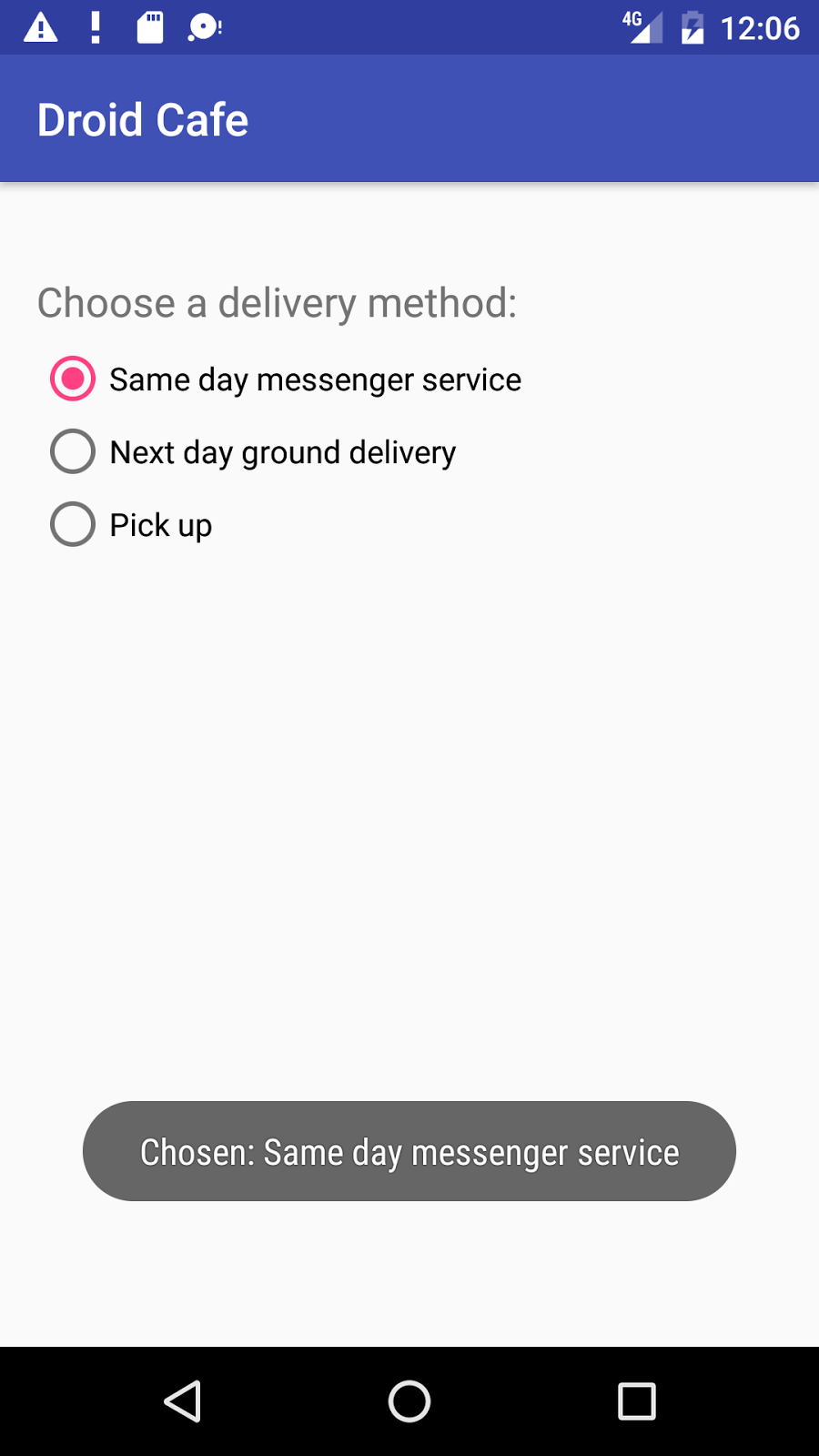
onRadioButtonClicked()method, which checks to see if a radio button has been checked, and uses aswitch caseblock to determine which radio button item was selected, in order to set the appropriatemessagefor that item to use withdisplayToast():public void onRadioButtonClicked(View view) { // Is the button now checked? boolean checked = ((RadioButton) view).isChecked(); // Check which radio button was clicked switch(view.getId()) { case R.id.sameday: if (checked) // Same day service displayToast(getString(R.string.chosen) + getString(R.string.same_day_messenger_service)); break; case R.id.nextday: if (checked) // Next day delivery displayToast(getString(R.string.chosen) + getString(R.string.next_day_ground_delivery)); break; case R.id.pickup: if (checked) // Pick up displayToast(getString(R.string.chosen) + getString(R.string.pick_up)); break; default: Log.d(TAG_ACTIVITY, getString(R.string.nothing_clicked)); break; } } - Run the app. Tap an image to see the OrderActivity activity, which shows the delivery choices. Tap a delivery choice, and you will see a toast message at the bottom of the screen with the choice, as shown in the figure below.
Solution code
Android Studio project: DroidCafe Part 1
Coding challenge
Challenge: You can also perform an action directly from the keyboard and replace the Return (Enter) key with a "send" key, such as for dialing a phone number:
![]()
For this challenge, use the android:imeOptions attribute for the EditText component with the actionSend value:
android:imeOptions="actionSend"
In the onCreate() method for this main activity, you can use setOnEditorActionListener() to set the listener for the EditText view to detect if the key is pressed:
EditText editText = (EditText) findViewById(R.id.editText_main);
if (editText != null)
   editText.setOnEditorActionListener(new TextView.OnEditorActionListener() {
      ...
   });
For help setting the listener, see "Specifying the Input Action" in Handling Keyboard Input and "Specifying Keyboard Actions" in Text Fields.
The next step is to override onEditorAction() and use the IME_ACTION_SEND constant in the EditorInfo class to respond to the pressed key. In the example below, the key is used to call the dialNumber() method to dial the phone number:
@Override
public boolean onEditorAction(TextView textView, int actionId, KeyEvent keyEvent) {
   boolean mHandled = false;
   if (actionId == EditorInfo.IME_ACTION_SEND) {
      dialNumber();
      mHandled = true;
   }
   return mHandled;
}
To finish the challenge, create the dialNumber() method, which uses an implicit intent with ACTION_DIAL to pass the phone number to another app that can dial the number. It should look like this:
private void dialNumber() {
   EditText editText = (EditText) findViewById(R.id.editText_main);
   String mPhoneNum = null;
   if (editText != null) mPhoneNum = "tel:" + editText.getText().toString();
   Log.d(TAG, "dialNumber: " + mPhoneNum);
   Intent intent = new Intent(Intent.ACTION_DIAL);
   intent.setData(Uri.parse(mPhoneNum));
   if (intent.resolveActivity(getPackageManager()) != null) {
      startActivity(intent);
   } else {
       Log.d("ImplicitIntents", "Can't handle this!");
   }
}
Summary
In this practical, you learned how to:
- Set up XML layout attributes to control the keyboard for an EditText element:
- Use the
textAutoCorrectvalue for theandroid:inputTypeattribute to change the keyboard so that it suggests spelling corrections. - Use the
textCapSentencesvalue for theandroid:inputTypeattribute to start each new sentence with a capital letter. - Use the
textPasswordvalue for theandroid:inputTypeattribute to hide a password when entering it. - Use the
textEmailAddressvalue for theandroid:inputTypeattribute to show an email keyboard rather than a standard keyboard. - Use the
phonevalue for theandroid:inputTypeattribute to show a phone keypad rather than a standard keyboard. - Challenge: Use the
android:imeOptionsattribute with theactionSendvalue to perform an action directly from the keyboard and replace the Return key with an action key, such as an implicit intent to another app to dial a phone number.
- Use the
- Use a Spinner input control to provide a drop-down menu, and write code to control it:
- Use an ArrayAdapter to assign an array of text values as the spinner menu items.
- Implement the
AdapterView.OnItemSelectedListenerinterface, which requires also adding theonItemSelected()andonNothingSelected()callback methods to activate the spinner and its listener. - Use the
onItemSelected()callback method to retrieve the selected item in the spinner menu usinggetItemAtPosition.
- Use
AlertDialog.Builder, a subclass of AlertDialog, to build a standard alert dialog, usingsetTitleto set its title,setMessageto set its message, andsetPositiveButtonandsetNegativeButtonto set its buttons. - Use the standard date and time pickers:
- Add a fragment for a date picker, and extend the DialogFragment class to implement
DatePickerDialog.OnDateSetListenerfor a standard date picker with a listener. - Add a fragment for a time picker, and extend the DialogFragment class to implement
TimePickerDialog.OnTimeSetListenerfor a standard time picker with a listener. - Implement the
onDateSet(),onTimeSet(), andonCreateDialog()methods. - Use the
onFinishDateDialog()andonFinishTimeDialog()methods to retrieve the selected date and time.
- Add a fragment for a date picker, and extend the DialogFragment class to implement
- Use images in a project:
- Copy an image into the project, and define an ImageView element to use it.
- Add the
android:onClickattribute to make the ImageView elements clickable like buttons. You can make any View clickable with theandroid:onClickattribute.
- Use radio buttons:
- Create a second activity.
- Add RadioButton elements within a RadioGroup in the second activity.
- Create radio button handlers.
- Launch the second activity from an image click.
Related concept
The related concept documentation is in Android Developer Fundamentals: Concepts.
Learn more
- Android API Guide, "Develop" section:
- Specifying the Input Method Type
- Text Fields
- Input Controls
- Spinners
- Dialogs
- Fragments
- Input Events
- Pickers
- DateFormat
- ImageView
- Radio Buttons (User Interface section)
- Material Design Specification:
