5.3: Supporting Landscape, Multiple Screen Sizes and Localization
Contents:
- What you should already KNOW
- What you will LEARN
- What you will DO
- App overview
- Task 1: Support Landscape Orientation
- Task 2: Support Tablets
- Task 3: Localize your App
- Coding challenges
- Summary
- Related concept
- Learn more
After using the Material Me! application you created in the last practical, you may notice that it is not optimized for use when the orientation for the device is rotated from portrait mode to landscape mode. Likewise, if you are testing on a tablet, the font-sizes are too small and the space is not used efficiently. The Android framework has a way to solve both of these issues. Resource qualifiers allow the Android Runtime to use alternate resource files (.xml) depending on the device configuration, such as, the orientation, the locale and other "qualifiers". For a full list of available qualifiers, visit the Providing Resources guide. In this practical you will optimize the use of space in the Material sports app so that your app works well in landscape mode, as well as on a tablet.
What you should already KNOW
From the previous chapters you should be able to:
- Locate and edit resource files.
- Extract resources.
- Instantiate a virtual phone or tablet using the emulator.
What you will LEARN
In this practical, you will learn to:
- Provide alternate resources for landscape mode.
- Provide alternate resources for tablets.
- Provide alternate resources for different locales.
What you will DO
In this practical you will:
- Update the Material Me! application for better use of space in landscape mode.
- Add an alternative layout for tablets.
- Localize the content of your app.
App Overview
The improved Material Me! application will include improved layouts when used in landscape mode, on a tablet, and offer localized content for users outside of the US.


This practical builds on the "Material Me!" app from the previous practical.
- Continue on your version of the "Material Me!" application, or download it here.
Task 1: Support Landscape Orientation
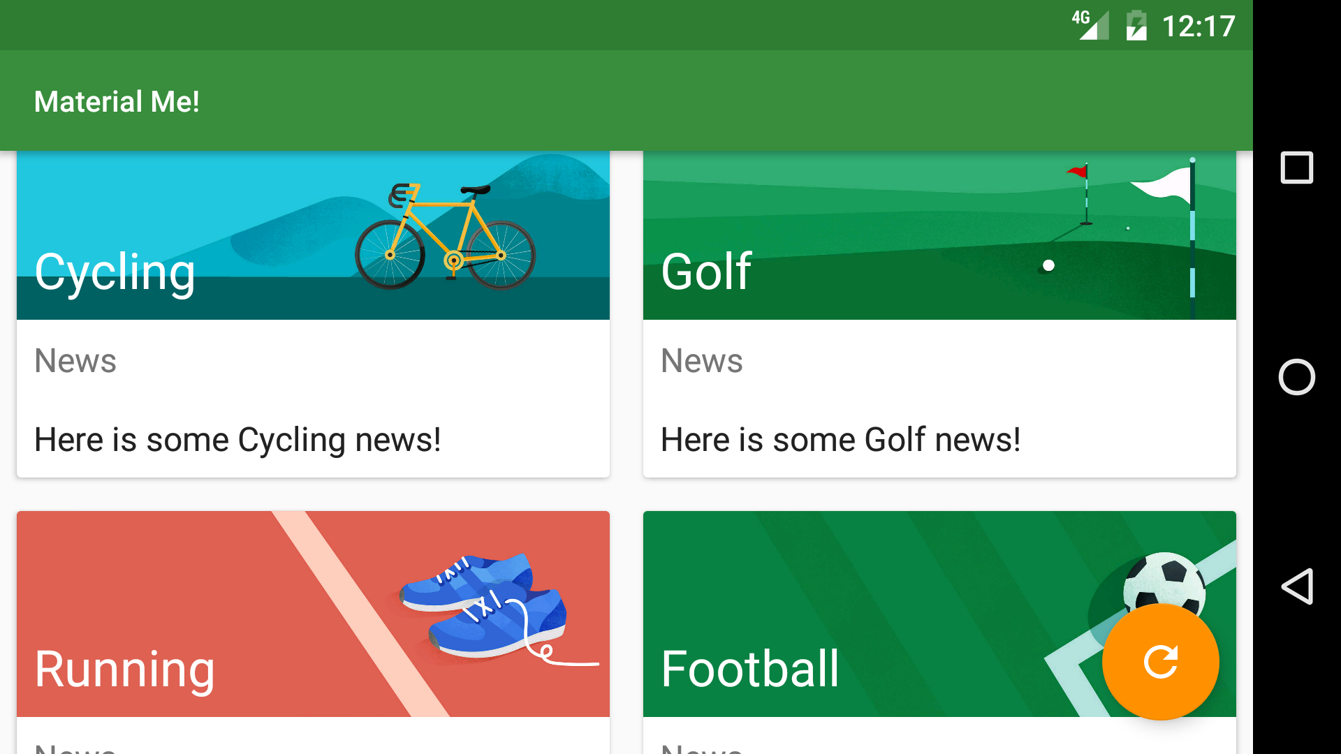
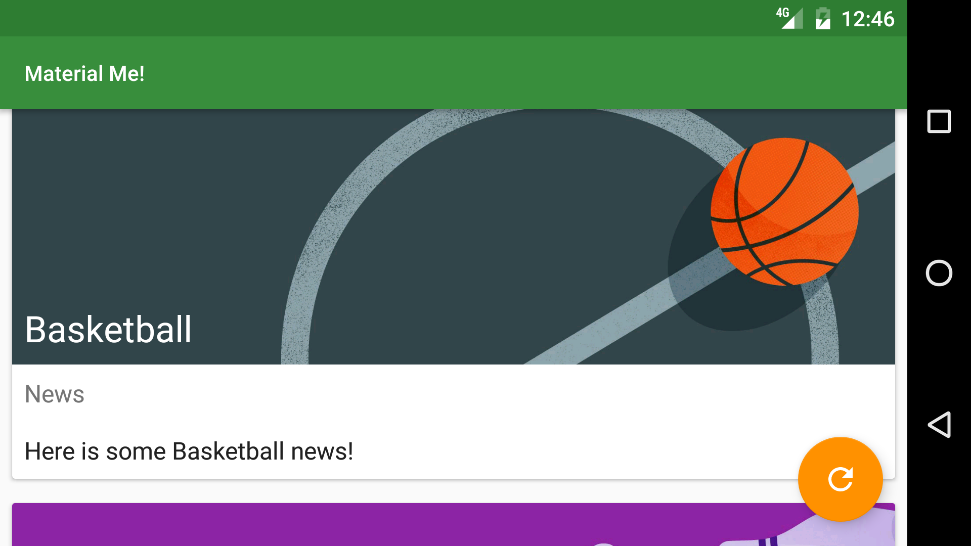
You may recall that when the user changes the orientation of the device, the Android framework destroys and recreates the current activity. The new orientation often has different layout requirements than the original one. For example, the Material Me! application looks good in portrait mode, but does not make optimal use of the screen in landscape mode. With the larger width in landscape mode, the image in each list item overwhelms the text providing a poor user experience.

In this task, you will create an alternative resource file that will change the appearance of the app when it is used in landscape orientation.
1.1 Change to a GridLayoutManager
Layouts that contain list items often look unbalanced in landscape mode when the list items include full-width images. One good solution is to use a grid, instead of a linear list when displaying the CardViews in landscape mode. Recall that the items in a RecyclerView list are placed using a LayoutManager; until now, you have been using the LinearLayoutManager which lays out each item in a vertical or horizontal scrolling list. GridLayoutManager is another layout manager that displays items in a grid, rather than a list. When you create a GridLayoutManager, you supply two parameters: the application context, and an integer representing the number of columns. You can change the number of columns programmatically, which gives you flexibility in designing responsive layouts. In this case, the number of columns integer should be 1 in portrait orientation (single column) and 2 when in landscape mode. Notice when the number of columns is 1, a GridLayoutManager behaves similar to a LinearLayoutManager.
- Create a new resources file called integers.xml. Navigate to your resources directory, right-click on the values directory name and select New > Values resource file.
- Name the file integers.xml and click OK.
- Create an integer constant between the
<resources>tags called "grid_column_count" and set it equal to 1:<integer name="grid_column_count">1</integer> Create another values resource file, again called integers.xml but with different characteristics.
Note the "Available qualifiers" option in the dialog for creating the resource file. These characteristics are called "resource qualifiers" and are used to label resource configurations for various situations.
- Select Orientation, and press the >> symbol in the middle of the dialog to access this qualifier.
- Change the Screen orientation selector to Landscape, and notice how the directory name "values-land" is automatically changed. This is the essence of resource qualifiers: the directory name tells Android when to use that specific layout file. In this case, that is when the phone is rotated to landscape mode.
- Click OK to generate the new layout file.
- Copy the integer constant you created into this new resource file, but change the value to 2.
You should now have two individual integers.xml files. In the "Android" project view in Android Studio, these should be grouped into an "integers.xml" folder, with each file inside labeled with the qualifier you selected ("land" in this case).
1.2 Modify MainActivity
In
onCreate()in MainActivity, get the integer from the integers.xml resource file:int gridColumnCount = getResources().getInteger(R.integer.grid_column_count);The Android Runtime will take care of deciding which integers.xml file to use, depending on the state of the device.
- Change the LinearLayoutManager to a GridLayoutManager, passing in the context and the newly created integer:
mRecyclerView.setLayoutManager(new GridLayoutManager(this, gridColumnCount)); - Run the app and rotate the device. The number of columns changes automatically with the orientation of the device.
When using the application in landscape mode, you will notice that the swipe to dismiss functionality is no longer intuitive, since the items are now in a grid and not a list. You can use the gridColumnCount variable to disable the swipe action when there is more than one column:
int swipeDirs;
if(gridColumnCount > 1){
   swipeDirs = 0;
} else {
   swipeDirs = ItemTouchHelper.LEFT | ItemTouchHelper.RIGHT;
}
ItemTouchHelper helper = new ItemTouchHelper(new ItemTouchHelper.SimpleCallback
       (ItemTouchHelper.LEFT | ItemTouchHelper.RIGHT | ItemTouchHelper.DOWN
               | ItemTouchHelper.UP, swipeDirs)
Task 2 : Support Tablets
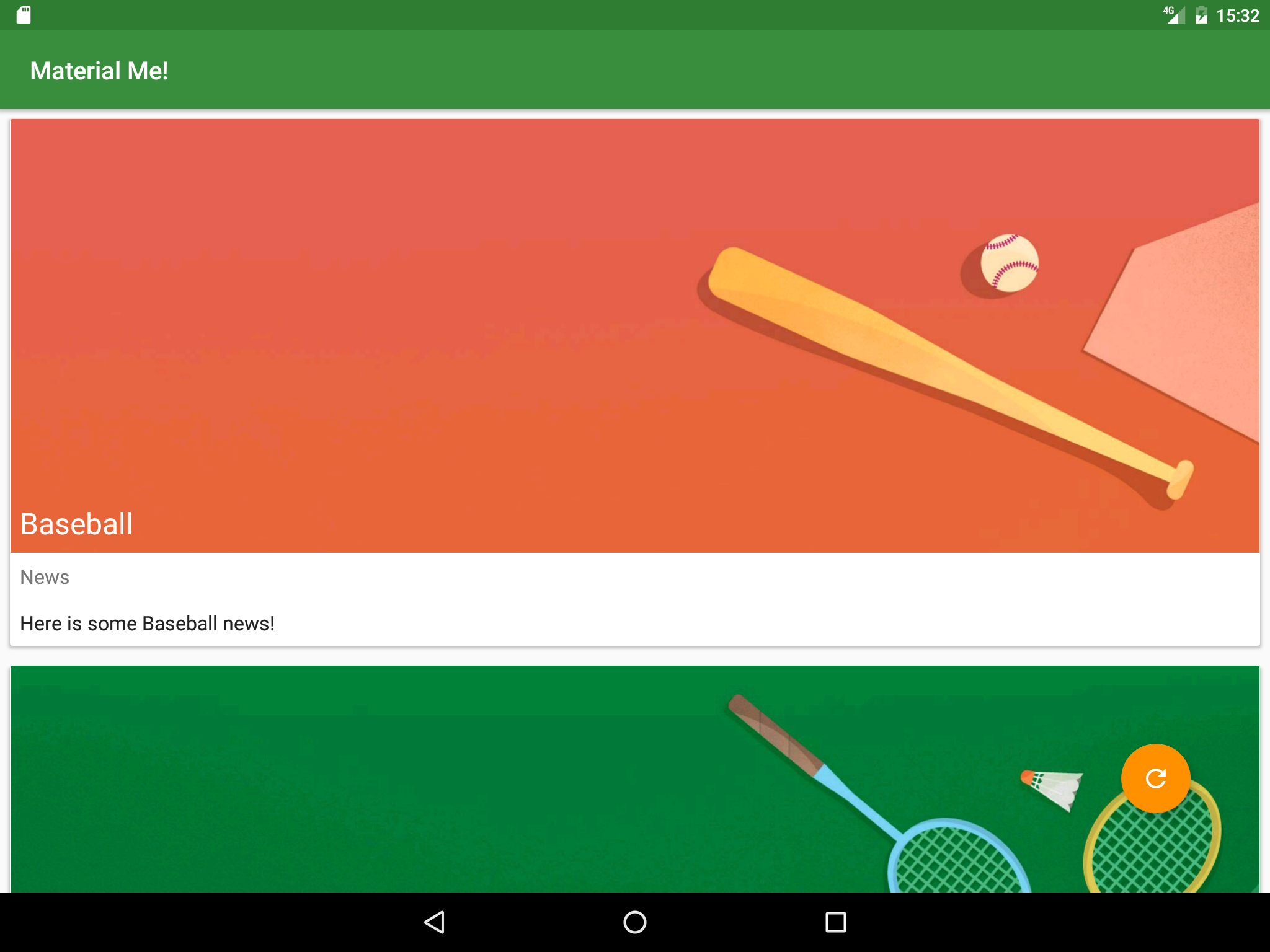
Although you have modified the app to look better in landscape mode, running it on a tablet with physically larger dimensions results in all the text appearing too small. Also when the device is in landscape orientation, the screen is not used efficiently; 3 columns would be more appropriate for a tablet-sized screen in landscape mode. In this task, you will add additional resource qualifiers to change the appearance of the app when used on tablets.

2.1 Make the Layout Adapt to Tablets
In this step, you will create different resource qualifiers to maximize screen use for tablet sized devices, increasing the column count to 2 for portrait orientation and 3 for landscape orientation. The resource qualifier you need depends on your specific requirements. There are several qualifiers that you can use to select the correct conditions:
- "smallest width" - This qualifier is used most frequently to select for tablets. It is defined by the smallest width of the device (regardless of orientation), which removes the ambiguity when talking about "height" and "width" since some devices are traditionally held in landscape mode, and others in portrait. Anything with a smallest width of at least 600dp is considered a tablet.
- "available width" - The available width is the effective width of the device, regardless of the orientation. The available width changes when the device is rotated, since the effective height and width of the device are switched.
- "available height" - Same as "available width", except it uses the effective height instead of the effective width.
To start this task:
- Create an integers.xml file which uses the "smallest width" qualifier with the value set to 600. Android uses this file whenever the app runs on a tablet.
- Copy the code from the integers.xml file with the landscape resource qualifier (it has a grid count of 2) and paste it in the new integers.xml file.
Create a third integers.xml file that includes both the smallest screen width of 600dp qualifier, and the landscape orientation qualifier. Android uses this file when the app runs on a tablet in landscape mode.
Note: Android will look for the resource file with the most specific resource qualifier first, then move on to a more generic one. For example, if a value is defined in the integers.xml file with both the landscape and smallest width qualifier, it will override the value in the integers.xml file with just the landscape qualifier. For more information about resource qualifiers, visit the Providing Resources Guide.Change the grid_column_count variable to 3 in the landscape, tablet integers.xml file.
- Create a virtual tablet emulator. Run the app on a tablet emulator as well as a phone emulator and rotate both of the devices into landscape mode. With these resource qualifier files, the app uses the screen real estate much more effectively.
2.2 Update the tablet list item styles
At this point, your app changes the number of columns in a GridLayoutManager to fit the orientation of the device and maximize the use of the screen. However, all the TextViews that appeared correctly-sized on a phone's screen now appear too small for the larger screen of a tablet. To fix this, you will extract the TextAppearance styles from the layout resource files into the styles resource file. You will also create additional styles.xml files for tablets using resource qualifiers.
Create the Styles
- In the styles.xml file, create the following styles:
Name Parent SportsTitle TextAppearance.AppCompat.Headline SportsDetailText TextAppearance.AppCompat.Subhead
Create a styles.xml file for tablets
Now you will create the file where you will define styles for tablets.
- Create a new styles.xml resource file that uses the Smallest Screen Width qualifier with a value of 600.
- Copy the "SportsTitle" and "SportsDetailText" styles from the original styles.xml file into the new, qualified styles.xml file.
- Change the parent of the "SportsTitle" style to
"TextAppearance.AppCompat.Display1" The Android pre-defined
Display1style uses the textColorSecondary value from the current theme (ThemeOverlay.AppCompat.Dark), which in this case is a light gray color. The light gray color does not show up well on the banner images in your app. To correct this add an"android:textColor"attribute to the "SportsTitle" style and set it to"?android:textColorPrimary".'Note: The question mark tells Android Runtime to find the value in the theme applied to the View. In this example the theme isThemeOverlay.AppCompat.Darkin which thetextColorPrimaryattribute is white.Change the parent of "SportsDetailText" style to
"TextAppearance.AppCompat.Headline".
Update the style of the text views in list_item.xml
- Back in the list_item.xml file, change the style attribute of the "title" Textview to
"@style/SportsDetailTitle" - Change the style attribute of the "newsTitle" and "subTitle" TextViews to
"@style/SportsDetailText". - Run your app. Each list item now has a larger text size on the tablet.
2.3 Update the tablet sports detail styles
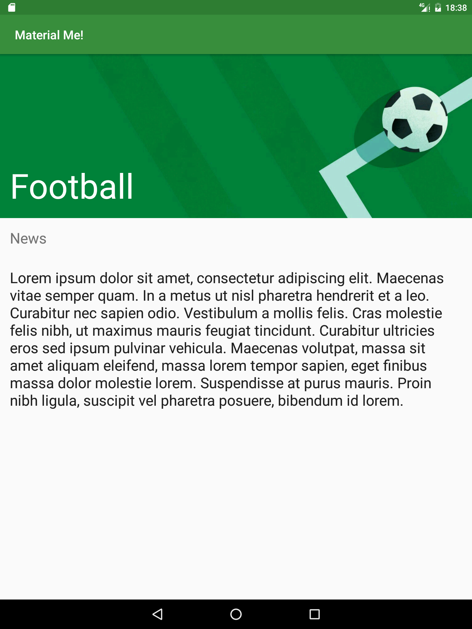
You have now fixed the display for the MainActivity, which lists all the Sports CardViews. The DetailActivity still has the same font sizes on tablets and phones.
- Create the following style in each styles.xml file:
styles.xml (sw600dp) Name Parent SportsDetailTitle TextAppearance.AppCompat.Display3 styles.xml (not qualified) Name Parent SportsDetailTitle TextAppearance.AppCompat.Headline - Change the style of both the "newsTitleDetail" and "subTitleDetail" TextViews in the activity_detail.xml layout file to the "SportsDetailText" style you created in the previous step.
- Run your app. All of the text is now larger on the tablet, which greatly improves the user experience of your application.
Task 3: Localize your App
A "locale" represents a specific geographic, political or cultural region of the world. Resource qualifiers can be used to provide alternate resources based on the users' locale. Just as for orientation and screen width, Android provides the ability to include separate resource files for different locales. In this step, you will modify your strings.xml file to be a little more international.
3.1 Add a localized strings.xml file
You may have noticed that the sports information contained in this app is designed for users from the US. It uses the term "soccer" to represent a sport known as "football" everywhere else in the world. In order to make your app more internationalized, you can provide a locale specific strings.xml file to the US users which uses "soccer", while all other locales will use "football".
- Create a new values resource file.
- Call the file strings.xml and select Locale from the list of available qualifiers.
- In the "Language:" section, select en: English.
- In the "Specific Region Only:" section, select US: United States. This will create a specific values directory for the US locale, called "values-en-rUS".
- Copy the entirety of the generic strings.xml file to the new locale specific strings.xml file.
- In the generic strings.xml file, change the "Soccer" item in the sports_titles array to "Football", as well as changing the relevant item in "sports_info" array.
- Run the app. Depending on the language setting on your device, you will see either "Soccer" or "Football".Note: To change the locale setting on your device, go to the device settings, then choose Language & input and change the Language setting. If you pick English (United States) the app will have "Soccer" as the string, otherwise it will say "Football".
Solution code
Android Studio project: MaterialMe-Resource
Coding challenges
Challenge 1: It turns out that several countries other than the US use "soccer" instead of "football". Research these countries and add localized strings resources for them.
Challenge 2: Use the localization techniques you learned in Task 3 in combination with Google translate to translate all of the strings in your app into a different language.
Summary
- GridLayoutManager is a layout manager that handles 2-dimensional scrolling lists.
- You can dynamically change the number of columns in a GridLayoutManager.
- The Android Runtime uses alternative configuration files for various runtime environments such as device layout, screen dimensions, locale, country, keyboard, etc.
- Alternative resources are located in files named with resource qualifiers as part of their names.
- The format for these directories is
<resources_name>-<qualifier>. - Any file in your "res" directory can be qualified this way.
- Some common qualifiers are:
- orientation: land, portrait
- smallest width: sw600dp
- locale: en-rGB, fr
- screen density: ldpi, mpdi, xhdpi, xxhdpi, xxxhdpi
- mobile country code: mcc310 (US), mcc208 (France)
- and more!
Related concepts
The related concept documentation is in Android Developer Fundamentals: Concepts.
Learn more
Developer Documentation:
