1.2: Layouts and resources for the UI
Contents:
- Views
- The layout editor
- Editing XML directly
- Resource files
- Responding to View clicks
- Related practicals
- Learn more
This chapter describes the screen's user interface (UI) layout and other resources you create for your app, and the code you would use to respond to a user's tap of a UI element.
Views
The UI consists of a hierarchy of objects called views — every element of the screen is a View. The View class represents the basic building block for all UI components, and the base class for classes that provide interactive UI components such as buttons, checkboxes, and text entry fields.
A View has a location, expressed as a pair of left and top coordinates, and two dimensions, expressed as a width and a height. The unit for location and dimensions is the density-independent pixel (dp).
The Android system provides hundreds of predefined View subclasses. Commonly used View subclasses described over several lessons include:
TextViewfor displaying textEditTextto enable the user to enter and edit textButtonand other clickable elements (such asRadioButton,CheckBox, andSpinner) to provide interactive behaviorScrollViewandRecyclerViewto display scrollable itemsImageViewfor displaying imagesConstraintLayoutandLinearLayoutfor containing other views and positioning them
You can define a View to appear on the screen and respond to a user tap. A View can also be defined to accept text input, or to be invisible until needed.
You can specify View elements in layout resource files. Layout resources are written in XML and listed within the layout folder in the res folder in the Project > Android pane.
ViewGroup groups
View elements can be grouped inside a ViewGroup, which acts as a container. The relationship is parent-child, in which the parent is a ViewGroup, and the child is a View or another ViewGroup. The following are commonly used ViewGroup groups:
ConstraintLayout: A group that places UI elements (childViewelements) using constraint connections to other elements and to the layout edges (parentView).ScrollView: A group that contains one other childViewelement and enables scrolling the childViewelement.RecyclerView: A group that contains a list of otherViewelements orViewGroupgroups and enables scrolling them by adding and removingViewelements dynamically from the screen.
Layout ViewGroup groups
The View elements for a screen are organized in a hierarchy. At the root of this hierarchy is a ViewGroup that contains the layout of the entire screen. The ViewGroup can contain child View elements or other ViewGroup groups as shown in the following figure.

In the figure above:
- The root
ViewGroup. - The first set of child
Viewelements andViewGroupgroups whose parent is the root.
Some ViewGroup groups are designated as layouts because they organize child View elements in a specific way and are typically used as the root ViewGroup. Some examples of layouts are:
ConstraintLayout: A group of childViewelements using constraints, edges, and guidelines to control how the elements are positioned relative to other elements in the layout.ConstraintLayoutwas designed to make it easy to click and dragViewelements in the layout editor.LinearLayout: A group of childViewelements positioned and aligned horizontally or vertically.RelativeLayout: A group of childViewelements in which each element is positioned and aligned relative to other elements within theViewGroup. In other words, the positions of the childViewelements can be described in relation to each other or to the parentViewGroup.TableLayout: A group of childViewelements arranged into rows and columns.FrameLayout: A group of childViewelements in a stack.FrameLayoutis designed to block out an area on the screen to display oneView. ChildViewelements are drawn in a stack, with the most recently added child on top. The size of theFrameLayoutis the size of its largest childViewelement.GridLayout: A group that places its childViewelements in a rectangular grid that can be scrolled.
Tip: Learn more about different layout types in Common Layout Objects.
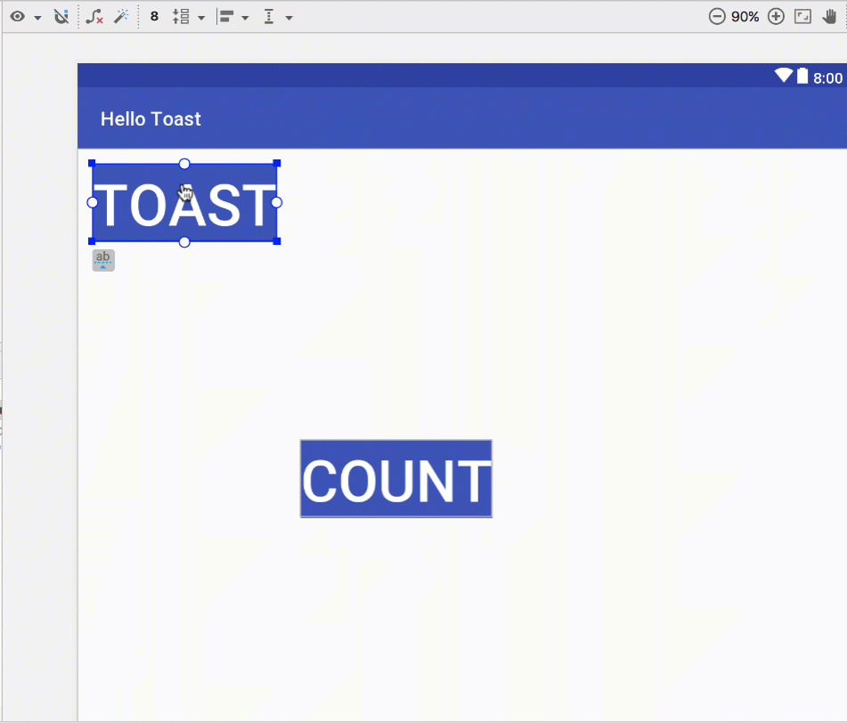
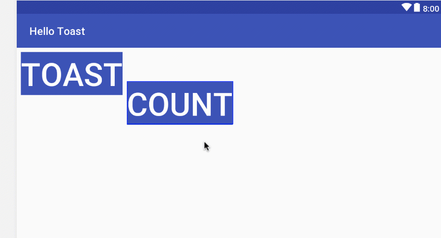
A simple example of a LinearLayout with child View elements is shown below as a diagram of the layout file (activity_main.xml), along with a hierarchy diagram (top right) and a screenshot of the actual finished layout (bottom right).
, View hierarchy (right, top) and finished layout (right, bottom)")
In the figure above:
LinearLayout, the rootViewGroup, contains all the childViewelements in a vertical orientation.Button(button_toast). The first childViewelement appears at the top in theLinearLayout.TextView(show_count). The second childViewelement appears under the first childViewelement in theLinearLayout.Button(button_count). The third childViewelement appears under the second childViewelement in theLinearLayout.
The layout hierarchy can grow to be complex for an app that shows many View elements on a screen. It's important to understand the hierarchy, as it affects whether View elements are visible and how efficiently they are drawn.
Tip: You can explore the layout hierarchy of your app using Hierarchy Viewer. It shows a tree view of the hierarchy and lets you analyze the performance of View elements on an Android-powered device. Performance issues are covered in a subsequent chapter.
The layout editor
You define layouts in the layout editor, or by entering XML code.
The layout editor shows a visual representation of XML code. You can drag View elements into the design or blueprint pane and arrange, resize, and specify attributes for them. You immediately see the effect of changes you make.
To use the layout editor, double-click the XML layout file (activity_main.xml). The layout editor appears with the Design tab at the bottom highlighted. (If the Text tab is highlighted and you see XML code, click the Design tab.) For the Empty Activity template, the layout is as shown in the figure below.

- XML layout file (activity_main.xml).
- Design and Text tabs. Click Design to see the layout editor, or Text to see XML code.
- Palette pane. The Palette pane provides a list of UI elements and layouts. Add an element or layout to the UI by dragging it into the design pane.
- Component Tree. The Component Tree pane shows the layout hierarchy. Click a
Viewelement orViewGroupin this pane to select it.Viewelements are organized into a tree hierarchy of parents and children, in which a child inherits the attributes of its parent. In the figure above, theTextViewis a child of theConstraintLayout. - Design and blueprint panes. Drag
Viewelements from the Palette pane to the design or blueprint pane to position them in the layout. In the figure above, the layout shows only one element: aTextViewthat displays "Hello World". - Attributes tab. Click Attributes to display the Attributes pane for setting attributes for a
Viewelement.
Layout editor toolbars
The layout editor toolbars provide buttons to configure your layout and change its appearance. The top toolbar lets you configure the appearance of the layout preview in the layout editor:

The figure above shows the top toolbar of the layout editor:
- Select Design Surface: Select Design to display a color preview of the UI elements in your layout, or Blueprint to show only outlines of the elements. To see both panes side by side, select Design + Blueprint.
- Orientation in Editor: Select Portrait or Landscape to show the preview in a vertical or horizontal orientation. The orientation setting lets you preview the layout orientations without running the app on an emulator or device. To create alternative layouts, select Create Landscape Variation or other variations.
- Device in Editor: Select the device type (phone/tablet, Android TV, or Android Wear).
- API Version in Editor: Select the version of Android to use to show the preview.
- Theme in Editor: Select a theme (such as AppTheme) to apply to the preview.
- Locale in Editor: Select the language and locale for the preview. This list displays only the languages available in the string resources (see the lesson on localization for details on how to add languages). You can also select Preview as Right To Left to see the layout as if an RTL language had been chosen.
The layout editor also offers a second toolbar that lets you configure the appearance of UI elements in a ConstraintLayout and zoom in and out of the preview:

The figure above shows the ConstraintLayout editing toolbar:
- Show: Select Show Constraints and Show Margins to show them in the preview, or to stop showing them.
- Autoconnect: Enable or disable Autoconnect. With Autoconnect enabled, you can drag any element (such as a
Button) to any part of a layout to generate constraints against the parent layout. - Clear All Constraints: Clear all constraints in the entire layout.
- Infer Constraints: Create constraints by inference.
- Default Margins: Set the default margins.
- Pack: Pack or expand the selected elements.
- Align: Align the selected elements.
- Guidelines: Add vertical or horizontal guidelines.
- Zoom controls: Zoom in or out.
Using ConstraintLayout
The layout editor offers more features in the Design tab when you use a ConstraintLayout, including handles for defining constraints.
A constraint is a connection or alignment to another UI element, to the parent layout, or to an invisible guideline. Each constraint appears as a line extending from a circular handle. After you select a UI element in the Component Tree pane or click it in the layout editor, the element shows a resizing handle on each corner and a circular constraint handle in the middle of each side.

The figure above shows the constraint and resizing handles on View elements in a layout:
- Resizing handle.
- Constraint line and handle. In the figure, the constraint aligns the left side of the Toast
Buttonto the left side of the layout. - Constraint handle without a constraint line.
- Baseline handle. The baseline handle aligns the text baseline of an element to the text baseline of another element.
In the blueprint or design panes, the following handles appear on the TextView element:
Constraint handle: To create a constraint, click a constraint handle, shown as a circle on each side of an element. Then drag the circle to another constraint handle or to a parent boundary. A zigzag line represents the constraint.

Resizing handle: You can drag the square resizing handles to resize the element. While dragging, the handle changes to an angled corner.

You can drag the resizing handles on each corner of the UI element to resize it, but doing so hard-codes the width and height dimensions, which you should avoid for most elements because hard-coded dimensions don't adapt to different screen densities.
Constraining a UI element
To add a constraint to a UI element, click the circular handle and drag a line to another element or to the side of a layout, as shown in the two animated figures below. To remove a constraint from an element, click the circular handle.

The constraints you define in the layout editor are created as XML attributes, which you can see in the Text tab as described in "Editing XML directly" in this chapter. For example, the following XML code is created constraining the top of an element to the top of its parent:
app:layout_constraintTop_toTopOf="parent"
Using a baseline constraint
You can align one UI element that contains text, such as a TextView or Button, with another UI element that contains text. A baseline constraint lets you constrain the elements so that the text baselines match. Select the UI element that has text, and then hover your pointer over the element until the baseline constraint button
 appears underneath the element.
Click the baseline constraint button. The baseline handle appears, blinking in green as shown in the animated figure. Drag a baseline constraint line to the baseline of the other UI element.
Tip: For an in-depth tutorial on using ConstraintLayout, see Using ConstraintLayout to design your views.
Using the Attributes pane
The Attributes pane offers access to all of the XML attributes you can assign to a UI element. You can find the attributes (known as properties) common to all views in the View class documentation.
To show the Attributes pane, click the Attributes tab on the right side of the layout editor. The Attributes pane includes a square sizing panel called the view inspector. The symbols inside the view inspector represent the height and width settings.

The figure above shows the Attributes pane:
- Vertical view size control. The vertical size control, which appears on the top and bottom of the view inspector, specifies the
layout_heightproperty. The angles indicate that this size control is set towrap_content, which means the UI element expands vertically as needed to fit its contents. The "8" indicates a standard margin set to 8 dp. - Horizontal view size control. The horizontal size control, which appears on the left and right of the view inspector, specifies the
layout_width. The angles indicate that this size control is set towrap_content, which means the UI element expands horizontally as needed to fit its contents, up to a margin of 8 dp. - Attributes pane close button. Click to close the pane.
The layout_width and layout_height attributes in the Attributes pane change as you change the inspector's horizontal and vertical size controls. These attributes can take one of three values for a ConstraintLayout:
- The
match_constraintsetting expands the UI element to fill its parent by width or height up to a margin, if a margin is set. The parent in this case is theConstraintLayout. - The
wrap_contentsetting shrinks the UI element to the size of its content. If there is no content, the element becomes invisible. - To specify a fixed size that's adjusted for the screen size of the device, set a number of
dp(density-independent pixels). For example,16dpmeans 16 density-independent pixels.
Tip: If you change the layout_width attribute using its popup menu, the layout_width attribute is set to zero because there is no set dimension. This setting is the same as match_constraint—the UI element can expand as much as possible to meet constraints and margin settings.
The Attributes pane offers access to all of the attributes you can assign to a View element. You can enter values for each attribute, such as the android:id, background, textColor, and text attributes.
Creating layout variants for orientations and devices
You can preview an app's layout with a horizontal orientation, and with different devices, without having to run the app on an emulator or device.
To preview the layout for a different orientation, click the Orientation in Editor button
 in the top toolbar. To show the layout in a horizontal orientation, select Switch to Landscape. To return to vertical orientation, select Switch to Portrait.
You can also preview the layout for different devices. Click the Device in Editor button
 in the top toolbar, and select a different device in the drop-down menu. For example, select Nexus 4, Nexus 5, and then Pixel to see differences in the previews.
To create a variant of the layout strictly for the horizontal orientation, leaving the vertical orientation layout alone: click the Orientation in Editor button and select Create Landscape Variation. A new editor window opens with the land/activity_main.xml tab showing the layout for the landscape (horizontal) orientation. You can change this layout, which is specifically for horizontal orientation, without changing the original portrait (vertical) orientation.
In the Project > Android pane, look inside the res > layout directory. You see that Android Studio automatically creates the variant for you, called activity_main.xml (land).

To create a layout variant for tablet-sized screens, click the Orientation in Editor button and select Create layout x-large Variation. A new editor window opens with the xlarge/activity_main.xml tab showing the layout for a tablet-sized device. The editor also picks a tablet device, such as the Nexus 9 or Nexus 10, for the preview. In the Project > Android pane, look inside the res > layout directory. You see that Android Studio automatically creates the variant for you, called activity_main.xml (xlarge). You can change this layout, which is specifically for tablets, without changing the other layouts.
Editing XML directly
It is sometimes quicker and easier to edit the XML code directly, especially when copying and pasting the code for similar views.
To view and edit the XML code, open the XML layout file. The layout editor appears with the Design tab at the bottom highlighted. Click the Text tab to see the XML code. The following shows the XML code for a LinearLayout with two Button elements with a TextView in the middle:
<LinearLayout xmlns:android="http://schemas.android.com/apk/res/android"
    xmlns:app="http://schemas.android.com/apk/res-auto"
    xmlns:tools="http://schemas.android.com/tools"
    android:layout_width="match_parent"
    android:layout_height="match_parent"
    android:orientation="vertical"
    tools:context="com.example.android.hellotoast.MainActivity">

    <Button
        android:id="@+id/button_toast"
        android:layout_width="match_parent"
        android:layout_height="wrap_content"
        android:layout_marginEnd="8dp"
        android:layout_marginStart="8dp"
        android:layout_marginTop="8dp"
        android:background="@color/colorPrimary"
        android:onClick="showToast"
        android:text="@string/button_label_toast"
        android:textColor="@android:color/white" />

    <TextView
        android:id="@+id/show_count"
        android:layout_width="match_parent"
        android:layout_height="wrap_content"
        android:gravity="center_vertical"
        android:layout_marginBottom="8dp"
        android:layout_marginEnd="8dp"
        android:layout_marginStart="8dp"
        android:layout_marginTop="8dp"
        android:background="#FFFF00"
        android:text="@string/count_initial_value"
        android:textAlignment="center"
        android:textColor="@color/colorPrimary"
        android:textSize="160sp"
        android:textStyle="bold"
        android:layout_weight="1"/>

    <Button
        android:id="@+id/button_count"
        android:layout_width="match_parent"
        android:layout_height="wrap_content"
        android:layout_marginBottom="8dp"
        android:layout_marginEnd="8dp"
        android:layout_marginStart="8dp"
        android:background="@color/colorPrimary"
        android:onClick="countUp"
        android:text="@string/button_label_count"
        android:textColor="@android:color/white" />
</LinearLayout>
XML attributes (view properties)
Views have properties that define where a view appears on the screen, its size, how the view relates to other views, and how it responds to user input. When defining views in XML or in the layout editor's Attributes pane, the properties are referred to as attributes.
For example, in the following XML description of a TextView, the android:id, android:layout_width, android:layout_height, android:background, are XML attributes that are translated automatically into the TextView properties:
<TextView
       android:id="@+id/show_count"
       android:layout_width="match_parent"
       android:layout_height="wrap_content"
       android:background="@color/myBackgroundColor"
       android:textStyle="bold"
       android:text="@string/count_initial_value" />
Attributes generally take this form:
android:attribute_name="value"
The attribute_name is the name of the attribute. The value is a string with the value for the attribute. For example:
android:textStyle="bold"
If the value is a resource, such as a color, the @ symbol specifies what kind of resource. For example:
android:background="@color/myBackgroundColor"
The background attribute is set to the color resource identified as myBackgroundColor, which is declared to be #FFF043. Color resources are described in Style-related attributes in this chapter.
Every View and ViewGroup supports its own variety of XML attributes:
- Some attributes are specific to a
Viewsubclass. For example, theTextViewsubclass supports thetextSizeattribute. Any elements that extend theTextViewsubclass inherit these subclass-specific attributes. - Some attributes are common to all
Viewelements, because they are inherited from the rootViewclass. Theandroid:idattribute is one example.
For descriptions of specific attributes, see the overview section of the View class documentation.
Identifying a View
To uniquely identify a View and reference it from your code, you must give it an id. The android:id attribute lets you specify a unique id—a resource identifier for a View.
For example:
android:id="@+id/button_count"
The @+id/button_count part of the attribute creates an id called button_count for a Button (a subclass of View). You use the plus (+) symbol to indicate that you are creating a new id.
Referencing a View
To refer to an existing resource identifier, omit the plus (+) symbol. For example, to refer to a View by its id in another attribute, such as android:layout_toLeftOf (described in the next section) to control the position of a View, you would use:
android:layout_toLeftOf="@id/show_count"
In the attribute above, @id/show_count refers to the View with the resource identifier show_count. The attribute positions the element to be "to the left of" the show_count View.
Positioning a View
Some layout-related positioning attributes are required for a View or a ViewGroup, and automatically appear when you add the View or ViewGroup to the XML layout.
LinearLayout positioning
LinearLayout is required to have these attributes set:
The android:layout_width and android:layout_height attributes can take one of three values:
match_parentexpands the UI element to fill its parent by width or height. When the LinearLayout is the rootViewGroup, it expands to the size of the device screen. For a UI element within a rootViewGroup, it expands to the size of the parentViewGroup.wrap_contentshrinks the UI element to the size of its content. If there is no content, the element becomes invisible.- Use a fixed number of
dp(density-independent pixels) to specify a fixed size, adjusted for the screen size of the device. For example,16dpmeans 16 density-independent pixels. Density-independent pixels and other dimensions are described in "Dimensions" in this chapter.
The android:orientation can be:
horizontal: Views are arranged from left to right.vertical: Views are arranged from top to bottom.
Other layout-related attributes include:
android:layout_gravity: This attribute is used with a UI element to control where the element is arranged within its parent. For example, the following attribute centers the UI element horizontally within the parentViewGroup:
android:layout_gravity="center_horizontal"
- Padding is the space, measured in density-independent pixels, between the edges of the UI element and the element's content, as shown in the figure below.

In the figure above: (1) Padding is the space between the edges of the TextView (dashed lines) and the content of the TextView (solid line). Padding is not the same as margin, which is the space from the edge of the View to its parent.
The size of a View includes its padding. The following are commonly used padding attributes:
android:padding: Sets the padding of all four edges.android:paddingTop: Sets the padding of the top edge.android:paddingBottom: Sets the padding of the bottom edge.android:paddingLeft: Sets the padding of the left edge.android:paddingRight: Sets the padding of the right edge.android:paddingStart: Sets the padding of the start of the view, in pixels. Used in place of the padding attributes listed above, especially with views that are long and narrow.android:paddingEnd: Sets the padding of the end edge of the view, in pixels. Used along withandroid:paddingStart.
Tip: To see all of the XML attributes for a LinearLayout, see the Summary section of the LinearLayout class definition. Other root layouts, such as RelativeLayout and AbsoluteLayout, also list their XML attributes in the Summary sections.
RelativeLayout Positioning
Another useful Viewgroup for layout is RelativeLayout, which you can use to position child View elements relative to each other or to the parent. The attributes you can use with RelativeLayout include the following:
android:layout_toLeftOf: Positions the right edge of thisViewto the left of anotherView(identified by itsID).android:layout_toRightOf: Positions the left edge of thisViewto the right of anotherView(identified by itsID).android:layout_centerHorizontal: Centers thisViewhorizontally within its parent.android:layout_centerVertical: Centers thisViewvertically within its parent.android:layout_alignParentTop: Positions the top edge of thisViewto match the top edge of the parent.android:layout_alignParentBottom: Positions the bottom edge of thisViewto match the bottom edge of the parent.
For a complete list of attributes for View and View subclass elements in a RelativeLayout, see RelativeLayout.LayoutParams.
Style-related attributes
You specify style attributes to customize the appearance of a View. A View that doesn't have style attributes, such as android:textColor, android:textSize, and android:background, takes on the styles defined in the app's theme.
The following are style-related attributes used in lesson on using the layout editor:
android:background: Specifies a color or drawable resource to use as the background.android:text: Specifies text to display in the view.android:textColor: Specifies the text color.android:textSize: Specifies the text size.android:textStyle: Specifies the text style, such asbold.
Resource files
Resource files are a way of separating static values from code so that you don't have to change the code itself to change the values. You can store all the strings, layouts, dimensions, colors, styles, and menu text separately in resource files.
Resource files are stored in folders located in the res folder when viewing the Project > Android pane. These folders include:
drawable: For images and iconslayout: For layout resource filesmenu: For menu itemsmipmap: For pre-calculated, optimized collections of app icons used by the Launchervalues: For colors, dimensions, strings, and styles (theme attributes)
The syntax to reference a resource in an XML layout is as follows:
@package_name:resource_type/resource_name
- package_name is the name of the package in which the resource is located. The package name is not required when you reference resources that are stored in the
resfolder of your project, because these resources are from the same package. - resource_type is the
Rsubclass for the resource type. See Resource Types for more about the resource types and how to reference them. - resource_name is either the resource filename without the extension, or the
android:nameattribute value in the XML element.
For example, the following XML layout statement sets the android:text attribute to a string resource:
android:text="@string/button_label_toast"
- No package_name is included, because the resource is stored in the
strings.xmlfile in the project. - The resource_type is
string. - The resource_name is
button_label_toast.
Another example: this XML layout statement sets the android:background attribute to a color resource, and since the resource is defined in the project (in the colors.xml file), the package_name is not specified:
android:background="@color/colorPrimary"
In the following example, the XML layout statement sets the android:textColor attribute to a color resource. However, the resource is not defined in the project but supplied by Android, so you need to specify the package_name, which is android, followed by a colon:
android:textColor="@android:color/white"
Tip: For more about accessing resources from code, see Accessing Resources. For Android color constants, see the Android standard R.color resources.
Values resource files
Keeping values such as strings and colors in separate resource files makes it easier to manage them, especially if you use them more than once in your layouts.
For example, it is essential to keep strings in a separate resource file for translating and localizing your app, so that you can create a string resource file for each language without changing your code. Resource files for images, colors, dimensions, and other attributes are handy for developing an app for different device screen sizes and orientations.
Strings
String resources are located in the strings.xml file (inside res > values in the Project > Android pane). You can edit this file directly by opening it in the editor pane:
<resources>
    <string name="app_name">Hello Toast</string>
    <string name="button_label_count">Count</string>
    <string name="button_label_toast">Toast</string>
    <string name="count_initial_value">0</string>
</resources>
The name (for example, button_label_count) is the resource name you use in your XML code, as in the following attribute:
android:text="@string/button_label_count"
The string value of this name is the word (Count) enclosed within the <string></string> tags. (You don't use quotation marks unless the quotation marks are part of the string value.)
Extracting strings to resources
You should also extract hard-coded strings in an XML layout file to string resources.


To extract a hard-coded string in an XML layout, follow these steps, as shown in the figure above:
- Click the hard-coded string and press Alt-Enter in Windows, or Option-Return in Mac OS X.
- Select Extract string resource.
- Edit the Resource name for the string value.
You can then use the resource name in your XML code. Use the expression "@string/resource_name" (including quotation marks) to refer to the string resource:
android:text="@string/button_label_count"
Colors
Color resources are located in the colors.xml file (inside res > values in the Project > Android pane). You can edit this file directly in the editor pane:
<resources>
    <color name="colorPrimary">#3F51B5</color>
    <color name="colorPrimaryDark">#303F9F</color>
    <color name="colorAccent">#FF4081</color>
    <color name="myBackgroundColor">#FFF043</color>
</resources>
The name (for example, colorPrimary) is the resource name you use in your XML code:
android:textColor="@color/colorPrimary"
The color value of this name is the hexadecimal color value (#3F51B5) enclosed within the <color></color> tags. The hexadecimal value specifies red, green, and blue (RGB) values. The value always begins with a pound (#) character, followed by the Alpha-Red-Green-Blue information. For example, the hexadecimal value for black is #000000, while the hexadecimal value for a variant of sky blue is #559fe3. Base color values are listed in the Color class documentation.
The colorPrimary color is one of the predefined base colors and is used for the app bar. In a production app, you could, for example, customize this to fit your brand. Using the base colors for other UI elements creates a uniform UI.
Tip: For the Material Design specification for Android colors, see Style and Using the Material Theme. For common color hexadecimal values, see Color Hex Color Codes. For Android color constants, see the Android standard R.color resources.
You can see a small block of the color choice in the left margin next to the color resource declaration in colors.xml, and also in the left margin next to the attribute that uses the resource name in the layout XML file.


Tip: To see the color in a popup, turn on the Autopopup documentation feature. Select Preferences > Editor > General > Code Completion, and select the "Autopopup documentation in (ms)" option. You can then hover your cursor over a color resource name to see the color.
Dimensions
To make dimensions easier to manage, you should separate the dimensions from your code, especially if you need to adjust your layout for devices with different screen densities. Keeping dimensions separate from code also makes it easy to have consistent sizing for UI elements, and to change the size of multiple elements by changing one dimension resource.
Dimension resources are located in the dimens.xml file (inside res > values in the Project > Android pane). The dimens.xml file can actually be a folder holding more than one dimens.xml file—one for each device screen resolution. You can edit each dimens.xml file directly:
<resources>
    <!-- Default screen margins, per the Android Design guidelines. -->
    <dimen name="activity_horizontal_margin">16dp</dimen>
    <dimen name="activity_vertical_margin">16dp</dimen>
    <dimen name="my_view_width">300dp</dimen>
    <dimen name="count_text_size">200sp</dimen>
    <dimen name="counter_height">300dp</dimen>
</resources>
The name (for example, activity_horizontal_margin) is the resource name you use in the XML code:
android:paddingLeft="@dimen/activity_horizontal_margin"
The value of this name is the measurement (16dp) enclosed within the <dimen></dimen> tags.
You can extract dimensions in the same way as strings:
- Click the hard-coded dimension, and press Alt-Enter in Windows, or press Option-Return in Mac OS X.
- Select Extract dimension resource.
- Edit the Resource name for the dimension value.
Density-independent pixels (dp) are independent of screen resolution. For example, 10px (10 fixed pixels) look a lot smaller on a higher resolution screen, but Android scales 10dp (10 device-independent pixels) to look right on different resolution screens. Text sizes can also be set to look right on different resolution screens using scaled-pixel (sp) sizes.
Tip: For more information about dp and sp units, see Supporting Different Densities.
Styles
A style is a resource that specifies common attributes such as height, padding, font color, font size, background color. Styles are meant for attributes that modify the look of the view.
Styles are defined in the styles.xml file (inside res > values in the Project > Android pane). You can edit this file directly. Styles are covered in a later chapter, along with the Material Design Specification.
Other resource files
Android Studio defines other resources that are covered in other chapters:
- Images and icons: The
drawablefolder provides icon and image resources. If your app does not have adrawablefolder, you can manually create it inside theresfolder. For more information about drawable resources, see Drawable Resources in the App Resources section of the Android Developer's Guide. - Optimized icons: The
mipmapfolder typically contains pre-calculated, optimized collections of app icons used by the Launcher. Expand the folder to see that versions of icons are stored as resources for different screen densities. - Menus: You can use an XML resource file to define menu items and store them in your project in the
menufolder. Menus are described in a later chapter.
Responding to View clicks
A click event occurs when the user taps or clicks a clickable View, such as a Button, ImageButton, ImageView, or FloatingActionButton. When such an event occurs, your code performs an action. In order to make this pattern work, you have to:
- Write a Java method that performs the specific action you want the app to do when this event occurs. This method is typically referred to as an event handler.
- Associate this event-handler method to the
View, so that the method executes when the event occurs.
The onClick attribute
Android Studio provides a shortcut for setting up a clickable View, and for associating an event handler with the View: use the android:onClick attribute in the XML layout.
For example, the following XML attribute sets a Button to be clickable, and sets showToast() as the event handler:
<Button
    android:id="@+id/button_toast"
    android:onClick="showToast"
When the user taps the button_toast Button, the button's android:onClick attribute calls the showToast() method. In order to work with the android:onClick attribute, the showToast() method must be public and return void. To know which View called the method, the showToast() method must require a view parameter.
Android Studio provides a shortcut for creating an event handler stub (a placeholder for a method that you can fill in later) in the code for the Activity associated with the XML layout. Follow these steps:
- Inside the XML layout file (such as
activity_main.xml), click the method name in theandroid:onClickattribute statement (showToastin the XML snippet above). - Press Alt-Enter in Windows or Option-Return in Mac OS X, and select Create onClick event handler.
- Select the
Activityassociated with the layout file (such as MainActivity) and click OK. Android Studio creates a placeholder method stub inMainActivity.javaas shown below.
public void showToast(View view) {
        // Do something in response to the button click.
}
Updating a View
To update a View, for example to replace the text in a TextView, your code must first instantiate an object from the View. Your code can then update the object, which updates the screen.
To refer to the View in your code, use the findViewById() method of the View class, which looks for a View based on the resource id. For example, the following statement sets mShowCount to be the TextView in the layout with the resource id show_count:
mShowCount = (TextView) findViewById(R.id.show_count);
From this point on, your code can use mShowCount to represent the TextView, so that when you update mShowCount, the TextView is updated.
For example, when the following Button with the android:onClick attribute is tapped, onClick calls the countUp() method:
android:onClick="countUp"
You can implement countUp() to increment the count, convert the count to a string, and set the string as the text for the mShowCount object:
public void countUp(View view) {
        mCount++;
        if (mShowCount != null)
            mShowCount.setText(Integer.toString(mCount));
}
Since you had already associated mShowCount with the TextView for displaying the count, the mShowCount.setText() method updates the TextView on the screen.
Related practicals
The related practical lessons are:
Learn more
Android Studio documentation:
Android developer documentation:
- UI Overview
- Build a UI with Layout Editor
- Build a Responsive UI with ConstraintLayout
- Layouts
ViewButtonTextView- Android Input Events
- Context
- Common Layout Objects
Color- Android resources
- Android standard R.color resources
- Supporting Different Densities
Material Design:
Other: