4.1: Buttons and clickable images
Contents:
- Designing for interactivity
- Designing buttons
- Responding to button-click events
- Using clickable images
- Using a floating action button
- Recognizing gestures
- Related practical
- Learn more
Designing for interactivity
The user interface (UI) that appears on a screen of an Android-powered device consists of a hierarchy of objects called views. Every element of the screen is a view.
The View class represents the basic building block for all UI components. View is the base class for classes that provide interactive UI components, such as Button elements. Users tap these elements on a touchscreen or click them using a pointing device. Any element that users tap or click to perform an action is called a clickable element.
For an Android app, user interaction typically involves tapping, typing, using gestures, or talking. The Android framework provides corresponding user interface (UI) elements such as buttons, clickable images, menus, keyboards, text entry fields, and a microphone.
When designing an interactive app, make sure your app is intuitive; that is, your app should perform as your users expect it to perform. For example, when you rent a car, you expect the steering wheel, gear shift, headlights, and indicators to be in a certain place. Another example is that when you first enter a room, you expect the light switch to be in a certain place. Similarly, when a user starts an app, the user expects buttons and images to be clickable. Don't violate established expectations, or you'll make it harder for your users to use your app.
In this chapter you learn how to create buttons and clickable images for triggering actions.
Designing buttons
People like to press buttons. Show someone a big red button with a message that says "Do not press" and the person will probably press the button, just for the pleasure of pressing a big red button. (That the button is forbidden is also a factor.)
You use the Button class to make a button for an Android app. Buttons can have the following design:
- Text only, as shown on the left side of the figure below.
- Icon only, as shown in the center of the figure below.
- Both text and an icon, as shown on the right side of the figure below.

When the user touches or clicks a button, the button performs an action. The button's text or icon should provide a hint about what that action will be. (Buttons are sometimes called "push-buttons" in Android documentation.)
A button is usually a rectangle or rounded rectangle with a descriptive caption or icon in its center. Android Button elements follow the guidelines in the Android Material Design specification. (You learn more about Material Design in another lesson.)
Android offers several types of Button elements, including raised buttons and flat buttons as shown in the figure below. Each button has three states: normal, disabled, and pressed.

In the figure above:
- Raised button in three states: normal, disabled, and pressed
- Flat button in three states: normal, disabled, and pressed
Designing raised buttons
A raised button is an outlined rectangle or rounded rectangle that appears lifted from the screen—the shading around it indicates that it is possible to tap or click it. The raised button can show text, an icon, or both.
To use raised buttons that conform to the Material Design specification, follow these steps:
If your build.gradle (Module: app) file doesn't include the
android.support:appcompat-v7library, add it to thedependenciessection:compile 'com.android.support:appcompat-v7:26.1.0.'In the snippet above,
26.1.0is the version number. If the version number you specified is lower than the currently available library version number, Android Studio will warn you ("a newer version is available"). Update the version number to the one Android Studio tells you to use.Make your
Activityextendandroid.support.v7.app.AppCompatActivity:public class MainActivity extends AppCompatActivity { // ... }- Use the
Buttonelement in the layout file. A raisedButtonis the default style.
Use raised<Button android:layout_width="wrap_content" android:layout_height="wrap_content" <!-- more attributes ... --> />Buttonelements to give more prominence to actions in layouts with a lot of varying content. A raisedButtonadds dimension to a flat layout—it shows a background shadow when touched (pressed) or clicked, as shown below.
In the figure above:
- Normal state: A raised
Button. - Disabled state: When disabled, the
Buttonis dimmed out and not active in the app's context. In most cases you would hide an inactiveButton, but there may be times when you would want to show it as disabled. - Pressed state: The pressed state, with a larger background shadow, indicates that the
Buttonis being touched or clicked. When you attach a callback to theButton(such as theandroid:onClickattribute), the callback is called when theButtonis in this state.
Creating a raised button with text
Some raised Button elements are best designed as text, without an icon, such as a Save button, because an icon by itself might not convey an obvious meaning. The Button class extends the TextView class. To use it, add it to the XML layout:
<Button
    android:layout_width="wrap_content"
    android:layout_height="wrap_content"
    android:text="@string/button_text"
    <!-- more attributes ... -->
/>
The best practice with a text Button is to define a very short word as a string resource (button_text in the example above), so that the string can be translated. For example, Save could be translated into French as Enregistrer without changing any of the code.
Creating a raised button with an icon and text
While a Button usually displays text that tells the user what the action is, a raised Button can also display an icon along with text.
Choosing an icon
To choose images of a standard icon that are resized for different displays, follow these steps:
- Expand app > res in the Project > Android pane, and right-click (or Command-click) the drawable folder.
- Choose New > Image Asset. The Configure Image Asset dialog appears.
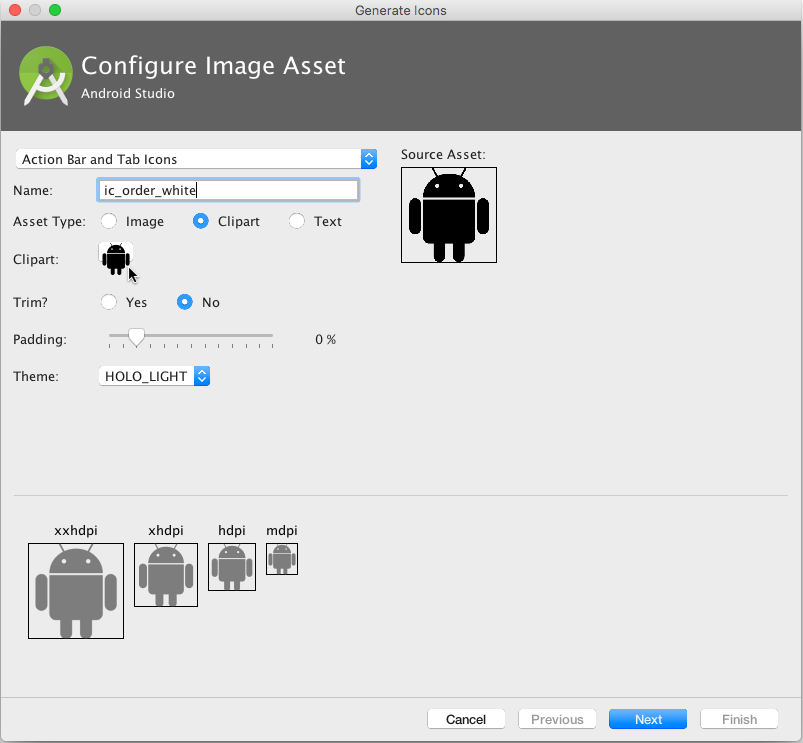
- Choose Action Bar and Tab Icons in the drop-down menu. (For a complete description of this dialog, see Create app icons with Image Asset Studio.)
Click the Clipart: image (the Android logo) to select a clip art image as the icon. A page of icons appears as shown below. Click the icon you want to use.
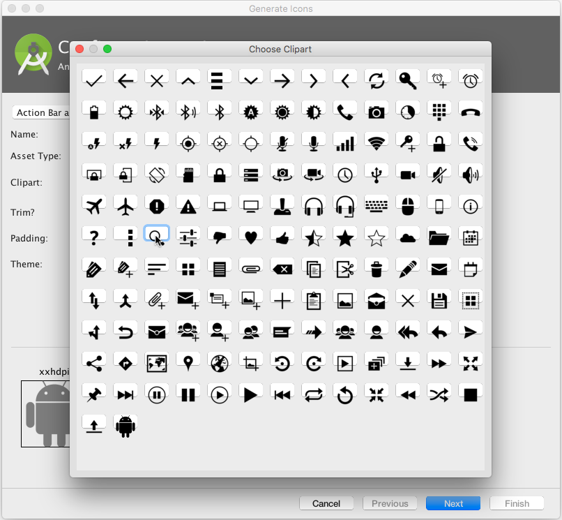
Optional: Choose HOLO_DARK from the Theme drop-down menu to set the icon to be white against a dark-colored or black background.
- Optional: Depending on the shape of the icon, you may want to add padding to the icon so that the icon doesn't crowd the text. Drag the Padding slider to the right to add more padding.
- Click Next, and then click Finish in the Confirm Icon Path dialog. The icon name should now appear in the app > res > drawable folder.
Vector images of a standard icon are automatically resized for different sizes of device displays. To choose vector images, follow these steps:
- Expand app > res in the Project > Android pane, and right-click (or Command-click) the drawable folder.
- Choose New > Vector Asset for an icon that automatically resizes itself for each display.
- The Vector Asset Studio dialog appears for a vector asset. Click the Material Icon radio button, and then click the Choose button to choose an icon from the Material Design specification. (For a complete description of this dialog, see Add Multi-Density Vector Graphics.)
- Click Next after choosing an icon, and click Finish to finish. The icon name should now appear in the app > res > drawable folder.
Adding the button with text and icon to the layout
To create a button with text and an icon as shown in the figure below, use a Button in your XML layout. Add the android:drawableLeft attribute to draw the icon to the left of the button's text, as shown in the figure below:
<Button
    android:layout_width="wrap_content"
    android:layout_height="wrap_content"
    android:text="@string/button_text"
    android:drawableLeft="@drawable/button_icon"
    <!-- more attributes ... -->
/>
![]()
Creating a raised button with only an icon
If the icon is universally understood, you may want to use it instead of text.
To create a raised button with just an icon or image (no text), use the ImageButton class, which extends the ImageView class. You can add an ImageButton to your XML layout as follows:
<ImageButton
    android:layout_width="wrap_content"
    android:layout_height="wrap_content"
    android:src="@drawable/button_icon"
    <!-- more attributes ... -->
/>
Changing the style and appearance of raised buttons
The simplest way to show a more prominent raised button is to use a different background color for the button. You can specify the android:background attribute with a drawable or color resource:
android:background="@color/colorPrimary"
The appearance of your button—the background color and font—may vary from one device to another, because devices by different manufacturers often have different default styles for input controls. You can control exactly how your buttons and other input controls are styled using a theme that you apply to your entire app.
For instance, to ensure that all devices that can run the Holo theme will use the Holo theme for your app, declare the following in the <application> element of the AndroidManifest.xml file:
android:theme="@android:style/Theme.Holo"
After adding the declaration above, the app will be displayed using the theme.
Apps designed for Android 4.0 and higher can also use the DeviceDefault public theme family. DeviceDefault themes are aliases for the device's native look and feel. The DeviceDefault theme family and widget style family offer ways for developers to target the device's native theme with all customizations intact.
For Android apps running on 4.0 and newer, you have the following options:
- Use a theme, such as one of the
Holothemes, so that your app has the exact same look across all Android-powered devices running 4.0 or newer. In this case, the app's look does not change when running on a device with a different default skin or custom skin. - Use one of the
DeviceDefaultthemes so that your app takes on the look of the device's default skin. - Don't use a theme, but you may have unpredictable results on some devices.
Recommended reading:
- If you're not familiar with Android's style and theme system, you should read Styles and themes.
- For information about using the Holo theme while supporting older devices, see the blog post Holo Everywhere.
- For a guide on styling and customizing buttons using XML, see Buttons in the Android developer documentation.
- For a comprehensive guide to designing buttons, see Buttons in the Material Design specification.
Designing flat buttons
A flat button, also known as a text button or borderless button, is a text-only button that looks flat and doesn't have a shadow. The major benefit of flat buttons is simplicity: a flat button doesn't distract the user from the main content as much as a raised button does. Flat buttons are useful for dialogs that require user interaction, as shown in the figure below. In this case, you want the button to use the same font and style as the surrounding text to keep the look and feel consistent across all the elements in the dialog.
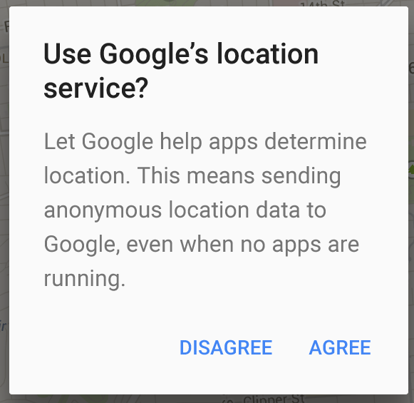
Flat buttons have no borders or background, but they do change their appearance when they change to different states.

In the figure above:
- Normal state: In its normal state, the button looks just like ordinary text.
- Disabled state: When the text is dimmed out, the button is not active in the app's context.
- Pressed state: A background shadow indicates that the button is being tapped or clicked. When you attach a callback (such as the
android:onClickattribute) to the button, the callback is called when the button is in this state.
To create a flat button, use the Button class. Add a Button to your XML layout, and apply "?android:attr/borderlessButtonStyle" as the style attribute:
<Button
    android:id="@+id/button_send"
    android:layout_width="wrap_content"
    android:layout_height="wrap_content"
    android:text="@string/button_send"
    android:onClick="sendMessage"
    style="?android:attr/borderlessButtonStyle" />
Responding to button-click events
An event listener is an interface in the View class that contains a single callback method. The Android system calls the method when the user triggers the View to which the listener is registered.
To respond to a user tapping or clicking a button, use the event listener called OnClickListener, which contains one method, onClick(). To provide functionality when the user clicks, you implement this onClick() method.
For more about event listeners and other UI events, see Input events overview in the Android developer documentation.
Adding onClick() to the layout element
A quick way to set up an OnClickListener for a clickable element in your Activity code and assign a callback method is to add the android:onClick attribute to the element in the XML layout.
For example, a Button in the layout would include the android:onClick attribute:
<Button
    android:id="@+id/button_send"
    android:layout_width="wrap_content"
    android:layout_height="wrap_content"
    android:text="@string/button_send"
    android:onClick="sendMessage" />
When a user clicks the Button, the Android framework calls the sendMessage() method in the Activity:
public void sendMessage(View view) {
    // Do something in response to button click
}
The callback method for the android:onClick attribute must be public, return void, and define a View as its only parameter (this is the View that was tapped). Use the method to perform a task or call other methods as a response to the Button tap.
Using the button-listener design pattern
You can also handle the click event in your Java code using the button-listener design pattern, shown in the figure below. For more information on the "listener" design pattern, see Creating Custom Listeners.
Use the event listener View.OnClickListener, which is an interface in the View class that contains a single callback method, onClick(). The method is called by the Android framework when the view is triggered by user interaction.
The event listener must already be registered to the View in order to be called for the event. Follow these steps to register the listener and use it (refer to the figure below the steps):
- Use the
findViewById()method of theViewclass to find theButtonin the XML layout file:Button button = findViewById(R.id.button_send); - Get a new
View.OnClickListenerand register it to theButtonby calling thesetOnClickListener()method. The argument tosetOnClickListener()takes an object that implements theView.OnClickListenerinterface, which has one method:onClick().button.setOnClickListener(new View.OnClickListener() { // ... The onClick method goes here. } - Override the
onClick()method:button.setOnClickListener(new View.OnClickListener() { @Override public void onClick(View v) { // Do something in response to button click } } - Do something in response to the button click, such as perform an action.

Using the event listener interface for other events
Other events can occur with UI elements, and you can use the callback methods already defined in the event listener interfaces to handle them. The methods are called by the Android framework when the view—to which the listener has been registered—is triggered by user interaction. You therefore must set the appropriate listener to use the method. The following are some of the listeners available in the Android framework and the callback methods associated with each one:
onClick()fromView.OnClickListener: Handles a click event in which the user touches and then releases an area of the device display occupied by aView. TheonClick()callback has no return value.onLongClick()fromView.OnLongClickListener: Handles an event in which the user maintains touch on aViewfor an extended period. This method returns abooleanto indicate whether you have consumed the event, and the event should not be carried further. That is, returntrueto indicate that you have handled the event and the event should stop here. Returnfalseif you have not handled the event, or if the event should continue to any other listeners.onTouch()fromView.OnTouchListener: Handles any form of touch contact with the screen including individual or multiple touches and gesture motions, including a press, a release, or any movement gesture on the screen (within the bounds of the UI element). AMotionEventis passed as an argument, which includes directional information, and it returns abooleanto indicate whether your listener consumes this event.onFocusChange()fromView.OnFocusChangeListener: Handles when focus moves away from the currentViewas the result of interaction with a trackball or navigation key.onKey()fromView.OnKeyListener:Handles when a key on a hardware device is pressed while aViewhas focus.
Using clickable images
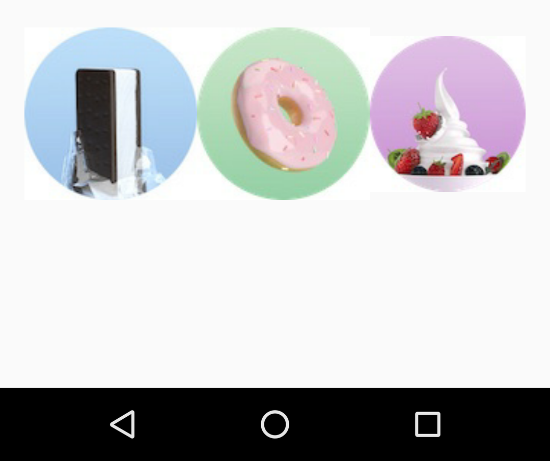
You can turn any View, such as an ImageView, into a button by adding the android:onClick attribute in the XML layout. The image for the ImageView must already be stored in the drawable folder of your project.
For example, the following images in the drawable folder (icecream_circle.jpg, donut_circle.jpg, and froyo_circle.jpg) are defined for ImageView elements arranged in a LinearLayout:
<LinearLayout
        android:layout_width="match_parent"
        android:layout_height="match_parent"
        android:orientation="horizontal"
        android:layout_marginTop="260dp">
        <ImageView
            android:layout_width="wrap_content"
            android:layout_height="wrap_content"
            android:src="@drawable/icecream_circle"
            android:onClick="orderIcecream"/>
        <ImageView
            android:layout_width="wrap_content"
            android:layout_height="wrap_content"
            android:src="@drawable/donut_circle"
            android:onClick="orderDonut"/>
        <ImageView
            android:layout_width="wrap_content"
            android:layout_height="wrap_content"
            android:src="@drawable/froyo_circle"
            android:onClick="orderFroyo"/>
</LinearLayout>
Using a floating action button
A floating action button (FloatingActionButton), shown below as #1 in the figure below, is a circular button that appears to float above the layout.
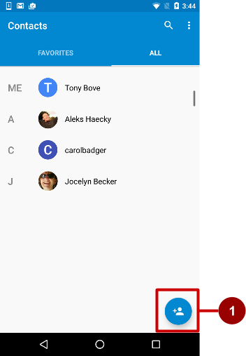
You should use a floating action button only to represent the primary action for a screen. For example, the primary action for the Contacts app main screen is adding a contact, as shown in the figure above. A floating action button is the right choice if your app requires an action to be persistent and readily available on a screen. Only one floating action button is recommended per screen.
The floating action button uses the same type of icons that you would use for a button with an icon, or for actions in the app bar at the top of the screen. You can add an icon as described previously in "Choosing an icon for the button".
If you start your project or Activity with the Basic Activity template, Android Studio adds a floating action button to the layout file for the Activity. To create a floating action button yourself, use the FloatingActionButton class, which extends the ImageButton class. You can add a floating action button to your XML layout as follows:
<android.support.design.widget.FloatingActionButton
        android:id="@+id/fab"
        android:layout_width="wrap_content"
        android:layout_height="wrap_content"
        android:layout_gravity="bottom|end"
        android:layout_margin="@dimen/fab_margin"
        android:src="@drawable/ic_fab_chat_button_white" />
- Floating action buttons, by default, are 56 x 56 dp in size. It is best to use the default size unless you need the smaller version to create visual continuity with other screen elements.
- You can set the mini size (30 x 40 dp) with the
app:fabSizeattribute:app:fabSize="mini" - To set it back to the default size (56 x 56 dp):
app:fabSize="normal"
For more design instructions involving floating action buttons, see Components– Buttons: Floating Action Button in the Material Design Spec.
Recognizing gestures
A touch gesture occurs when a user places one or more fingers on the touchscreen, and your app interprets that pattern of touches as a particular gesture, such as a tap, touch & hold, double-tap, fling, or scroll.
Android provides a variety of classes and methods to help you create and detect gestures. Although your app should not depend on touch gestures for basic behaviors (because the gestures may not be available to all users in all contexts), adding touch-based interaction to your app can greatly increase its usefulness and appeal.
To provide users with a consistent, intuitive experience, your app should follow the accepted Android conventions for touch gestures. The Gestures design guide shows you how to design common gestures in Android apps. For more code samples and details, see Using touch gestures in the Android developer documentation.
Detecting common gestures
If your app uses common gestures such as double tap, long press, fling, and so on, you can take advantage of the GestureDetector class for detecting common gestures. Use GestureDetectorCompat, which is provided as a compatibility implementation of the framework's GestureDetector class which guarantees the newer focal point scrolling behavior from Jellybean MR1 on all platform versions. This class should be used only with motion events reported for touch devices—don't use it for trackball or other hardware events.
GestureDetectorCompat lets you detect common gestures without processing the individual touch events yourself. It detects various gestures and events using MotionEvent objects, which report movements by a finger (or mouse, pen, or trackball).
The following snippets show how you would use GestureDetectorCompat and the GestureDetector.SimpleOnGestureListener class.
Creating an instance of GestureDetectorCompat
To use GestureDetectorCompat, create an instance (mDetector in the snippet below) of the GestureDetectorCompat class, using the onCreate() method in the Activity (such as MainActivity):
public class MainActivity extends Activity {
    private GestureDetectorCompat mDetector;

    @Override
    public void onCreate(Bundle savedInstanceState) {
        super.onCreate(savedInstanceState);
        setContentView(R.layout.activity_main);
        mDetector = new GestureDetectorCompat(this, new
                MyGestureListener());
        // ... Rest of onCreate code.
    }
    // ... Rest of code.
}
When you instantiate a GestureDetectorCompat object, one of the parameters it takes is a class that you must create, which is MyGestureListener in the snippet above. The class you create should do one of the following:
- Implement the
GestureDetector.OnGestureListenerinterface to detect all standard gestures, or - Extend the
GestureDetector.SimpleOnGestureListenerclass, which you can use to process only a few gestures by overriding the methods you need.
SimpleOnGestureListener provides methods such as onDown(), onLongPress(), onFling(), onScroll(), and onSingleTapUp().
Extending GestureDetector.SimpleOnGestureListener
Create the class MyGestureListener as a separate Activity (MyGestureListener) to extend GestureDetector.SimpleOnGestureListener. Override the onFling() and onDown() methods to show log statements about the event:
class MyGestureListener
                   extends GestureDetector.SimpleOnGestureListener {
   private static final String DEBUG_TAG = "Gestures";

   @Override
   public boolean onDown(MotionEvent event) {
      Log.d(DEBUG_TAG,"onDown: " + event.toString());
      return true;
   }

   @Override
   public boolean onFling(MotionEvent event1, MotionEvent event2,
                  float velocityX, float velocityY) {
       Log.d(DEBUG_TAG, "onFling: " +
            event1.toString()+event2.toString());
       return true;
   }
}
Intercepting touch events
To intercept touch events, override the onTouchEvent() callback of the GestureDetectorCompat class:
@Override
public boolean onTouchEvent(MotionEvent event){
      this.mDetector.onTouchEvent(event);
      return super.onTouchEvent(event);
}
Detecting all gestures
To detect all types of gestures, you need to perform two essential steps:
- Gather data about touch events.
- Interpret the data to see if it meets the criteria for any of the gestures your app supports.
The gesture starts when the user first touches the screen, continues as the system tracks the position of the user's finger or fingers, and ends when the system captures the event of the user's fingers leaving the screen. Throughout this interaction, an object of the MotionEvent class is delivered to onTouchEvent(), providing the details. Your app can use the data provided by the MotionEvent to determine if a gesture it cares about happened.
For example, when the user first touches the screen, the onTouchEvent() method is triggered on the View that was touched, and a MotionEvent object reports movement by a finger (or mouse, pen, or trackball) in terms of:
- An action code: Specifies the state change that occurred, such as a finger tapping down or lifting up.
- A set of axis values: Describes the position in X and Y coordinates of the touch and information about the pressure, size and orientation of the contact area.
The individual fingers or other objects that generate movement traces are referred to as pointers. Some devices can report multiple movement traces at the same time. Multi-touch screens show one movement trace for each finger. Motion events contain information about all of the pointers that are currently active even if some of them have not moved since the last event was delivered. Based on the interpretation of the MotionEvent object, the onTouchEvent() method triggers the appropriate callback on the GestureDetector.OnGestureListener interface.
Each MotionEvent pointer has a unique id that is assigned when it first goes down (indicated by ACTION_DOWN or ACTION_POINTER_DOWN). A pointer id remains valid until the pointer eventually goes up (indicated by ACTION_UP or ACTION_POINTER_UP) or when the gesture is canceled (indicated by ACTION_CANCEL). The MotionEvent class provides methods to query the position and other properties of pointers, such as getX(int), getY(int), getAxisValue(int), getPointerId(int), and getToolType(int).
The interpretation of the contents of a MotionEvent varies significantly depending on the source class of the device. On touchscreens, the pointer coordinates specify absolute positions such as view X/Y coordinates. Each complete gesture is represented by a sequence of motion events with actions that describe pointer state transitions and movements.
A gesture starts with a motion event with ACTION_DOWN that provides the location of the first pointer down. As each additional pointer goes down or up, the framework generates a motion event with ACTION_POINTER_DOWN or ACTION_POINTER_UP accordingly. Pointer movements are described by motion events with ACTION_MOVE. A gesture ends when the final pointer goes up as represented by a motion event with ACTION_UP, or when the gesture is canceled with ACTION_CANCEL.
To intercept touch events in an Activity or View, override the onTouchEvent() callback as shown in the snippet below. You can use the getActionMasked() method of the MotionEventCompat class to extract the action the user performed from the event parameter. (MotionEventCompat is a helper for accessing features in a MotionEvent, which was introduced after API level 4 in a backwards compatible fashion.) This gives you the raw data you need to determine if a gesture you care about occurred:
public class MainActivity extends Activity {
// ...
// This example shows an Activity, but you would use the same approach if
// you were subclassing a View.
   @Override
   public boolean onTouchEvent(MotionEvent event){
       int action = MotionEventCompat.getActionMasked(event);
       switch(action) {
          case (MotionEvent.ACTION_DOWN) :
             Log.d(DEBUG_TAG,"Action was DOWN");
             return true;
          case (MotionEvent.ACTION_MOVE) :
             Log.d(DEBUG_TAG,"Action was MOVE");
             return true;
          case (MotionEvent.ACTION_UP) :
             Log.d(DEBUG_TAG,"Action was UP");
             return true;
          case (MotionEvent.ACTION_CANCEL) :
             Log.d(DEBUG_TAG,"Action was CANCEL");
             return true;
          case (MotionEvent.ACTION_OUTSIDE) :
             Log.d(DEBUG_TAG,"Movement occurred outside bounds " +
                    "of current screen element");
             return true;
          default :
             return super.onTouchEvent(event);
    }
}
You can then do your own processing on these events to determine if a gesture occurred.
Related practical
The related practical is 4.1: Clickable images.
Learn more
Android Studio documentation:
Android developer documentation:
- User interface & navigation
- Build a UI with Layout Editor
- Build a Responsive UI with
ConstraintLayout - Layouts
ViewButtonImageViewTextView- Buttons
- Input events overview
- Styles and themes
- Use touch gestures
Material Design spec:
Other:
- Codelabs: Using
ConstraintLayoutto design your views - Android Developers Blog: Holo Everywhere
- Developer blog: Implementing Material Design in Your Android app