4.2: Input controls
Contents:
- Input controls
- Checkboxes
- Radio buttons
- Spinner
- Toggle buttons and switches
- Text input
- Related practical
- Learn more
Input controls
This chapter introduces the Android input controls. Input controls are interactive elements in your app's UI that accept data input. Users input data to apps by entering text or numbers into fields using the on-screen keyboard. Users also select options from checkboxes, radio buttons, and drop-down menus, and they change settings and turn on or turn off certain features.
Android provides a variety of input controls for your UI. The figure below shows some popular ones.
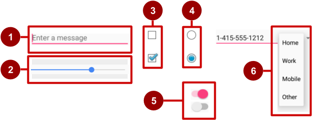
In the figure above:
EditTextfield (subclass ofTextView) for entering text using a keyboardSeekBarfor sliding left or right to a settingCheckBoxelements for selecting one or more optionsRadioGroupofRadioButtonelements for selecting one optionSwitchfor turning on or turning off an optionSpinnerdrop-down menu for selecting one option
When your app needs to get data from the user, try to make the process as easy for the user as it can be. For example, anticipate the source of the data, minimize the number of user gestures such as taps and swipes, and pre-fill forms when possible.
The user expects input controls to work in your app the same way they work in other apps. For example, users expect a Spinner to show a drop-down menu, and they expect text-editing fields to show a keyboard when tapped. Don't violate established expectations, or you'll make it harder for your users to use your app.
Input controls for making choices
Android offers ready-made input controls for the user to select one or more choices:
Checkbox: Select one or more choices from a set of choices by tapping or clicking checkboxes.RadioGroupof radio buttons: Select one choice from a set of choices by clicking one circular "radio" button. Radio buttons are useful if you are providing only two or three choices.ToggleButtonandSwitch: Turn an option on or off.Spinner: Select one choice from a set of choices in a drop-down menu. ASpinneris useful for three or more choices, and takes up little room in your layout.
Input controls and the View focus
If your app has several UI input elements, which element gets input from the user first? For example, if you have several EditText elements for the user to enter text, which element (that is, which View) receives the text? The View that "has the focus" receives user input.
Focus indicates which View is selected. The user can initiate focus by tapping on a View, for example a specific EditText element. You can define a focus order that defines how focus moves from one element to another when the user taps the Return key, Tab key, or arrow keys. You can also control focus programmatically by calling requestFocus() on any View that is focusable.
In addition to being focusable, input controls can be clickable. If a view's clickable attribute is set to true, then the view can react to click events. You can also make an element clickable programmatically.
What's the difference between focusable and clickable?
- A focusable view is allowed to gain focus from a touchscreen, external keyboard, or other input device.
- A clickable view is any view that reacts to being tapped or clicked.
Android-powered devices use many input methods, including directional pads (D-pads), trackballs, touchscreens, external keyboards, and more. Some devices, like tablets and smartphones, are navigated primarily by touch. Other device have no touchscreen. Because a user might navigate through your UI with an input device such as D-pad or a trackball, make sure you do the following:
- Make it visually clear which
Viewhas focus, so that the user knows where the input goes. - Explicitly set the focus in your code to provide a path for users to navigate through the input elements using directional keys or a trackball.
Fortunately, in most cases you don't need to control focus yourself. Android provides "touch mode" for devices that respond to touch, such as smartphones and tablets. When the user begins interacting with the UI by touching it, only View elements with isFocusableInTouchMode() set to true, such as text input fields, are focusable. Other View elements that are touchable, such as Button elements, don't take focus when touched. If the user clicks a directional key or scrolls with a trackball, the device exits "touch mode" and finds a view to take focus.
Focus movement is based on a natural algorithm that finds the nearest neighbor in a given direction:
- When the user taps the screen, the topmost
Viewunder the tap is in focus, providing touch access for the childViewelements of the topmostView. If you set an
EditTextview to a single line (such as thetextPersonNamevalue for theandroid:inputTypeattribute), the user can tap the right-arrow key on the on-screen keyboard to close the keyboard and shift focus to the next input controlViewbased on what the Android system finds.The system usually finds the nearest input control in the same direction the user was navigating (up, down, left, or right).
If there are multiple input controls that are nearby and in the same direction, the system scans from left to right, top to bottom.
Focus can also shift to a different
Viewif the user interacts with a directional control, such as a D-pad or trackball.
You can influence the way Android handles focus by arranging input controls such as EditText elements in a certain layout from left to right and top to bottom, so that focus shifts from one to the other in the sequence you want.
If the algorithm does not give you what you want, you can override it by adding the nextFocusDown, nextFocusLeft, nextFocusRight, and nextFocusUp XML attributes to your layout file:
- Add one of these attributes to a
Viewto decide where to go upon leaving theView—in other words, whichViewshould be the nextView. - Define the value of the attribute to be the
idof the nextView. For example:
<LinearLayout
    <!-- Other attributes... -->
    android:orientation="vertical" >

    <Button android:id="@+id/top"
          <!-- Other Button attributes... -->
          android:nextFocusUp="@+id/bottom" />

    <Button android:id="@+id/bottom"
          <!-- Other Button attributes... -->
          android:nextFocusDown="@+id/top"/>

</LinearLayout>
In a vertical LinearLayout, navigating up from the first Button would not ordinarily go anywhere, nor would navigating down from the second Button. But in the example above, the top Button has specified the bottom Button as the nextFocusUp (and vice versa), so the navigation focus will cycle from top-to-bottom and bottom-to-top.
To declare a View as focusable in your UI (when it is traditionally not), add the android:focusable XML attribute to the View in the layout, and set its value to true. You can also declare a View as focusable while in "touch mode" by setting android:focusableInTouchMode set to true.
You can also explicitly set the focus or find out which View has focus by using the following methods:
- Call
onFocusChangedto determine where focus came from. - To find out which
Viewcurrently has the focus, callActivity.getCurrentFocus(), or useViewGroup.getFocusedChild()to return the focused child of aView(if any). - To find the
Viewin the hierarchy that currently has focus, usefindFocus(). - Use
requestFocusto give focus to a specificView. - To change whether a
Viewcan take focus, callsetFocusable. - To set a listener that is notified when the
Viewgains or loses focus, usesetOnFocusChangeListener.
In this chapter, you learn more about focus with EditText elements.
Checkboxes
Use a set of checkboxes when you want the user to select any number of choices, including zero choices:
- Each checkbox is independent of the other boxes in the set, so selecting one box doesn't clear the other boxes. (If you want to limit the user's selection to one choice, use radio buttons.)
- A user can clear a checkbox that was already selected.
Users expect checkboxes to appear in a vertical list, like a to-do list, or side-by-side if the labels are short.
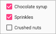
Each checkbox is a separate CheckBox element in your XML layout. To create multiple checkboxes in a vertical orientation, use a vertical LinearLayout:
<LinearLayout xmlns:android="http://schemas.android.com/apk/res/android"
        android:orientation="vertical"
        android:layout_width="fill_parent"
        android:layout_height="fill_parent">

        <CheckBox android:id="@+id/checkbox1_chocolate"
            android:layout_width="wrap_content"
            android:layout_height="wrap_content"
            android:text="@string/chocolate_syrup" />
        <CheckBox android:id="@+id/checkbox2_sprinkles"
            android:layout_width="wrap_content"
            android:layout_height="wrap_content"
            android:text="@string/sprinkles" />
        <CheckBox android:id="@+id/checkbox3_nuts"
            android:layout_width="wrap_content"
            android:layout_height="wrap_content"
            android:text="@string/crushed_nuts" />

</LinearLayout>
Typically programs retrieve the state of each CheckBox when a user taps or clicks a Submit or Done Button in the same Activity, which uses the android:onClick attribute to call a method such as onSubmit():
<Button
   android:layout_width="wrap_content"
   android:layout_height="wrap_content"
   android:text="@string/submit"
   android:onClick="onSubmit"/>
The callback method—onSubmit() in the example above—must be public, return void, and define a View as a parameter (the view that was clicked). In this callback method you can determine whether a CheckBox is selected by using the isChecked() method (inherited from CompoundButton).
The isChecked() method returns true if there is a check mark in the box. For example, the following statement assigns true or false to checked, depending on whether the checkbox is checked:
boolean checked = ((CheckBox) view).isChecked();
The following code snippet shows the onSubmit() method checking to see which CheckBox is selected, using the resource id for the CheckBox:
public void onSubmit(View view) {
   StringBuffer toppings = new
                 StringBuffer().append(getString(R.string.toppings_label));
   if  (((CheckBox) findViewById(R.id.checkbox1_chocolate)).isChecked()) {
      toppings.append(getString(R.string.chocolate_syrup_text));
   }
   if  (((CheckBox) findViewById(R.id.checkbox2_sprinkles)).isChecked()) {
      toppings.append(getString(R.string.sprinkles_text));
   }
   if  (((CheckBox) findViewById(R.id.checkbox3_nuts)).isChecked()) {
      toppings.append(getString(R.string.crushed_nuts_text));
   }
// Code to display the result...
}
Tip: To respond quickly to a CheckBox—such as display a message (like an alert), or show a set of further options—you can use the android:onClick attribute in the XML layout for each CheckBox to declare the callback method for that CheckBox. The callback method must be defined within the Activity that hosts this layout.
For more information about checkboxes, see Checkboxes in the Android developer documentation.
Radio buttons
Use radio buttons when you have two or more options that are mutually exclusive. When the user selects one, the others are automatically deselected. (If you want to enable more than one selection from the set, use checkboxes.)
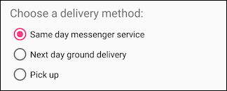
Users expect radio buttons to appear as a vertical list, or side-by-side if the labels are short.
Each radio button is an instance of the RadioButton class. Radio buttons are normally placed within a RadioGroup in a layout. When several RadioButton elements are inside a RadioGroup, selecting one RadioButton clears all the others.
Add RadioButton elements to your XML layout within a RadioGroup:
<RadioGroup
        android:layout_width="wrap_content"
        android:layout_height="wrap_content"
        android:layout_marginLeft="24dp"
        android:layout_marginStart="24dp"
        android:orientation="vertical"
        app:layout_constraintStart_toStartOf="parent"
        app:layout_constraintTop_toBottomOf="@id/delivery_label">

        <RadioButton
            android:id="@+id/sameday"
            android:layout_width="wrap_content"
            android:layout_height="wrap_content"
            android:onClick="onRadioButtonClicked"
            android:text="Same day messenger service" />

        <RadioButton
            android:id="@+id/nextday"
            android:layout_width="wrap_content"
            android:layout_height="wrap_content"
            android:onClick="onRadioButtonClicked"
            android:text="Next day ground delivery" />

        <RadioButton
            android:id="@+id/pickup"
            android:layout_width="wrap_content"
            android:layout_height="wrap_content"
            android:onClick="onRadioButtonClicked"
            android:text="Pick up" />
</RadioGroup>
Use the android:onClick attribute for each RadioButton to declare the click handler, which must be defined within the Activity that hosts the layout. In the layout above, clicking any RadioButton calls the same onRadioButtonClicked() method in the Activity. You could also create separate click handlers in the Activity for each RadioButton.
The click handler method must be public, return void, and define a View as its only parameter (the view that was clicked). The following shows one click handler, onRadioButtonClicked(), for all the RadioButton elements in the RadioGroup. It uses a switch case block to check the resource id for the RadioButton element to determine which one was checked:
public void onRadioButtonClicked(View view) {
   // Check to see if a button has been clicked.
   boolean checked = ((RadioButton) view).isChecked();
   // Check which radio button was clicked.
   switch(view.getId()) {
      case R.id.sameday:
         if (checked)
            // Code for same day service ...
            break;
      case R.id.nextday:
         if (checked)
            // Code for next day delivery ...
            break;
      case R.id.pickup:
         if (checked)
            // Code for pick up ...
            break;
   }
}
Tip: To give users a chance to review their radio button selection before the app responds, you could implement a Submit or Done button as shown previously with checkboxes, and remove the android:onClick attributes from the radio buttons. Then add the onRadioButtonClicked() method to the android:onClick attribute for the Submit or Done button.
For more information about radio buttons, see Radio Buttons in the Android developer documentation.
Spinner
A Spinner provides a quick way for the user to select one value from a set. The user taps on the spinner to see a drop-down list with all available values.
A spinner works well when the user has more than three choices, because spinners scroll as needed, and a spinner doesn't take up much space in your layout. If you are providing only two or three choices and you have space in your layout, you might want to use radio buttons instead of a spinner.
Tip: For more information about spinners, see the Spinners guide.
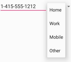
If you have a long list of choices, a spinner might extend beyond your layout, forcing the user to scroll. A spinner scrolls automatically, with no extra code needed. However, making the user scroll through a long list (such as a list of countries) isn't recommended, because it can be hard for the user to select an item.
To create a spinner, use the Spinner class, which creates a View that displays individual spinner values as child View elements and lets the user pick one. Follow these steps:
- Create a
Spinnerelement in your XML layout, and specify its values using an array and anArrayAdapter. - Create the
Spinnerand its adapter using theSpinnerAdapterclass. - To define the selection callback for the
Spinner, update theActivitythat uses theSpinnerto implement theAdapterView.OnItemSelectedListenerinterface.
Create the Spinner UI element
To create a spinner in your XML layout, add a Spinner element, which provides the drop-down list:
<Spinner
   android:id="@+id/label_spinner"
   android:layout_width="wrap_content"
   android:layout_height="wrap_content"/>
Specify values for the Spinner
Add an adapter that fills the Spinner list with values. An adapter is like a bridge, or intermediary, between two incompatible interfaces. For example, a memory card reader acts as an adapter between the memory card and a laptop. You plug the memory card into the card reader, and plug the card reader into the laptop, so that the laptop can read the memory card.
The adapter takes the data set you've specified (an array in this example), and makes a View for each item in the data set (a View within the Spinner), as shown in the figure below.
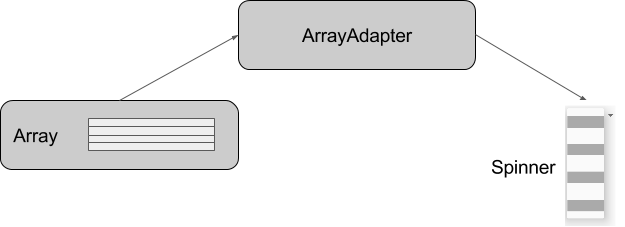
The SpinnerAdapter class, which implements the Adapter class, allows you to define two different views: one that shows the data values in the Spinner itself, and one that shows the data in the drop-down list when the Spinner is touched or clicked.
The values you provide for the Spinner can come from any source, but must be provided through a SpinnerAdapter, such as an ArrayAdapter if the values are easily stored in an array. The following shows a simple array called labels_array of predetermined values in the strings.xml file:
<string-array name="labels_array">
        <item>Home</item>
        <item>Work</item>
        <item>Mobile</item>
        <item>Other</item>
</string-array>
Tip: You can use a CursorAdapter if the values are provided from a source such as a stored file or a database. You learn more about stored data in another lesson.
Implement the OnItemSelectedListener interface in the Activity
To define the selection callback for the Spinner, update the Activity that uses the Spinner to implement the AdapterView.OnItemSelectedListener interface:
public class OrderActivity extends AppCompatActivity implements
            AdapterView.OnItemSelectedListener {
As you type AdapterView. in the statement above, Android Studio automatically imports the AdapterView widget. The reason why you need the AdapterView is because you need an adapter—specifically an ArrayAdapter—to assign the array to the Spinner.
After typing OnItemSelectedListener in the statement above, wait a few seconds for a red light bulb to appear in the left margin. Click the bulb and choose Implement methods. The onItemSelected() and onNothingSelected() methods, which are required for OnItemSelectedListener, should already be highlighted, and the "Insert @Override" option should be checked. Click OK.
Android Studio automatically adds empty onItemSelected() and onNothingSelected() callback methods to the bottom of the Activity. Both methods use the parameter AdapterView<?>. The <?> is a Java type wildcard, enabling the method to be flexible enough to accept any type of AdapterView as an argument.
Create the Spinner and its adapter
Create the Spinner, and set its listener to the Activity that implements the callback methods. The best place to do this is after the Activity layout is inflated in the onCreate() method. Follow these steps:
Instantiate a
Spinnerin theonCreate()method using thelabel_spinnerelement in the layout, and set its listener (spinner.setOnItemSelectedListener) in theonCreate()method, as shown in the following code snippet:@Override protected void onCreate(Bundle savedInstanceState) { // ... Rest of onCreate code ... // Create the spinner. Spinner spinner = findViewById(R.id.label_spinner); if (spinner != null) { spinner.setOnItemSelectedListener(this); } // Create ArrayAdapter using the string array and default spinner layout.The code snippet above uses
findViewById()to find theSpinnerby itsid(label_spinner). It then sets theonItemSelectedListenerto whicheverActivityimplements the callbacks (this) using thesetOnItemSelectedListener()methodContinuing to edit the
onCreate()method, add a statement that creates theArrayAdapterwith the string array (labels_array) using the Android-suppliedSpinnerlayout for each item (layout.simple_spinner_item):// Create ArrayAdapter using the string array and default spinner layout. ArrayAdapter<CharSequence> adapter = ArrayAdapter.createFromResource(this, R.array.labels_array, android.R.layout.simple_spinner_item); // Specify the layout to use when the list of choices appears.As shown in the snippet above, you use the
createFromResource()method to create the adapter. It takes as arguments theActivity(this) that implements the callbacks for processing the results of theSpinner, the array (labels_array), and the layout for each spinner item (layout.simple_spinner_item).The
simple_spinner_itemlayout used in this step, and thesimple_spinner_dropdown_itemlayout used in the next step, are the default predefined layouts provided by Android in theR.layoutclass. You should use these layouts unless you want to define your own layouts for the items in theSpinnerand its appearance.Specify the layout for the
Spinnerchoices to besimple_spinner_dropdown_item, and then apply the adapter to theSpinner:// Specify the layout to use when the list of choices appears. adapter.setDropDownViewResource (android.R.layout.simple_spinner_dropdown_item); // Apply the adapter to the spinner. if (spinner != null) { spinner.setAdapter(adapter); } // ... End of onCreate code ...The snippet above uses
setAdapter()to apply the adapter to theSpinner. You should use thesimple_spinner_dropdown_itemdefault layout, unless you want to define your own layout for theSpinnerappearance.
Add code to respond to Spinner selections
When the user chooses an item from the spinner's drop-down list, here's what happens and how you retrieve the item:
- The
Spinnerreceives an on-item-selected event. - The event triggers the calling of the
onItemSelected()callback method of theAdapterView.OnItemSelectedListenerinterface. - Retrieve the selected item in the
Spinnerusing thegetItemAtPosition()method of theAdapterViewclass:
The arguments forpublic void onItemSelected(AdapterView<?> adapterView, View view, int i, long l) { String spinner_item = adapterView.getItemAtPosition(i).toString(); // Do something with spinner_item string. }onItemSelected()are as follows:parent AdapterView The AdapterView where the selection happened view ViewThe Viewwithin theAdapterViewthat was clickedint posThe position of the Viewin the adapterlong idThe row id of the item that is selected
Implement/override the onNothingSelected() callback method of the AdapterView.OnItemSelectedListener interface to do something if nothing is selected.
For more information about using spinners, see Spinners in the Android developer documentation.
Toggle buttons and switches
A toggle input control lets the user change a setting between on and off. Android provides the ToggleButton class, which shows a raised button with "OFF" and "ON".

Examples of toggles include the on/off switches for Wi-Fi, Bluetooth, and other options in the Settings app.
Android also provides the Switch class, which is a short slider that looks like a rocker switch for on and off. Both are extensions of the CompoundButton class.

Using a toggle button
Create a toggle button by using a ToggleButton element in your XML layout:
<ToggleButton
        android:layout_width="wrap_content"
        android:layout_height="wrap_content"
        android:id="@+id/my_toggle"
        android:text="
        android:onClick="onToggleClick"/>
Tip: The android:text attribute does not provide a text label for a toggle button—the toggle button always shows either "ON" or "OFF". To provide a text label next to or above the toggle button, use a separate TextView.
To respond to the toggle tap, declare an android:onClick callback method for the ToggleButton:
- The
onClick()method must be defined in theActivityhosting the layout, and it must bepublicand returnvoid. - As its only parameter, the
onClick()method must define aView—this will be theViewthat is clicked.
Use CompoundButton.OnCheckedChangeListener() to detect the state change of the toggle. Create a CompoundButton.OnCheckedChangeListener object and assign it to the toggle by calling setOnCheckedChangeListener(). For example, the onToggleClick() method checks whether the toggle is on or off, and displays a Toast message:
public void onToggleClick(View view) {
   ToggleButton toggle = findViewById(R.id.my_toggle);
   toggle.setOnCheckedChangeListener(new
                              CompoundButton.OnCheckedChangeListener() {
      public void onCheckedChanged(CompoundButton buttonView,
                              boolean isChecked) {
         StringBuffer onOff = new StringBuffer().append("On or off? ");
         if (isChecked) { // The toggle is enabled
            onOff.append("ON ");
         } else { // The toggle is disabled
            onOff.append("OFF ");
         }
         Toast.makeText(getApplicationContext(), onOff.toString(),
                              Toast.LENGTH_SHORT).show();
      }
   });
}
Tip: You can also programmatically change the state of a ToggleButton using the setChecked(boolean) method. Be aware, however, that the method specified by the android:onClick() attribute will not be executed in this case.
Using a switch
A switch is a separate instance of the Switch class, which extends the CompoundButton class just like ToggleButton. Create a toggle switch by using a Switch element in your XML layout:
<Switch
        android:layout_width="wrap_content"
        android:layout_height="wrap_content"
        android:id="@+id/my_switch"
        android:text="@string/turn_on_or_off"
        android:onClick="onSwitchClick"/>
The android:text attribute defines a string that appears to the left of the Switch, as shown below:

To respond to the Switch tap, declare an android:onClick callback method for the Switch—the code is basically the same as for a ToggleButton. The method must be defined in the Activity hosting the layout, and it must be public, return void, and define a View as its only parameter (this will be the View that was clicked). Use CompoundButton.OnCheckedChangeListener() to detect the state change of the Switch. Create a CompoundButton.OnCheckedChangeListener object and assign it to the Switch by calling setOnCheckedChangeListener(). For example, the onSwitchClick() method checks whether the Switch is on or off, and displays a Toast message:
public void onSwitchClick(View view) {
   Switch aSwitch = findViewById(R.id.my_switch);
   aSwitch.setOnCheckedChangeListener(new
                             CompoundButton.OnCheckedChangeListener() {
      public void onCheckedChanged(CompoundButton buttonView,
                             boolean isChecked) {
         StringBuffer onOff = new StringBuffer().append("On or off? ");
         if (isChecked) { // The switch is enabled
            onOff.append("ON ");
         } else { // The switch is disabled
            onOff.append("OFF ");
         }
         Toast.makeText(getApplicationContext(), onOff.toString(),
                             Toast.LENGTH_SHORT).show();
      }
   });
}
Tip: You can also programmatically change the state of a Switch using the setChecked(boolean) method. Be aware, however, that the method specified by the android:onClick() attribute will not be executed in this case.
For more information about toggles, see Toggle Buttons in the Android developer documentation.
Text input
Use the EditText class to get user input that consists of textual characters, including numbers and symbols. EditText extends the TextView class, to make the TextView editable.
Customizing an EditText for user input
Create an EditText view by adding an EditText to your layout with the following XML:
<EditText
    android:id="@+id/edit_simple"
    android:layout_height="wrap_content"
    android:layout_width="match_parent">
    android:hint="@string/enter_text_here"
</EditText>
Multiple lines of text
By default, the EditText view allows multiple lines of input as shown in the figure below, and suggests full words the user can tap. Tapping the Return (also known as Enter) key on the keyboard starts a new line in the same EditText.
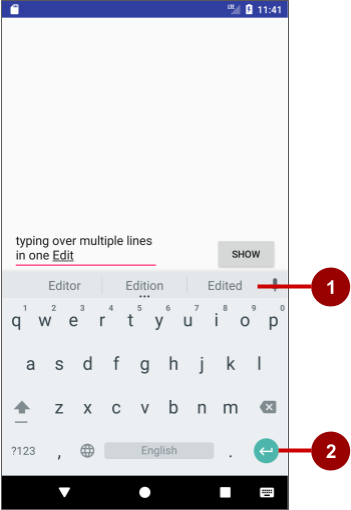
In the figure above:
- Suggestions to tap
- Return (Enter) key
Message or single line of text
If you add the android:inputType attribute to the EditText you can customize it. For example, the following code uses android:inputType="textShortMessage" to show an EditText that offers a single line for typing a message, as shown on the left side of the figure below. An emoji (smiley face) takes the place of a Return key, changing the keyboard to emoji. To close the keyboard, the user taps the down-arrow key, which replaces the Back button in the bottom row of buttons.
<EditText
    android:id="@+id/edit_simple"
    android:layout_height="wrap_content"
    android:layout_width="match_parent">
    android:hint="@string/enter_text_here"
    android:inputType="textShortMessage"
</EditText>
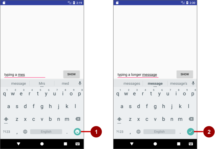
In the figure above:
- Emoji key
- Done key
Use android:inputType="textLongMessage" to show an EditText that offers a single line for typing a message, as shown on the right side of the figure above, with a Done key that closes the keyboard and advances the focus to the next View. This behavior is useful if you want the user to fill out a form consisting of EditText fields, so that the user can advance quickly to the next EditText field.
Tip: The Android Studio layout editor lets you drag a Plain Text element from the Palette to the layout. This element is, by default, an EditText with its android:inputType set to textPersonName for entering a person's name. It provides a single line of text with suggestions and a Done key, just like textLongMessage. You can change the element to use a different inputType (android:inputType) value in the Attributes pane, as shown in the figure below.

Attributes for customizing an EditText view
The following are generally used attributes for customizing an EditText:
android:inputType="textCapCharacters": Set the text entry to all capital letters.android:inputType="textCapSentences": Start each sentence with a capital letter.android:inputType="textMultiLine": Set the text field to enable multiple lines. This value is useful for combining with other attributes. To combine values, concatenate them using the pipe (|) character.android:inputType="textPassword": Turn each character the user enters into a dot to conceal an entered password.android:inputType="number": Restrict text entry to numbers.android:textColorHighlight="#7cff88": Set the background color of selected (highlighted) text.android:hint="@string/my_hint": Set text to appear in the field that provides a hint for the user, such as "Enter a message".
For a list of EditText attributes, including inherited TextView attributes, see the "Summary" of the EditText class description.
Getting the user's input
To use the user's input in your app, set up layout and code by following these steps:
- Add an
EditTextelement to the XML layout for theActivity. Be sure to identify this element with anandroid:idso that you can refer to it by itsid:android:id="@+id/editText_main" - In the Java code for the same
Activity, refer to theEditTextby using the findViewById() method to find theViewby itsid(editText_main):EditText editText = findViewById(R.id.editText_main); - Use the
getText()method to obtain the text as a character sequence (CharSequence). You can convert the character sequence into a string using thetoString()method, which returns a string for the character sequence.
Use theString showString = editText.getText().toString();valueOf()method of theIntegerclass to convert the string to an integer if the input is an integer.
Customizing the keyboard
The Android system shows an on-screen keyboard—known as a soft input method—when an EditText in the UI receives focus. To provide the best user experience, you can customize the keyboard to show, for example, a numeric keypad for entering phone number, or a keyboard for entering email addresses with the @ symbol conveniently located near the space key.
To customize the keyboard, use the android:inputType attribute for the EditText with the following values:
textEmailAddress: Show an email keyboard with the @ symbol conveniently located next to the space key.phone: Show a numeric phone keypad.date: Show a numeric keypad with a slash for entering the date.time: Show a numeric keypad with a colon for entering the time.datetime: Show a numeric keypad with a slash and colon for entering the date and time.
Tip: You can use the pipe (|) character (Java bitwise OR) to combine attribute values for the android:inputType attribute:
android:inputType="textAutoCorrect|textCapSentences"
For details about the android:inputType attribute, see Specify the input method type in the developer documentation. For a complete list of constant values for android:inputType, see android:inputType.
Changing the "action" key in the keyboard
The "action" key for an EditText keyboard is the Done or Return key. You can change the "action" key to something else, such as a Send key, and change the action it performs.
To use a Send key and an action that dials a phone number, use the android:inputType attribute for the EditText element set to phone. Then use the android:imeOptions attribute with the actionSend value:
android:inputType="phone"
android:imeOptions="actionSend"
In the onCreate() method for the Activity, you can use setOnEditorActionListener() to set the listener for the EditText to detect if the key is pressed:
EditText editText = findViewById(R.id.editText_main);
if (editText != null)
   editText.setOnEditorActionListener
                         (new TextView.OnEditorActionListener() {
      // If view is found, set the listener for editText.
   });
To respond to the pressed key, override onEditorAction() and use the IME_ACTION_SEND constant in the EditorInfo class. In the snippet below, the key is used to call the dialNumber() method to dial the phone number:
@Override
public boolean onEditorAction(TextView textView, int actionId, KeyEvent keyEvent) {
   boolean mHandled = false;
   if (actionId == EditorInfo.IME_ACTION_SEND) {
      dialNumber();
      mHandled = true;
   }
   return mHandled;
}
You would then need a dialNumber() method, which would use an implicit intent with ACTION_DIAL to pass the phone number to another app that can dial the number.
Tip: For help setting the listener, see Specify the input method type.
Related practical
The related practical is 4.2: Input controls.
Learn more
Android Studio documentation:
Android developer documentation: