4.3: Menus and pickers
Contents:
- Types of menus
- The app bar and options menu
- Contextual menus
- Popup menu
- Dialogs and pickers
- Related practical
- Learn more
Types of menus
A menu is a set of options. The user can select from a menu to perform a function, for example searching for information, saving information, editing information, or navigating to a screen. The figure below shows the types of menus that the Android system offers.
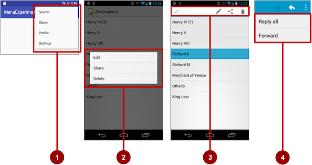
- Options menu: Appears in the app bar and provides the primary options that affect use of the app itself. Examples of menu options: Search to perform a search, Share to share a link, and Settings to navigate to a Settings
Activity. - Contextual menu: Appears as a floating list of choices when the user performs a long tap on an element on the screen. Examples of menu options: Edit to edit the element, Delete to delete it, and Share to share it over social media.
- Contextual action bar: Appears at the top of the screen overlaying the app bar, with action items that affect the selected element or elements. Examples of menu options: Edit, Share, and Delete for one or more selected elements.
- Popup menu: Appears anchored to a
Viewsuch as anImageButton, and provides an overflow of actions or the second part of a two-part command. Example of a popup menu: the Gmail app anchors a popup menu to the app bar for the message view with Reply, Reply All, and Forward.
The app bar and options menu
The app bar (also called the action bar) is a dedicated space at the top of each Activity screen. When you create an Activity from a template (such as Empty Template), an app bar is automatically included for the Activity.
The app bar by default shows the app title, or the name defined in AndroidManifest.xml by the android:label attribute for the Activity. The app bar may also include the Up button for navigating up to the parent activity. Up navigation is described in the chapter on using the app bar for navigation.
The options menu in the app bar usually provides navigation to other screens in the app, or options that affect using the app itself. (The options menu should not include options that act on an element on the screen. For that you use a contextual menu, described later in this chapter.)
For example, your options menu might let the user navigate to another activity to place an order. Or your options menu might let the user change settings or profile information, or do other actions that have a global impact on the app.
The options menu appears in the right corner of the app bar. The app bar is split into four functional areas that apply to most apps, as shown in the figure below.
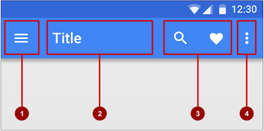
In the figure above:
- Navigation button or Up button: Use a navigation button in this space to open a navigation drawer, or use an Up button for navigating up through your app's screen hierarchy to the parent activity. Both are described in the next chapter.
- Title: The title in the app bar is the app title, or the name defined in AndroidManifest.xml by the
android:labelattribute for the activity. - Action icons for the options menu: Each action icon appears in the app bar and represents one of the options menu's most frequently used items. Less frequently used options menu items appear in the overflow options menu.
- Overflow options menu: The overflow icon opens a popup with option menu items that are not shown as icons in the app bar.
Frequently used options menu items should appear as icons in the app bar. The overflow options menu shows the rest of the menu:
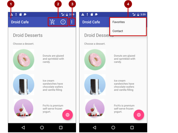
In the above figure:
- App bar. The app bar includes the app title, the options menu, and the overflow button.
- Options menu action icons. The first two options menu items appear as icons in the app bar.
- Overflow button. The overflow button (three vertical dots) opens a menu that shows more options menu items.
- Options overflow menu. After clicking the overflow button, more options menu items appear in the overflow menu.
Adding the app bar
Each activity that uses the default theme also has an ActionBar as its app bar. Some themes also set up an ActionBar as an app bar by default. When you start an app from a template such as Empty Activity, an ActionBar appears as the app bar.
Features were added to the native ActionBar over time, so the behavior of the native ActionBar depends on the version of Android that the device is running. For this reason, if you add an options menu, use the v7 appcompat support library's Toolbar as an app bar:
Toolbarmakes it easy to set up an app bar that works on a wide range of devices.Toolbargives you room to customize your app bar later, as your app develops.Toolbarincludes the most recent features, and it works for any device that can use the support library.
To use Toolbar as an activity's app bar (instead of using the default ActionBar), you can start your project with the Basic Activity template. That template implements Toolbar for the activity, and it implements a rudimentary options menu with one item, Settings.
Tip: If you use the Basic Activity template, you can skip the rest of this section, because the template provides everything you need.
If you are not using the Basic Activity template, this section describes how to add Toolbar yourself. The following are the general steps:
- Add the support libraries
appcompatanddesign. - Use a
NoActionBartheme and styles for the app bar and background. - Add an
AppBarLayoutand aToolbarto the layout. - Add code to the
Activityto set up the app bar.
Adding the support libraries
If you start an app project using the Basic Activity template, the template adds the following support libraries for you, so you can skip this step.
If you are not using the Basic Activity template, add two things to your project: the appcompat support library for the Toolbar class, and the design library for the NoActionBar themes:
- Choose Tools > Android > SDK Manager to check whether the Android Support Repository is installed. If the repository is not installed, install it.
- Open the
build.gradlefile for your app, and add the support library feature project identifiers to thedependenciessection. For example, to includesupport:appcompatandsupport:design, add:compile 'com.android.support:appcompat-v7:26.1.0' compile 'com.android.support:design:26.1.0'Note: If necessary, update the version numbers for dependencies. If the version number you specified is lower than the currently available library version number, Android Studio warns you. Update the version number to the one Android Studio tells you to use.
Using themes to design the app bar
If you start an app project using the Basic Activity template, the template adds the theme to replace the ActionBar with a Toolbar, so you can skip this step.
If you are not using the Basic Activity template, you can use the Toolbar class for the app bar by turning off the default ActionBar using a NoActionBar theme for the activity. Themes in Android are similar to styles, except that they are applied to an entire app or activity rather than to a specific view.
When you create a new project in Android Studio, an app theme is automatically generated for you. For example, if you start an app project with the Empty Activity or Basic Activity template, the AppTheme theme is provided in styles.xml. To see this file, expand the res > values folder in the Project > Android pane.
Tip: You learn more about themes in the chapter on drawables, styles, and themes.
You can modify the theme to provide a style for the app bar and app background. Follow these steps to make the app bar stand out against its background:
Open styles.xml. You should already have the following in the file within the
<resources>section:<!-- Base application theme. --> <style name="AppTheme" parent="Theme.AppCompat.Light.DarkActionBar"> <!-- Customize your theme here. --> <item name="colorPrimary">@color/colorPrimary</item> <item name="colorPrimaryDark">@color/colorPrimaryDark</item> <item name="colorAccent">@color/colorAccent</item> </style>AppTheme"inherits"—takes on all the styles—from a parent theme calledTheme.AppCompat.Light.DarkActionBar, which is a standard theme supplied with Android. However, you can override an inherited style with another style by adding the other style to styles.xml.Add the
AppTheme.NoActionBar,AppTheme.AppBarOverlay, andAppTheme.PopupOverlaystyles under theAppThemestyle, as shown below. These styles will override the style attributes with the same names inAppTheme, affecting the appearance of the app bar and the app's background:<style name="AppTheme.NoActionBar"> <item name="windowActionBar">false</item> <item name="windowNoTitle">true</item> </style> <style name="AppTheme.AppBarOverlay" parent="ThemeOverlay.AppCompat.Dark.ActionBar" /> <style name="AppTheme.PopupOverlay" parent="ThemeOverlay.AppCompat.Light" />- Open AndroidManifest.xml and add the
NoActionBartheme inappcompatto the<application>element. Using this theme prevents the app from using the nativeActionBarclass to provide the app bar:<activity <!-- android:name and android:label code goes here. --> android:theme="@style/AppTheme.NoActionBar"> <!-- intent filter code would go here if needed. --> </activity>Adding AppBarLayout and a Toolbar to the layout
If you start an app project using the Basic Activity template, the template adds the AppBarLayout and Toolbar for you, so you can skip this step.
If you are not using the Basic Activity template, you can include the Toolbar in an Activity layout by adding an AppBarLayout and a Toolbar element. AppBarLayout is a vertical LinearLayout which implements many of the features of the material designs app bar concept, such as scrolling gestures. Keep in mind the following:
AppBarLayoutmust be a direct child within aCoordinatorLayoutroot view group, andToolbarmust be a direct child withinAppBarLayout, placed at the top of theActivitylayout. Shown below is a layout that uses this structure:<android.support.design.widget.CoordinatorLayout xmlns:android="http://schemas.android.com/apk/res/android" xmlns:app="http://schemas.android.com/apk/res-auto" xmlns:tools="http://schemas.android.com/tools" android:layout_width="match_parent" android:layout_height="match_parent" tools:context="com.example.android.droidcafeinput.MainActivity"> <android.support.design.widget.AppBarLayout android:layout_width="match_parent" android:layout_height="wrap_content" android:theme="@style/AppTheme.AppBarOverlay"> <android.support.v7.widget.Toolbar android:id="@+id/toolbar" android:layout_width="match_parent" android:layout_height="?attr/actionBarSize" android:background="?attr/colorPrimary" app:popupTheme="@style/AppTheme.PopupOverlay" /> </android.support.design.widget.AppBarLayout> <include layout="@layout/content_main" /> </android.support.design.widget.CoordinatorLayout>AppBarLayoutalso requires a separate content layout sibling for the content that scrolls underneath the app bar. You can add this sibling as a view group (such asRelativeLayoutorLinearLayout) in the same layout file, or in a separate layout file. The above XML snippet uses aninclude layoutto include the content layout incontent_main.xml.- Set the content sibling's view group to use the scrolling behavior
AppBarLayout.ScrollingViewBehavior:
The layout behavior for theapp:layout_behavior="@string/appbar_scrolling_view_behavior"RelativeLayoutis set to the string resource@string/appbar_scrolling_view_behavior. This string resource controls how the screen scrolls in relation to the app bar at the top. The resource represents the following string, which is defined in thevalues.xmlfile (which you should not modify):
This behavior is defined by theandroid.support.design.widget.AppBarLayout$ScrollingViewBehaviorAppBarLayout.ScrollingViewBehaviorclass. AnyViewor view group that can scroll vertically to support nested scrolling forAppBarLayoutsiblings should use this behavior.
Adding code to set up the app bar
If you start an app project using the Basic Activity template, the template adds the code needed to set up the app bar, so you can skip this step.
If you are not using the Basic Activity template, you can follow these steps to set up the app bar in the Activity:
- Make sure that any
Activitythat you want to show an app bar extendsAppCompatActivity:public class MainActivity extends AppCompatActivity { // ... Activity code } - In the
onCreate()method for theActivity, callsetSupportActionBar()with theToolbar. ThesetSupportActionBar()method sets theToolbaras the app bar for theActivity:
The@Override protected void onCreate(Bundle savedInstanceState) { super.onCreate(savedInstanceState); setContentView(R.layout.activity_main); Toolbar toolbar = findViewById(R.id.toolbar); setSupportActionBar(toolbar); }Activitynow shows the app bar. By default, the app bar contains just the name of the app.
Adding the options menu
Android provides a standard XML format to define options menu items. Instead of building the menu in your Activity code, you can define the menu and all its items in an XML menu resource. A menu resource defines an application menu (options menu, context menu, or popup menu) that can be inflated with MenuInflater, which loads the resource as a Menu object in your Activity.
If you start an app project using the Basic Activity template, the template adds the menu resource for you and inflates the options menu with MenuInflater, so you can skip this step and go right to "Defining how menu items appear".
If you are not using the Basic Activity template, use the resource-inflate design pattern, which makes it easy to create an options menu. Follow these steps (refer to the figure below):

- XML menu resource. Create an XML menu resource file for the menu items, and assign appearance and position attributes as described in the next section.
- Inflating the menu. Override the
onCreateOptionsMenu()method in yourActivityto inflate the menu. - Handling menu-item clicks. Menu items are
Viewelements, so you can use theandroid:onClickattribute for each menu item. However, theonOptionsItemSelected()method can handle all the menu-item clicks in one place and determine which menu item the user clicked, which makes your code easier to understand. - Performing actions. Create a method to perform an action for each options menu item.
Creating an XML resource for the menu
Follow these steps to add menu items to an XML menu resource:
- Select the res folder in the Project > Android pane and choose File > New > Android resource directory.
- Choose menu in the Resource type drop-down menu, and click OK.
- Select the new menu folder, and choose File > New > Menu resource file.
- Enter the name, such as menu_main, and click OK. The new
menu_main.xmlfile now resides within the menu folder. - Open menu_main.xml and click the Text tab to show the XML code.
- Add menu items using the
<item ... />tag. In this example, the item is Settings:
After setting up and inflating the XML resource in the<menu xmlns:android="http://schemas.android.com/apk/res/android" xmlns:app="http://schemas.android.com/apk/res-auto" xmlns:tools="http://schemas.android.com/tools" tools:context="com.example.android.droidcafeinput.MainActivity"> <item android:id="@+id/action_settings" android:orderInCategory="100" android:title="Settings" app:showAsAction="never" />Activity, the overflow icon in the app bar, when clicked, would show the options menu with just one option (Settings).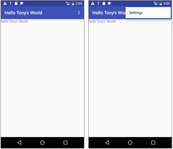
Defining how menu items appear
If you start an app project using the Basic Activity template, the template adds the options menu with one option: Settings.
To add more options menu items, add more <item ... /> tags in the menu_main.xml file. For example, in the following snippet, two menu items are defined: @string/settings (Settings) and @string/action_order (Order):
<item
      android:id="@+id/action_settings"
      android:title="@string/settings" />
<item
      android:id="@+id/action_order"
      android:icon="@drawable/ic_order_white"
      android:title="@string/action_order"/>
Within each <item ... /> tag, you add attributes that define how the menu item appears. For example, you can define the order of the item's appearance relative to other items, and whether the item can appear as an icon in the app bar. The following items are placed in the overflow menu:
- Any item that you set to not appear in the app bar.
- Any item that can't fit in the app bar, given the display orientation.
Whenever possible, show the most-used actions using icons in the app bar so that the user can tap these actions without having to first tap the overflow button.
Adding icons for menu items
To specify icons for actions, first add the icons as image assets to the drawable folder by following the steps below. (For a comlete description, see Create app icons with Image Asset Studio.)
- Expand res in the Project > Android pane, and right-click (or Command-click) drawable.
- Choose New > Image Asset. The Configure Image Asset dialog appears.
- Choose Action Bar and Tab Items in the drop-down menu.
- Edit the name of the icon (for example, ic_order_white for the Order menu item).
- Click the clip art image (the Android logo) to select a clip art image as the icon. A page of icons appears. Click the icon you want to use.
- (Optional) Choose HOLO_DARK from the Theme drop-down menu. This sets the icon to be white against a dark-colored (or black) background. Click Next.
- Click Finish in the Confirm Icon Path dialog.
Icon and appearance attributes
Use the following attributes to govern the menu item's appearance:
android:icon: An image to use as the menu item icon. For example, the following menu item definesic_order_whiteas its icon:<item android:id="@+id/action_order" android:icon="@drawable/ic_order_white" android:title="@string/action_order"/>android:title: A string for the title of the menu item.android:titleCondensed: A string to use as a condensed title for situations in which the normal title is too long.
Position attributes
Use the android:orderInCategory attribute to specify the order in which the menu items appear in the menu, with the lowest number appearing higher in the menu. This is usually the order of importance of the item within the menu. For example, if you want Order to be first, followed by Status, Favorites, and Contact, the following table shows the priority of these items in the menu:
| Menu item | orderInCategory attribute |
| Order | 10
|
| Status | 20
|
| Favorites | 30
|
| Contact | 40
|
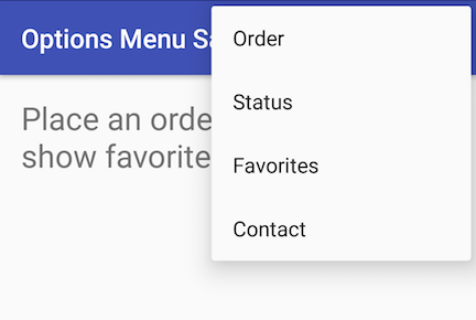
Use the app:showAsAction attribute to show menu items as icons in the app bar, with the following values:
"always": Always place this item in the app bar. Use this only if it's critical that the item appear in the app bar (such as a Search icon). If you set multiple items to always appear in the app bar, they might overlap something else in the app bar, such as the app title."ifRoom": Only place this item in the app bar if there is room for it. If there is not enough room for all the items marked"ifRoom", the items with the lowestorderInCategoryvalues are displayed in the app bar. The remaining items are displayed in the overflow menu."never": Never place this item in the app bar. Instead, list the item in the app bar's overflow menu."withText": Also include the title text (defined byandroid:title) with the item. This attribute is used primarily to include the title with the icon in the app bar, because if the item appears in the overflow menu, the title text appears regardless.
For example, the following menu item's icon appears in the app bar only if there is room for it:
<item
   android:id="@+id/action_favorites"
   android:icon="@drawable/ic_favorites_white"
   android:orderInCategory="40"
   android:title="@string/action_favorites"
   app:showAsAction="ifRoom" />

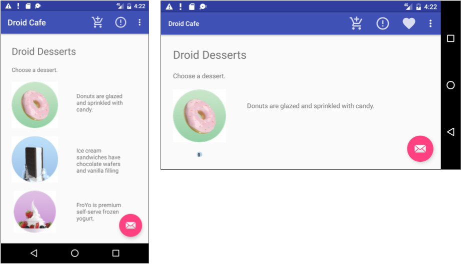
In the above figure:
- Options menu action icons. The first two menu items appear as action icons in the app bar: Order (the shopping cart icon) and Info (the "i" icon).
- Overflow button. Clicking the overflow button shows the overflow menu.
- Options overflow menu. The overflow menu shows more of the options menu: Favorites (the heart icon) and Contact. Favorites doesn't fit into the app bar in vertical orientation, but may appear in horizontal orientation on a smartphone, or in both orientations on a tablet, as shown below.
Inflating the menu resource
If you start an app project using the Basic Activity template, the template adds the code for inflating the options menu with MenuInflater, so you can skip this step.
If you are not using the Basic Activity template, inflate the menu resource in your activity by overriding the onCreateOptionsMenu() method and using the getMenuInflater() method of the Activity class.
The getMenuInflater() method returns a MenuInflater, which is a class used to instantiate menu XML files into Menu objects. The MenuInflater class provides the inflate() method, which takes two parameters:
- The resource
idfor an XML layout resource to load (R.menu.menu_mainin the following example). - The
Menuto inflate into (menuin the following example).@Override public boolean onCreateOptionsMenu(Menu menu) { getMenuInflater().inflate(R.menu.menu_main, menu); return true; }Handling the menu-item click
As with a Button, the android:onClick attribute defines a method to call when this menu item is clicked. You must declare the method in the Activity as public and accept a MenuItem as its only parameter, which indicates the item clicked.
For example, you could define the Favorites item in the menu resource file to use the android:onClick attribute to call the onFavoritesClick() method:
<item
        android:id="@+id/action_favorites"
        android:icon="@drawable/ic_favorites_white"
        android:orderInCategory="40"
        android:title="@string/action_favorites"
        app:showAsAction="ifRoom"
        android:onClick="onFavoritesClick" />
You would declare the onFavoritesClick() method in the Activity:
public void onFavoritesClick(MenuItem item) {
    // The item parameter indicates which item was clicked.
    // ... Add code to handle the Favorites click.
}
However, the onOptionsItemSelected() method can handle all the menu-item clicks in one place and determine which menu item the user clicked. This makes your code easier to understand.
For example, you can use a switch case block to call the appropriate method (such as showOrder) based on the menu item's id. You retrieve the id using the getItemId() method:
@Override
public boolean onOptionsItemSelected(MenuItem item) {
   switch (item.getItemId()) {
      case R.id.action_order:
         showOrder();
         return true;
      case R.id.action_status:
         showStatus();
         return true;
      case R.id.action_contact:
         showContact();
         return true;
      default:
         // Do nothing
   }
   return super.onOptionsItemSelected(item);
}
Contextual menus
Use a contextual menu to allow users to take an action on a selected View. Contextual menus are most often used for items in a RecyclerView, GridView, or other view collection in which the user can perform direct actions on each item.
Android provides two kinds of contextual menus:
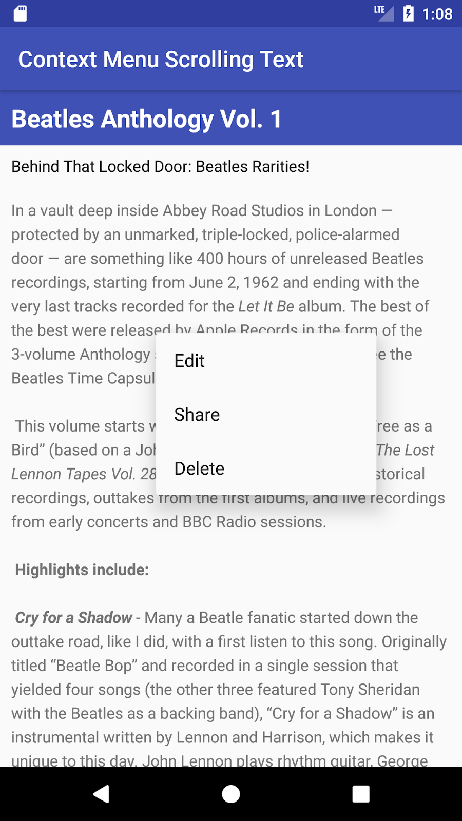
- A context menu, shown on the left side in the figure below, appears as a floating list of menu items when the user performs a long tap on a
View. It is typically used to modify theViewor use it in some fashion. For example, a context menu might include Edit to edit the contents of aView, Delete to delete aView, and Share to share aViewover social media. Users can perform a contextual action on one selectedViewat a time. - A contextual action bar, shown on the right side of the figure below, appears at the top of the screen in place of the app bar or underneath the app bar, with action items that affect one or more selected
Viewelements. Users can perform an action on multipleViewelements at once, if your app allows it.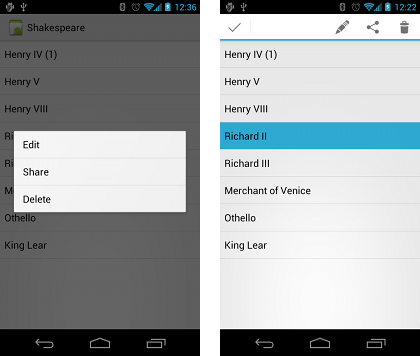
Floating context menu
The familiar resource-inflate design pattern is used to create a context menu, modified to include registering (associating) the context menu with a View. The pattern consists of the steps shown in the figure below.
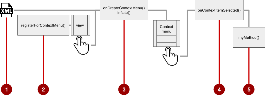
- Create an XML menu resource file for the menu items. Assign appearance and position attributes as described in the previous section for the options menu.
- Register a
Viewto the context menu using theregisterForContextMenu() method of theActivityclass. - Implement the
onCreateContextMenu()method in yourActivityto inflate the menu. - Implement the
onContextItemSelected()method in yourActivityto handle menu-item clicks. - Create a method to perform an action for each context menu item.
Creating the XML resource file
To create the XML menu resource directory and file, follow the steps in the previous section for the options menu. However, use a different name for the file, such as menu_context. Add the context menu items within <item ... /> tags.
For example, the following code defines the Edit menu item:
<item
   android:id="@+id/context_edit"
   android:title="Edit"
   android:orderInCategory="10"/>
Registering a View to the context menu
To register a View to the context menu, call the registerForContextMenu() method with the View. Registering a context menu for a view sets the View.OnCreateContextMenuListener on the View to this activity, so that onCreateContextMenu() is called when it's time to show the context menu. (You implement onCreateContextMenu in the next section.)
For example, in the onCreate() method for the Activity, you would add registerForContextMenu():
// Registering the context menu to the TextView of the article.
TextView article_text = findViewById(R.id.article);
registerForContextMenu(article_text);
Multiple views can be registered to the same context menu. If you want each item in a ListView or GridView to provide the same context menu, register all items for a context menu by passing the ListView or GridView to registerForContextMenu().
Implementing the onCreateContextMenu() method
When the registered View receives a long-click event, the system calls the onCreateContextMenu() method, which you can override in your Activity. (Long-click events are also called touch & hold events and long-press events.)
The onCreateContextMenu() method is where you define the menu items, usually by inflating a menu resource.
For example:
@Override
public void onCreateContextMenu(ContextMenu menu, View v,
                         ContextMenu.ContextMenuInfo menuInfo) {
   super.onCreateContextMenu(menu, v, menuInfo);
   MenuInflater inflater = getMenuInflater();
   inflater.inflate(R.menu.menu_context, menu);
}
In the code above:
- The
menuparameter foronCreateContextMenu()is the context menu to be built. - The
vparameter is theViewregistered for the context menu. The
menuInfoparameter is extra information about theViewregistered for the context menu. This information varies depending on the class of thevparameter, which could be aRecyclerViewor aGridView.If you are registering a
RecyclerViewor aGridView, you instantiate aContextMenu.ContextMenuInfoobject to provide information about the item selected, and pass it asmenuInfo, such as the rowid, position, or childView.
The MenuInflater class provides the inflate() method, which takes two parameters:
- The resource
idfor an XML layout resource to load. In the example above, theidismenu_context. - The
Menuto inflate into. In the example above, theMenuismenu.
Implementing the onContextItemSelected() method
When the user clicks on a menu item, the system calls the onContextItemSelected() method. You override this method in your Activity in order to determine which menu item was clicked, and for which view the menu is appearing. You also use it to implement the appropriate action for the menu items, such as editNote() and shareNote() in the following code snippet for the Edit and Share menu items:
@Override
public boolean onContextItemSelected(MenuItem item) {
   switch (item.getItemId()) {
      case R.id.context_edit:
         editNote();
         return true;
      case R.id.context_share:
         shareNote();
         return true;
      default:
         return super.onContextItemSelected(item);
   }
}
The above code snippet uses the getItemId() method to get the id for the selected menu item, and uses it in a switch case block to determine which action to take. The id is the android:id attribute assigned to the menu item in the XML menu resource file.
When the user performs a long-click on the article in the TextView, the floating context menu appears and the user can click a menu item.
If you are using the menuInfo information for a RecyclerView or a GridView, you would add a statement before the switch case block to gather the specific information about the selected View (for info) by using AdapterView.AdapterContextMenuInfo:
AdapterView.AdapterContextMenuInfo info =
            (AdapterView.AdapterContextMenuInfo) item.getMenuInfo();
Contextual action bar
A contextual action bar appears at the top of the screen to present actions the user can perform on a View after long-clicking the View, as shown in the figure below.
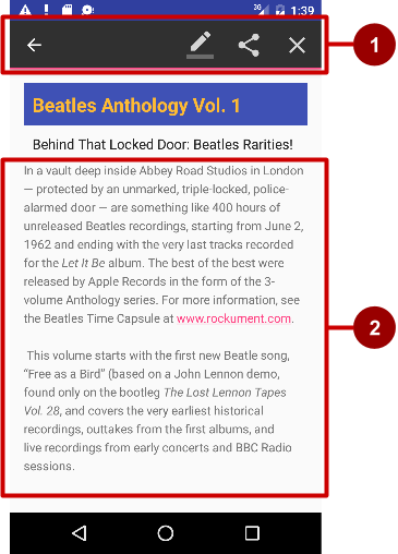
In the above figure:
- Contextual action bar. The bar offers three actions on the right side (Edit, Share, and Delete) and the Done button (left arrow icon) on the left side.
- View.
Viewon which a long-click triggers the contextual action bar.
The contextual action bar appears only when contextual action mode, a system implementation of ActionMode, occurs as a result of the user performing a long-click on one or more selected View elements.
ActionMode represents UI mode for providing alternative interaction, replacing parts of the normal UI until finished. For example, text selection is implemented as an ActionMode, as are contextual actions that work on a selected item on the screen. Selecting a section of text or long-clicking a view triggers ActionMode.
While this mode is enabled, the user can select multiple items, if your app allows it. The user can also deselect items, and continue to navigate within the activity. ActionMode is disabled when one of the following things occur:
- The user deselects all items.
- The user presses the Back button.
- The user taps Done (the left-arrow icon) on the left side of the action bar.
When ActionMode is disabled, the contextual action bar disappears.
Follow these steps to create a contextual action bar, as shown in the figure below:
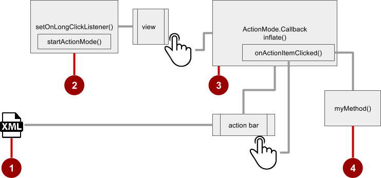
- Create an XML menu resource file for the menu items, and assign an icon to each one (as described in a previous section).
- Set the long-click listener using
setOnLongClickListener()to theViewthat should trigger the contextual action bar. CallstartActionMode()within thesetOnLongClickListener()method when the user performs a long tap on theView. - Implement the
ActionMode.Callbackinterface to handle theActionModelifecycle. Include in this interface the action for responding to a menu-item click in theonActionItemClicked()callback method. - Create a method to perform an action for each context menu item.
Creating the XML resource file
Create the XML menu resource directory and file by following the steps in the previous section on the options menu. Use a suitable name for the file, such as menu_context. Add icons for the context menu items. For example, the Edit menu item would have these attributes:
<item
   android:id="@+id/context_edit"
   android:orderInCategory="10"
   android:icon="@drawable/ic_action_edit_white"
   android:title="Edit" />
The standard contextual action bar has a dark background. Use a light or white color for the icons. If you are using clip art icons, choose HOLO_DARK for the Theme drop-down menu when creating the new image asset.
Setting the long-click listener
Use setOnLongClickListener() to set a long-click listener to the View that should trigger the contextual action bar. Add the code to set the long-click listener to the Activity using the onCreate() method. Follow these steps:
Declare the member variable
mActionMode:private ActionMode mActionMode;You will call
startActionMode()to enableActionMode, which returns theActionModecreated. By saving this in a member variable (mActionMode), you can make changes to the contextual action bar in response to other events.Set up the contextual action bar listener in the
onCreate()method, usingViewas the type in order to use thesetOnLongClickListener:@Override protected void onCreate(Bundle savedInstanceState) { // ... The rest of the onCreate code. View articleView = findViewById(article); articleView.setOnLongClickListener(new View.OnLongClickListener() { // Start ActionMode after long-click. }); }Implementing the ActionMode.Callback interface
Before you can add the code to onCreate() to start ActionMode, you must implement the ActionMode.Callback interface to manage the ActionMode lifecycle. In its callback methods, you can specify the actions for the contextual action bar, and respond to clicks on action items.
- Add the following method to the
Activityto implement the interface:public ActionMode.Callback mActionModeCallback = new ActionMode.Callback() { // ... Code to create ActionMode. } Add the
onCreateActionMode()code within the brackets of the above method to createActionMode:@Override public boolean onCreateActionMode(ActionMode mode, Menu menu) { // Inflate a menu resource providing context menu items MenuInflater inflater = mode.getMenuInflater(); inflater.inflate(R.menu.menu_context, menu); return true; }The
onCreateActionMode()method inflates the menu using the same pattern used for a floating context menu. But this inflation occurs only whenActionModeis created, which is when the user performs a long-click. TheMenuInflaterclass provides theinflate()method, which takes as a parameter the resourceidfor an XML layout resource to load (menu_contextin the above example), and theMenuto inflate into (menuin the above example).Add the
onActionItemClicked()method with your handlers for each menu item:@Override public boolean onActionItemClicked(ActionMode mode, MenuItem item) { switch (item.getItemId()) { case R.id.context_edit: editNote(); mode.finish(); return true; case R.id.context_share: shareNote(); mode.finish(); return true; default: return false; }The above code above uses the
getItemId()method to get theidfor the selected menu item, and uses it in aswitch caseblock to determine which action to take. Theidin eachcasestatement is theandroid:idattribute assigned to the menu item in the XML menu resource file.The actions shown are the
editNote()andshareNote()methods, which you create in theActivity. After the action is picked, you use themode.finish()method to close the contextual action bar.Add the
onPrepareActionMode()andonDestroyActionMode()methods, which manage the ActionMode lifecycle:@Override public boolean onPrepareActionMode(ActionMode mode, Menu menu) { return false; // Return false if nothing is done. }The
onPrepareActionMode()method shown above is called each timeActionModeoccurs, and is always called afteronCreateActionMode().@Override public void onDestroyActionMode(ActionMode mode) { mActionMode = null; }The
onDestroyActionMode()method shown above is called when the user exitsActionModeby clicking Done in the contextual action bar, or clicking on a different view.
The following is the full code for the ActionMode.Callback interface implementation:
public ActionMode.Callback mActionModeCallback = new
ActionMode.Callback() {
 @Override
 public boolean onCreateActionMode(ActionMode mode, Menu menu) {
       // Inflate a menu resource providing context menu items
       MenuInflater inflater = mode.getMenuInflater();
       inflater.inflate(R.menu.menu_context, menu);
       return true;
 }
// Called each time ActionMode is shown. Always called after
// onCreateActionMode.
@Override
public boolean onPrepareActionMode(ActionMode mode, Menu menu) {
return false; // Return false if nothing is done
}
// Called when the user selects a contextual menu item
 @Override
 public boolean onActionItemClicked(ActionMode mode, MenuItem item) {
    switch (item.getItemId()) {
       case R.id.context_edit:
          editNote();
          mode.finish();
          return true;
       case R.id.context_share:
          shareNote();
          mode.finish();
          return true;
       default:
          return false;
 }
}
// Called when the user exits the action mode
@Override
public void onDestroyActionMode(ActionMode mode) {
   mActionMode = null;
}
};
Starting ActionMode
You use startActionMode() to start ActionMode after the user performs a long-click.
To start ActionMode, add the onLongClick() method within the brackets of the setOnLongClickListener method in onCreate():
@Override
protected void onCreate(Bundle savedInstanceState) {
   // ... Rest of onCreate code
   articleView.setOnLongClickListener(new View.OnLongClickListener() {
      // Called when the user long-clicks on articleView
      public boolean onLongClick(View view) {
         if (mActionMode != null) return false;
         // Start the contextual action bar
         // using the ActionMode.Callback.
         mActionMode =
               MainActivity.this.startActionMode(mActionModeCallback);
         view.setSelected(true);
         return true;
      }
   });
}
The above code first ensures that the ActionMode instance is not recreated if it's already active by checking whether mActionMode is null before starting the action mode:
if (mActionMode != null) return false;
When the user performs a long-click, the call is made to startActionMode() using the ActionMode.Callback interface, and the contextual action bar appears at the top of the display. The setSelected() method changes the state of this View to selected (set to true).
The following is the code for the onCreate() method in the Activity, which now includes setOnLongClickListener() and startActionMode():
@Override
protected void onCreate(Bundle savedInstanceState) {
   super.onCreate(savedInstanceState);
   setContentView(R.layout.activity_main);
   // set up the contextual action bar listener
   View articleView = findViewById(article);
   articleView.setOnLongClickListener(new View.OnLongClickListener() {
      // Called when the user long-clicks on articleView.
      public boolean onLongClick(View view) {
         if (mActionMode != null) return false;
         // Start the contextual action bar using the ActionMode.Callback.
         mActionMode =
                MainActivity.this.startActionMode(mActionModeCallback);
         view.setSelected(true);
         return true;
      }
   });
}
Popup menu
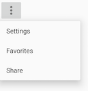
A PopupMenu is a vertical list of items anchored to a View. It appears below the anchor View if there is room, or above the View otherwise.
A popup menu is typically used to provide an overflow of actions (similar to the overflow action icon for the options menu) or the second part of a two-part command. Use a popup menu for extended actions that relate to regions of content in your Activity. Unlike a context menu, a popup menu is anchored to a Button, is always available, and its actions generally do not affect the content of the View.
For example, the Gmail app uses a popup menu anchored to the overflow icon in the app bar when showing an email message. The popup menu items Reply, Reply All, and Forward are related to the email message, but don't affect or act on the message. Actions in a popup menu should not directly affect the corresponding content (use a contextual menu to directly affect selected content). As shown below, a popup can be anchored to the overflow action button in the app bar.

Creating a popup menu
Follow these steps to create a popup menu (refer to figure below):

- Create an XML menu resource file for the popup menu items, and assign appearance and position attributes (as described in a previous section).
- Add an
ImageButtonfor the popup menu icon in the XML activity layout file. - Assign
onClickListener()to theImageButton. - Override the
onClick()method to inflate the popup menu and register it withPopupMenu.OnMenuItemClickListener. - Implement the
onMenuItemClick()method. - Create a method to perform an action for each popup menu item.
Creating the XML resource file
Create the XML menu resource directory and file by following the steps in a previous section. Use a suitable name for the file, such as menu_popup.
Adding an ImageButton for the icon to click
Use an ImageButton in the Activity layout for the icon that triggers the popup menu. Popup menus are anchored to a View in the Activity, such as an ImageButton. The user clicks it to see the menu.
<ImageButton
    android:layout_width="wrap_content"
    android:layout_height="wrap_content"
    android:id="@+id/button_popup"
    android:src="@drawable/@drawable/ic_action_popup"/>
Assigning onClickListener to the button
- Create a member variable (
mButton) in theActivityclass definition:public class MainActivity extends AppCompatActivity { private ImageButton mButton; // ... Rest of Activity code } - In the
onCreate()method for the sameActivity, assignonClickListener()to theImageButton:// ... Rest of Activity code @Override protected void onCreate(Bundle savedInstanceState) { // ... Rest of onCreate code mButton = (ImageButton) findViewById(R.id.button_popup); mButton.setOnClickListener(new View.OnClickListener() { // Define onClick here ... }); }Inflating the popup menu
As part of the setOnClickListener() method within onCreate(), add the onClick() method to inflate the popup menu and register it with PopupMenu.OnMenuItemClickListener:
// Define onClick here ...
@Override
public void onClick(View v) {
   // Create the instance of PopupMenu.
   PopupMenu popup = new PopupMenu(MainActivity.this, mButton);
   // Inflate the Popup using XML file.
   popup.getMenuInflater().inflate(R.menu.menu_popup, popup.getMenu());
   // Register the popup with OnMenuItemClickListener.
   popup.setOnMenuItemClickListener(new
                              PopupMenu.OnMenuItemClickListener() {
      // Add onMenuItemClick here...
      // Perform action here ...
}
The method instantiates a PopupMenu object, which is popup in the example above. Then the method uses the MenuInflater class and its inflate() method.
The inflate() method takes the following parameters:
- The resource
idfor an XML layout resource to load, which ismenu_popupin the example above. - The
Menuto inflate into, which ispopup.getMenu()in the example above.
The code then registers the popup with the listener, PopupMenu.OnMenuItemClickListener.
Implementing onMenuItemClick
To perform an action when the user selects a popup menu item, implement the onMenuItemClick() callback within the above setOnClickListener() method. Finish the method with popup.show to show the popup menu:
    // Add onMenuItemClick here...
    public boolean onMenuItemClick(MenuItem item) {
        // Perform action here ...
        return true;
    }
});
// Show the popup menu.
popup.show();
Dialogs and pickers
A dialog is a window that appears on top of the display or fills the display, interrupting the flow of Activity. Dialogs inform users about a specific task and may contain critical information, require decisions, or involve multiple tasks.
For example, an alert dialog might require the user to click Continue after reading it, or give the user a choice to agree with an action by clicking a positive button (such as OK or Accept), or to disagree by clicking a negative button (such as Cancel).
You can also use a dialog to provide choices in the style of radio buttons, as shown on the right side of the figure below.
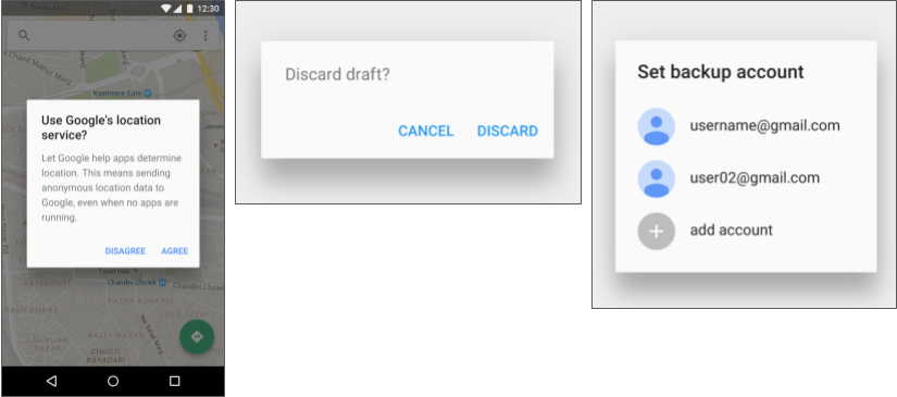
The base class for all dialog components is a Dialog. There are several useful Dialog subclasses for alerting the user on a condition, showing status or progress, displaying information on a secondary device, or selecting or confirming a choice, as shown on the left side of the figure below. The Android SDK also provides ready-to-use dialog subclasses such as pickers for picking a time or a date, as shown on the right side of the figure below. Pickers allow users to enter information in a predetermined, consistent format that reduces the chance for input error.
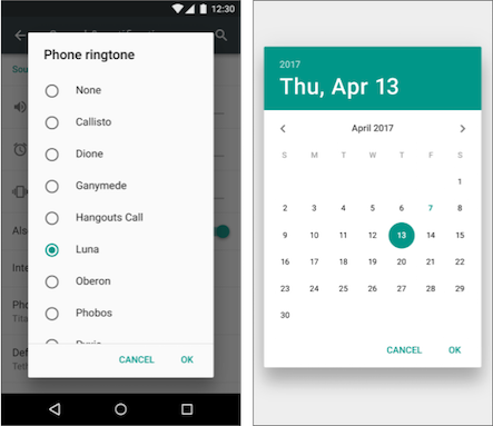
Dialogs always retain focus until dismissed or a required action has been taken.
Tip: Best practices recommend using dialogs sparingly as they interrupt the user's workflow. Read the Dialogs design guide for additional best design practices, and Dialogs in the Android developer documentation for code examples.
The Dialog class is the base class for dialogs, but you should avoid instantiating Dialog directly unless you are creating a custom dialog. For standard Android dialogs, use one of the following subclasses:
AlertDialog: A dialog that can show a title, up to three buttons, a list of selectable items, or a custom layout.DatePickerDialog: A dialog with a predefined UI that lets the user select a date.TimePickerDialog: A dialog with a predefined UI that lets the user select a time.
Showing an alert dialog
Alerts are urgent interruptions, requiring acknowledgement or action, that inform the user about a situation as it occurs, or an action before it occurs (as in discarding a draft). You can provide buttons in an alert to make a decision. For example, an alert dialog might require the user to click Continue after reading it, or give the user a choice to agree with an action by clicking a positive button (such as OK or Accept), or to disagree by clicking a negative button (such as Disagree or Cancel).
Use the AlertDialog subclass of the Dialog class to show a standard dialog for an alert. The AlertDialog class allows you to build a variety of dialog designs. An alert dialog can have the following regions (refer to the diagram below):
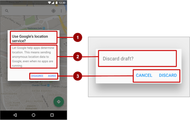
- Title: A title is optional. Most alerts don't need titles. If you can summarize a decision in a sentence or two by either asking a question (such as, "Discard draft?") or making a statement related to the action buttons (such as, "Click OK to continue"), don't bother with a title. Use a title if the situation is high-risk, such as the potential loss of connectivity or data, and the content area is occupied by a detailed message, a list, or custom layout.
- Content area: The content area can display a message, a list, or other custom layout.
- Action buttons: You should use no more than three action buttons in a dialog, and most have only two.
Building the AlertDialog
The AlertDialog.Builder class uses the builder design pattern, which makes it easy to create an object from a class that has a lot of required and optional attributes and would therefore require a lot of parameters to build. Without this pattern, you would have to create constructors for combinations of required and optional attributes; with this pattern, the code is easier to read and maintain. For more information about the builder design pattern, see Builder pattern.
Use AlertDialog.Builder to build a standard alert dialog, with setTitle() to set its title, setMessage() to set its message, and setPositiveButton() and setNegativeButton() to set its buttons.
If AlertDialog.Builder is not recognized as you enter it, you may need to add the following import statements to the Activity:
import android.content.DialogInterface;
import android.support.v7.app.AlertDialog;
The following creates the dialog object (myAlertBuilder) and sets the title (the string resource alert_title) and message (the string resource alert_message):
AlertDialog.Builder myAlertBuilder = new
                  AlertDialog.Builder(MainActivity.this);
myAlertBuilder.setTitle(R.string.alert_title);
myAlertBuilder.setMessage(R.string.alert_message);
Setting the button actions for the alert dialog
Use the setPositiveButton() and setNegativeButton() methods to set the button actions for the alert dialog. These methods require a title for the button and the DialogInterface.OnClickListener class that defines the action to take when the user presses the button:
myAlertBuilder.setPositiveButton("OK", new
                                 DialogInterface.OnClickListener() {
      public void onClick(DialogInterface dialog, int which) {
           // User clicked OK button.
           // ... Action to take when OK is clicked.
      }
});
myAlertBuilder.setNegativeButton("Cancel", new
                                 DialogInterface.OnClickListener() {
      public void onClick(DialogInterface dialog, int which) {
         // User clicked the CANCEL button.
         // ... Action to take when CANCEL is clicked.
      }
});
You can add only one of each button type to an AlertDialog. For example, you can't have more than one "positive" button.
Tip: You can also set a "neutral" button with setNeutralButton(). The neutral button appears between the positive and negative buttons. Use a neutral button, such as Remind me later, if you want the user to be able to dismiss the dialog and decide later.
Displaying the dialog
To display the dialog, call its show() method:
alertDialog.show();
Date and time pickers
Android provides ready-to-use dialogs, called pickers, for picking a time or a date. Use them to ensure that your users pick a valid time or date that is formatted correctly and adjusted to the user's locale. Each picker provides controls for selecting each part of the time (hour, minute, AM/PM) or date (month, day, year).
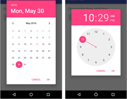
When showing a picker, you should use an instance of DialogFragment, a subclass of Fragment, which displays a dialog window floating on top of its Activity window. A Fragment is a behavior or a portion of a UI within an Activity. It's like a mini-Activity within the main Activity, with its own lifecycle. A Fragment receives its own input events, and you can add or remove it while the Activity is running. You might combine multiple Fragment elements in a single Activity to build a multiple-pane UI, or reuse a Fragment in more than one Activity. To learn about Fragment, see Fragments in the API Guide.
One benefit of using a Fragment for a picker is that you can isolate the code sections for managing the date and the time for various locales that display date and time in different ways. You can also use DialogFragment to manage the dialog lifecycle.
Tip: Another benefit of using fragments for the pickers is that you can implement different layout configurations, such as a basic dialog on handset-sized displays or an embedded part of a layout on large displays.
Adding a fragment
To add a Fragment for the date picker, create a blank Fragment without a layout XML, and without factory methods or interface callbacks:
- Expand app > java > com.example.android... and select an
Activity(such as MainActivity). - Choose File > New > Fragment > Fragment (Blank), and name the
Fragment(such as DatePickerFragment). Clear all three checkbox options so that you do not create a layout XML, do not includeFragmentfactory methods, and do not include interface callbacks. You don't need to create a layout for a standard picker. Click Finish to create theFragment.
Extending DialogFragment for the picker
The next step is to create a standard picker with a listener. Follow these steps:
Edit the
DatePickerFragmentclass definition to extendDialogFragmentand implementDatePickerDialog.OnDateSetListenerto create a standard date picker with a listener. See Pickers for more information about extendingDialogFragmentfor a date picker:public class DatePickerFragment extends DialogFragment implements DatePickerDialog.OnDateSetListener {As you type DialogFragment and DatePickerDialog.OnDateSetListener, Android Studio automatically adds several
importstatements to theimportblock at the top, including:import android.app.DatePickerDialog; import android.support.v4.app.DialogFragment;In addition, a red bulb icon appears in the left margin after a few seconds.
Click the red bulb icon and choose Implement methods from the popup menu. A dialog appears with
onDateSet()already selected and the Insert @Override option selected. Click OK to create the emptyonDateSet()method. This method will be called when the user sets the date.After adding the empty
onDateSet()method, Android Studio automatically adds the following in theimportblock at the top:import android.widget.DatePicker;The
onDateSet()parameters should beint i,int i1, andint i2. Change the names of these parameters to ones that are more readable:public void onDateSet(DatePicker datePicker, int year, int month, int day)- When you extend
DialogFragment, you should override theonCreateDialog()callback method, rather thanonCreateView. Replace the entireonCreateView()method withonCreateDialog()that returnsDialog, and annotateonCreateDialog()with@NonNullto indicate that thereturnvalueDialogcan't be null. Android Studio displays a red bulb next to the method because it doesn'treturnanything yet.@NonNull @Override public Dialog onCreateDialog(Bundle savedInstanceState) { } You use your version of the callback method to initialize the
year,month, anddayfor the date picker. For example, you can add the following code toonCreateDialog()to initialize theyear,month, anddayfromCalendar, and return the dialog and these values to theActivity. As you enter Calendar.getInstance(), specify the import to be java.util.Calendar.// Use the current date as the default date in the picker. final Calendar c = Calendar.getInstance(); int year = c.get(Calendar.YEAR); int month = c.get(Calendar.MONTH); int day = c.get(Calendar.DAY_OF_MONTH);The
Calendarclass sets the default date as the current date—it converts between a specific instant in time and a set of calendar fields such asYEAR,MONTH,DAY_OF_MONTH, andHOUR.Calendaris locale-sensitive. TheCalendargetInstance()method returns aCalendarwhose fields are initialized with the current date and time.Add the following statement to the end of the method to create a new instance of the date picker and return it:
 // Create a new instance of DatePickerDialog and return it.
 return new DatePickerDialog(
    getActivity(), this, year, month, day);
Showing the picker
To show the picker, add a method to the Activity that creates an instance of FragmentManager using getSupportFragmentManager(). You can then use the method as the handler for the android:onClick attribute for a button or other input control.
public void showDatePicker(View view) {
        DialogFragment newFragment = new DatePickerFragment();
        newFragment.show(getSupportFragmentManager(),"datePicker");
}
For more information about the Fragment class, see Fragments.
Processing the user's picker choice
When the user makes a selection in the date picker, the system calls the onDateSet() method, so you can use onDateSet() to manipulate the chosen date:
Open an
Activityand add a method that takes theyear,month, anddayas arguments. You can then use this method to take action. For example, in this method you can convert themonth,day, andyearto separate strings so that you can concatenate them with slash marks for the U.S. date format:public void processDatePickerResult( int year, int month, int day) { String month_string = Integer.toString(month + 1); String day_string = Integer.toString(day); String year_string = Integer.toString(year); String dateMessage = (month_string + "/" + day_string + "/" + year_string); // ... Code to do some action with dateMessage. }The
monthinteger returned by the date picker starts counting at 0 for January, so you need to add 1 to it to show months starting at 1.Add code to the
onDateSet()method in theFragmentto invokeprocessDatePickerResult()in the activity and pass it theyear,month, andday:@Override public void onDateSet(DatePicker datePicker, int year, int month, int day) { MainActivity activity = (MainActivity) getActivity(); activity.processDatePickerResult(year, month, day); }When you use the
getActivity()method in aFragment, the method returns the activity with which the fragment is associated. You need to do this because you can't call a method in the activity without the activity context—you would have to use an intent, as you learned in another lesson. The activity inherits the context, so you can use the activity as the context for calling the method, as inactivity.processDatePickerResult.
The time picker
Follow the same procedures outlined above for a date picker, with the following differences:
- The
Fragmentshould extendDialogFragmentand implementTimePickerDialog.OnTimeSetListener. - Override the
onTimeSet()method. - Use
onCreateDialog()to initialize the time and return the dialog, as you did with the date picker. - Create a method to instantiate the picker
DialogFragment, as you did with the date picker. - Create a method to process the result as you did with the date picker.
- Use
onTimeSet()to get the time and pass it to the method to process the result.
You can read all about setting up pickers in Pickers.
Related practical
The related practical is 4.3: Menus and pickers.
Learn more
Android Studio documentation:
Android developer documentation:
- Add the app bar
- Menus
Toolbar- v7 appcompat support library
AppBarLayoutonOptionsItemSelected()ViewMenuInflaterregisterForContextMenu()onCreateContextMenu()onContextItemSelected()- Dialogs
AlertDialog- Pickers
- Fragments
DialogFragmentFragmentManagerCalendar
Material Design spec:
Other:
- Android Developers Blog: Android Design Support Library
- Builder pattern in Wikipedia