6.1: Accessibility
Contents:
- Introduction
- About accessibility
- App layout and organization
- Content labels and descriptions
- Color and contrast
- Type size
- Audio and video
- Testing for accessibility
- Related practicals
- Learn more
Accessibility is a set of design, implementation, and testing techniques that enable your app to be usable by everyone, including people with disabilities.
Common disabilities that can affect a person's use of an Android device include blindness, low vision, color blindness, deafness or hearing loss, and restricted motor skills. When you develop your apps with accessibility in mind, you make the user experience better not only for users with these disabilities, but also for all of your other users.
About accessibility
The goal of accessibility is to enable all users, including those with disabilities, to use your app. To develop an accessible app, you must challenge the assumptions you have about your users. Tailor the design and code for your app to address those assumptions.
In most cases you don't need to rewrite or redesign your app to address accessibility—the Android framework provides many accessibility features that your app gets for free. To turn up further possible limitations, test your app with accessibility in mind. Usually you can make easy adaptations to fix the problems you find.
Most of Android's accessibility features for users are contained in the settings activity (Android > Settings > Accessibility). Android accessibility features include:
- Google TalkBack : To interact with your device using touch and spoken feedback, turn on the TalkBack screen reader. TalkBack describes your actions and tells you about alerts and notifications.
- Select to Speak for Android : If you want spoken feedback only at certain times, turn on Select to Speak. Select items on your screen to hear them read or described aloud.
- Switch Access for Android : For users with limited mobility, Switch Access is an alternative to using the touchscreen. Switch Access enables you to use a switch or keyboard to control your device.
- Voice Access app for Android : If using a touchscreen is difficult, the Voice Access app lets you control your device with spoken commands. Use your voice to open apps, navigate, and edit text hands-free. Voice Access is currently in a limited beta release in English only.
- Google BrailleBack : With this app you can connect a refreshable braille display to your device via Bluetooth. BrailleBack works with TalkBack for a combined speech and braille experience, allowing you to edit text and interact with your device. The BrailleBack app is available in the Play Store.
- Display size and font size : To change the size of items on your screen, adjust the display size or font size.
- Magnification gestures : To temporarily zoom or magnify your screen, use magnification gestures.
- Contrast and color options : To adjust the contrast or colors on your screen, use high-contrast text, color inversion, or color correction.
- Captions : Turn on captions for your device and specify options for closed captioning. Options include language, text, and style.
App layout and organization
Accessibility begins with the basic design of your app. Designing clear layouts with distinct calls to action helps all your users, including users with disabilities.
Layout design
Follow these guidelines for layout design to improve the accessibility of your app:
- Avoid complex layouts and cluttered screens, where users with low vision may have trouble distinguishing between elements. Screens with too many views may be difficult to navigate with a screen reader, because each view's description must be read aloud.
- Place items on the screen according to their level of importance. Place important actions at the top or the bottom of the screen. Ensure that key items stand out structurally and visually.
- Use the standard Material Design guidelines for toolbars, menus, action buttons, and other elements. Apps with regular, consistent elements are easier to navigate.
- Group-related items together on the screen in proximity to each other. Keeping related items together is helpful for users who have low vision or trouble focusing on the screen.
Touch targets
Touch targets are the parts of the screen that respond to user input. They extend beyond the visual bounds of an element. For example, an icon may appear to be 24 x 24 dp, but the padding surrounding it comprises the full 48 x 48 dp touch target.
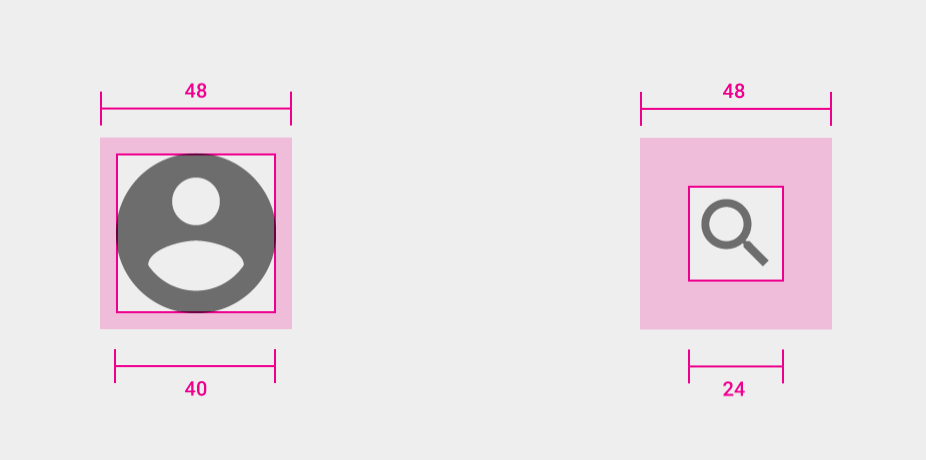
Touch targets should be at least 48 x 48 dp. Larger touch targets are easier for users to tap, which is helpful for users who can't see the screen and users who have motor-dexterity problems. Large touch targets may also help you to accommodate a larger spectrum of users, such as children with developing motor skills. For more information, see Touch target size.
Selection and focus
Selection and focus are not concepts you normally run into with touch-based devices, because the user interacts directly with the views on the screen. To activate a button, for example, the user just touches it.
Users who cannot touch the screen or who have visual impairments may use a separate input device such as a keyboard, mouse, or the TalkBack screen reader to interact with your app. With a hardware input device, the user can move an indicator such as a highlight or colored box from view to view on the screen. The view that has the highlight is considered selected or focussed . The user can then activate the selected view by pressing a key or a button. With TalkBack, the user touches the screen to identify each view, and the selected view is read aloud. The selected item is activated by touching it a second time.
If you use standard Android views in your app, you do not need to do anything to enable selection and focus navigation for your app. The Android system automatically recognizes when a user is interacting with your app using a method other than the touch screen, and shows a highlight (a colored box) on selected views.
You should test your app to ensure that it behaves the way you expect for non-touch users. To test your app, connect an external input device to your phone or tablet, or use the Android emulator. Use the tab keys to move the selection from view to view, or the arrow keys to move left, right, up, and down. Press Return to activate the selection.
There are two things to watch out for when you test your app for focus and selection:
- Whether all the views can receive the focus (that is, whether all the views are focusable).
- The focus order of the views in an activity.
Views that can be selected or focussed are considered focusable . Most Android views are focusable by default. Some views, such as ImageView objects, are not focusable, can't be selected, and are not described in TalkBack. If you use an ImageView to convey important information, you may want this view to be focusable so it can be described in TalkBack. To make a view focusable, use the focusable attribute in your XML layout:
<ImageView
   android:id="@+id/image_partly_cloudy"
   android:layout_width="200dp"
   android:layout_height="160dp"
   app:srcCompat="@drawable/partly_cloudy"
   android:focusable="true" />
Focus order indicates which view next gets the selection and the focus when the user traverses your app from view to view. For focus order, Android automatically tries to figure out the right focus order for your views. Most often, the focus order is left to right, then top to bottom. To change the default focus order for your app, use the nextFocusDown, nextFocusLeft, nextFocusRight, and nextFocusUp XML attributes. Specify which view (by ID) should get the focus next, after the current view.
<Button
   android:id="@+id/button1"
   android:layout_alignParentTop="true"
   android:layout_alignParentRight="true"
   android:nextFocusForward="@+id/editText1"
   ... />
See Supporting Keyboard Navigation for more details on selection and focus order.
Content labels and descriptions
Content labels describe the meaning and purpose of each element in your app. These labels allow screen readers to explain the function of each element accurately.
Views that don't otherwise contain text need labels. For example, ImageView and ImageButton views need labels. Buttons with text that doesn't fully describe the action for that view might also need labels.
Views with textual components such as TextView views or checkboxes might not need labels, because the actual text might be enough of a label.
Providing labels
You can provide labels for elements in the following two ways:
- When labeling a static element, add an attribute to the corresponding XML element within the activity's layout resource file. (Static elements don't change their appearance during an activity's lifecycle.)
- When labeling a dynamic element, set the element's label in the Java method that changes the element's appearance. (Dynamic elements change their appearance during an activity's lifecycle.)
When labeling graphical elements, such as ImageView and ImageButton objects, use the android:contentDescription attribute for static elements and the setContentDescription() method for dynamic elements.
<ImageButton
   android:id="@+id/button_image"
   android:layout_width="wrap_content"
   android:layout_height="wrap_content"
   android:contentDescription="Discard this message"
   app:srcCompat="@drawable/ic_action_discard" />
When labeling editable elements, such as EditText objects, use the android:hint XML attribute for static elements and the setHint() method for dynamic elements to indicate each element's purpose.
<EditText
   android:id="@+id/edittext_message"
   android:layout_width="match_parent"
   android:layout_height="wrap_content"
   android:hint="Enter your message" />
If you target your app to Android 4.2 (API level 17) or higher, use the android:labelFor attribute when labeling views that serve as content labels for other View objects. For example, the TextView view below serves as a content label for an EditText view with the ID edittext_message. The TextView uses the android:labelFor attribute with the ID of the EditText that the TextView labels.
<TextView
   android:id="@+id/textview_label"
   android:layout_width="wrap_content"
   android:layout_height="wrap_content"
   android:text="@string/label_message"
   android:labelFor="@+id/edittext_message"/>
Creating useful descriptions
When adding content descriptions to your views, follow these best practices:
- Always add content descriptions to
ImageViewandImageButtonviews that have no textual component. - A button needs a content description if the button label does not fully describe the action, or to differentiate buttons with the same label.
- You usually don't need to add a content description to a view that has a textual component, such as a text view or a checkbox.
- Use action verbs to describe what an element does, not what the element looks like. For example, "Delete this message" is better than "Trash Can."
- Do not include the name of the UI element (such as "button") in the content description. Accessibility services such as TalkBack announce the view's type after announcing its label.
- Don't tell users how to physically interact with a control. Users may be navigating with a keyboard or by voice, not with their fingers or a mouse. Accessibility software will describe the correct interaction for the user. For example, "Voice Search" is a better label than "Tap to speak."
- Make sure that your content descriptions are unique so that your users can identify each element accurately. Unique content descriptions are especially important with collective views such as
RecyclerViewobjects, where there may be many similar list elements. - Conversely, make sure that the same view has the same description everywhere the description is used.
Color and contrast
Your visual design choices can help users with low vision or color blindness see and interpret your app's content, interact with the right elements, and understand actions.
Color
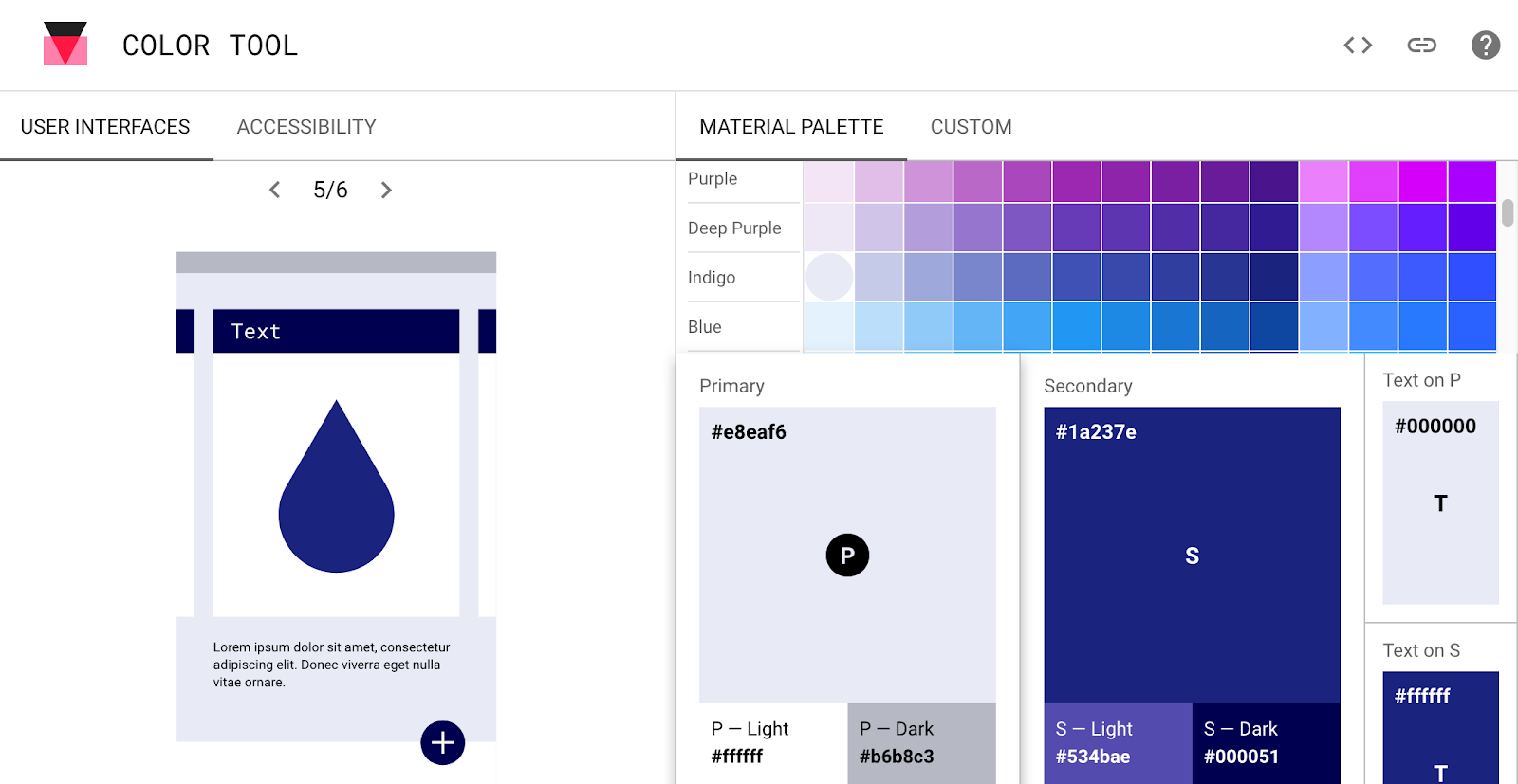
When choosing colors for your app, the Material Design color palettes have been designed to work harmoniously with each other. Google's Material Design color tool can help you create, share, and apply color palettes to your UI, as well as measure the accessibility level of any color combination. Choose colors for your app and then click the Accessibility tab to see legibility warnings. The tool can help you ensure that the majority of combinations you choose have the right amount of contrast.
Contrast
Even if you choose colors from the Material Design palettes, ensure that your app's colors have sufficient color contrast between elements. A contrast ratio represents how different a color is from another color. The higher the difference between the two numbers in the ratio, the greater the difference in relative luminance between the two colors.
The contrast ratio between a color and its background ranges from 1-21 based on its luminance, or intensity of light emitted, according to the World Wide Web Consortium (W3C). The W3C recommends the following contrast ratios for body text and image text:
- Small text should have a contrast ratio of at least 4.5:1 against its background.
- Large text (at 14 pt bold/18 pt regular and up) should have a contrast ratio of at least 3:1 against its background.
These two images show examples of text set against a black or white background. The text at the left show higher contrast. On the right, the text is set at a lower contrast, which is harder to read.
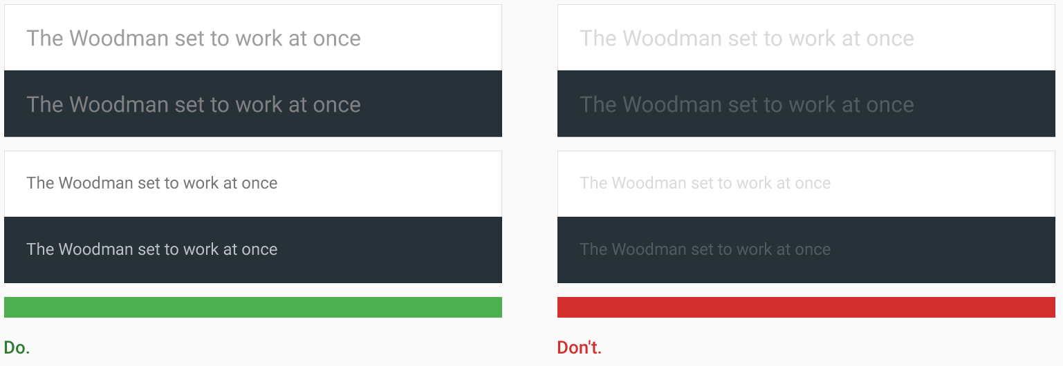
Declarative elements such as logos don't need to meet minimum contrast ratios. Even so, if declarative elements provide important information, make sure they are easy to distinguish.
Other visual cues
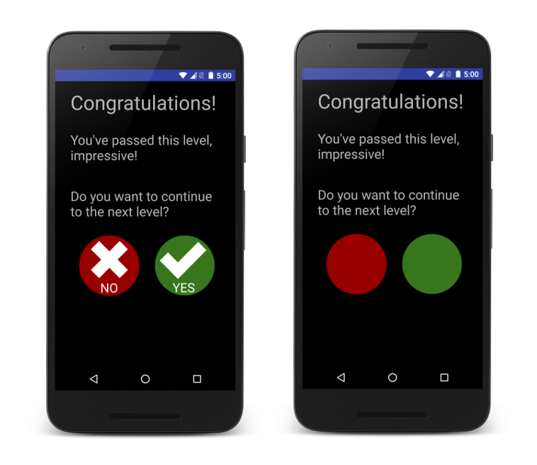
Color blindness takes different forms, including red-green, blue-yellow, and monochromatic color blindness. To assist users with color vision deficiencies, use visual cues other than color to distinguish UI elements within your app's screens. To mark the differences between elements, use different shapes or sizes, provide text or visual patterns, or add audio- or touch-based (haptic) feedback.
For example, here are two versions of an activity. One version uses only color to distinguish between two possible actions in a workflow, and the other version uses shapes and text to highlight the differences between the two options:
Type size
Users can change the system font size in the Android settings by selecting Settings > Accessibility > Font Size. Larger font sizes are easier to read for users with vision impairment, older adults, and on-the-go users who may need to access information at a glance.
An Android best practice is to specify all type in your app as scalable point (sp) units. Using sp units for font sizes enables your layout to scale based on the system font size.
Android also provides styles for small, medium, and large typefaces that you can use for your views:
<TextView
    android:id="@+id/labelSmall"
    style="@android:style/TextAppearance.Small"
    android:layout_width="wrap_content"
    android:layout_height="wrap_content"
    android:text="Small Text" />
Specifying your type sizes with dynamic values (sp or styles) enables your layout to adjust to the user's type-size setting.
Test your app with a large font size enabled to ensure that your layout adapts for larger font sizes.
Audio and video
Apps that play sound or video need to be accessible by people who are hard of hearing. Provide visual alternatives to audio content, and provide audio alternatives to visual content. Do not use audio-only feedback. For essential audio feedback and alerts, provide closed captions, a transcript, or another visual alternative.
Testing for accessibility
Testing for accessibility lets you experience your app from the perspective of your users and find usability issues that you might otherwise miss. Accessibility testing can reveal opportunities to make your app more powerful and versatile for all your users, including users with disabilities.
For requirements, recommendations, and considerations to help you make sure that your app is accessible, see the tools described in this section and Make apps more accessible.
Manual testing with TalkBack
TalkBack is Android's built-in screen reader. When TalkBack is on, users can interact with their Android device without seeing the screen. Users with visual impairments may rely on TalkBack when they use your app.
Testing your app manually with TalkBack lets you to experience your app the same way your users do. TalkBack can help you quickly identify places with room for improvement.
To enable TalkBack and test your app:
- On a device, navigate to Settings > Accessibility > TalkBack.
- Tap the On/Off toggle button to turn on TalkBack.
- Tap OK to confirm permissions.
Confirm your device password, if asked.
If you have never run TalkBack, a tutorial launches. Use the tutorial to learn about:
- Explore by touch. TalkBack identifies every item you touch on the screen. You can touch items individually or move your finger over the screen. Swipe left or right to explore the items in tab (focus) order. To activate the last item heard, double-tap that item.
- Scrolling. Lists can be scrolled with a two finger scroll, or you can jump forward or back in a list with a side-by-side swipe.
- Using global and local TalkBack menus.
- Setting the text navigation rate. Swipe up or down as TalkBack reads text aloud, one character, word, line, or paragraph at a time.
- Activating
EditTextviews and entering text.
Navigate to your app and test each view and activity.
The Accessibility Scanner app
The Accessibility Scanner app scans your screen and provides suggestions for improving the accessibility of your app. To use Accessibility Scanner:
- Install Accessibility Scanner on your device from the Google Play Store.
- Navigate to Settings > Accessibility >Accessibility Scanner and click the toggle button to enable Accessibility Scanner. A button with a check mark appears and floats on the screen.
- Navigate to your app on the device and to the activity you want to scan.
- Tap the Accessibility Scanner (check mark) button to scan the screen.
A screenshot appears with problematic elements highlighted, and with notes about possible improvements. To get a full list of results, tap the list button, which is the third icon from the right.
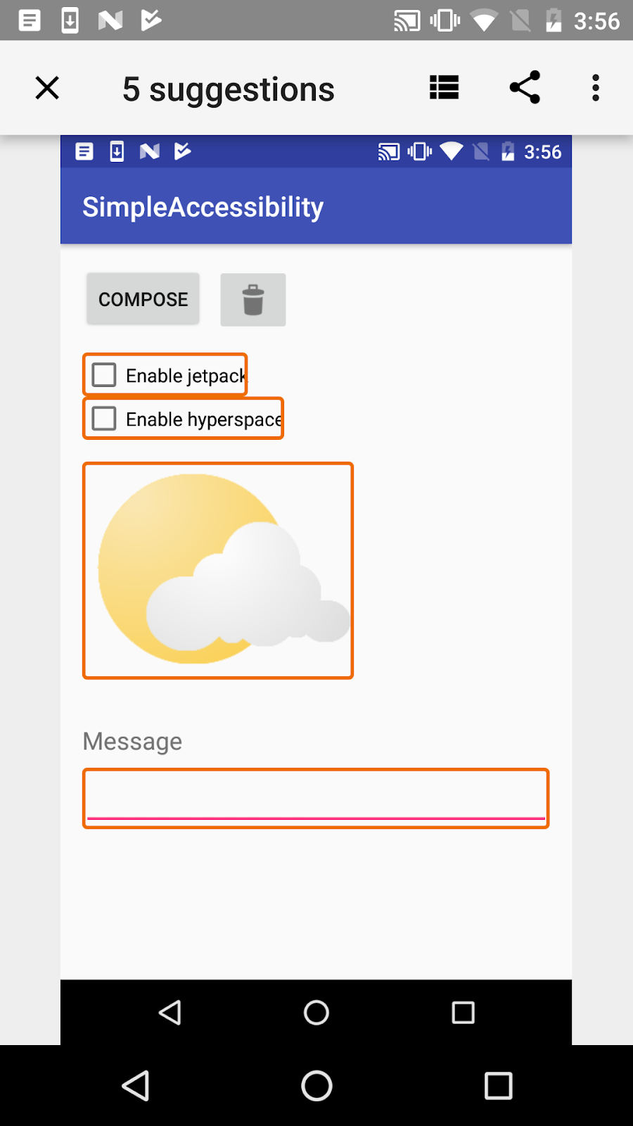
Accessibility Scanner saves the results of all past scans, and you can share the results of any scan.
Accessibility testing framework
The Android platform supports several testing frameworks, including Espresso and Robolectric. These testing frameworks allow you to create and run automated tests that evaluate the accessibility of your app.
The Android Testing Support Library includes accessibility functions.You can enable and configure accessibility testing through the AccessibilityChecks class:
AccessibilityChecks.enable();
By default, the checks run when you perform any view action that's defined in the ViewActions class. The check includes the view on which the action is performed as well as all descendent views. You can check the entire view hierarchy of a screen with this code:
AccessibilityChecks.enable().setRunChecksFromRootView(true);
Lint
Android Studio shows lint warnings for various accessibility issues and provides links to the places in the source code containing these issues. For example, if one of the views in your XML layout needs a content description and doesn't have one, that view name is highlighted in yellow. Android Studio displays a message such as the following:
[Accessibility] Missing 'contentDescription' attribute on image
Related practicals
The related practical documentation is in:
Learn more
Android support documentation:
- Android accessibility overview - Android Accessibility Help
- Get started on Android with TalkBack - Android Accessibility Help
- Editable View labels - Android Accessibility Help
- Content labels - Android Accessibility Help
Android developer documentation:
- Accessibility Overview
- Making Apps More Accessible
- Building Accessible Custom Views
- Developing Accessible Applications
- Designing Effective Navigation
- Testing Your App's Accessibility
- Developing an Accessibility Service
Material Design:
Accessibility testing:
- Testing your App's Accessibility
- Get Started with Accessibility Scanner
- Accessibility Testing on Android
Videos:
- GTAC 2015: Automated Accessibility Testing for Android Applications
- Google I/O 2015 - Improve your Android app's accessibility
- Google I/O 2016 - What's New in Android Accessibility
- Google I/O 2017 - What's New in Android Accessibility
Other: