4.1: Rendering and layout
Contents:
The Android Developer Fundamentals course talked about how to make your apps look interesting and visually compelling using Material Design guidelines, and it taught you how to use the Layout Editor to create your layouts. You learned that you can create nested hierarchies of layouts. You learned how to use drawables as background elements for your views. These elements allow you to create complex nested layouts with backgrounds and views overlapping each other throughout your app.
However, your layouts draw faster and use less power and battery if you spend time designing them in the most efficient way.
To design an efficient layout:
- Minimize overdraw.
- Simplify complex view hierarchies.
Minimize overdraw
Every time your app draws a pixel on the screen, it takes time. Every time your app draws an opaque pixel to replace something that has already been drawn, it wastes time. Drawing a pixel more than once per screen refresh is called overdraw , and it's a common problem affecting the performance of modern applications. Strive to create an app that draws every changed pixel only once.
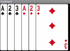
For example, an app might draw a stack of 52 overlapping cards, with only the last card fully visible. Completely drawing the 51 cards that are underneath and partially covered is an example of overdraw.

The most likely symptom you will see in an app with overdraw is slow rendering and stuttering animations. This is the most generic of symptoms. Since overdraw is common, and straightforward to test for, make it a habit to check for it every time you change the views of your app.
Test for overdraw
You can visualize overdraw using color tinting on your device with the Debug GPU Overdraw tool.
To turn on Debug GPU Overdraw on your mobile device:
- In Settings > Developer options, scroll to Hardware accelerated rendering.
- Select Debug GPU Overdraw.
- In the Debug GPU overdraw dialog, select Show overdraw areas.
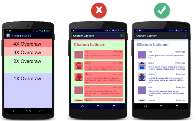
Watch your device turn into a rainbow of colors. The colors are hinting at the amount of overdraw on your screen for each pixel.
- True color has no overdraw. ( True color means there's no change from what the app normally shows.)
- Purple/blue is overdrawn once.
- Green is overdrawn twice.
- Pink is overdrawn three times.
- Red is overdrawn four or more times.

Remove unnecessary backgrounds
One simple thing you can do to reduce overdraw is to remove backgrounds that the user never sees:
- Search your code for
android:background. - For each background, determine whether it's needed and visible on the screen.
- If the view's background is covered by something else, for example an image or the children's backgrounds, remove the
android:backgroundline of code from the view.
Before:
<ImageView
   android:layout_width="match_parent"
   android:layout_height="match_parent"
   android:src="@drawable/beach"
   android:background="@android:color/white">
</ImageView>
After:
<ImageView
   android:layout_width="match_parent"
   android:layout_height="match_parent"
   android:src="@drawable/beach" >
</ImageView>
When drawing custom views, clip generously
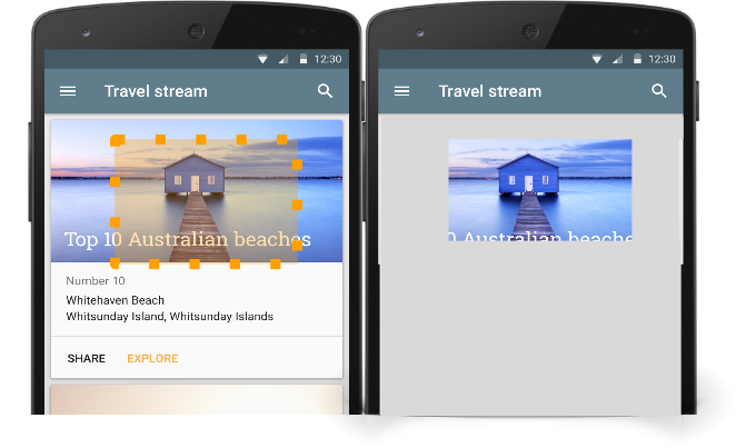
In the context of drawing on the screen, clipping is a way to exclude regions from being drawn. In the basic form of clipping, you provide the system with a rectangle and instruct it to only draw what falls inside that rectangle, as shown below.

One use for clipping is to only draw the parts of a view that the user sees, reducing the amount of rendering work the system has to do, which can improve the performance of your app. However, clipping is not free, and it is better to arrange your views without overlapping in the first place, for example by using ConstraintLayout.
For standard views (like ImageView, Button, and ProgressBar), the Android system reduces overdraw as much as it can and avoids drawing views that are completely hidden. For example, nothing underneath an open navigation drawer is drawn.
For custom views where you override the onDraw() method, the underlying system doesn't have insight into how you're drawing your content, which makes it hard for the system to know what to avoid. For example, without clipping, you would draw the full cards even though only a small part of each card is visible.
clipRect()
You can help the system draw custom views efficiently by using the Canvas.clipRect() method. This method allows you to define a rectangle for a view, and only the content inside the rectangle is drawn.
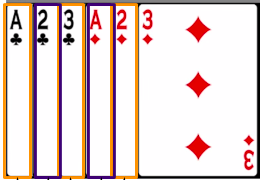
For the set of stacked overlapping cards, you can determine what part of the current card is visible, then use the Canvas.clipRect() method to set your clipping rectangle accordingly.

quickReject()
Even if you only draw a small circle in a corner of your custom view, that entire view is rebuilt. Instead of recalculating and redrawing the whole screen, you can calculate the clipping rectangle for the changed area, then use the quickReject() method inside your onDraw() method to test for places where clipping rectangles intersect. If some part of a view that takes a lot of processing time is outside the clipping rectangle, quickReject() can tip you off, so that you can skip that processing altogether.
Complex clipping
Beyond clipRect() and quickReject(), the Canvas class provides methods for complex clipping (clipPath(), clipRegion(), or applying clipRect() while rotated). This kind of clipping can be expensive, and it isn't anti-aliased.
To minimize complex clipping, compose drawing elements of the right shape and size. For example, using drawCircle() or drawPath() is much cheaper than using clipPath() with drawColor().
Reduce transparency
Rendering transparent pixels on the screen is called alpha rendering . Alpha rendering contributes to overdraw, because the system has to render both the transparent pixel and what is underneath the pixel, then blend the two to create the see-through effect.
Visual effects like transparent animations, fade-outs, and drop shadows all involve transparency, and can therefore contribute significantly to overdraw. To improve overdraw in these situations, reduce the number of transparent objects you render. For example, consider making text a solid color and using transitions that don't use alpha, such as wipe transitions.
To learn more about the performance costs that transparency imposes throughout the entire drawing pipeline, watch the Hidden Cost of Transparency video.
Overdraw still matters
As with many other performance challenges, overdraw may not matter on the most advanced mobile device. But most people in the world have less powerful devices. Reducing overdraw for them can save significant resources and greatly decrease the time it takes to draw a frame.
See Reducing Overdraw for more information.
Simplify complex view hierarchies
At the heart of your app is the hierarchy of views that makes up the UI and the visual experience of users. With feature-rich apps, this hierarchy grows large and complex and can become a source of performance problems. The most likely symptom you will see is a generic general slowness of the app, especially when rendering complex views to the screen.
It is a common misconception that using the basic layout structures leads to the most efficient layouts. However, each widget and layout you add to your application requires initialization, layout, and drawing. For example, using nested instances of LinearLayout can lead to an excessively deep view hierarchy. Nesting several instances of LinearLayout that use the layout_weight parameter can be especially expensive, as each child needs to be measured twice.
Simplifying or rearranging the view hierarchy of your app can improve performance, especially on lower-end devices and earlier versions of Android. As an added benefit, your app will become easier to maintain.
To eliminate or reduce many of these issues, use a ConstraintLayout instance to build your UI when possible. For details, see Build a Responsive UI with ConstraintLayout.
Measure and layout
The rendering pipeline includes a measure-and-layout stage, during which the system positions the items in your view hierarchy. The "measure" part of this stage determines the sizes and boundaries of View objects. The "layout" part determines where on the screen to position the View objects.
Both of these stages incur a small cost for each view or layout that they process. Most of the time, this cost is minimal and doesn't noticeably affect performance. However, it can be greater when an app adds or removes View objects, such as when a RecyclerView object recycles or reuses a view.
The cost can also be higher if a View object needs to resize to maintain its constraints. For example, if your app calls setText() on a View object that wraps text, the View may need to be larger or smaller to accommodate the characters. If this process takes too long, it can prevent a frame from rendering fast enough. The frame is dropped, and animation becomes janky.
You cannot move measure and layout to a worker thread, because your app must process this stage of rendering on the main thread. Your best bet is to optimize your views so that they take as little time as possible to measure and lay out.
Double taxation
Typically, the system executes the measure-and-layout stage in a single pass and quite quickly. However, in complicated layout cases, the system may have to iterate multiple times on parts of the hierarchy before positioning the elements. Having to perform more than one measure-and-layout iteration is referred to as double taxation .
For example, the RelativeLayout container allows you to position View objects with respect to the positions of other View objects. When you use RelativeLayout, the system performs the following actions:
- Executes a measure-and-layout pass. During this pass, the system calculates each child object's position and size, based on each child's request.
- Uses this data to figure out the proper position of correlated views, taking object weights into account.
- Performs a second layout pass to finalize the objects' positions.
- Goes on to the next stage of the rendering process.
Using ConstraintLayout can help you minimize the double taxation that RelativeLayout causes. ConstraintLayout provides similar functionality to RelativeLayout, but at a significantly lower cost.
Analyze the view hierarchy
Analyze the view hierarchy by using several tools together to pinpoint and fix performance problems. You may need to use just one of these tools to optimize performance, or you may need to use them all.
Profile GPU Rendering
Run the Profile GPU Rendering tool and look at the light and dark blue segments of the bars. If the blue segments are tall and causing the bars to cross the green 16-ms-per-frame line, your app spends a lot of time updating display lists. The M release of Android adds additional color segments, including a light-green Measure/Layout segment. If this segment is large, your view hierarchies might be unnecessarily complex.
The Profile GPU Rendering tool only tells you there might be a problem; it doesn't tell you where to look.
Show GPU view updates
On your physical mobile device, run the tool that shows GPU view updates.
- In Settings > Developer options, scroll to Hardware accelerated rendering.
- Enable Show GPU view updates.
- Interact with your app.
When a view on the screen is updated, it flashes red. If views on your screen are flashing, and they have nothing to do with the area that should be updated, look at your code and determine if they get invalidated unnecessarily because, for example, you may have mistakes in parent-child view relationships.
Layout Inspector
The Layout Inspector allows you to inspect your app's view hierarchy at runtime from within Android Studio. This is particularly useful when your layout is built at runtime rather than being defined entirely in an XML layout.
Lint
Use the lint tool on your layout files to search for possible view hierarchy optimizations. Lint tool automatically runs whenever you compile your program.
In Android Studio, choose Analyze > Inspect Code... to manually run the
Lint tool on your whole project, a particular module, or a specific file.
To manage inspection profiles and configure inspections within Android Studio:
- Choose File > Other Settings > Default Settings. The Default Preferences dialog appears.
- Click Editor and then Inspections in the navigation bar.
- Click Android and Lint in the right-hand pane.
- Select or clear inspection checkboxes as desired.
The following are some of the lint inspections related to the view hierarchy. They are listed under Android > Lint > Performance in the Editor > Inspections preferences.
"Node can be replaced by a
TextViewwith compound drawables"A
LinearLayoutthat contains anImageViewand aTextViewcan be more efficiently handled as a compound drawable. In a compound drawable, you add aDrawableto aTextViewusing one of thesetCompoundDrawablesmethods, and you specify how the text flows around thedrawable."
FrameLayoutcan be replaced with<merge>tag"If the root of a layout is a
FrameLayoutthat does not provide background, padding, and so on, you can replace theFrameLayoutwith a merge tag, which is slightly more efficient."Useless leaf layout"
If a layout has no children or no background, it's invisible. You might be able to remove it for a flatter layout hierarchy.
"Useless parent layout"
A layout with children and no siblings that is not a
ScrollViewor a root layout, and does not have a background, can be removed for a flatter and more efficient layout hierarchy. For example, if you have oneLinearLayoutinside anotherLinearLayout, you can probably remove one of them."Layout hierarchy is too deep"
Consider using flatter layouts, for example by using the
ConstraintLayoutclass. The default maximum depth in the lint tool is 10.
See Simplify your view hierarchy, below.
Systrace and dumpsys
The Systrace tool, which is built into the Android SDK, provides excellent data about performance. Systrace allows you to collect and inspect timing information across an entire device, allowing you to see when layout performance problems cause performance problems. For more information, see Analyzing UI Performance with Systrace.
Systrace is sometimes used with dumpsys, a tool that runs on the device and dumps status information about system services.
You will use Systrace and dumpsys in the Systrace and dumpsys practical.
Simplify your view hierarchy
Remove views that do not contribute to the final image.
Eliminate from your code the views that are completely covered, never displayed, or outside the screen. This seems obvious, but during development, unnecessary views can accumulate.
Flatten the view hierarchy to reduce nesting.
Android layouts allow you to nest UI objects in the view hierarchy. This nesting can impose a cost. When your app processes an object for layout, the app performs the same process on all children of the layout as well.
Keep your view hierarchy flat and efficient by using ConstraintLayout wherever possible.
Reduce the number of views.
If your UI has many simple views, you may be able to combine some of them without diminishing the user experience.
- Combining views may affect how you present information to the user and will include design trade-offs. Opt for simplicity wherever you can.
- Reduce the number of views by combining them into fewer views. For example, you may be able to combine
TextViewsif you reduce the number of fonts and styles.
Simplify nested layouts that trigger multiple layout passes.
Some layout containers, such a RelativeLayout, require two layout passes in order to finalize the positions of their child views. As a result, their children also require two layout passes. When you nest these types of layout containers, the number of layout passes increases exponentially with each level of the hierarchy. See the Optimizing View Hierarchies documentation and the Double Layout Taxation video.
Be conscious of layout passes when using:
RelativeLayoutLinearLayoutthat also usemeasureWithLargestChildGridViewthat also usegravity- Custom view groups that are subclasses of the above
- Weights in
LinearLayout, which can sometimes trigger multiple layout passes
Using any of the listed view groups as
- the root of a complex view hierarchy,
- the parent of a deep subtree,
- or using many of them in your layout,
can hurt performance.
Consider whether you can achieve the same layout using a view group configuration that does not result in these exponential numbers of layout passes, such as a ConstraintLayout. See Build a Responsive UI with ContstraintLayout and Build a UI with Layout Editor.
Another advanced technique is delayed loading of views, which is discussed in Delayed Loading of Views and Re-using Layouts with
Related practicals
Related practical documentation:
Learn more
Android developer documentation:
- Layouts
- Optimizing Layout Hierarchies
- Build a Responsive UI with ContstraintLayout
- Build a UI with Layout Editor
- Improving Layout Performance
- Performance and View Hierarchies
Articles:
Video and community:
- Android Performance Udacity course
- Android Performance Patterns on YouTube
- Android Performance G+ Community
Tool documentation: